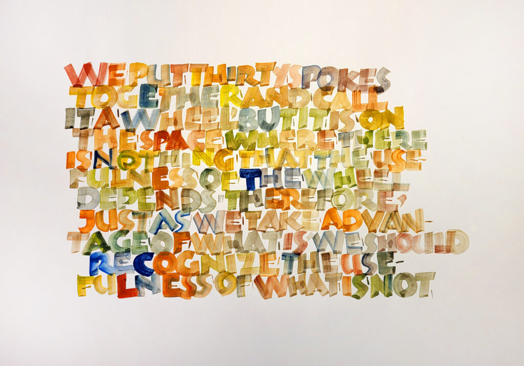
I’m still having a good time with the flat brush and Romans. This was a response to an online prompt – Postive:Negative. I was going to do it in black and white, but I had a leftover palette of gouache. (I always have a leftover palette, and I hate to wash color down the sink.) Kaerell #4 flat brush on some white butcher paper.
Lao-Tse’s quotation seemed appropriate for the prompt as well: “We put thirty spokes together and call it a wheel, but it is on the space where there is nothing that the usefulness of the wheel depends. Therefore, just as we take advantage of what is, we should recognize the usefulness of what is not.”
Our week-long class at the international calligraphy conference at St. Ambrose University with John Stevens was simply wonderful. My main frustration was that there was so much else to do at the conference that I didn’t get enough time to work in the classroom. Every full day that I’ve been home since then, I’ve been doing three pages of brush Romans. That’s two pages of Trajans and one page of whatever else I want to do. Even though the letters aren’t improving much, I think that my eye is seeing more.
Practice sheets 18″ x 30″ (mostly) July 1-21.
One of the really valuable lessons from John was about how to condition our flat brushes to get them to work at their optimum level. Between July 1 and 21, I was interested to see that, after daily brush conditioning at the end of each session, my Winsor & Newton 995 is now substantially wider than when I started.
All these 18″ x 30″ (mostly) sheets cuts from a roll of butcher paper have reached a certain critical mass: they no longer can be contained by the three binder clips I’ve been using to hang them. So I’ve rolled them up and put them in the corner, but I don’t have a lot of extra space for these. They’ll be seeing the recycling bin before long.
I’m looking forward to creating a new batch of higher-class recycling 🙂
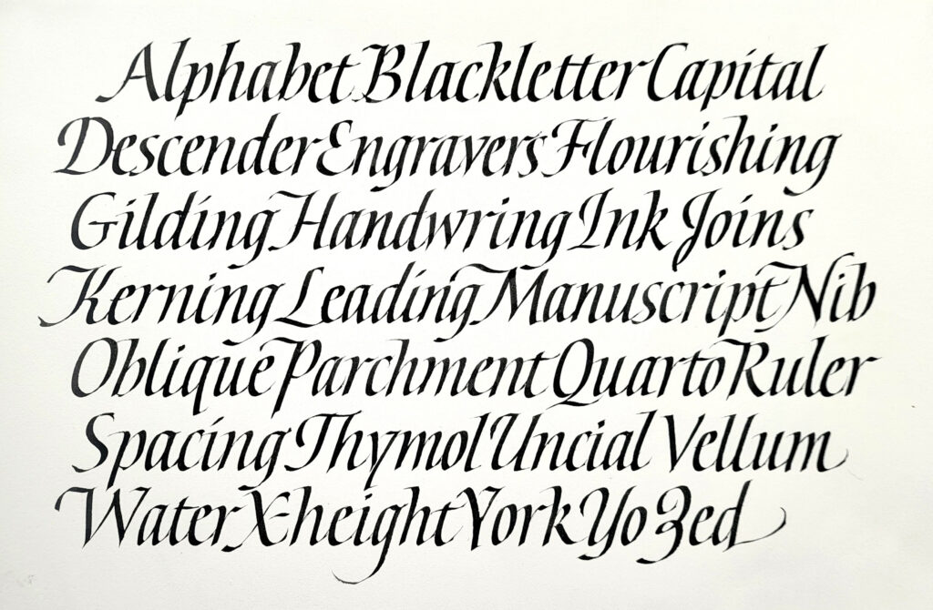
This week I had occasion to write out a poem in letters of nearly 1/2″ x-height. It had been a long time since I had written anything of any length with a 3mm-wide nib, so I began with my go-to practice page, the alphabetical list of related terms. The first page was of upright italic, and then I tried something with a good slanted. The final piece had a slant that was somewhere between these two, but these two sheets were a good starting point and a great warm-up.
Gouache, Zig Cocoiro brush pen, ZIG Mangaka 01 pen on Canson XL watercolor paper. 6 x 9 in.
I’m continuing to enjoy Akim lettering. I made these in preparation for next month’s local guild meeting. Even though I switched to a brush pen for the main lettering, I tried for a fairly monoline effect. I love doing Akim lettering with a brush pen.
Gouache, ZIG Mangaka 01 pen on Canson XL watercolor paper. 6 x 9 in.
Here I used the same palette as for the first one, but mixed neutrals. After I penciled in the box and did the main lettering, I went over the lettering inside the box with Pebeo masking fluid and a bowl-pointed pen (didn’t want to ruin my tiny brushes). Then I painted in the box. When the paint was dry, I removed the masking fluid with a rubber cement eraser. I had done a pretty bad job of tracing the lettering, but that was all right. And where it was just too egregiously out of whack I painted some neutral back in and blended it with the rest of the painting.
Studying Akim for our guild’s long-term project with monoline lettering. Here the lines are discrete, but the letter elements are stretched to maximize the graphic impact and slow down reading. Fine-line marker on Clairfontaine paper. About 4 x 6 in, as I recall.
I’ve come across Akim script several times over the years, most usually because I return again and again to Hans-Joachim Burgert’s book The Calligraphic Line. This script is an approach as much as a hand, developed by Burgert. Until now, it has not drawn me in. But now I see it as a relaxation of the confines of lettering in favor of the graphical aspect of the page. And I’m really enjoying it.
These pages were done while sitting at the piano through many hours of choreography and staging and technical rehearsals for a production of “Carousel.” All I needed was a pad of Clairfontaine Triomphe paper and a fine-line marker. (I didn’t even need guidelines, a circumstance that is quite freeing.) Most of these were done with ZIG Millennium markers, sizes 005 to 03.
Here the lines are baselines are allowed to wave, but the lines intrude only sometimes upon one another. Fine-line marker on Clairfontaine paper. About 4 x 6 in, as I recall.
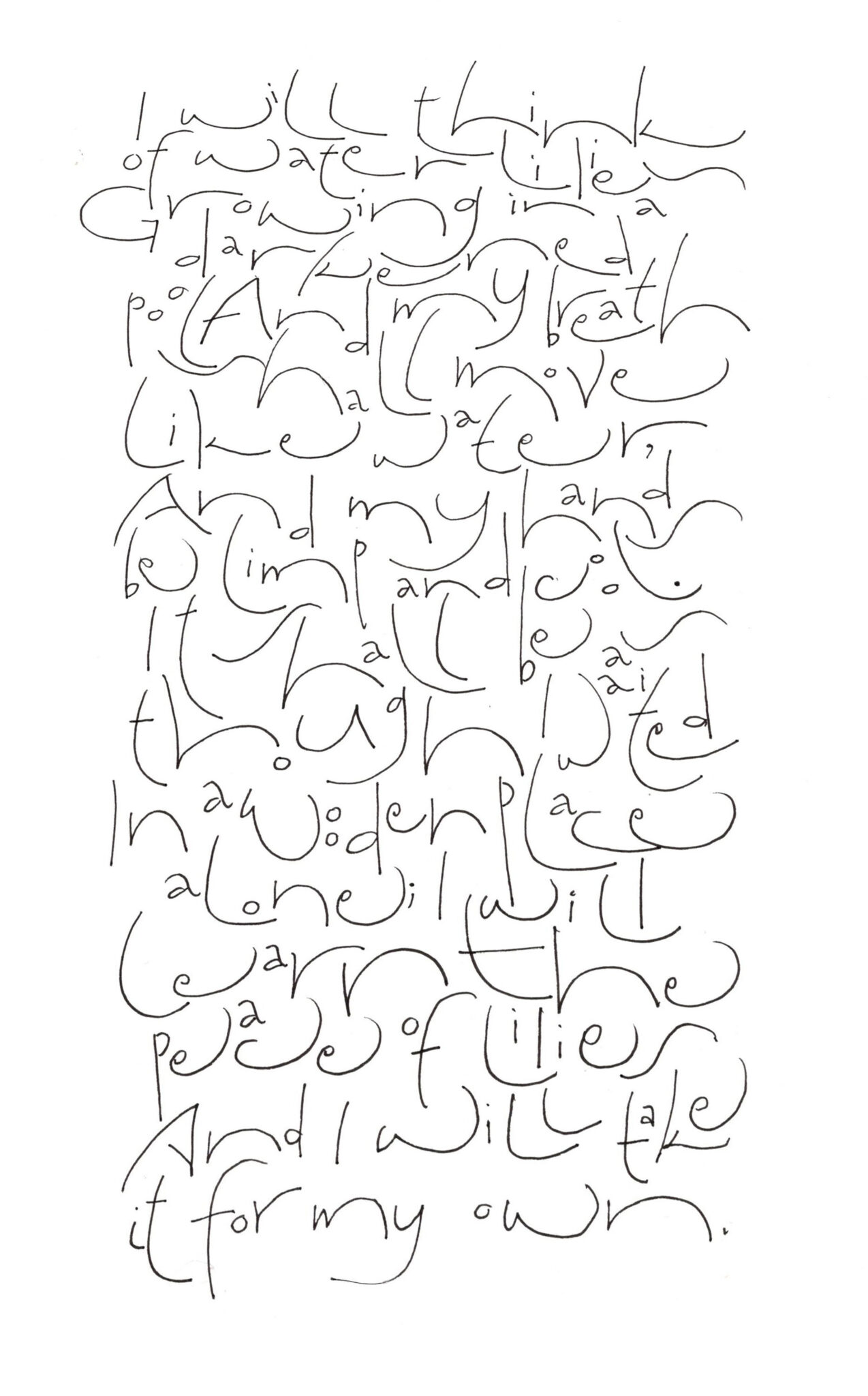
Here I’m exploring a less linear texture by allowing the lines of text to intrude upon one another. Because of this intrusion, I’ve lessened the contrast between the letters’ wide arcs and the small counters. The text is “After Quiet,” by Hazel Hall. Fine-line marker on Clairfontaine paper, about 8 x 10 in.
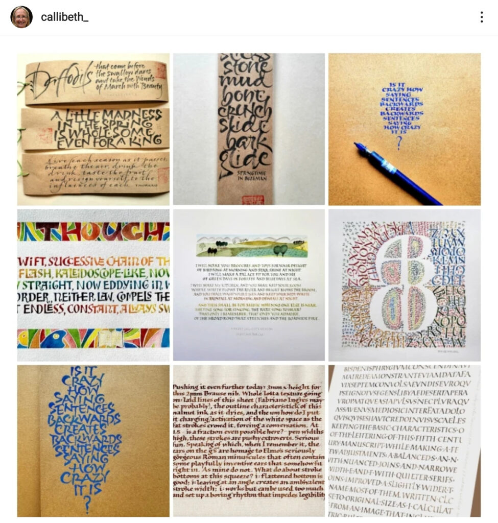
Here are my nine most popular posts on Instagram in 2022. The app tells me that I had 2.6K likes in 2022 on a total of 24 posts. Gives me a warm, fuzzy feeling 🙂
Some of these images I’ve posted on this blog. You can get a better look at the bottom right one here (my second blog post of the year). And two weathergram images are the subject of this blog post in March. And this March blog post show the Ben Shahn lettering of the middle left image.
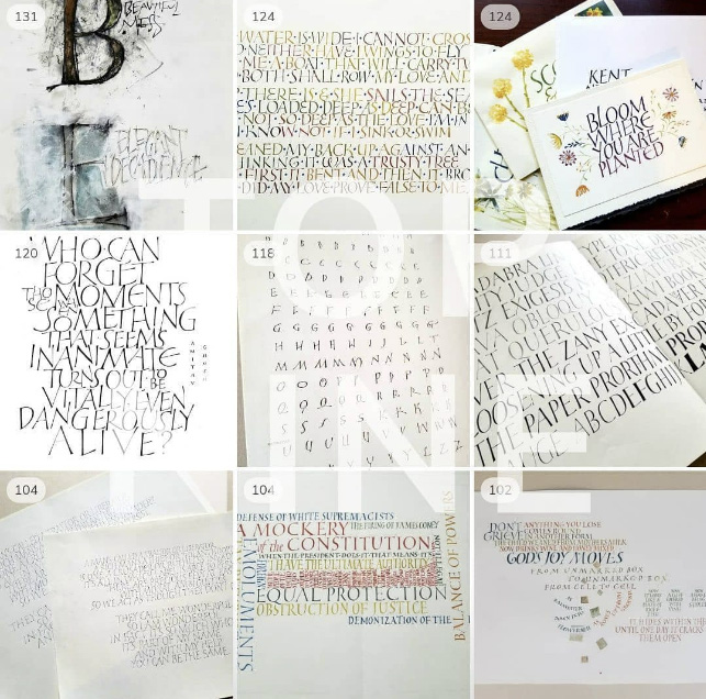
I evidently didn’t look for my top nine in 2021, but you can see my top nine in 2020 here on Instagram. In some ways, it’s a very different look. Oh, I’ll just put them here, so you can see them on the same page.
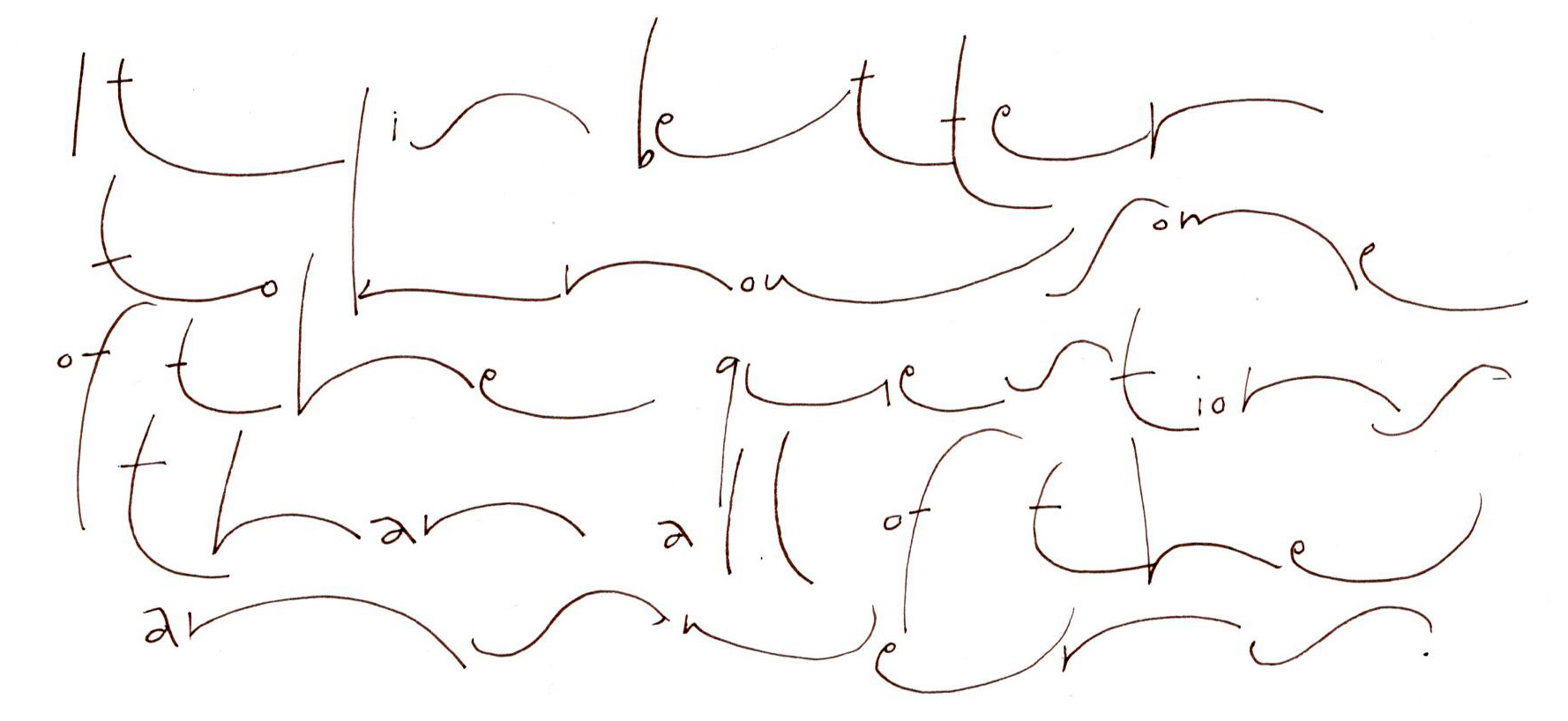
I can’t believe it’s been so long since I posted anything at all! Life has been jammed up with political things (my husband’s re-election campaign, for instance), and I’m finally getting a chance to begin to catch up and take a deep breath. I’ve gotten back to Roman text capitals, which don’t want to let me go.
I’ve also been teaching more. Last month I taught a two-day workshop on Roman text capitals, color, painting and design to a delightful group of calligraphers in Albuquerque. Every time I teach this workshop, it evolves some more. (You may remember this blog post about my study of 6th century square capitals.)
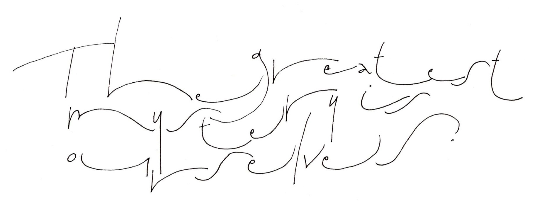
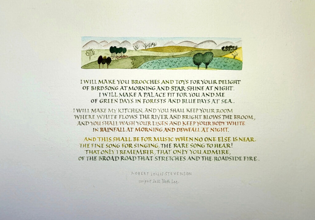
Here is one of the samples I brought along to the workshop this time.
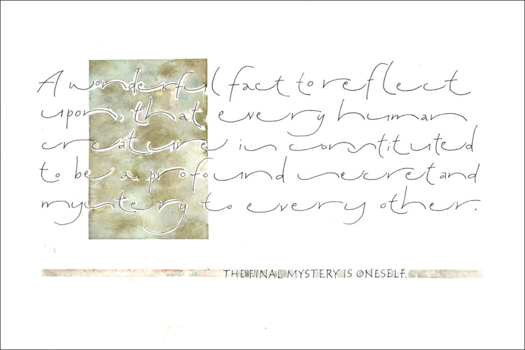
“The Roadside Fire #1” – Robert Louis Stevenson’s poem. Gouache and small metal pen on Arches Text Wove paper. Text area 4″ x 6″.
I can never see this poem without hearing in my head the Ralph Vaughn Williams setting of it. I’ve played the piano accompanied for many a baritone student at the university. You can hear Bryn Terfel sing it here. The entire song cycle is pretty wonderful.
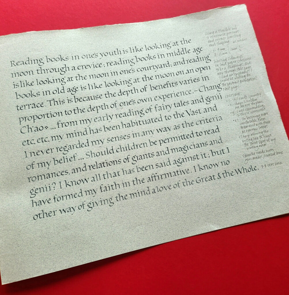
Gouache and #5 Mitchell nib on Zerkall Laid (sideways – ack!). X-height is 4mm.
I’m up to page 37 in my Roman minuscules practice journal. It’s strange how you begin to think you’ve run out of what to do next, and then suddenly more possibilities appear, and more, and more … I’ve become absorbed in the process, and I have ideas for another 37 pages, at least.
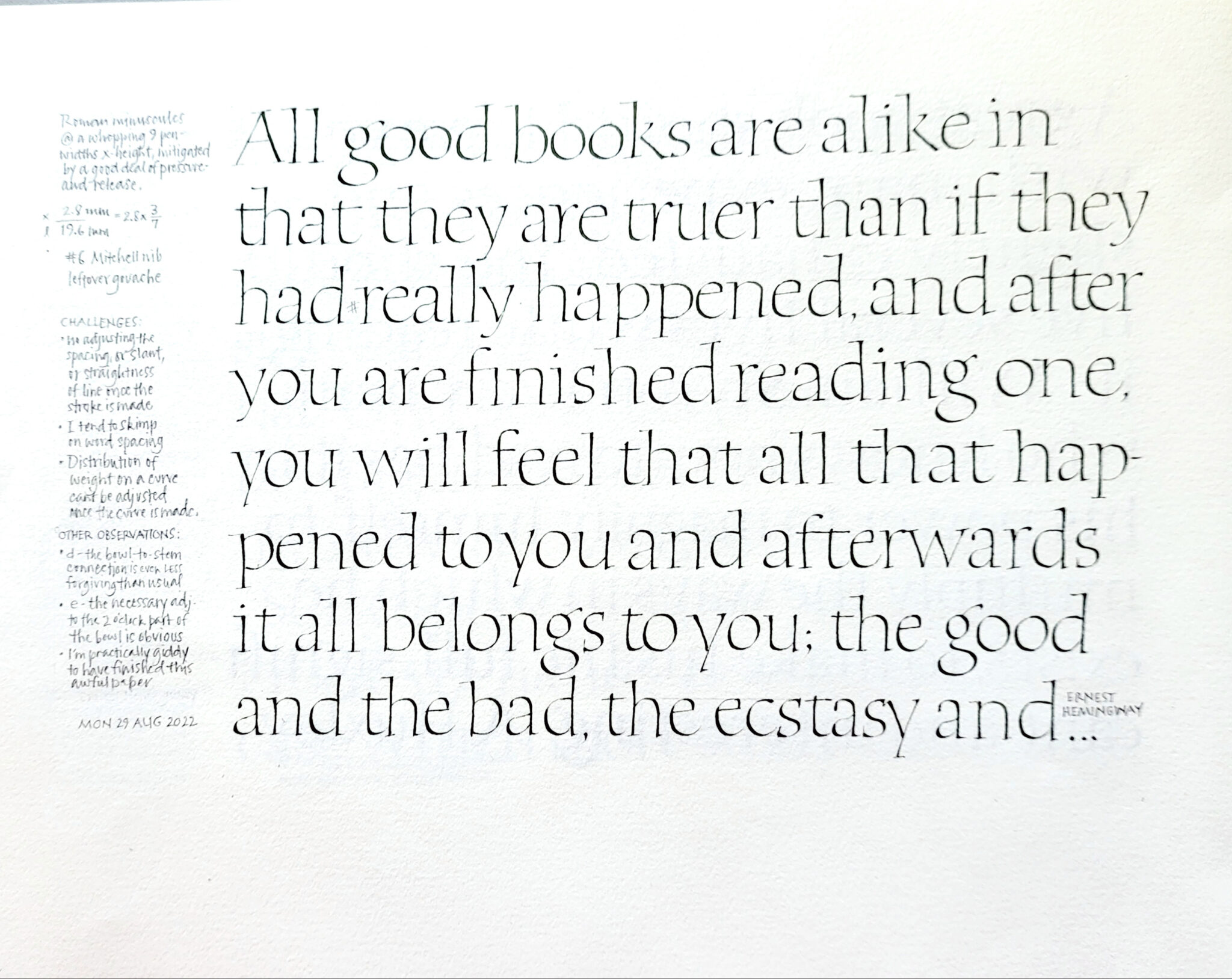
Roman minuscules practice journal, page 36. Leftover palette of gouache with a #6 Mitchell nib, x-height 2.8mm (or 9 pen-widths exclusive of pressure-and-release considerations). 12 x 9 in page of Somerset Book paper, I think.
Since mid-July, I’ve been steadily building a journal of Roman minuscules practice. This is today’s work: page 36, towards the end of my 3rd section. I’ll be happy to get off of this paper (Somerset Book?). And I’m looking forward to the Zerkall German Ingres that is the next folio.
At this point I’ve worked my way through the entire copious batch of handouts from Elmo van Slingerland’s 3-week online class. I’ve been branching out in a couple of ways. For a few pages, I followed some experiments to their logical conclusion, changing up size and boldness and shape. I have a lot more to do there. But then I branched out another way, emulating some pages I had long admired by past masters.
I had wandered into built-up pointed-pen Roman minuscules, thanks to a gorgeous page of those by Werner Schneider. (I don’t see it anywhere online, but trust me, it would blow you away.) They were a bear to do, and I actually had a little temper tantrum over them — rather out of character and most immature, but rather satisfying, in a way — before settling down to work on them seriously.
After the difficult work of building up monoline Roman minuscules, I took a break to do this page with a #6 Mitchell and pressure-and-release, curious to see whether I could approximate the general texture of the built-up monoline letters. The answer is: yes, sort of.
I believe I’ll repeat both the built-up pointed-pen and #6 Mitchell pressure-and-release experiments on the next two pages, if only to confirm for myself how much better life is on Zerkall German Ingres.
Contains information related to marketing campaigns of the user. These are shared with Google AdWords / Google Ads when the Google Ads and Google Analytics accounts are linked together.
90 days
__utma
ID used to identify users and sessions
2 years after last activity
__utmt
Used to monitor number of Google Analytics server requests
10 minutes
__utmb
Used to distinguish new sessions and visits. This cookie is set when the GA.js javascript library is loaded and there is no existing __utmb cookie. The cookie is updated every time data is sent to the Google Analytics server.
30 minutes after last activity
__utmc
Used only with old Urchin versions of Google Analytics and not with GA.js. Was used to distinguish between new sessions and visits at the end of a session.
End of session (browser)
__utmz
Contains information about the traffic source or campaign that directed user to the website. The cookie is set when the GA.js javascript is loaded and updated when data is sent to the Google Anaytics server
6 months after last activity
__utmv
Contains custom information set by the web developer via the _setCustomVar method in Google Analytics. This cookie is updated every time new data is sent to the Google Analytics server.
2 years after last activity
__utmx
Used to determine whether a user is included in an A / B or Multivariate test.
18 months
_ga
ID used to identify users
2 years
_gali
Used by Google Analytics to determine which links on a page are being clicked
30 seconds
_ga_
ID used to identify users
2 years
_gid
ID used to identify users for 24 hours after last activity
24 hours
_gat
Used to monitor number of Google Analytics server requests when using Google Tag Manager
1 minute
You can find more information in our Cookie Policy and .