I’ve been away on an of-my-gosh-school’s-about-to-start-and- we’ve-got-one-more-opportunity-for-a family trip. Now I’m working on addressing wedding invitations. Here’s a bit from the invitation itself:

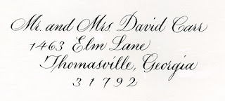
Although I first thought I’d use a pointed-pen script for the addresses, after struggling through a few envelopes I quickly bowed to the necessities of the materials. The paper proved to be way too toothy and not at all sized enough to allow the use of a pointed pen.
I could include a rant here about wedding stationers and their high-priced unwritable stock — even Crane has been known to make their envelopes inside-out at times, so that the sizing is on the useless inside of the envelope. Oh, the torture of having the beautiful side of the paper so close and yet so far away. It’s like a tying up a horse within 5 inches’ reach of water. All right, all right, I’ve just deleted the rest of this rant. Calligraphers know exactly whereof I speak, and the rest of you can only imagine our pain.
Anyway. On with my saga.
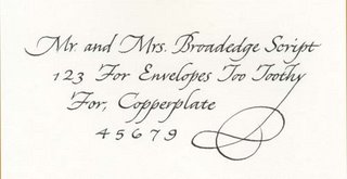
After I concluded that pointed pen was impossible for these envelopes, I started experimenting with a #5 Mitchell Roundhand nib — a narrow broad-edge nib — and tailored a script that I think complements the script above. Here it is (as always, click on the thumbnail for a closer view):
 I began with a standard italic, and then made changes so that it more closely resembles a pointed-pen script such as Copperplate. I used the same lining guide I had set up for the original pointed-pen script, and this had the effect of a) making very small lower-case letters, b) enlarging the capitals in proportion to the lower-case letters, and c) slanting the lettering from the usual italic 5-15 degrees to about 40 degrees.
Then I modified the capitals to follow Copperplate forms a little more closely. See the B, the T’s and the F’s. This modification worked because the capitals are so tall: 11 pen-widths.
The x-height is 3 pen-widths tall, which necessitated a widening of the script.
And, voila! I like this script. I think I’ll add it to my standard style offerings.
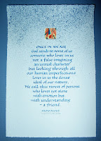
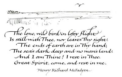
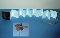 This business of catching up after a trip is the pits. I’m close to being caught up. Here’s a broadside and book for a client — same quote for each. The inset in the 2nd photo shows the book closed.