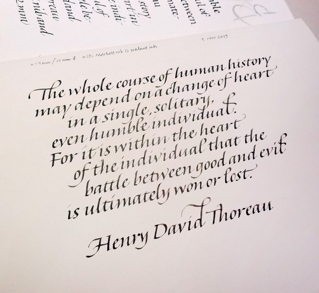
Daily lettering – Thoreau quotation

Calligraphy & more — the studio of Beth Lee, Redmond, WA
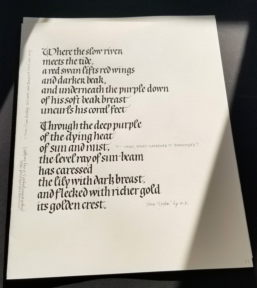
After just a few days off, the hand seems to slip through my fingers when I lose focus, but I am enjoying gothicized italic. This page was done June 11.
I’ve been negligent here on my blog — has it really been two months? to the day! — but I’ve been working pretty steadily in my studio. Here are a few pages of daily lettering, mostly delving into gothicized italic and uncial letter forms.
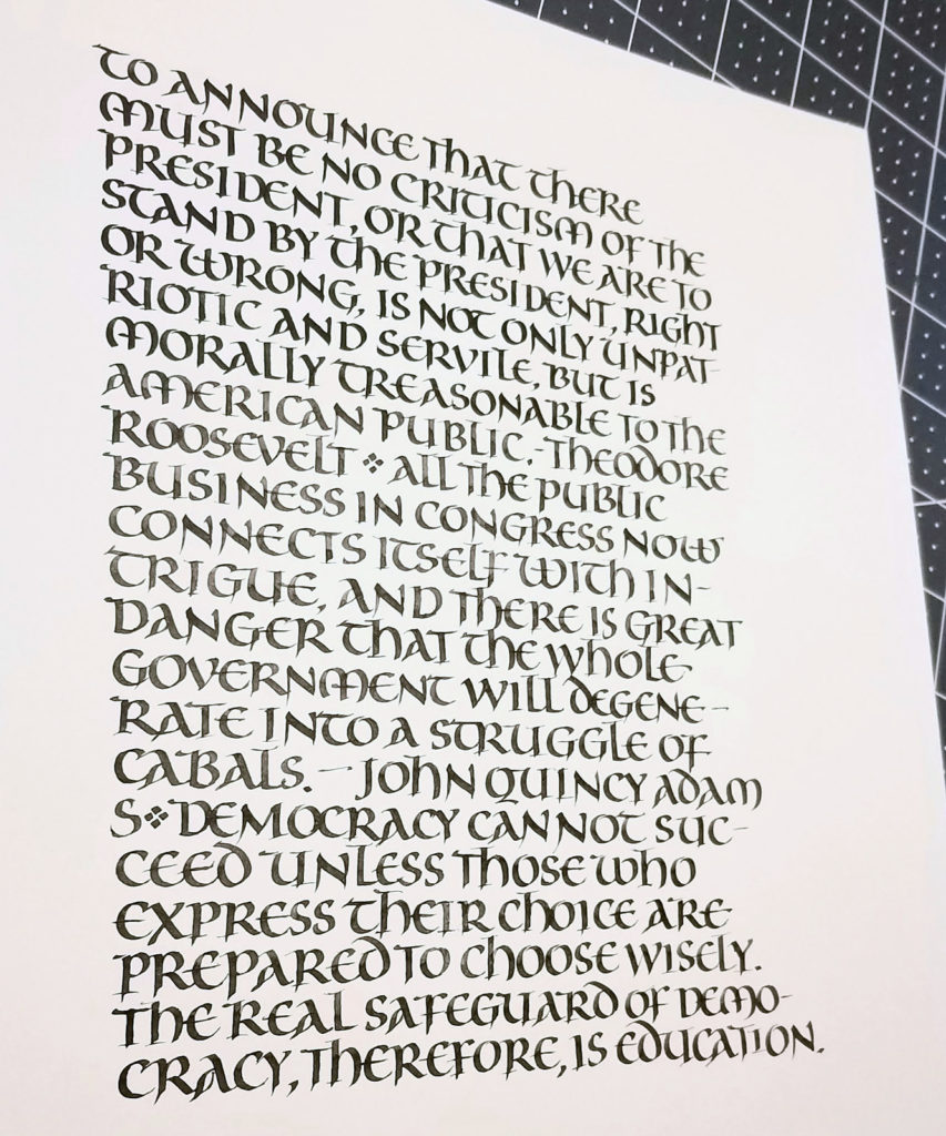
I’ve been studying gothicized italic, a hand I’ve never mastered. I began by analyzing a handout of a Lincoln quotation that Sheila Waters provided in a long-ago workshop. I determined the x-height and pen-width, lined up a sheet of paper, penciled in the bare bones of the letters, and had at it. As I worked I made notes about surprising discoveries: “the s is wider than I had thought”, “the final stroke of the e continues diagonally and does not go horizontal”, and so on. Then I repeated the exercise without penciling in the skeletal letters. (I won’t sully Sheila’s reputation — or mine — by reproducing my practice sheets here!) Next, I put up another handout from Sheila, a reproduction of a piece of Edward Johnston’s gothicized italic writing. You can see a portion of that handout in the image above. Once again, I analyzed it, ruled up a sheet, and copied the lettering as closely as possible, making notes as before.
Finally, I wrote out this sheet, choosing another text. My goal was to stick to Johnston’s lettering closely yet adhere to some best calligraphy practices and to make it more my own. I didn’t care for the long thin finials on his t and h, and his standard r is so wild and woolly that the next letter must be shorter to compensate. Next time around I will work on letter width and spacing to better match Johnston’s: mine were both two wide. Also, I regretted the use of the alternate r on the 2nd line. It seems to work best next to another oval letter such as a p.