Square capitals
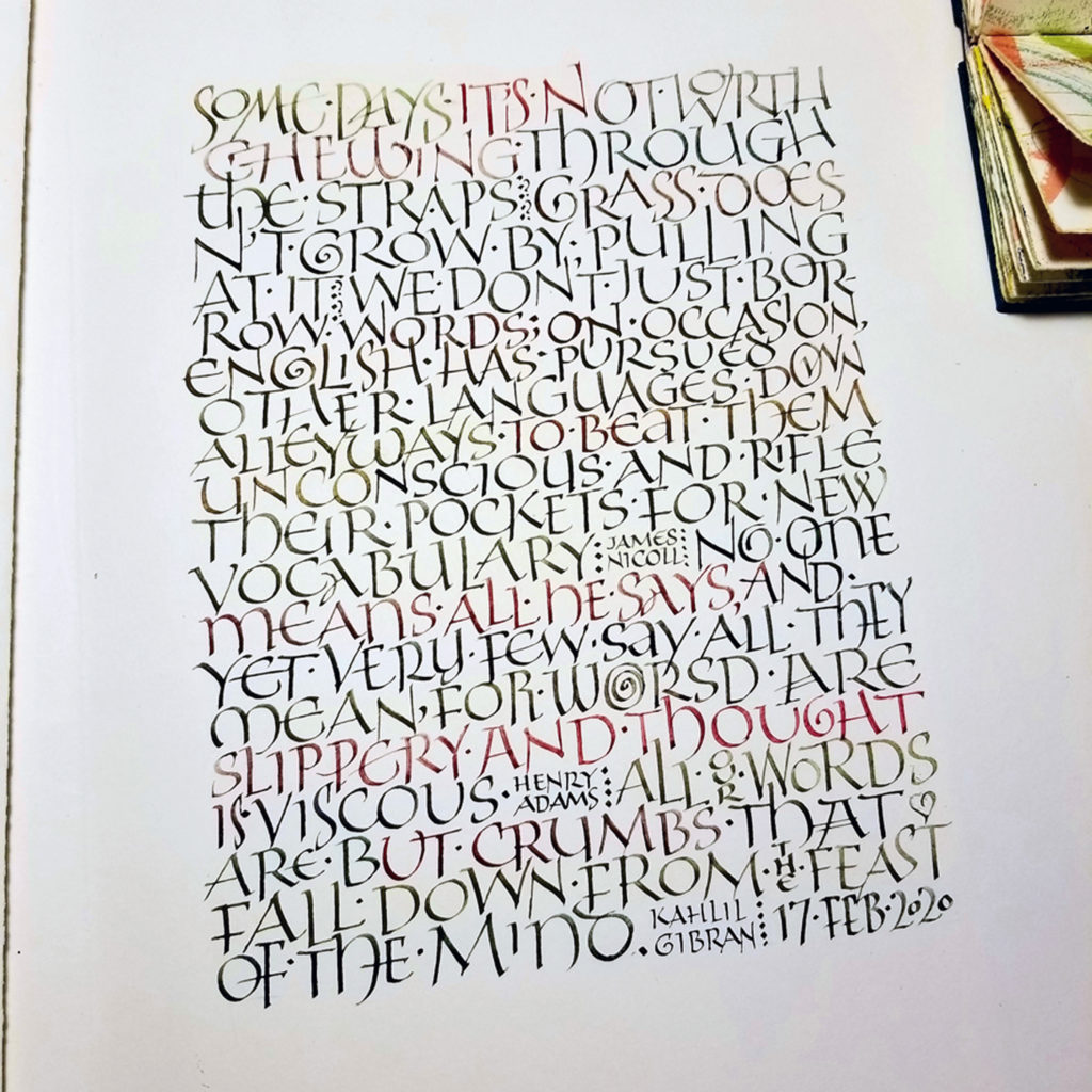
I have become particularly interested in capitals as a text hand. If you read this blog regularly, you may have noticed that I have long been drawn to capitals as a way to create texture on a page. (See this post and this one and this one. ) And square capitals are one of the styles of capitals that are found as a text hand in historical manuscripts.
I first began teaching the class, “Capitals as Text & Tiny Paintings as Graphical Elements” at the end of 2020. (See this blog post for more information.) I was able to organize my thinking about capitals as a text hand when I took an inspiring class with John Stevens in early 2021.
Then I took a really interesting class with Ewan Clayton in October and November. Six hour-long lectures traced the development of capital letters from the beginning of writing to contemporary times, and they were jam-packed with examples and information. And I mean jam-packed: there were sometime more than a hundred images covered in an hour!
Historical manuscripts
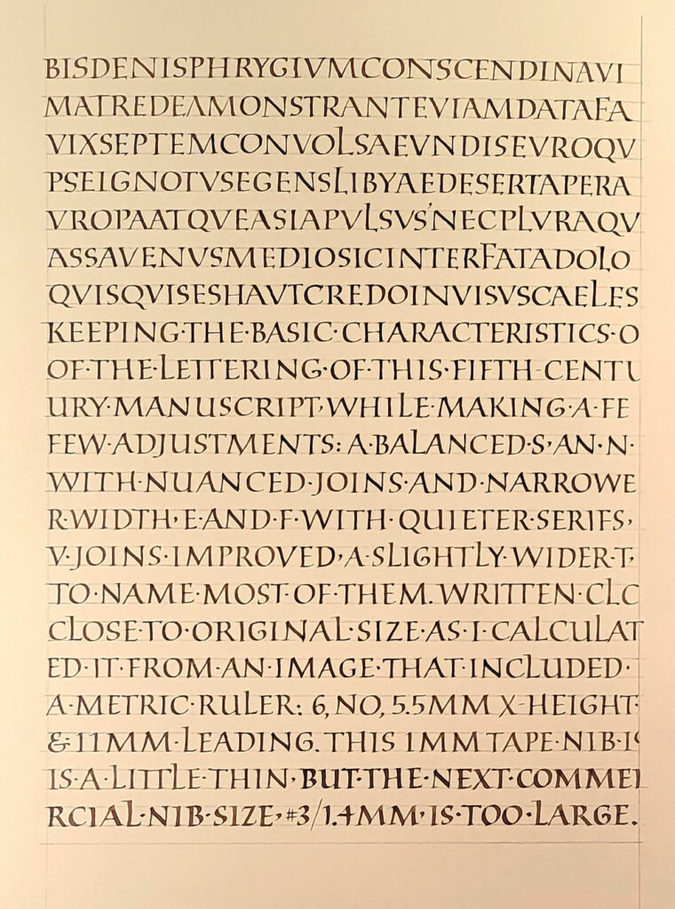
During the course of that survey of capitals square capitals caught my attention. They are found in only two historical manuscripts (that we know of so far), but it is thought that this hand was used in many more documents that have since been lost. One of the two manuscripts is Vergilius Augusteus, written around the 4th century, and only seven leaves survive. I found an image of page ruler (https://digi.vatlib.it/view/MSS_Vat.lat.3256), which enabled me to figure that the original letters on that page had been written at 5.6 – 6.0 mm high, and that the distance from the first baseline to the last was 200mm. When I divided by 18 lines, I got a line leading measurement of 11 mm. The calculations gave me my guidelines.
Codex Sangallensis 1394, written in the 5th century, is the only other extant example of square capitals as a manuscript hand. Only eleven leaves — partial leaves, really — survive. You can see them here:
https://fragmentarium.ms/overview/F-r237
I began this page in my daily journal by copying the first seven lines of this page as closely as possible:
https://fragmentarium.ms/view/page/F-r237/6/103
and then began to make adjustment for quirks that I wanted to leave out. I’ll keep working for another few pages, at least.