I’m having a good time with these new watercolors … and some sewing. At least a few parts of this page are interesting 🙂
Calligraphy & more — the studio of Beth Lee, Redmond, WA
I’m having a good time with these new watercolors … and some sewing. At least a few parts of this page are interesting 🙂
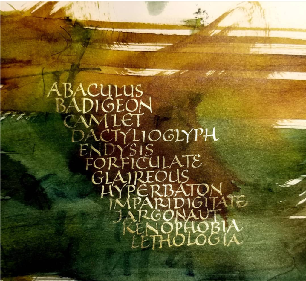
Slightly hungover from an overindulgence of Built Up Capitals, I’m trying flower painting… and a little hair of the dog that bit me, because I can’t quite go cold turkey even now.
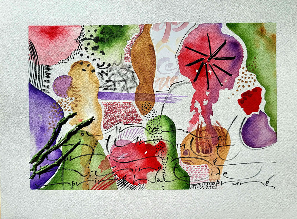
I recently posted this bagatelle on Instagram. It’s one of a series of daily useless writings made up of leftover paint and discarded papers. I’ve been making these as an antidote to the several long projects that I’ve been working on for what seems like forever. I can see the light at the end of this tunnel … but for now I’m still in the tunnel.
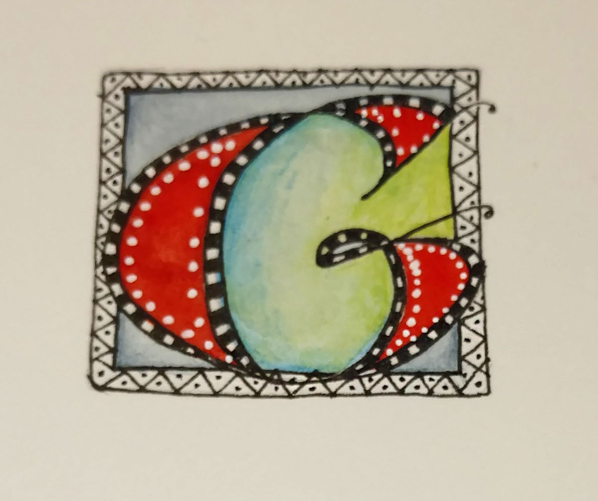
At our local guild meeting on Monday, Diana guided us through the designing and painting of a casual versal letter (or 4, in the case of one participant!). We had a lot of fun with pencil, pen, watercolor, and watercolor pencils. Here’s mine, at left. I began another; perhaps I’ll post it when I finish it.
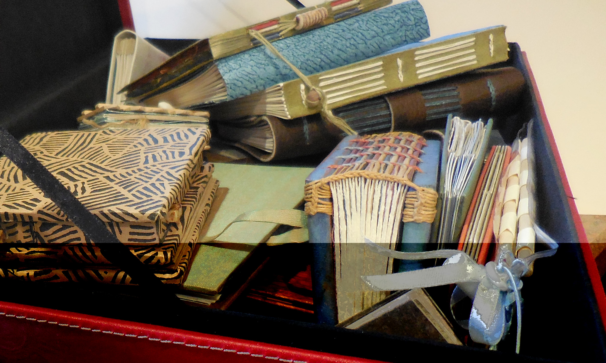
 Lots of projects going these days.
Today members of our local guild bound a test text block for the collaborative book we’ve been working on. We are making a standard case binding using the same paper on which the book will be printed. Today we got as far as applying the mull to the spine. I had brought supplies for this, and I was determined to unpack it all when I got back to my studio. This led eventually to trimming the text block and applying a headband. You can just see that text block underneath the top black square of paper. I did go ahead and cut out the cover and spine boards, but that’s for another day, because I continued to work on …
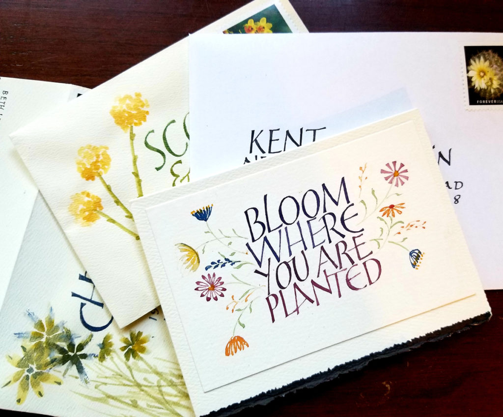
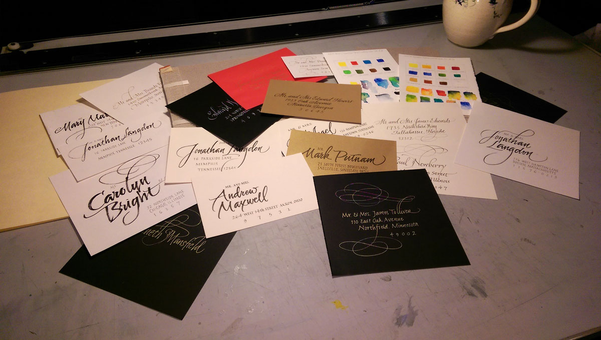
Addressing styles. I had the best time addressing some personal envelopes recently and discovered that I don’t really need guidelines for certain styles. So I’ve been developing some more casual envelope address styles. Some of what I tried today is shown above: sumi ink, pigment ink, gold gel pen, and fine marker on white, black and shimmery gold stock.
Yesterday I got out two travel watercolor sets and made test cards using a water brush. At the tops of the cards are the pure colors. At the bottoms of the cards I’ve experimented with mixing and tints.