Teaching Ben Shahn -ish letters

My exploration of Ben Shahn letters. Click on the image for a closer look.

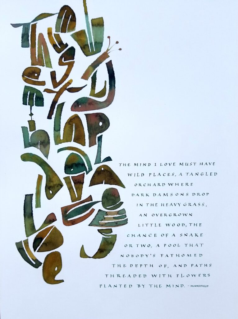
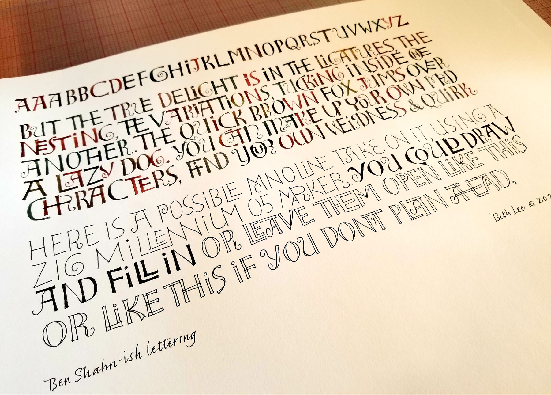
I enjoyed teaching Ben Shahn lettering to members of our local guild this month. Well, my take on them, at least. Clear examples of Ben Shahn’s actual lettering in this style have not been gathered into a book that is easy to acquire. In The Complete Graphic Works of Ben Shahn, there are some small images and one large but very faint image.

The renditions of contemporary calligraphy teachers vary widely. I think this is because the way the letters are put together with one another is as important as the letter forms themselves. Ben Shahn delighted to nest letters together, especially “LL”, to enclose one letter wholly or partially within the preceding letter, and to allow adjacent letters to sometimes share a single stem. It is a gently playful hand that is a delight to write.

We also explored the properties of Bister inks, which are similar to walnut ink but made in a range of colors.

My work in the GBW traveling exhibit “Wild/Life”

“The Mind I Love” — Inks and gouache on paper, 12 x 16 in.

I’m pleased to have this piece, titled “The Mind I Love”, accepted into WILD/LIFE. Hosted by the Guild of BookWorkers, this exhibition will travel to venues across the country from Summer 2021 to Fall 2022.

I enjoyed the work we did in Series 1 of Brody Neuenschwander’s online classes (see this post). So much, in fact, that I continued experimenting with it, and this piece is one result.

“The Water is Wide”: An edition of painted artist books as pandemic comfort art

I realize that I’ve never shared the variable edition of 12 manuscript books that I made last fall. Here are photos of the three verses of The Water is Wide. 5 x 8 in, Bister and sumi inks on Arches Text Wove, lettering done with a no. 2 round sable brush. Book cloth over hard cover.

These books were the “comfort food” of the studio this past fall. The melody that goes with these traditional lyrics is the kind of tune that sticks in your brain, but it’s soothing.

Pentel Color Brushes + Bister inks

Pentel Color Brushes are the bomb! And so are Bister inks. It was only a matter of time before I would combine them.

I’m continuing to enjoy Elizabeth McKee’s brush lettering class, so much so that my current book edition (going out the door tomorrow) is brush lettered. I’ve fiddled around with the Pentel Color Brush (PCB) a lot — emptying them, dipping them in watercolors and other inks, even using them as-is. The other day I emptied a nearly spent extra-fine PCB and refilled it with Bister inks. I have also been experimenting with making videos. So … here’s a video of me refilling a PCB with Bister inks. It turns out that Pentel Color Brushes and Bister inks go together well. I strained my ink through cheesecloth to keep out the undissolved Bister crystals.

Filling a Pentel Color Brush with Bister Inks

I show the PCB already taken apart. Taking apart a PCB is a simple operation. Grasp that black ring at the top of the black barrel with a needle-nose pliers and pull. The central tube will come out pretty easily. Then rinse out (or wash) both the barrel and the central tube. That’s it!

My favorite store for Pentel Color Brushes is JetPens. I’ve used them a lot over the years, especially when I was doing daily alphabets.