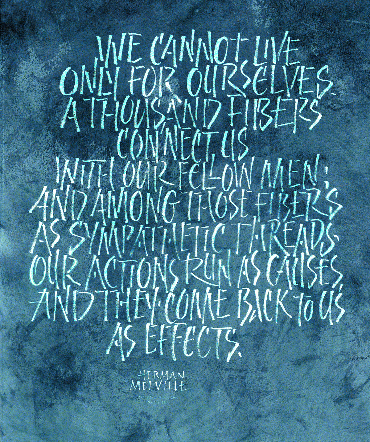
We cannot live only for ourselves …

Calligraphy & more — the studio of Beth Lee, Redmond, WA
Perhaps I should quit telling myself that I don’t do brush lettering. Maybe I can amend it to this: I don’t do traditional brush lettering. Or perhaps: My brush lettering is not schooled. I do enjoy this, whatever it is.
I’m not making much progress with brush lettering, so this will be the last post of brush lettering for awhile. Still, I’ve enjoyed it but I don’t see that I’m accomplishing much. I’ll be thinking about that in the meantime.
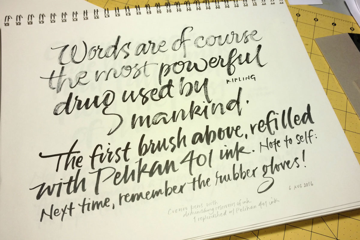
One of the brush pens ran out of ink and I didn’t have a brush refill (having accidentally ordered the extra-fine tip, which is more like a flexible drawing point). So, using my jewelry-making-size pliers, I pulled off the brush tip … and the base of the brush tip … and the stem inside that … and the base that the stem fit into. Then I squirted some Pelian 401 ink into the barrel using a thick needle-less syringe that was perfect for the job. Then put it all back together and tried it out at the bottom of the page. Interesting. As I wrote, next time: remember to wear rubber gloves. My cuticles will thank me for it.
—
When practicing, I try to be in the moment. But afterwards, it’s a good thing if the left brain kicks and tells me what’s good, what’s bad, what I need change next time. Otherwise, it’s just repetition, repetition, repetition.
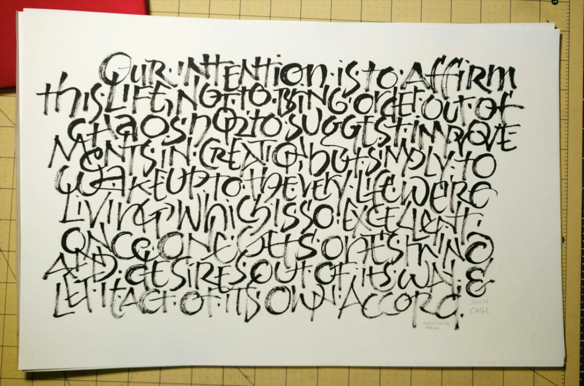
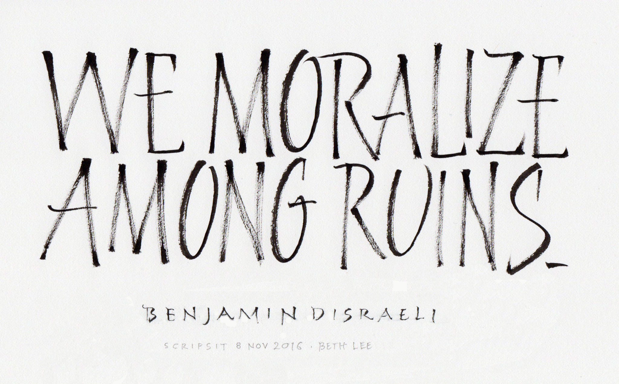
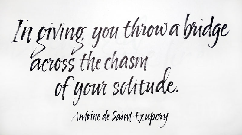
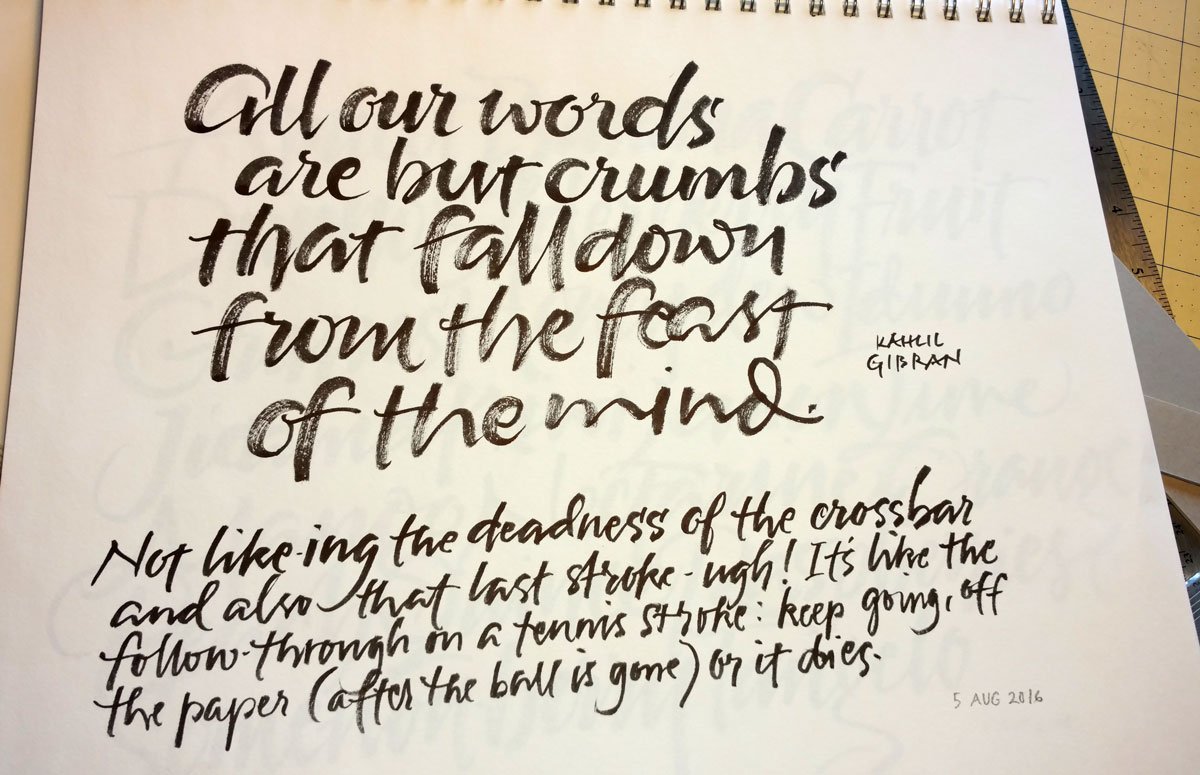
More brush lettering, not copying a page anymore, but trying to copy the approach … in an optimistic effort to achieve some brush wisdom.
Today I returned a Carl Rohrs workbook that I had a borrowed from my friend Rose several (or more) months ago. Rose had been doing some brush lettering earlier, and we got to talking about the challenges of brush lettering, trying different tools, talking about that luscious dragging-the-bristles-around-the-arc thing that Carl does … the usual thing that happens when you’re standing in someone’s studio and there’s pen/brush, paper, and paint out on the table 🙂
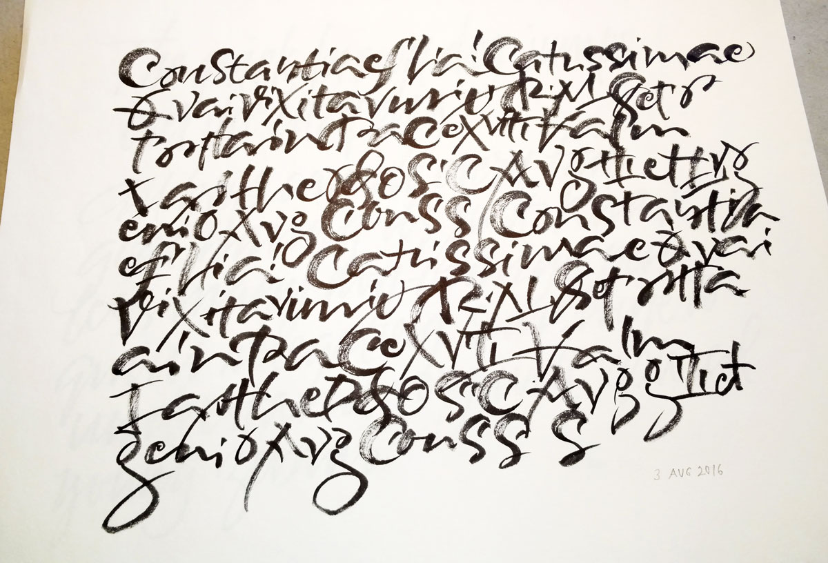
Anyway, I kept thinking about it as I finished running errands. When I got back to my studio I opened up the Carl Rohrs workbook that I own and started copying a page of lettering he provided. I treated it like a contour drawing, not looking much at the paper but trying to feel the shape and speed and gesture of the letters. During some part of the exercise I realized that not even the letters were registering, much less the words, and I only later realized that some figures were Roman numerals, for instance. I like this kind of practice, and plan to continue it for at least a little while.
P.S. If you saw this side-by-side with the workbook page, you would probably be surprised at how little they resemble one another. For one thing, I skipped and duplicated and re-tried things as I went. For another, I didn’t duplicate the line leading, naturally crowding the leading as is my wont.
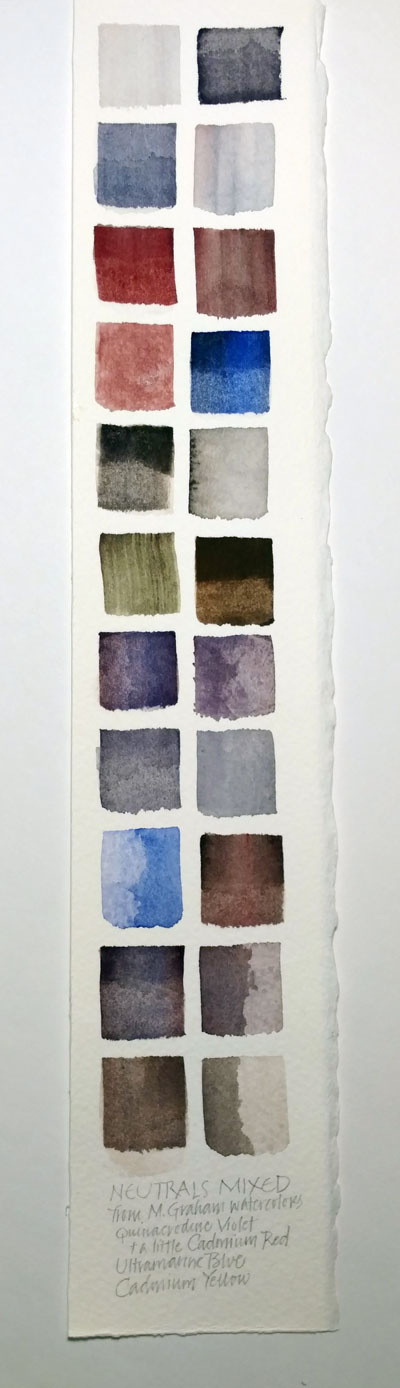
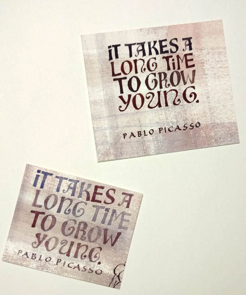
One of the really difficult parts about cleaning out my studio is figuring out what to do with all those bits of experiments that I’d like to develop further. A few cases in point:

And finally, in case you were wondering whether I’m still doing daily alphabets …

As always, click on an image for a closer look.

I’m back at work after the annual calligraphy conference and 4th of July celebrations. I’ll be posting about the conference soon.