It’s another daily alphabet … really!
Calligraphy & more — the studio of Beth Lee, Redmond, WA
Another day of pointed pen lettering, this time with McCaffery’s ink and my favorite pointed pen, the Principality. I’m not making much progress. This was done the same day as the copy-fitting exercise, which is to say, last Friday.
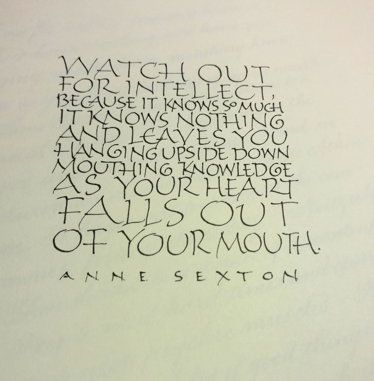 Sometimes the daily lettering isn’t about working on letter forms or loosening up with gestural strokes. On Friday, it was a sort of on-the-fly copy-fitting exercise, right-brained and hard to describe. Two or three things are going on, I think.
First, there is the guestimating about horizontal space − evaluating how big the letters should be, and how compressed or expanded. I was running out of room on the third line … but I kind of like that my choice for “so” makes it stand out. It almost gives “Valley Girl” emphasis to the phrase, which amuses me.
Second, though, there is the goal of making the current letters respect (and also with respect to) the line of letters above it. I added an entrance stroke to the “k” on “knowledge” to avoid having its spine line up with the spine of the “p” on the line above. “Falls out” doesn’t work very well here, opening up a big space between the “a” and “l” which connects to the space on the line above between “as” and “your” to make a big blob of white. I don’t mind the space between “falls” and “out” because it leaves room for “heart” to fall through to the last line. But “falls out” is just two few letters to work well on that line.
Third, there is the question of whether the letters should be larger or smaller than the others, given their importance to the content. Looking this over, I like my choices. I can read simply:
Watch out for intellect,
as your heart falls out of your mouth.
Or:
Watch out for intellect,
it know nothing and leaves you
as your heart falls out of your mouth.
Describing this process breaks it down and destroys the flow of the process. As Jacob Bronowsky said in a lecture memorialized in The Origins of Knowledge of Imagination, “It is an essential part of the methodology of science to divide the world for any experiment into what we regard as relevant and what we regard, for purposes of that experiment, as irrelevant. We make a cut. We put the experiment, if you like, into a box. Now the moment we do that, we do violence to the connections in the world … we are always decoding a part of nature which is not complete. We simply cannot get out of our own finiteness.”
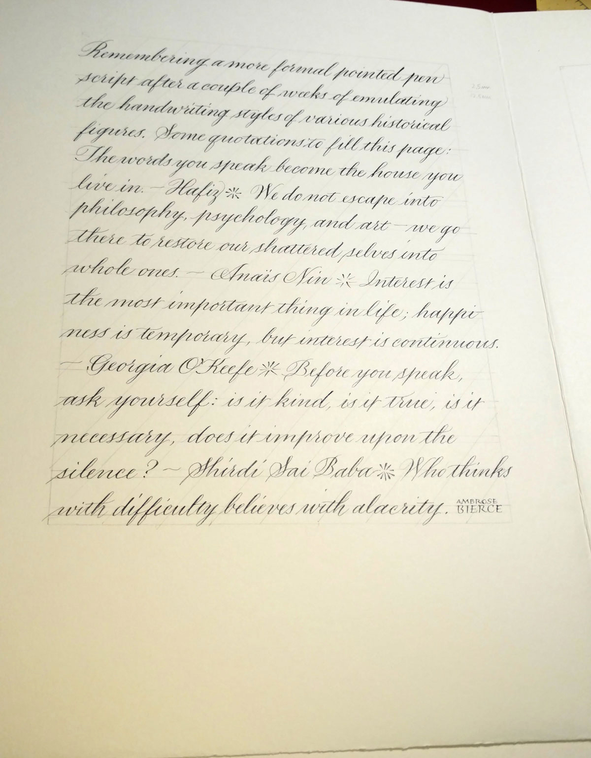
I just finished (I think) an interesting bit of work with a publishing company. I provided the lettering for historical documents that a character in a book of fiction has unearthed: journal entries, letters, and so on. It was interesting and challenging to come up with appropriate handwriting styles for four very different characters. Afterwards, the pen nibs weren’t worth much, and neither was my formal penmanship. This page was a start at getting back to a formal hand suitable for, for instance, some upcoming place cards.
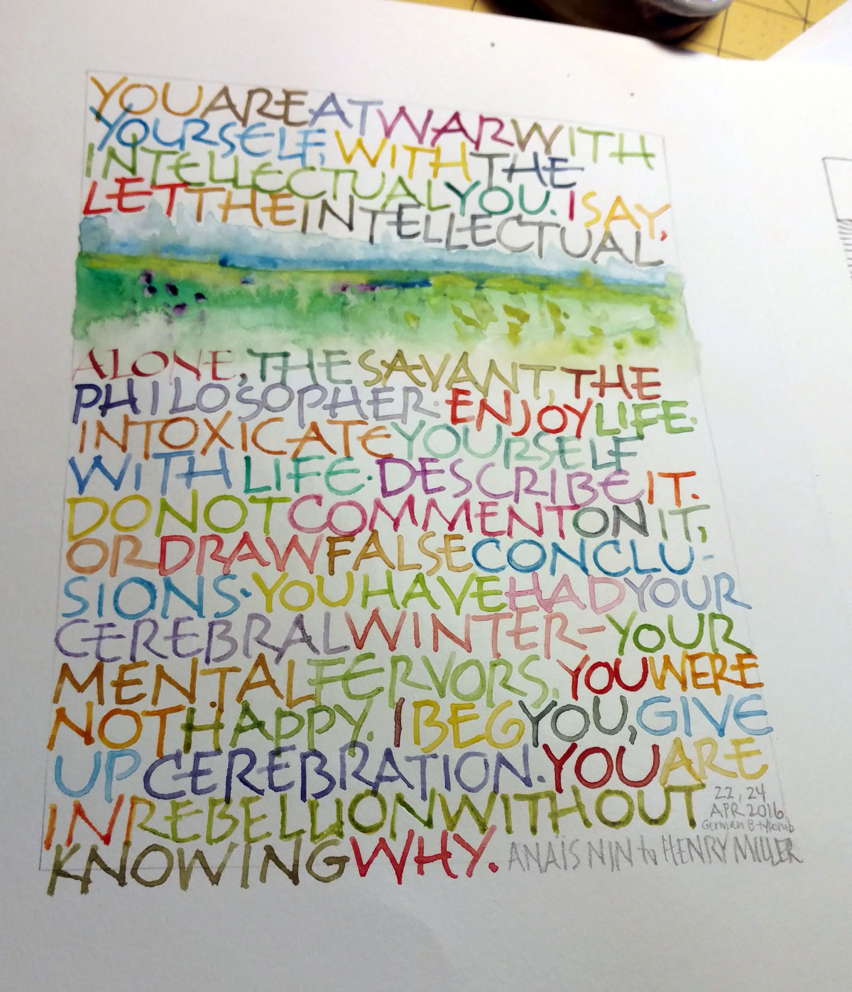
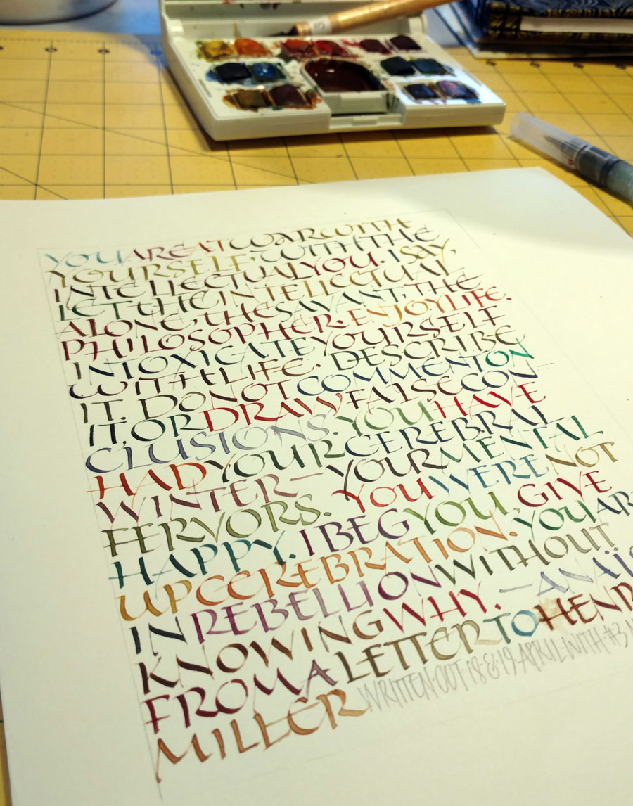
Same quote, same basic layout as last week: all-over texture, no guidelines, fairly large lettering (for me, at least) … except that I used a Speedball Flicker B5 nib, and included a little bit of watercolor painting. Once time I picked up the #3 Mitchell nib (from last week) by accident, and wrote one word before I realized my mistake. Since the word was “alone” it seem appropriate to leave it … um … alone. (Sorry.)
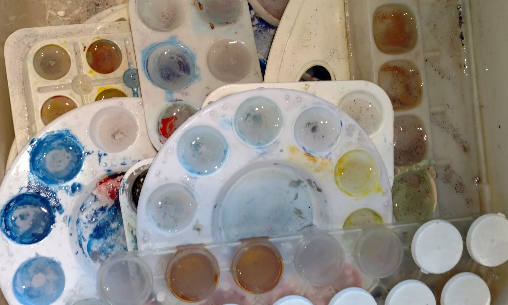
Back to my standard practice pages, which someday I’ll bind into journals. I used a water brush to help keep the palette and the brush clean. It’s handy.
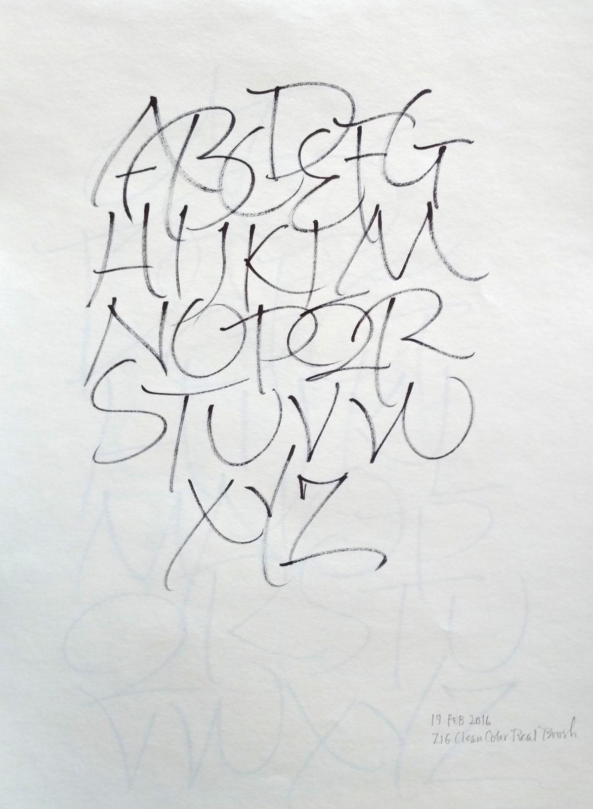
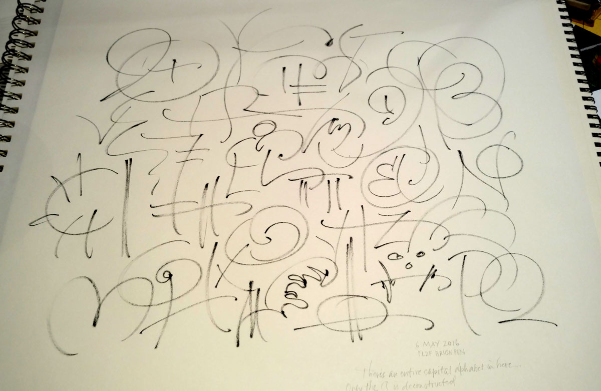
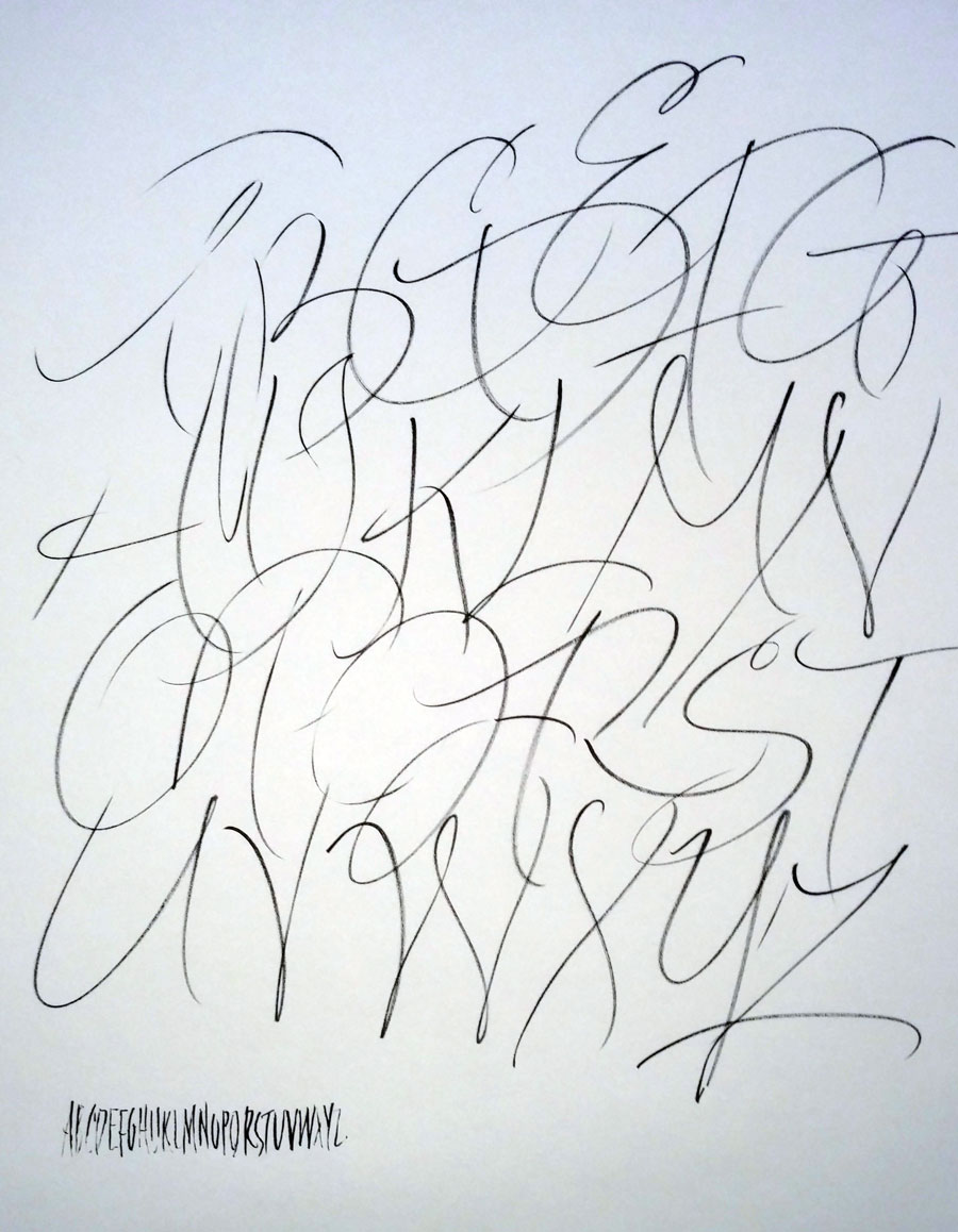
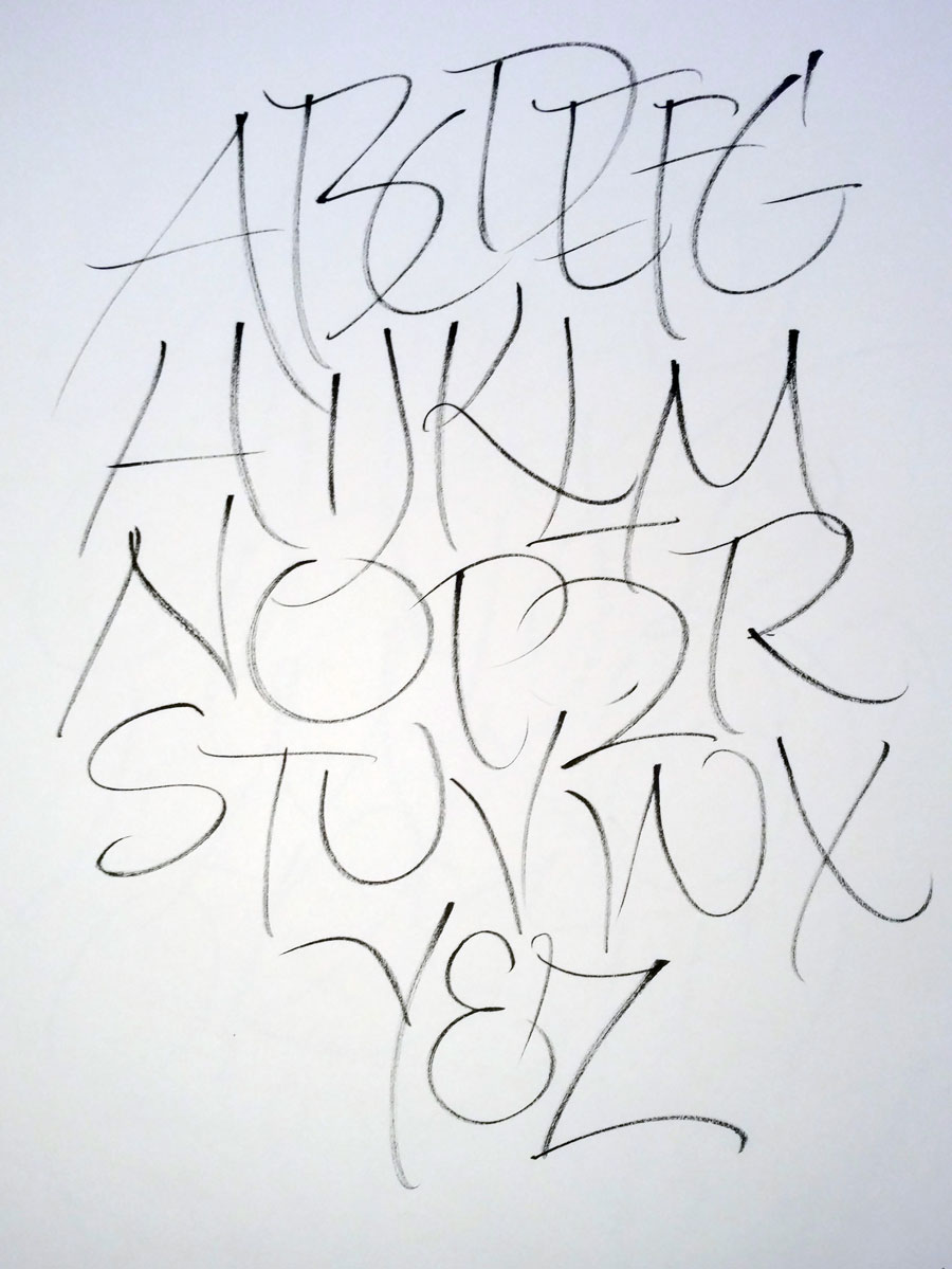
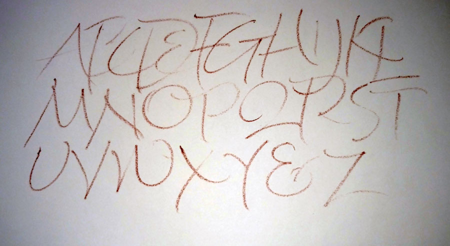
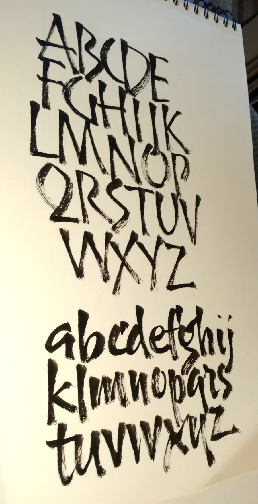
At our guild meeting a week and a half ago, I showed my paper pads full of gestural alphabets and demonstrated a couple of pages. Then we spent the rest of the meeting standing in front of our paper pads and making gestural ABCs and/or full alphabets. It was wonderful to see everyone in the room so absorbed in this meditational, rather addictive practice. Every once a while I would remind someone that she was resting her elbow on the table, or that she was looking a little too invested in the outcome to move freely, or [insert any other impediment to flow that I’ve caught myself doing], but mostly we just had a really wonderful time. Below is a sheet from March 11 plus two sheets I did during the guild meeting a few days later.
Web design and teaching have taken over my free time recently, but I still get in at least an alphabet a day. What do with them all? It’s actually rather surprising how long it takes to get through a pad of paper.