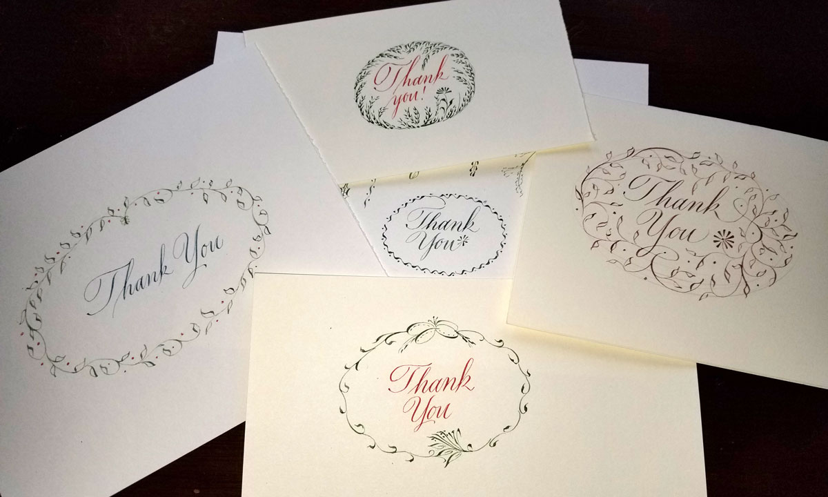
I’ve been preparing for our next pointed-pen class, when we will be experimenting with using the pressure and release of the pen to make decorative oval borders around some lettering. Here a few examples of what that could look like.

Calligraphy & more — the studio of Beth Lee, Redmond, WA
I’ve been preparing for our next pointed-pen class, when we will be experimenting with using the pressure and release of the pen to make decorative oval borders around some lettering. Here a few examples of what that could look like.
I’m having the best time teaching a great group of students this winter. Although I’ve taught calligraphy classes for [checks résumé] 30 years (!), this is the first time I’ve taught pointed pen scripts in a classroom setting. To teach others is always to educate myself. Determining how to explain a concept often spotlights previously ignored fuzzy areas in my own thinking.
We’ve begun with a business hand and no pressure, gotten an intro to pointed pen nib and offset holder and ink, and then moved on to a working copperplate hand that is not too fussy (think Buddy Blackwell).
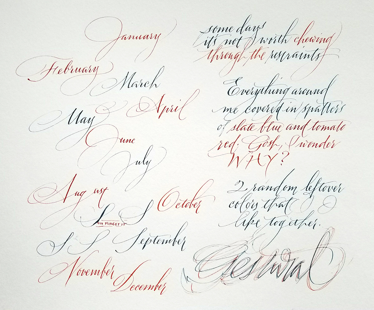
Here is a bit of silliness that broke out during a practice session focusing on whole-arm movement exercises. Contrary to what this image may suggest, I do not plan to cover “modern calligraphy” in any depth. I was just having fun. Click on the image for a closer look.
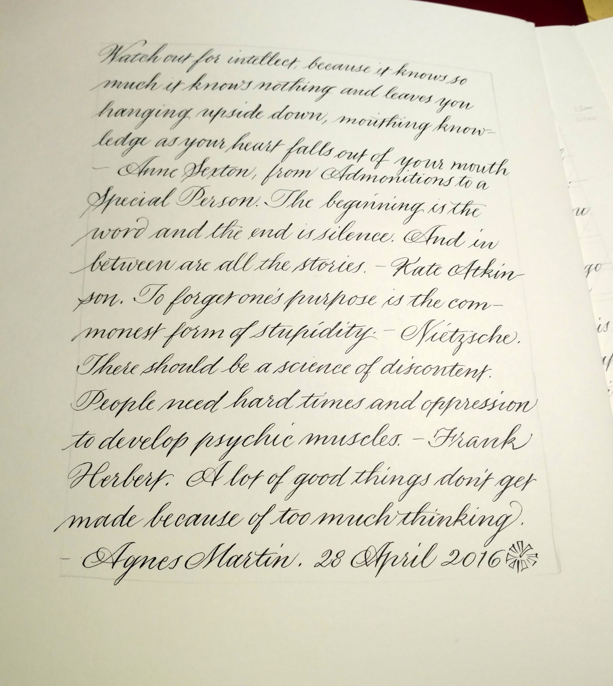
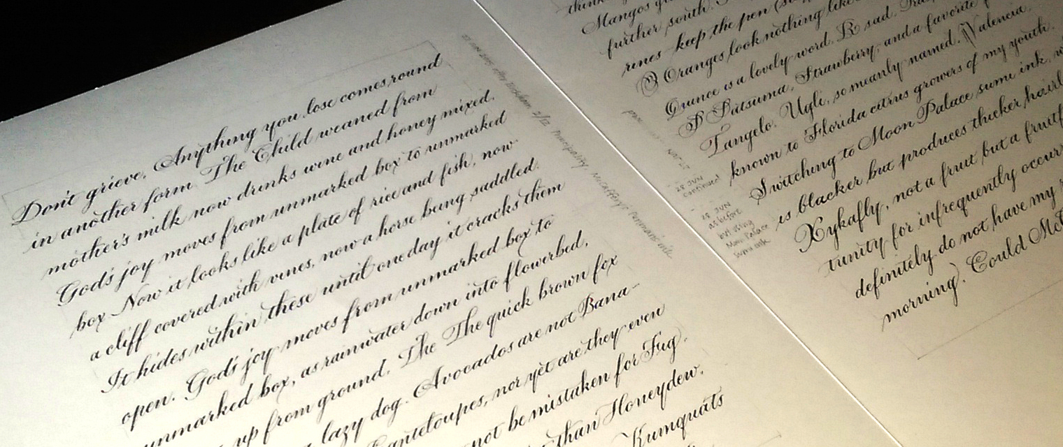
I just finished (I think) an interesting bit of work with a publishing company. I provided the lettering for historical documents that a character in a book of fiction has unearthed: journal entries, letters, and so on. It was interesting and challenging to come up with appropriate handwriting styles for four very different characters. Afterwards, the pen nibs weren’t worth much, and neither was my formal penmanship. This page was a start at getting back to a formal hand suitable for, for instance, some upcoming place cards.
One of my favorite calligraphers, Rachel Yallop, does beautiful pointed pen work, among other letter styles. She demonstrated her method in the class I took with her at Legacies II in summer 2014. She keeps the angle of the pen staff to the paper quite shallow. I’m sure if I kept my pen at the same angle, my letters would look just this good. Not.
Here’s a video of Rachel Yallp, calligrapher extraordinaire, writing copperplate with a straight pen holder. Originally shared publicly by Rachel on Facebook May 15, 2014.
Follow her on Facebook for a real treat.
A video of Rachel Yallop , calligrapher extraordinaire, writing copperplate with a straight pen holder. Originally shared publicly by Rachel on Facebook May 15, 2014

Today’s work included the final lettering for a commission: a long text in pointed pen script. I haven’t done much pointed pen lately, so I did this piece as a warm-up. It’s the beginning of the famous letter from Darcy to Elizabeth in Pride and Prejudice. Fun stuff. Good thing this wasn’t the real commission: there is a hando (rather than a typo) at the end of the very first line. The pen nib was new but awful. I had to change it out before starting on the actual commissioned piece.
It’s been so hot that I’ve been working in the dining room on the main floor of the house. My studio over the garage is an oven this summer, especially in the afternoons. For the past couple of days I’ve been addressing wedding invitations, which is good from a “venue” standpoint: the tools and materials needed are finite and portable.
Pointed pen is so different from broad-edge pen lettering, that when I switch from one to the other that I must practice to get back in the groove. Shown above are two of the three pages done to prepare for job. For the first page (not shown) I lettered in my default pointed pen script. Because the invitation was printed in Bickham Script, on these two pages I developed a script style that incorporates some of the characteristics of Bickham.
A few Bickahm characteristics I chose to incorporate in my script:
I’m always aiming for a balance between contrasting and complementing the printed invitations. Too little contrast, and it looks like inept printing. Too much contrast, and there is no connection between the addressed envelope and what’s inside.
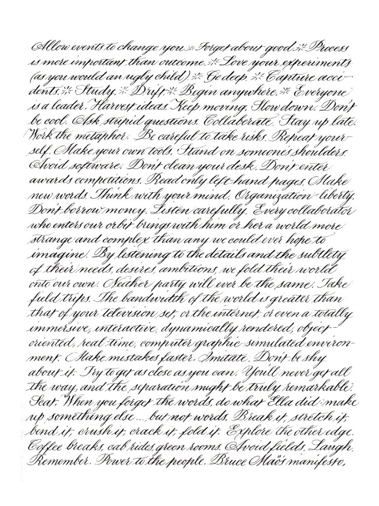
Done as comparison for a client, so she could compare this with trial lettering lettering that was larger lettering and had more leading. (The larger lettering was a birthday letter to her daughter, not shown here for obvious reasons.) This is a 9″ x 12″ page of lettering with 2.2mm x-height and 8.8mm leading. Moon Palace ink, Strathmore 400 Drawing paper. The text is from Bruce Mau’s “An Incomplete Manifesto for Growth“.
… on various papers with various mediums (or media, but people don’t put it that way).
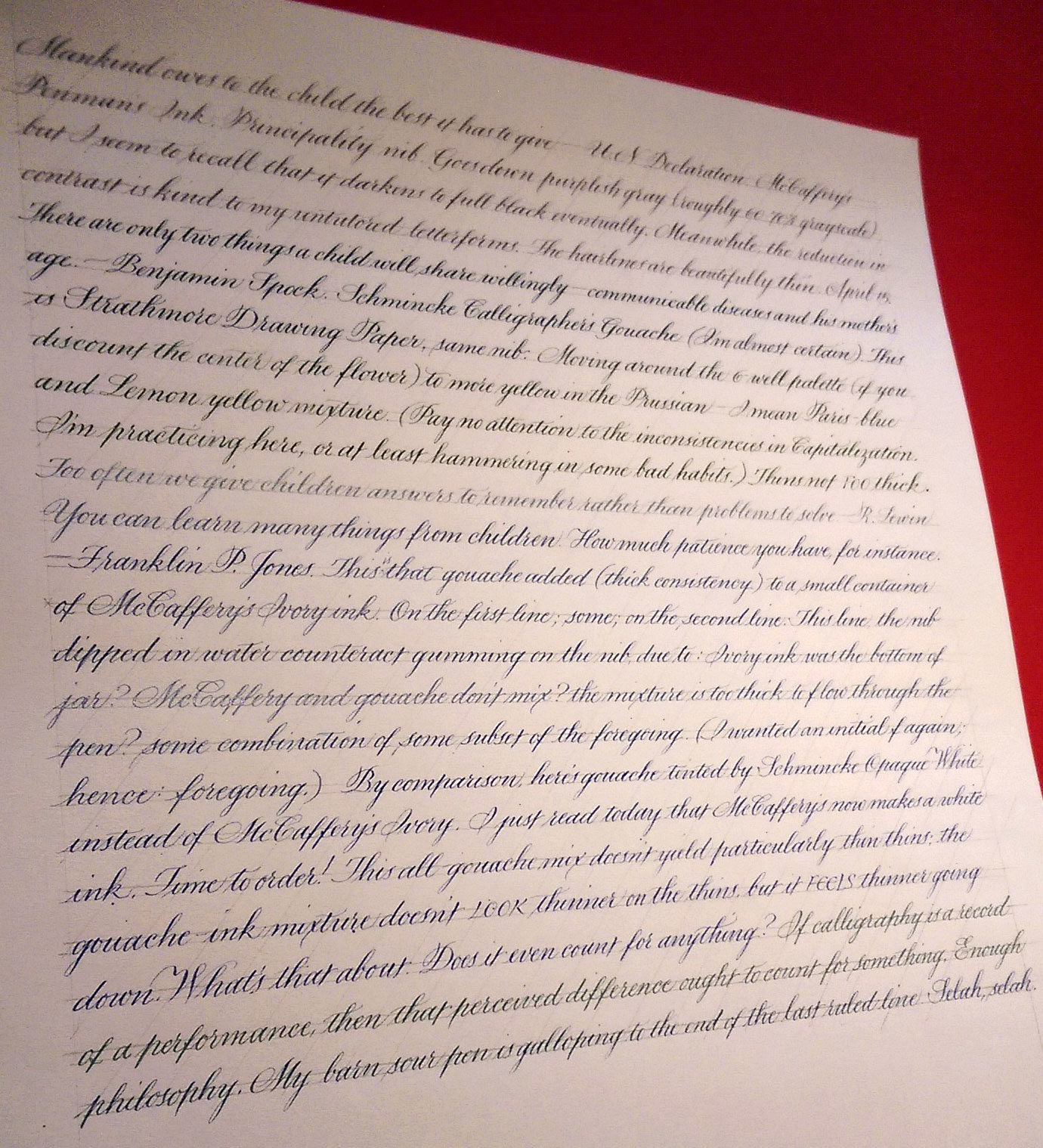
This top image shows lettering done on Canson Mi-Tientes and Strathmore colored papers using McCaffery’s Ivory ink.
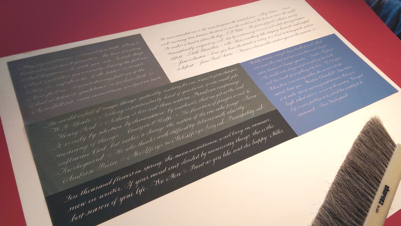
The image below shows lettering on a sheet of Strathmore Drawing paper using, in turn, McCaffery’s black ink, a mixture of Schmincke Calligraphy Gouache colors, that mixture + McCaffery’s Ivory ink, and that mixture + white gouache.