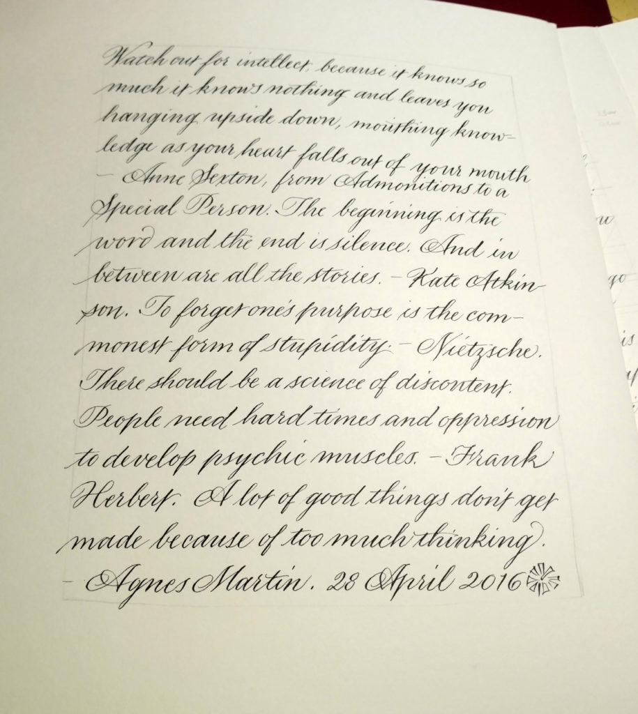
I just finished (I think) an interesting bit of work with a publishing company. I provided the lettering for historical documents that a character in a book of fiction has unearthed: journal entries, letters, and so on. It was interesting and challenging to come up with appropriate handwriting styles for four very different characters. Afterwards, the pen nibs weren’t worth much, and neither was my formal penmanship. This page was a start at getting back to a formal hand suitable for, for instance, some upcoming place cards.


Comments are closed.