Gouache and #5 Mitchell nib on Zerkall Laid (sideways – ack!). X-height is 4mm.
I’m up to page 37 in my Roman minuscules practice journal. It’s strange how you begin to think you’ve run out of what to do next, and then suddenly more possibilities appear, and more, and more … I’ve become absorbed in the process, and I have ideas for another 37 pages, at least.
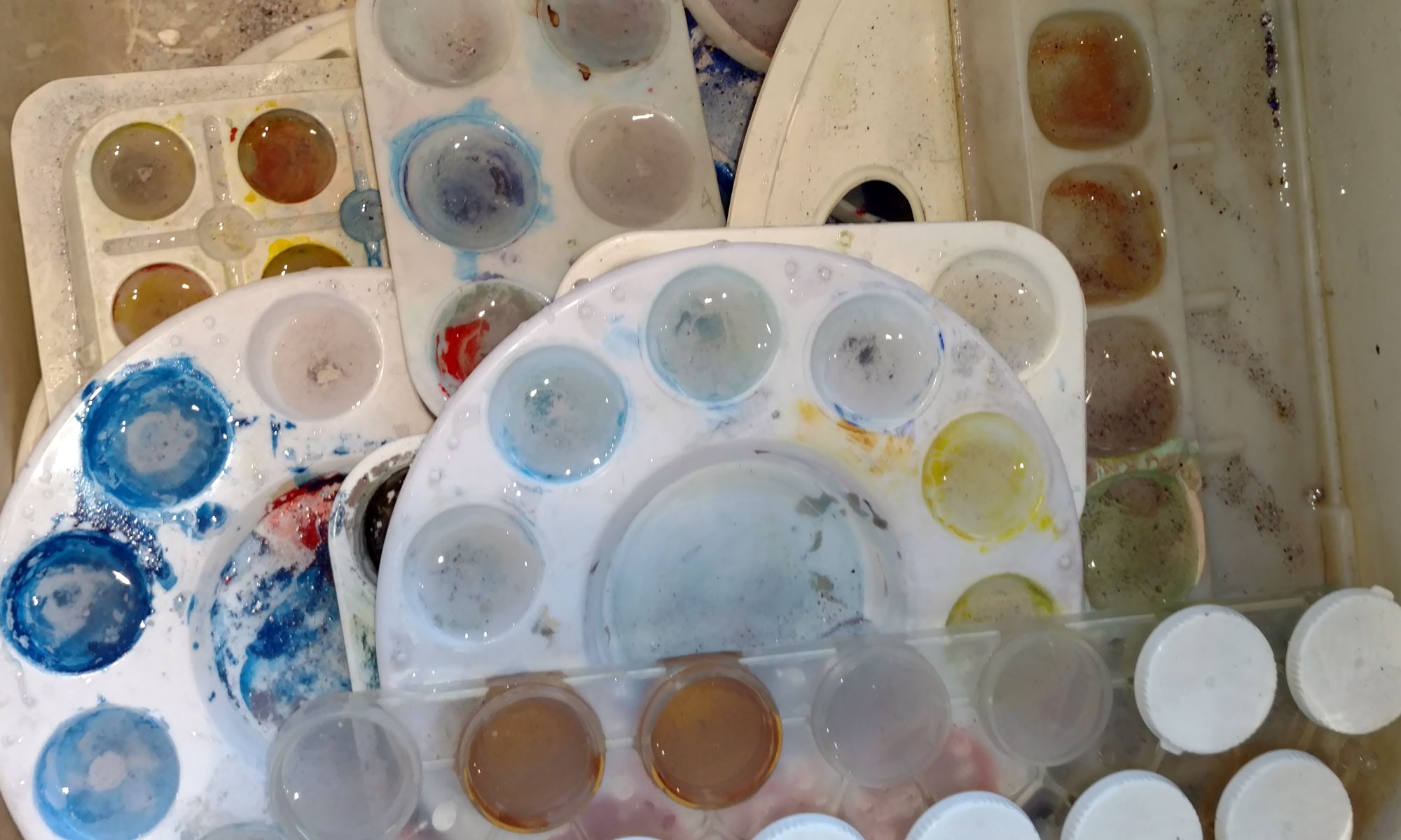
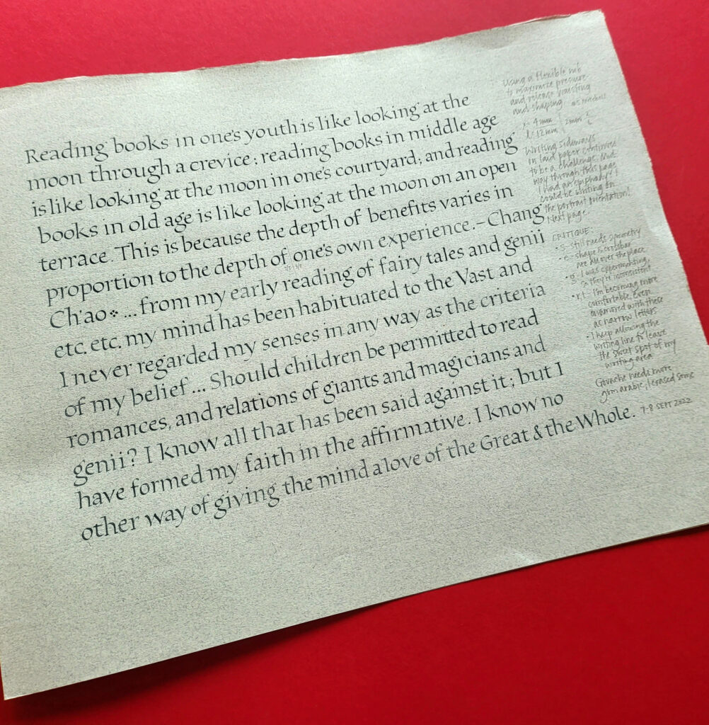
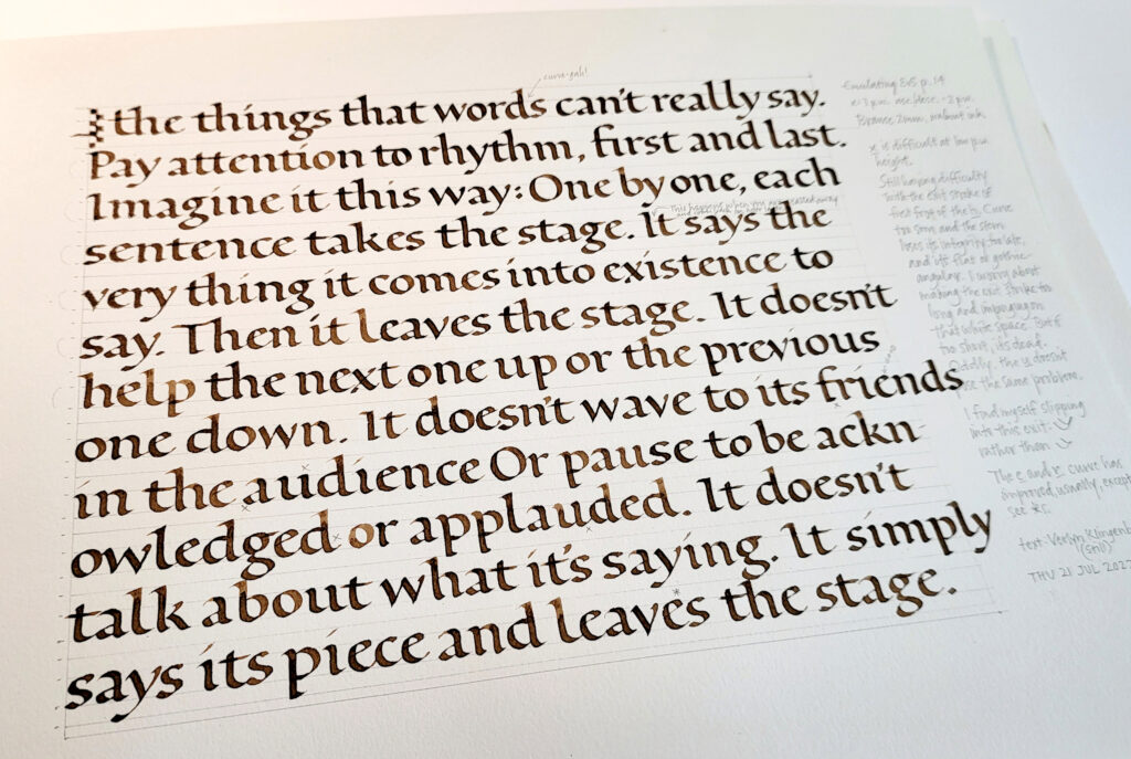
Roman minuscules practice journal, page 36. Leftover palette of gouache with a #6 Mitchell nib, x-height 2.8mm (or 9 pen-widths exclusive of pressure-and-release considerations). 12 x 9 in page of Somerset Book paper, I think.
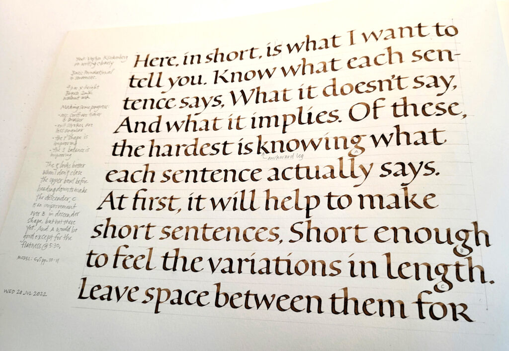
Since mid-July, I’ve been steadily building a journal of Roman minuscules practice. This is today’s work: page 36, towards the end of my 3rd section. I’ll be happy to get off of this paper (Somerset Book?). And I’m looking forward to the Zerkall German Ingres that is the next folio.
At this point I’ve worked my way through the entire copious batch of handouts from Elmo van Slingerland’s 3-week online class. I’ve been branching out in a couple of ways. For a few pages, I followed some experiments to their logical conclusion, changing up size and boldness and shape. I have a lot more to do there. But then I branched out another way, emulating some pages I had long admired by past masters.
I had wandered into built-up pointed-pen Roman minuscules, thanks to a gorgeous page of those by Werner Schneider. (I don’t see it anywhere online, but trust me, it would blow you away.) They were a bear to do, and I actually had a little temper tantrum over them — rather out of character and most immature, but rather satisfying, in a way — before settling down to work on them seriously.
After the difficult work of building up monoline Roman minuscules, I took a break to do this page with a #6 Mitchell and pressure-and-release, curious to see whether I could approximate the general texture of the built-up monoline letters. The answer is: yes, sort of.
I believe I’ll repeat both the built-up pointed-pen and #6 Mitchell pressure-and-release experiments on the next two pages, if only to confirm for myself how much better life is on Zerkall German Ingres.
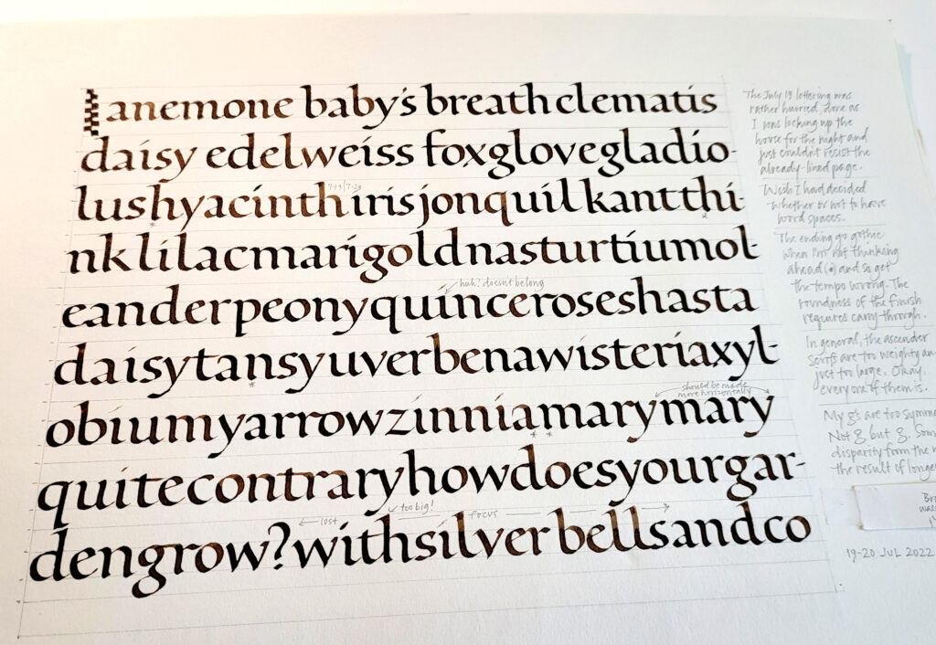
Elmo van Slingerland (@lettertetter) is coming to teach Roman minuscules in Montana this September, and I’m in! It’s time to get my Roman minuscules groove on. I’ve begun a practice journal of 9.5″ x 12″ Strathmore Drawing 400 sections. Here are some of the first pages.
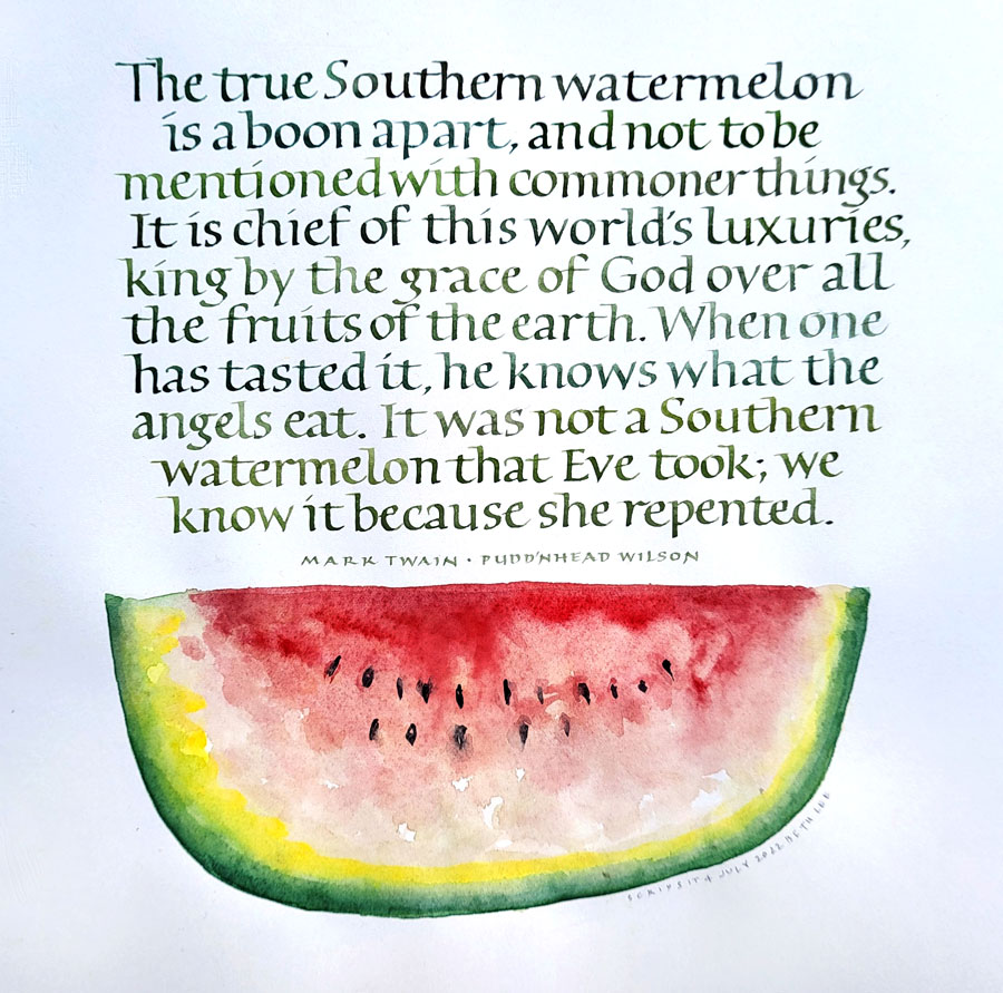
Mark Twain riffing on the Southern watermelon is one of my favorites. This is from his book Pudd’nhead Wilson. I have saved it since high school, I think, when I first read the book.
Watercolors and metal pen on Arches HP 90# watercolor paper. Text/image area: 8.5 in x 9 in.
Pudd’nhead Wilson’s calendar entries are quoted at the top of each chapter, and some are quite harsh. Here’s one that I delighted in when I was young. “He is useless on top of the ground; he ought to be under it, inspiring the cabbages.” The book is a biting commentary on humanity, particularly the socio-racial times in which he lived. You can read it for free thanks to Gutenberg Press.
I haven’t done any watercolor in awhile, and am rather pleased with this simple watermelon. Yes, it’s lopsided, but then so are the best-tasting watermelons, in my experience.
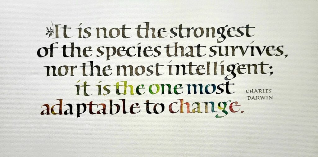
Roman minuscules done in gouache with a 3mm Brause pen on Arches Text Laid. Text area 10 x 4 in.
I lettered this quotation by Charles Darwin on adaptability in Roman minuscules fairly quickly. There wasn’t much time for lettering this week.
I don’t have much to show for what I did do this past week. The 6-pound beef brisket cooked in 7 pounds of caramelized onions and the even larger quantity of spring vegetables are mostly gone. I didn’t even take a photo, even though it was gorgeous. Our fellow diners brought even more delicious things, and it’s been some time since I’ve eaten so well!
Regardless of the text shown above, this annual meal has not changed since 1995. That’s a good thing, too.
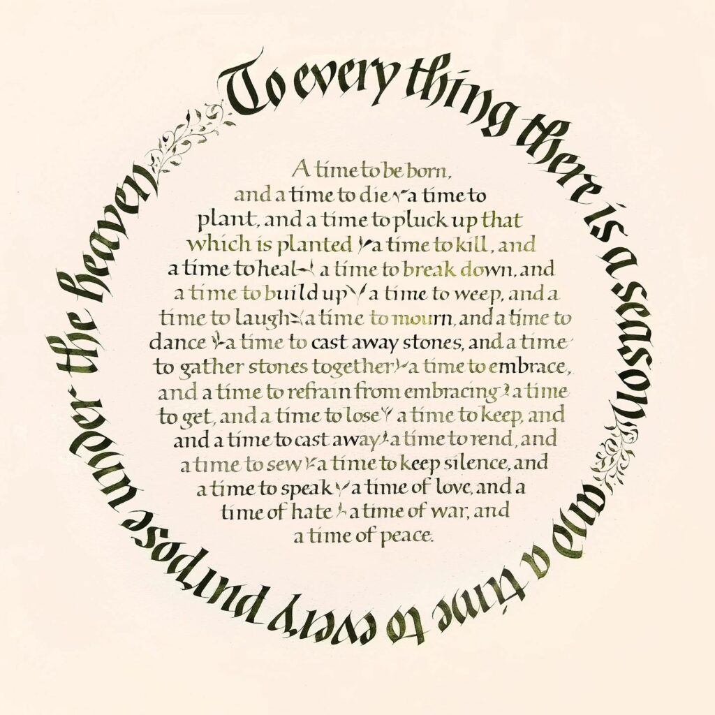
“To Every Thing There Is A Season” – gouache on paper, 24 in x 24 in
This is one of my pieces no hanging at The Artists Shop all month long in downtown Missoula, Montana. I’ll be there September 20 & 21. I’d love to see you there!
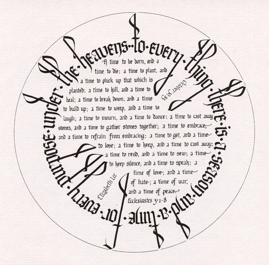
I have done this basic layout several times since the first time I tried it in 1983. It’s a kind of capstone piece, I guess.
In 1983, I was a rank beginner, and completely self-taught at that point, and I believe it is the first “finished” piece I ever did. Just for, I don’t know, entertainment, here’s an image of that first piece. I’m pretty sure it’s a scan of a photocopy of the original, which I gave to my mother way back then. So young and ignorant I was! But so enthusiastic, and I remain so after all these years.
I believe I did the original with a Schaeffer fountain pen (ack!) on the then-current version of Paper for Pens by Pentalic. The pad of paper was 11 in x 14 in, so this was about 10 in square in the original.
I’m so honored to have another solo exhibition of my calligraphy at the Artists’ Shop in downtown Missoula. Thank you, Ann Franke, for all your support! Ann will be hanging this show, and I’m looking forward to seeing what she does with such a disparate collection of pieces.
If you’re in Missoula during the month of September, please stop by. If you do stop by, please let me know your impressions. Unfortunately, I can’t attend the opening reception on September 3. But I’ll be there sometime after that date to see the show.
During the month of September I’ll be posting a few of the pieces here. So if you can’t get to Missoula, watch this space! As you can tell from the postcard, the show will, at the very least, include a broadside version of “Scintillate, Scintillate”. A manuscript book in this edition will be on display as well.
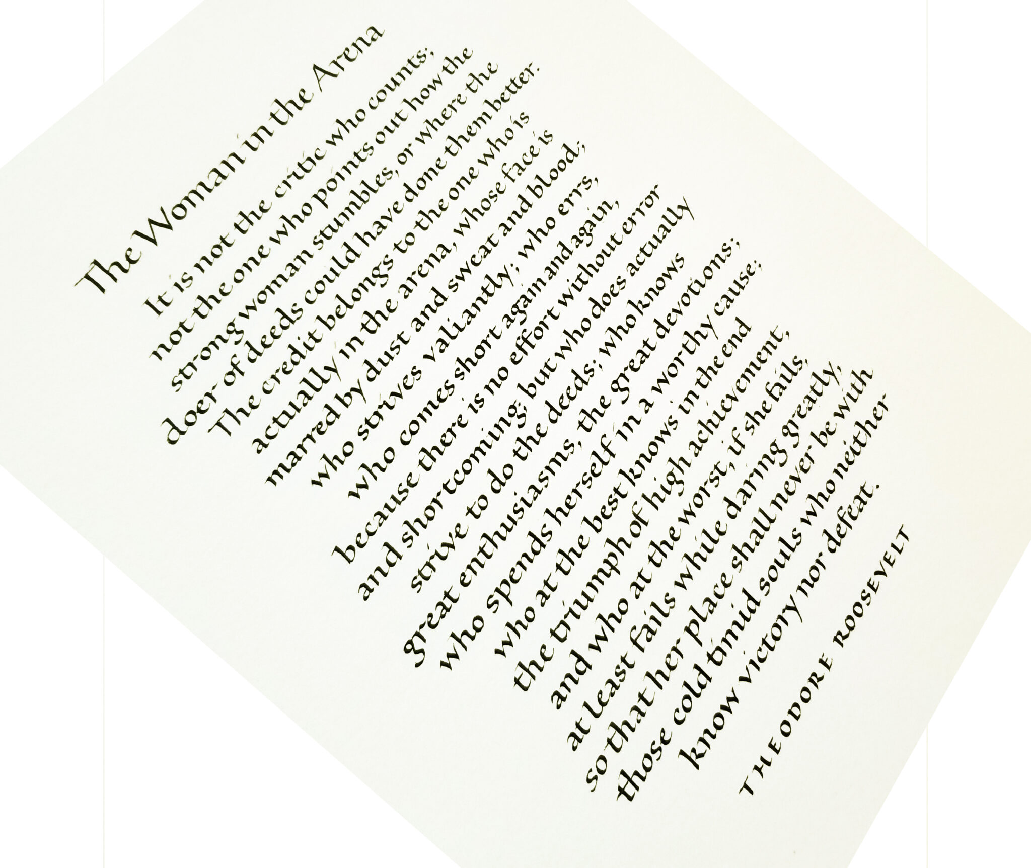
Roman bookhand and sumi ink on watercolor paper. About 11″ x 14″.
Yes, it’s been tough. Theodore Roosevelt’s famous quotation, “The Man in the Arena” is really resonating these days. I recall only one commission to letter this quote in the past 30+ years. And yet I’ve gotten three requests for it in the past six months! This latest one was gender-adapted for a client who wished to give it to a woman. And that’s appropriate: in many ways, women, especially those with school-age children, have born the brunt of the past 15 months, in the arenas of employment, child care, and housework.
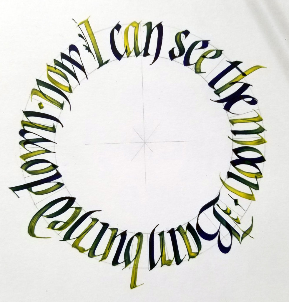
3.8mm Pilot Parallel Pen, purple ink cartridge that comes in the box of PPP cartridges, never used (I wonder why?? — not ), and an ancient jar of yellow FW acrylic ink, on Strathmore Bristol.
Thanks to Angie Vangalis for organizing an open-to-the public (!) virtual meeting of the Fort Worth Calligraphers Guild meeting online this afternoon. It was so good to be with people who care about x-heights, pen angles, and ink properties for a couple of hours.
Tamer Ghoneim presented the program, entitled “Circles on Steroids”, taking us through the process of writing in a circle — and, later, in a series of connected circles. Such fun! I followed along (image above), but instead of the straight-up blackletter that he demonstrated, I chose gothicized italic, a hand that is still texturally dense.
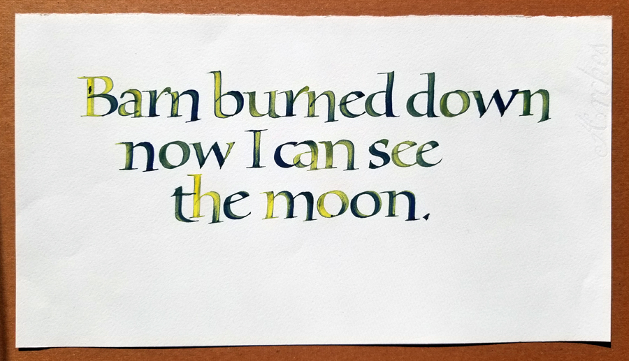
After the meeting I wanted to continue this process he introduced in the meeting: with a purple PPP ink cartridge in this Pilot Parallel Pen, he dipped the nib in the acrylic ink and then wrote, replenishing as the yellow faded and the purple approached full strength. He was using a Liquitex yellow acrylic ink, which somehow turned the purple in reddish, but my FW version didn’t do that, obviously. (I wasn’t at all surprised.) I repeated a quotation that had been suggested in the chat section of the meeting, lettering this time in a straight line somewhat in the style of the lettering by Karlgeorg Hoefer that I’ve been studying. The bolder weight necessitated some modifications.
Same 3.8mm Pilot Parallel Pen, purple ink cartridge, yellow FW acrylic ink. Bookhand on Arches Text Wove.
Contains information related to marketing campaigns of the user. These are shared with Google AdWords / Google Ads when the Google Ads and Google Analytics accounts are linked together.
90 days
__utma
ID used to identify users and sessions
2 years after last activity
__utmt
Used to monitor number of Google Analytics server requests
10 minutes
__utmb
Used to distinguish new sessions and visits. This cookie is set when the GA.js javascript library is loaded and there is no existing __utmb cookie. The cookie is updated every time data is sent to the Google Analytics server.
30 minutes after last activity
__utmc
Used only with old Urchin versions of Google Analytics and not with GA.js. Was used to distinguish between new sessions and visits at the end of a session.
End of session (browser)
__utmz
Contains information about the traffic source or campaign that directed user to the website. The cookie is set when the GA.js javascript is loaded and updated when data is sent to the Google Anaytics server
6 months after last activity
__utmv
Contains custom information set by the web developer via the _setCustomVar method in Google Analytics. This cookie is updated every time new data is sent to the Google Analytics server.
2 years after last activity
__utmx
Used to determine whether a user is included in an A / B or Multivariate test.
18 months
_ga
ID used to identify users
2 years
_gali
Used by Google Analytics to determine which links on a page are being clicked
30 seconds
_ga_
ID used to identify users
2 years
_gid
ID used to identify users for 24 hours after last activity
24 hours
_gat
Used to monitor number of Google Analytics server requests when using Google Tag Manager
1 minute
You can find more information in our Cookie Policy and .