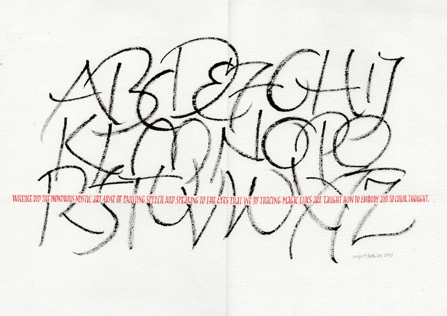
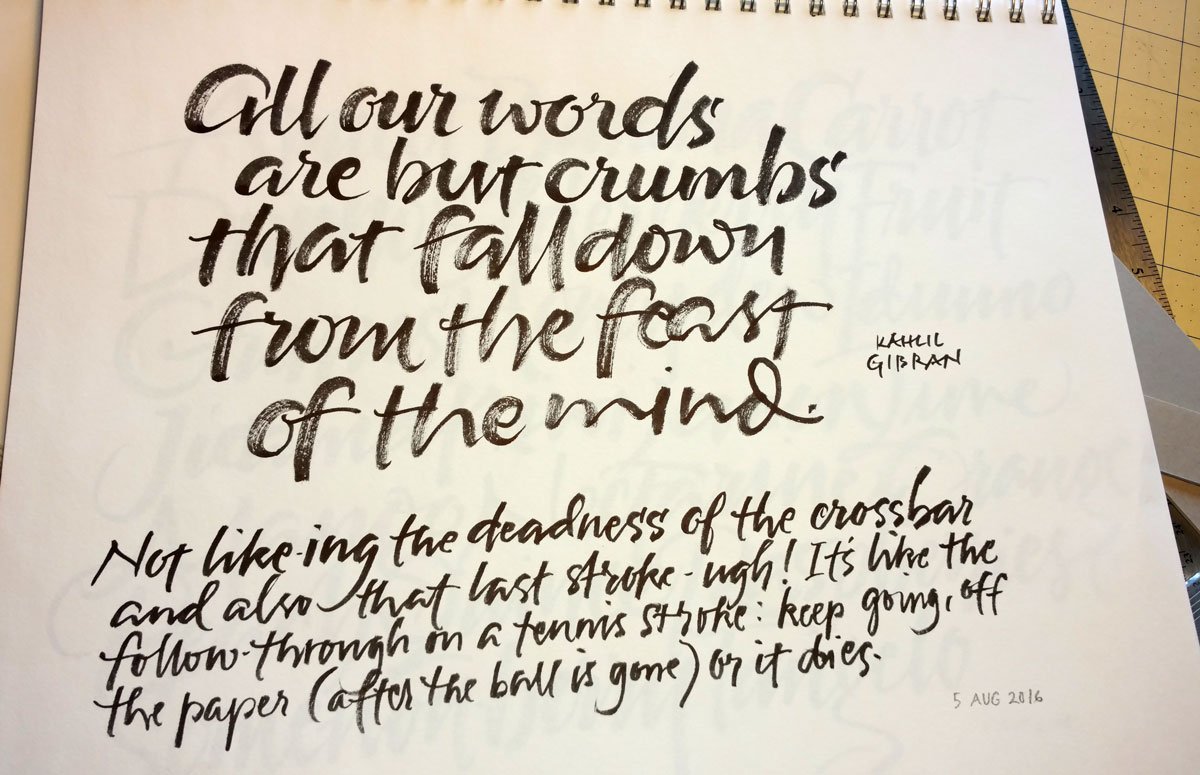
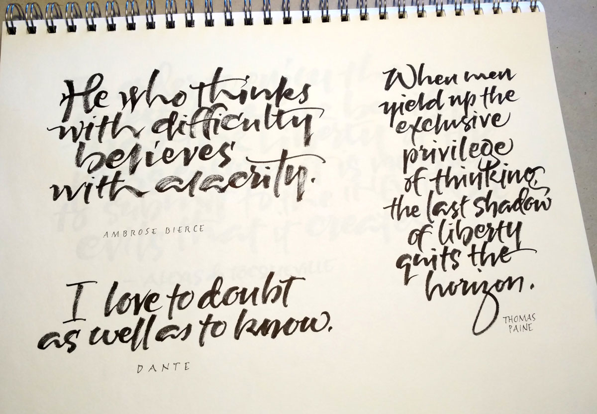
I do like to return to the gestural brush alphabet from time to time, especially when I pair with a contrasting element. This particular one was made to put in the solo exhibit in Missoula last fall.
Having embarked today on Yves Leterme’s online course, “Homegrown Trajans”, I can predict that I won’t be doing anything like the above in the near future. Unless … it’s as relief from those demanding Trajan Romans.
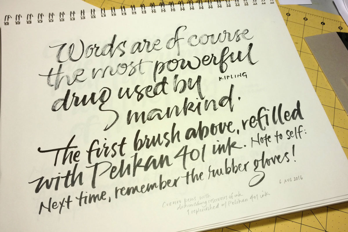
ZIG Cocoiro brush pens, the first pen losing ink, the second one with a full barrel of ink, and then the first one replenished with Pelikan 401 ink. On Strathmore Drawing 300, 11″ x 14″ pad.
I’m not making much progress with brush lettering, so this will be the last post of brush lettering for awhile. Still, I’ve enjoyed it but I don’t see that I’m accomplishing much. I’ll be thinking about that in the meantime.
One of the brush pens ran out of ink and I didn’t have a brush refill (having accidentally ordered the extra-fine tip, which is more like a flexible drawing point). So, using my jewelry-making-size pliers, I pulled off the brush tip … and the base of the brush tip … and the stem inside that … and the base that the stem fit into. Then I squirted some Pelian 401 ink into the barrel using a thick needle-less syringe that was perfect for the job. Then put it all back together and tried it out at the bottom of the page. Interesting. As I wrote, next time: remember to wear rubber gloves. My cuticles will thank me for it.
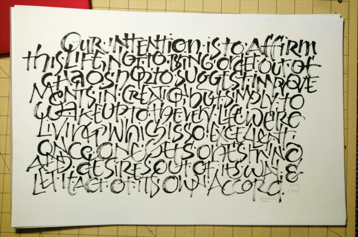
The usual suspects. Alphabets and really familiar texts are so much easier than other text because over time you get a kinetic sense of how the letters fit together.
—
When practicing, I try to be in the moment. But afterwards, it’s a good thing if the left brain kicks and tells me what’s good, what’s bad, what I need change next time. Otherwise, it’s just repetition, repetition, repetition.
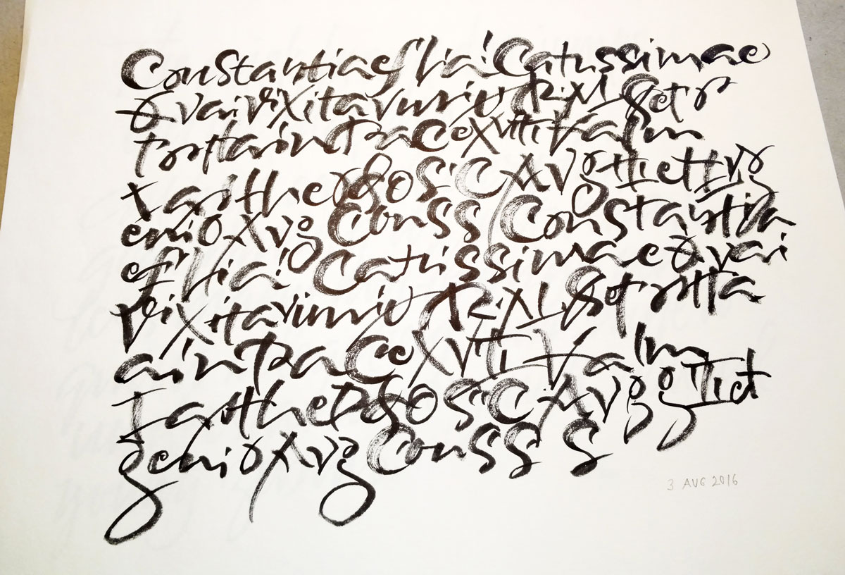
“Contour drawing” using a page from one of Carl Rohrs’ workbooks. Cocoiro brush pen on Strathmore Drawing 300.
Today I returned a Carl Rohrs workbook that I had a borrowed from my friend Rose several (or more) months ago. Rose had been doing some brush lettering earlier, and we got to talking about the challenges of brush lettering, trying different tools, talking about that luscious dragging-the-bristles-around-the-arc thing that Carl does … the usual thing that happens when you’re standing in someone’s studio and there’s pen/brush, paper, and paint out on the table 🙂
Anyway, I kept thinking about it as I finished running errands. When I got back to my studio I opened up the Carl Rohrs workbook that I own and started copying a page of lettering he provided. I treated it like a contour drawing, not looking much at the paper but trying to feel the shape and speed and gesture of the letters. During some part of the exercise I realized that not even the letters were registering, much less the words, and I only later realized that some figures were Roman numerals, for instance. I like this kind of practice, and plan to continue it for at least a little while.
P.S. If you saw this side-by-side with the workbook page, you would probably be surprised at how little they resemble one another. For one thing, I skipped and duplicated and re-tried things as I went. For another, I didn’t duplicate the line leading, naturally crowding the leading as is my wont.
Contains information related to marketing campaigns of the user. These are shared with Google AdWords / Google Ads when the Google Ads and Google Analytics accounts are linked together.
90 days
__utma
ID used to identify users and sessions
2 years after last activity
__utmt
Used to monitor number of Google Analytics server requests
10 minutes
__utmb
Used to distinguish new sessions and visits. This cookie is set when the GA.js javascript library is loaded and there is no existing __utmb cookie. The cookie is updated every time data is sent to the Google Analytics server.
30 minutes after last activity
__utmc
Used only with old Urchin versions of Google Analytics and not with GA.js. Was used to distinguish between new sessions and visits at the end of a session.
End of session (browser)
__utmz
Contains information about the traffic source or campaign that directed user to the website. The cookie is set when the GA.js javascript is loaded and updated when data is sent to the Google Anaytics server
6 months after last activity
__utmv
Contains custom information set by the web developer via the _setCustomVar method in Google Analytics. This cookie is updated every time new data is sent to the Google Analytics server.
2 years after last activity
__utmx
Used to determine whether a user is included in an A / B or Multivariate test.
18 months
_ga
ID used to identify users
2 years
_gali
Used by Google Analytics to determine which links on a page are being clicked
30 seconds
_ga_
ID used to identify users
2 years
_gid
ID used to identify users for 24 hours after last activity
24 hours
_gat
Used to monitor number of Google Analytics server requests when using Google Tag Manager
1 minute
You can find more information in our Cookie Policy and .