Clamshell box #2 – measurement fail

clamshell box fail

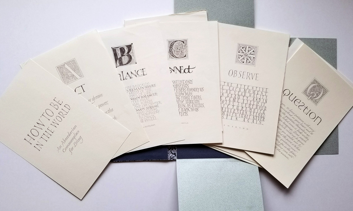
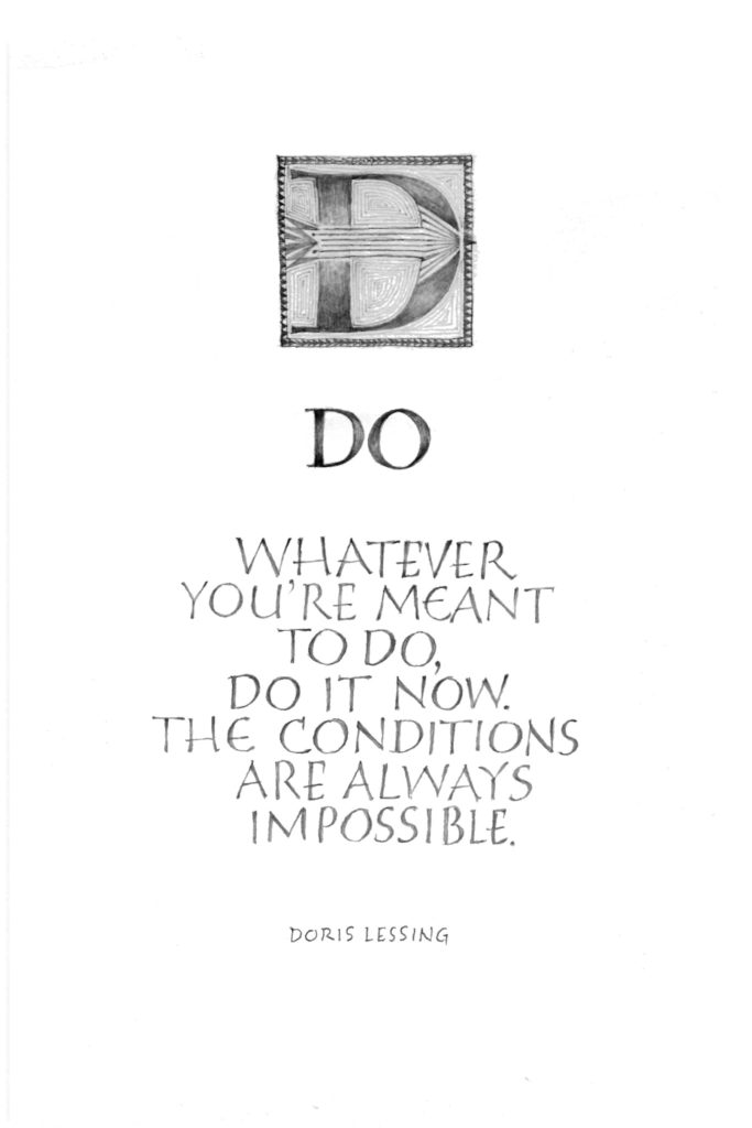
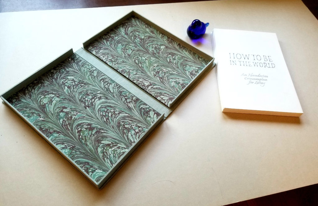
I just finished making this clamshell box for my abecedarian pencil portfolio, “How To Be In The World”. Except that it’s about 1/16″ too shallow to fit all the pages! Simply checking the fit after I made the inner tray — the first of three components to be made — would have made all clear. But I didn’t.

So now I have a beautiful clamshell box that needs a content. And a stack of pages that still need a box. Ah, well, I had planned to make three clamshell boxes this week, to solidify what I learned in the online bookbinding class through the University of Utah. Looks like the second and third ones will be virtually identical!

Rachel envelope

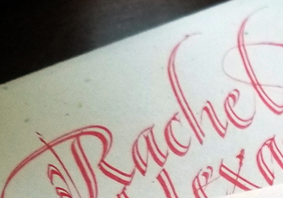
It’s been that kind of day. I wrote a letter to my niece using sumi ink and a 1/2mm Brause dip pen. It looked quite nice, if I say it myself, except that I discovered a huge, wet splotch of sumi ink on the back of the letter when I began to fold it for mailing. I mailed it anyway. Sometimes you’ve just got to move on. (The scroll-point red marker on the envelope went a little better.)

My work in Letter Arts Review!

My ABC pencil portfolio in Letter Arts Review!

On Monday, I was thrilled to receive my copy of the current issue of Letter Arts Review. It’s always a good day when the LAR arrives, but especially so this time: my ABC pencil portfolio, How to Be In The World, was featured in it — all 28 pages! If you follow this blog, you’ve read about the portfolio several times here. The final product is definitely a ship of Theseus: every single page has been redone at least once.

Although I’m understandably infatuated with those particular pages, the entire issue is an excellent one. It includes an interview with the inimitable Julie Wildman, a book project by Louise Grunewald, Anna Pinto on pastels and pochoir, and more. Get your own copy here.

(In a few weeks, I may be letting up on the exclamation points. Maybe.)

Decorative exchange envelopes

After a hiatus of some years, I’ve rejoined an 11-months-long monthly decorative envelope exchange. I’m enjoying it. We aren’t required to include anything calligraphic in the envelope — although we do have to include something. I’m putting calligraphy in mine.

My February envelope, using that palette of leftover gouache (that just keeps on giving).for the card inside.
My March envelope. The blurring kind of obscures the design, but you get an idea, anyway. All done in pencil, which is what I’ve mostly been doing in my studio lately.

Another page (unfinished) of the portfolio project

C – Connect. Unfinished page of the portfolio project, showing how weights have been added to monoline forms.

I’ve been so enamored of the pencil since Amity Parks’ workshop. I’m starting to think about moving back to the wet stuff. I still like drawing the letters, though; I may take that back to gouache and sumi ink.

Portfolio project

Remember this post? wherein I claimed to be making progress. Hahahahahaha.

I’ve scrapped those pages, and the minuscule progress I’ve made since then, to make it a pencil-only portfolio. Here are two completed pages. We will make portfolios for our projects in August, so I really do have to get cooking on these. 

Portfolio project – B is for Balance

Portfolio project – J is for Juxtapose

More pencil lettering, now with a wash pencil

2015-08-02-wash-pencil-italicsBack in my studio, I’m pleased to have most of my gear unpacked, and the spilled ink cleaned up. And I’m also pleased to get back to a daily lettering practice. In the conference goody bag was a General’s Sketch & Wash Pencil No. 588. When I was unpacking, it caught my eye, so I lettered a page of Strathmore Drawing 400 using it. Then I went back in with a Pentel water brush to see what would happen. I’ll probably do more on it later, but right now the kitchen is calling …

As usual, click on the image for a closer look.

Returning from The Passionate Pen calligraphy conference

2015-08-02-Burgert-layout-in-pencil-08-01

Yesterday I returned from The Passionate Pen in Sonoma County, California. It was a wonderful week seeing old friends and new work, experimenting with new ideas, tools and materials. I was surprised to find myself working with a pointed brush most of the week. I’ll post more about the conference in the days to come, but today I’ll share the page I did in the Oakland airport and on the plane to Salt Lake City. I learned more about “form themes” in Ewan Clayton’s four-day workshop, especially during the study of Hans-Joachim Burgert’s work. On this page, my form theme includes condensed capitals, line leading that is smaller than the height of the letters, and three rogue letters that are not condensed. The choice of three letters changes in each of the three blocks. It was a good way to spend the hours in the airport coming down from the conference.

Bic 0.5mm #2 mechanical pencil on a Strathmore 400 Drawing (heavier weight) sheet about 9×12.