More Roman text capitals … and painting

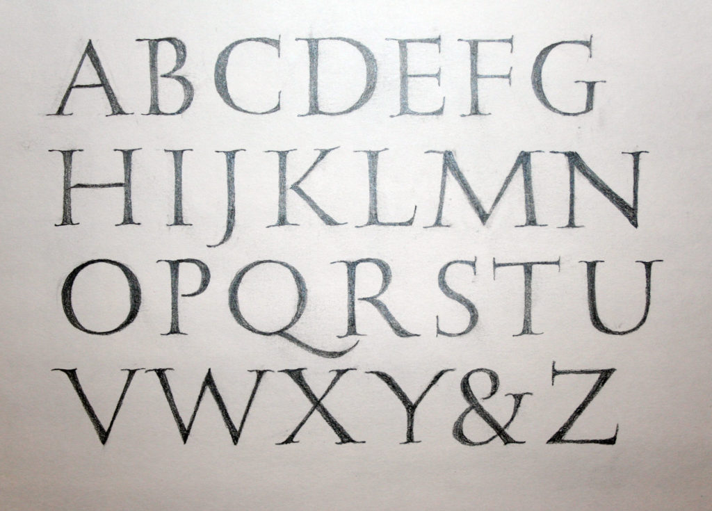
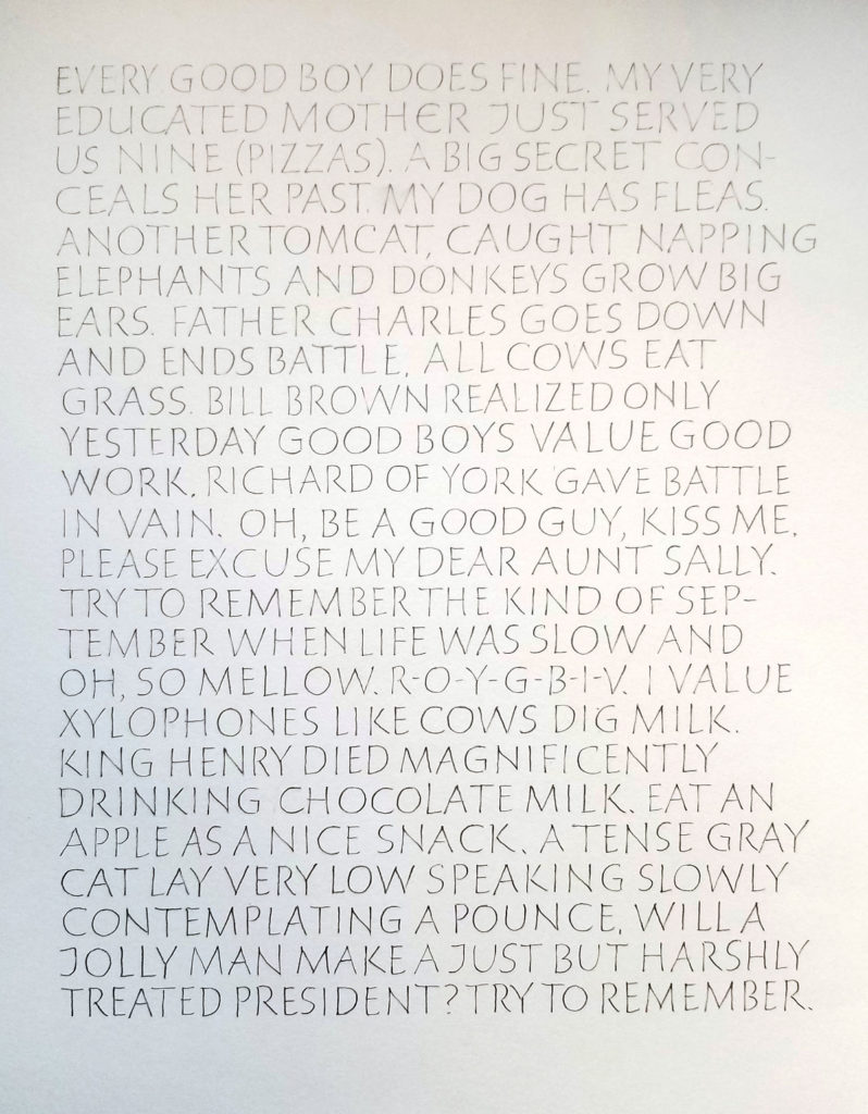
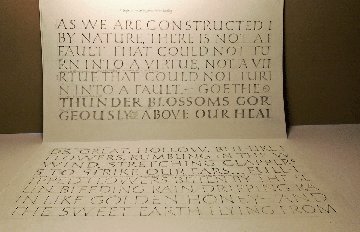
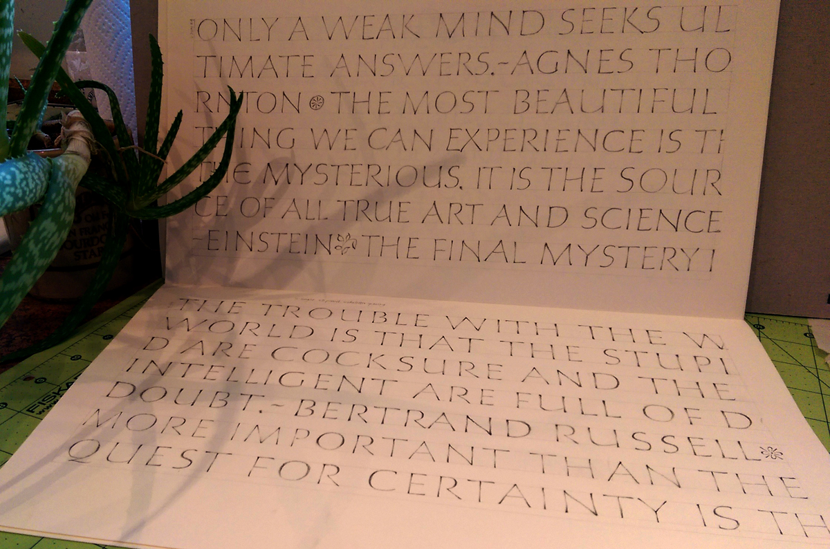
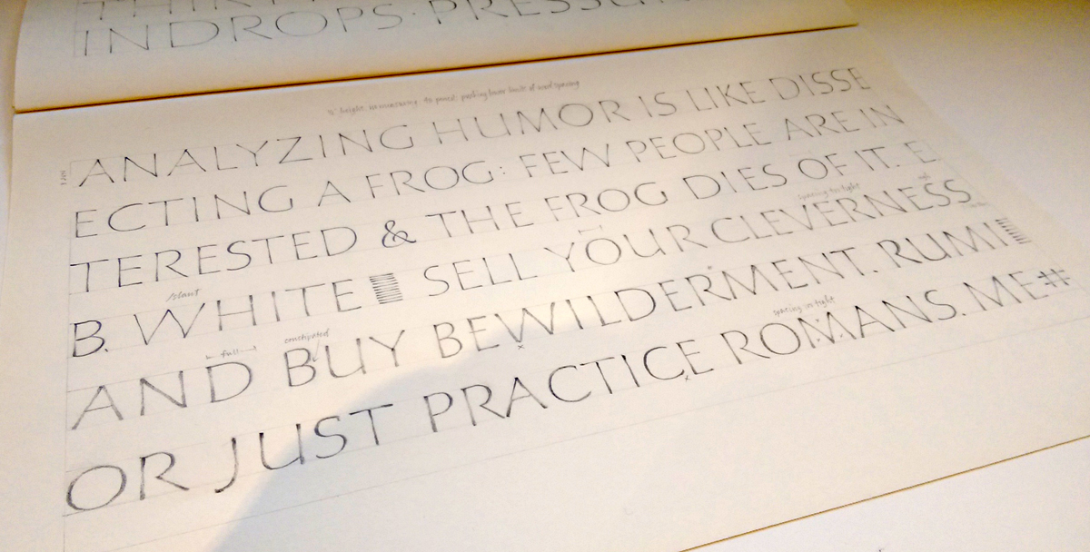
I can’t believe it’s been so long since I posted anything at all! Life has been jammed up with political things (my husband’s re-election campaign, for instance), and I’m finally getting a chance to begin to catch up and take a deep breath. I’ve gotten back to Roman text capitals, which don’t want to let me go.

I’ve also been teaching more. Last month I taught a two-day workshop on Roman text capitals, color, painting and design to a delightful group of calligraphers in Albuquerque. Every time I teach this workshop, it evolves some more. (You may remember this blog post about my study of 6th century square capitals.)

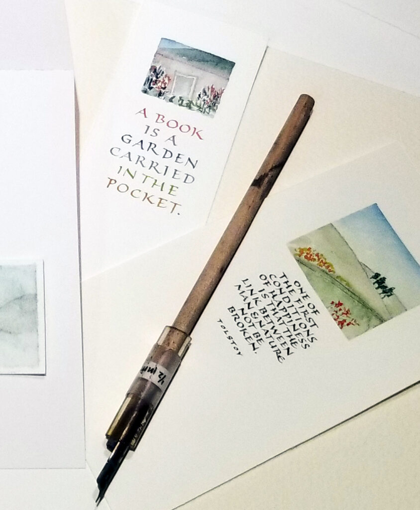
Here is one of the samples I brought along to the workshop this time.

"The Roadside Fire" by Robert Louis Stevenson, done in Roman text capitals with gouache and small metal pen.
“The Roadside Fire #1” – Robert Louis Stevenson’s poem.
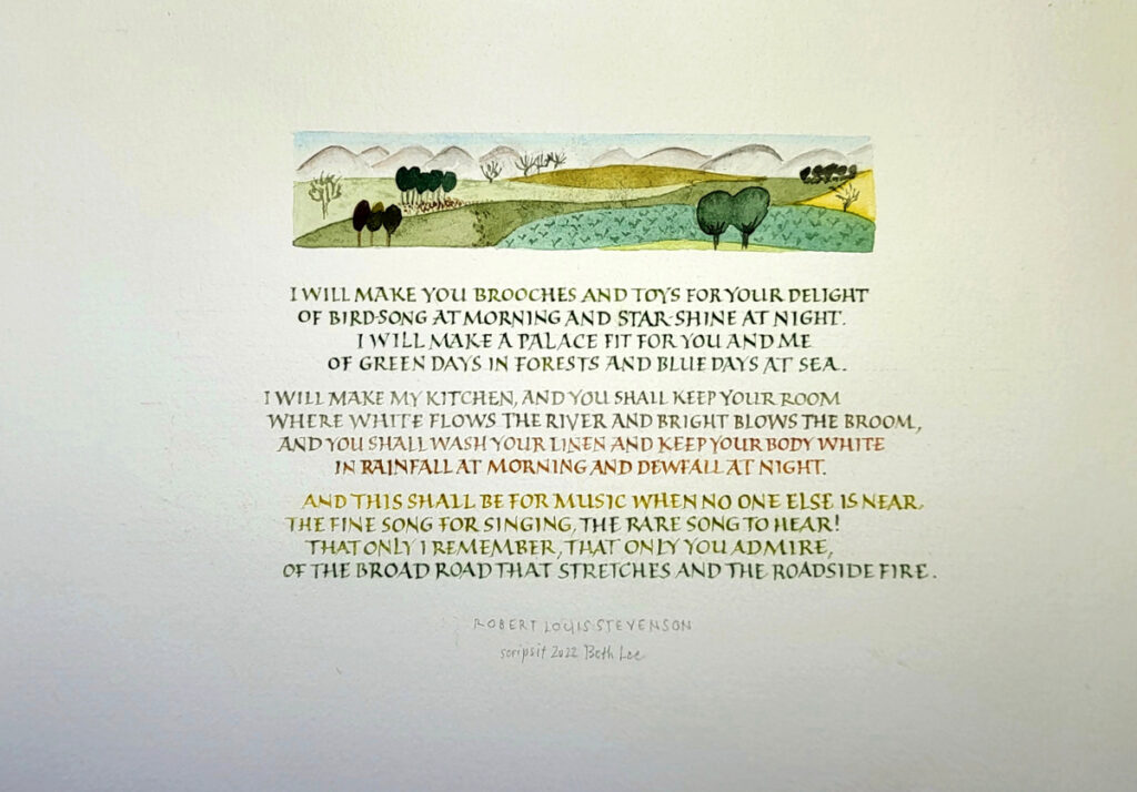
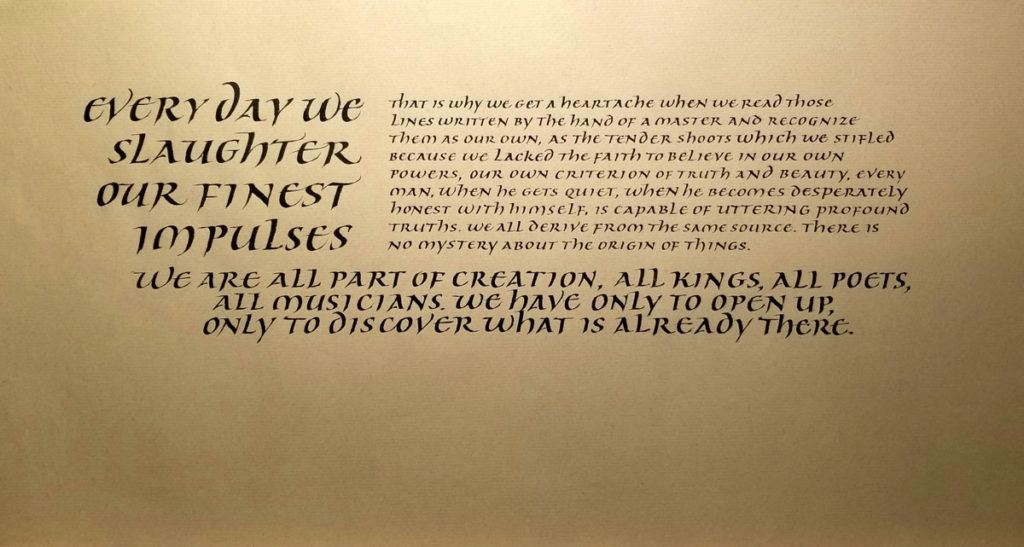
Gouache and small metal pen on Arches Text Wove paper. Text area 4″ x 6″.

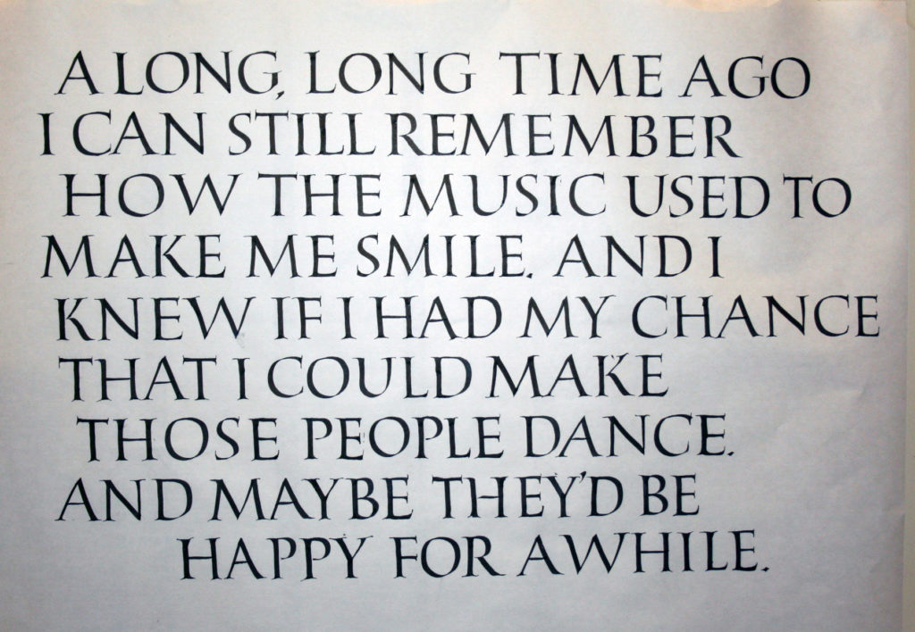
I can never see this poem without hearing in my head the Ralph Vaughn Williams setting of it. I’ve played the piano accompanied for many a baritone student at the university. You can hear Bryn Terfel sing it here. The entire song cycle is pretty wonderful.

Small Capitals with Small Landscapes – a workshop

examples of small landscapes with small Roman capitals

I’m looking forward to teaching a two-day workshop titled “Small Capitals with Small Landscapes” in September.

In this workshop, we’ll mix small Roman capitals fun with a landscape that is just one square inch. Start with pencil and fine marker, we’ll begin with monoline Roman capitals and gradually shrink them down for use as text lettering. Then we’ll focus on what creates rhythm and movement within those texts. We’ll use small broad-edged and pointed pens with gouache or watercolor, and I share a few strategies for making our small lettering sharp and clear. I’ll demonstrate a couple of ways to load the pen with changing colors that add further texture to the text block. And we’ll play with other kinds of texture, letter spacing, and more. And then we’ll create tiny painted landscapes as a graphic element that melds beautifully with our lettering.

These little paintings make beautiful greeting cards, bookmarks, and small framed pieces.

I’ve taught this workshop, “Small Capitals with Small Landscapes”, once before. This time I’ll be teaching members of a southern California guild. I look forward it!

Serifed Roman capitals in John Stevens’ Uncials to Capitals Class

Drawn Roman capitals done at 3/4-inch height with pencil on Strathmore Drawing 300.
Serifed Roman capitals done with a 3.8mm Pilot Parallel Pen on white butcher paper at 1-inch height. I don’t think I was that back-sloped at the bottom right; rather, I think I tried to fix the perspective of a not-straight-on camera shot. The stiffness of the strokes and serifs are all mine though, sadly.

These are two homework pages from session four of John Stevens’ excellent five-session course, Capitals to Uncials. Session five was held this weekend, and I’m looking forward to doing the homework from that session.

It’s been such a good class, and John presented about 10 times the material shown by my posted homework. I’ve got enough to work on for a year without stopping, and I’m sure that that year’s work would lead to another year, and so on.

John Stevens’ class on uncials and Roman capitals is a welcome challenge

Judging from the disappointed post of fellow calligraphers worldwide, I was awfully lucky to make it into this 5-week class on Uncials and Roman capitals taught by John Stevens. This is week 2. Here are the 2 pages of homework I was willing to share with the class.

I could easily work on this class full time! I’m quite sure that some of my fellow students have been doing so, and even working overtime. I’ve been drawn into spending much more time on it than I realized. So now I’m scrambling to get to all of the work piling up in my studio. Today and tomorrow will see me caught up (she says, optimistically).

Daily lettering – President Obama’s eulogy of Reverend Pinckney

2015-06-26-Obama-eulogy-Rev-Pinckney

Today was a big day in US public life, for at least three reasons. First, the Supreme Court upheld the Affordable Health Care Act in King v. Burwell. Second, it also upheld the right to same-sex marriage in all 50 states. And third, President Obama eulogized Reverend Pinckney, who was gunned down in his church in South Carolina last week.

Today’s daily lettering was a meditation on this inspiring eulogy. I could call it an exercise in improvisational layout, or practicing pencil Roman capitals and pressurizing down strokes. But I often forgot these technicalities while absorbing the text.

Counting down to the workshop this weekend

June 12 and 13 pencil Roman caps
June 12 and 13 daily lettering – pages 18-19

2015-06-16-pencil-Roman-caps-on-06-15
June 15 daily lettering – page 20

All that bicycling in Crete took its toll on my back, but I’ve been soldiering on – most days – on the homework for Peter Thornton’s workshop in Missoula this coming weekend.

Last Friday, page 18: Experimenting with changes in orientation, size, spontaneous layout. (I had to do something about that the horrendously large space in the O, which could have been fixed by wider letter spacing or a narrower O … but wasn’t.)  Page 19, done on Friday and Saturday, was an attempt to keep the three main width groups of Romans but condense them all by about 25%. Not a success, except that I learned that it would probably be better to move toward a more consistent letter width at that level of compression. None of the following work: condensation, condensing, condensement.

Yesterday, page 20: I dispensed with guidelines and line leading, experimenting with variations in orientation and size, and trying to get the spaces to “talk” to one another.

Daily lettering – pencil Roman capitals

day 10, pages 12-13, 6B pencil
day 7, pages 12-13, 6B pencil

These letters are slowly seeping into my kinetic memory. Spacing is still problematic (story of my life), and 3 o’clock to 6 o’clock on O, Q, C, G, D is just not happening with any regularity at all. That area of the circle is like trying to scratch the itch between my shoulder blades: I can get there, but not natural and it’s not elegant.

Daily lettering – pencil Roman capitals

daily lettering - pencil Roman capitals
daily lettering – pencil Roman capitals

Daily lettering – homework in preparation for a workshop with Peter Thornton later this month. Nothing like Roman capitals to make you feel like a child again. Day 6, page 9, progress … maybe.
Strathmore Drawing 400 paper (80#), 4B pencil, 1/2″ height. I started the homework at 1″ height for a few pages, moved to 3/4″ height for a few more pages, and this is the first page done at 1/2″ height.