A virtual meeting with Tamer Ghoneim and the Texas Lettering Arts Council

3.8mm Pilot Parallel Pen, purple ink cartridge that comes in the box of PPP cartridges, never used (I wonder why?? — not ), and an ancient jar of yellow FW acrylic ink, on Strathmore Bristol.

Thanks to Angie Vangalis for organizing an open-to-the public (!) virtual meeting of the Fort Worth Calligraphers Guild meeting online this afternoon. It was so good to be with people who care about x-heights, pen angles, and ink properties for a couple of hours.

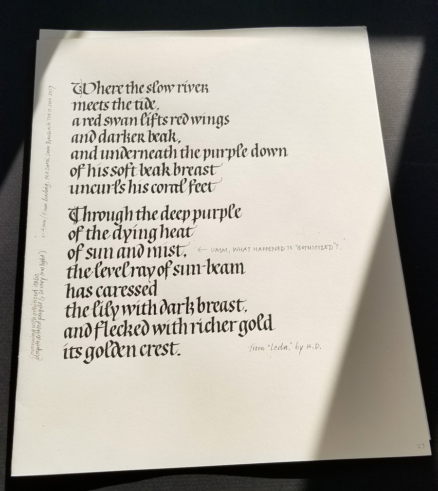
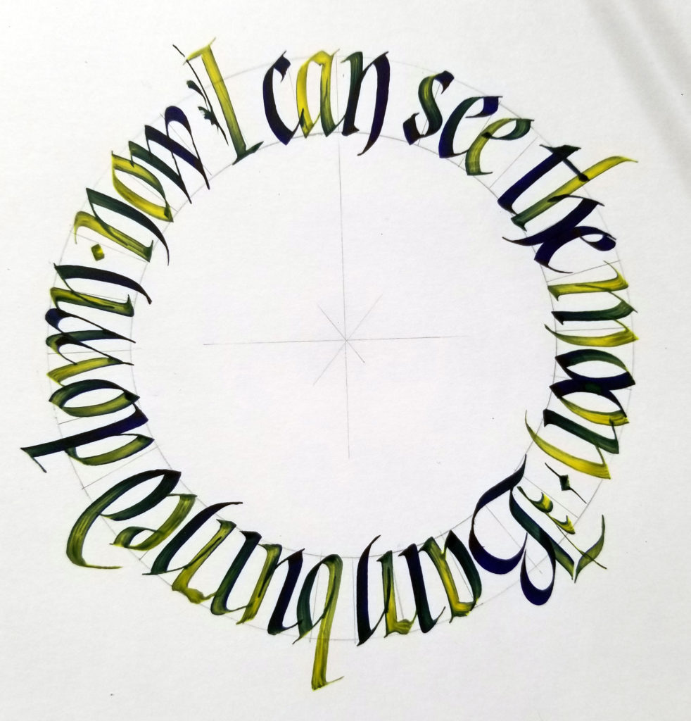
Tamer Ghoneim presented the program, entitled “Circles on Steroids”, taking us through the process of writing in a circle — and, later, in a series of connected circles. Such fun! I followed along (image above), but instead of the straight-up blackletter that he demonstrated, I chose gothicized italic, a hand that is still texturally dense.

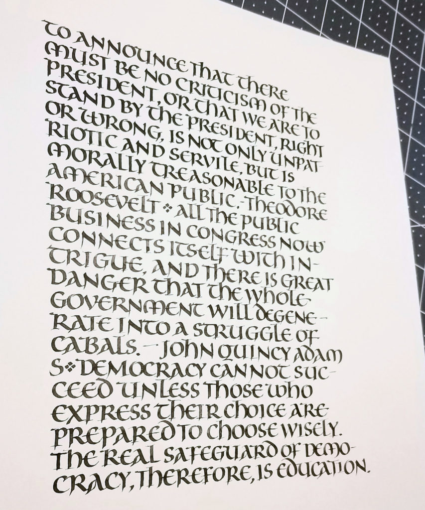
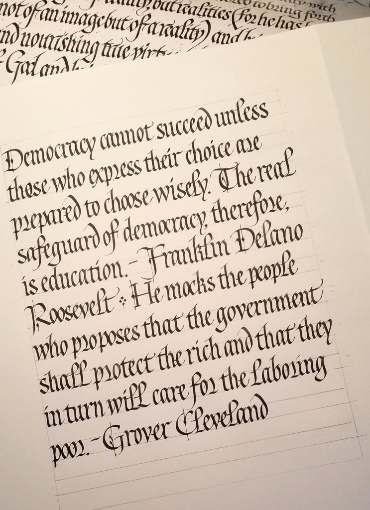
After the meeting I wanted to continue this process he introduced in the meeting: with a purple PPP ink cartridge in this Pilot Parallel Pen, he dipped the nib in the acrylic ink and then wrote, replenishing as the yellow faded and the purple approached full strength. He was using a Liquitex yellow acrylic ink, which somehow turned the purple in reddish, but my FW version didn’t do that, obviously. (I wasn’t at all surprised.) I repeated a quotation that had been suggested in the chat section of the meeting, lettering this time in a straight line somewhat in the style of the lettering by Karlgeorg Hoefer that I’ve been studying. The bolder weight necessitated some modifications.

Same 3.8mm Pilot Parallel Pen, purple ink cartridge, yellow FW acrylic ink. Bookhand on Arches Text Wove.

Catching up with a few pages of daily lettering

I’ve been negligent here on my blog — has it really been two months? to the day! — but I’ve been working pretty steadily in my studio. Here are a few pages of daily lettering, mostly delving into gothicized italic and uncial letter forms.

May 24 – After mixing color to match a colored background, I just kept going because I was having so much fun.
May 25 – A first approach to uncial, which I had not studied in years. Just trying to remember the feel of uncials: round, short, fruity (okay, that’s some weird kinaesthesia going on).
May 27 – Getting a little more specific by studying a handout received from Sheila Waters c. 1986.
May 30 – The same uncials, but taking it down in size.

Gothicized italic

I’ve been studying gothicized italic, a hand I’ve never mastered. I began by analyzing a handout of a Lincoln quotation that Sheila Waters provided in a long-ago workshop. I determined the x-height and pen-width, lined up a sheet of paper, penciled in the bare bones of the letters, and had at it. As I worked I made notes about surprising discoveries: “the s is wider than I had thought”, “the final stroke of the e continues diagonally and does not go horizontal”, and so on. Then I repeated the exercise without penciling in the skeletal letters. (I won’t sully Sheila’s reputation — or mine — by reproducing my practice sheets here!) Next, I put up another handout from Sheila, a reproduction of a piece of Edward Johnston’s gothicized italic writing. You can see a portion of that handout in the image above. Once again, I analyzed it, ruled up a sheet, and copied the lettering as closely as possible, making notes as before.

Finally, I wrote out this sheet, choosing another text. My goal was to stick to Johnston’s lettering closely yet adhere to some best calligraphy practices and to make it more my own. I didn’t care for the long thin finials on his t and h, and his standard r is so wild and woolly that the next letter must be shorter to compensate. Next time around I will work on letter width and spacing to better match Johnston’s: mine were both two wide. Also, I regretted the use of the alternate r on the 2nd line. It seems to work best next to another oval letter such as a p.