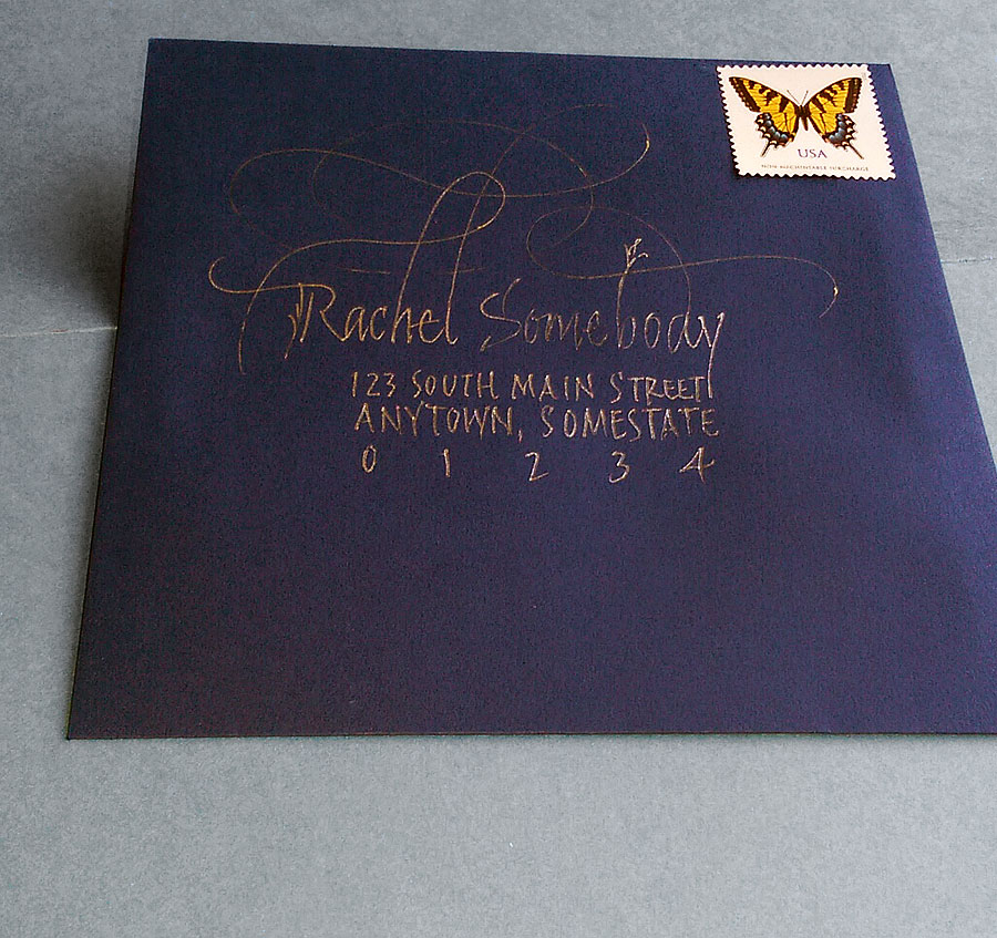
Freely written name and address with Y&C Gel Xtreme GX100G pen, which is finally running out after about 120 addresses.
I took these envelopes and a gel pen along with me on my trip to Florida recently, doing most of the work on the airplanes. The pen is just about out of ink now, but I eked this one out at the end. I had misspelled the name Rachel and so converted this one to a sample.
After all these years, I’ve got lots of “samples” in my studio.
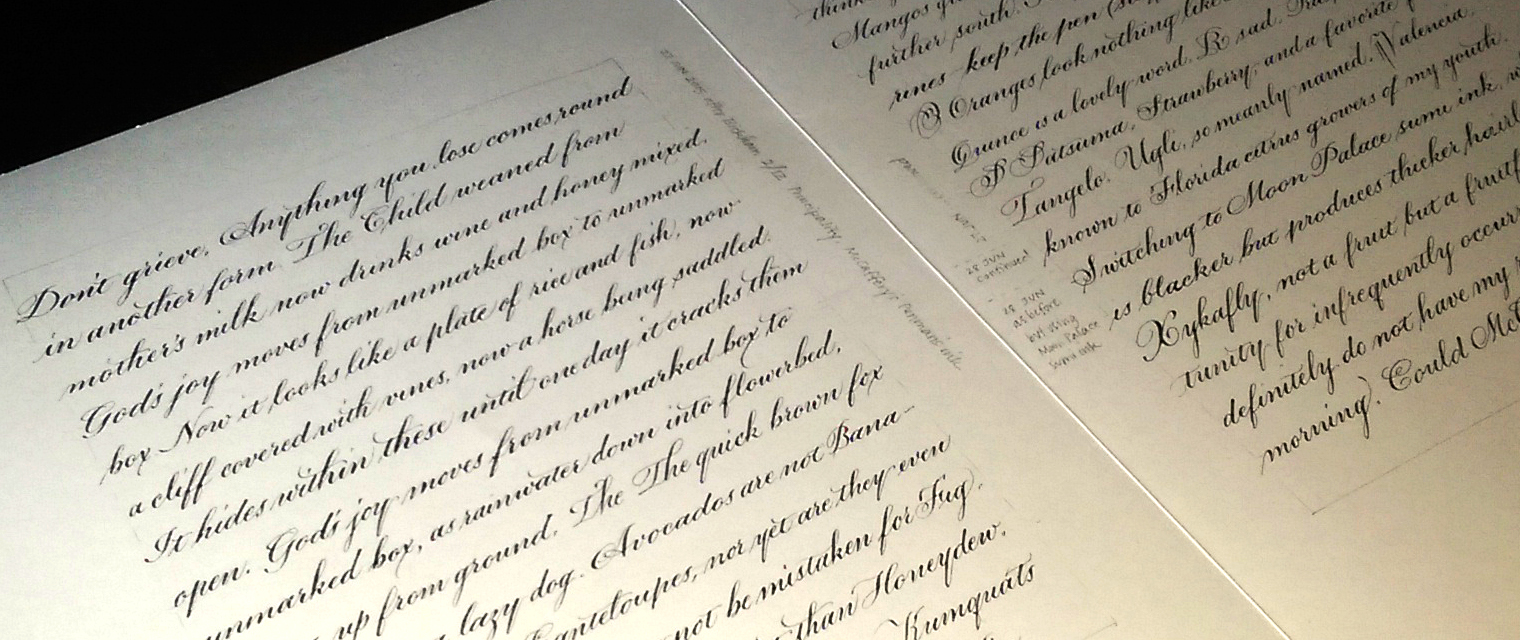
Pointed pen practice – Leonardt Principality nib, McCaffery Penman’s Ink and Moon Palace sumi ink on Strathrmore Drawing 400
It’s been so hot that I’ve been working in the dining room on the main floor of the house. My studio over the garage is an oven this summer, especially in the afternoons. For the past couple of days I’ve been addressing wedding invitations, which is good from a “venue” standpoint: the tools and materials needed are finite and portable.
Pointed pen is so different from broad-edge pen lettering, that when I switch from one to the other that I must practice to get back in the groove. Shown above are two of the three pages done to prepare for job. For the first page (not shown) I lettered in my default pointed pen script. Because the invitation was printed in Bickham Script, on these two pages I developed a script style that incorporates some of the characteristics of Bickham.
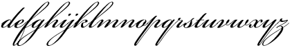
Sample from Bickham Script Pro font
A few Bickahm characteristics I chose to incorporate in my script:
small x-height
50º slant (or more)
weight on the heavy side
“y” descender with no loop but an exit stroke on the right
“o” exit stroke beginning from the middle right side of the oval
“f” with a lower loop as well as an upper loop
entrances to letters such as i, j, m, n, and especially u, w, y are more pointed than curved, allowing for tighter letter spacing
I’m always aiming for a balance between contrasting and complementing the printed invitations. Too little contrast, and it looks like inept printing. Too much contrast, and there is no connection between the addressed envelope and what’s inside.
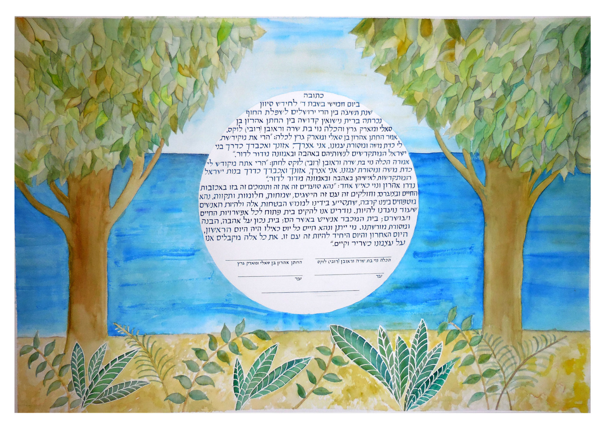
I had the honor of making this ketubah for Aaron and his bride Noy. An honor and a pleasure, as I’ve known Aaron since about the time he entered kindergarten. It was a beautiful evening in the foothills of the Judean Mountains.
Contains information related to marketing campaigns of the user. These are shared with Google AdWords / Google Ads when the Google Ads and Google Analytics accounts are linked together.
90 days
__utma
ID used to identify users and sessions
2 years after last activity
__utmt
Used to monitor number of Google Analytics server requests
10 minutes
__utmb
Used to distinguish new sessions and visits. This cookie is set when the GA.js javascript library is loaded and there is no existing __utmb cookie. The cookie is updated every time data is sent to the Google Analytics server.
30 minutes after last activity
__utmc
Used only with old Urchin versions of Google Analytics and not with GA.js. Was used to distinguish between new sessions and visits at the end of a session.
End of session (browser)
__utmz
Contains information about the traffic source or campaign that directed user to the website. The cookie is set when the GA.js javascript is loaded and updated when data is sent to the Google Anaytics server
6 months after last activity
__utmv
Contains custom information set by the web developer via the _setCustomVar method in Google Analytics. This cookie is updated every time new data is sent to the Google Analytics server.
2 years after last activity
__utmx
Used to determine whether a user is included in an A / B or Multivariate test.
18 months
_ga
ID used to identify users
2 years
_gali
Used by Google Analytics to determine which links on a page are being clicked
30 seconds
_ga_
ID used to identify users
2 years
_gid
ID used to identify users for 24 hours after last activity
24 hours
_gat
Used to monitor number of Google Analytics server requests when using Google Tag Manager
1 minute
You can find more information in our Cookie Policy and .