Serifed Roman capitals in John Stevens’ Uncials to Capitals Class

Drawn Roman capitals done at 3/4-inch height with pencil on Strathmore Drawing 300.
Serifed Roman capitals done with a 3.8mm Pilot Parallel Pen on white butcher paper at 1-inch height. I don’t think I was that back-sloped at the bottom right; rather, I think I tried to fix the perspective of a not-straight-on camera shot. The stiffness of the strokes and serifs are all mine though, sadly.

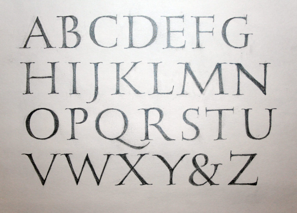
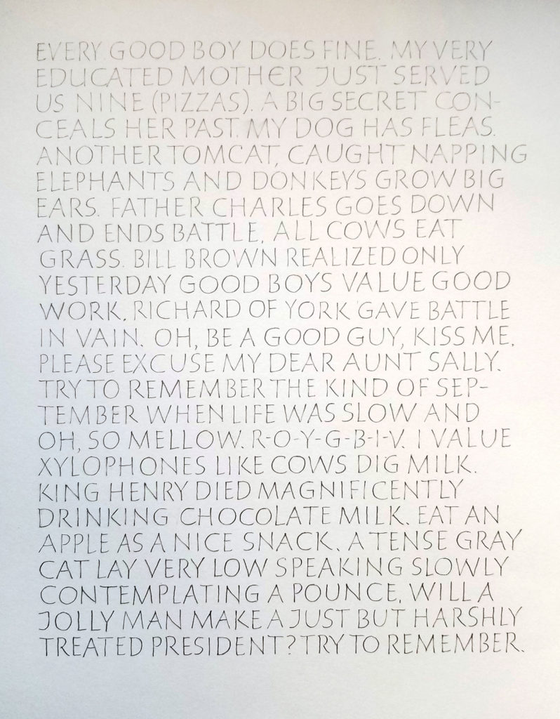
These are two homework pages from session four of John Stevens’ excellent five-session course, Capitals to Uncials. Session five was held this weekend, and I’m looking forward to doing the homework from that session.

It’s been such a good class, and John presented about 10 times the material shown by my posted homework. I’ve got enough to work on for a year without stopping, and I’m sure that that year’s work would lead to another year, and so on.

John Stevens’ class on uncials and Roman capitals is a welcome challenge

Judging from the disappointed post of fellow calligraphers worldwide, I was awfully lucky to make it into this 5-week class on Uncials and Roman capitals taught by John Stevens. This is week 2. Here are the 2 pages of homework I was willing to share with the class.

I could easily work on this class full time! I’m quite sure that some of my fellow students have been doing so, and even working overtime. I’ve been drawn into spending much more time on it than I realized. So now I’m scrambling to get to all of the work piling up in my studio. Today and tomorrow will see me caught up (she says, optimistically).

Off-weight lettering

2016-01-22-playing-with-off-weight-letteringLast week a friend pointed out a Facebook post by John Stevens: some “wrong weighted”
lettering, as he calls it, that she was working to emulate. I can’t find an example on his website, but if you’re on Facebook you might be able to see it here. I think it requires some time and enough kinetic familiarity to get a good rhythm going so that the strokes have more life than mine do. In the Facebook post, John calls it the “syncopated rhythm of Ben Shahn mixed with broad pen calligraphy.” In earlier posts here and here, you can see some of my attempts at the Ben Shahn lettering he references. Later, I used that lettering in a book commission of poetry by Madeleine Gomez:

Poem by Madeleine Gomez
2003 poem by Madeleine Gomez, written out 2013 by Beth Lee