More abstraction – metallic on Mi-Tientes

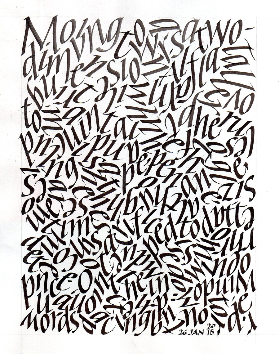
I did this a few days ago, lost it, and just found it again today. More abstraction of the letter forms I’ve been using from Hans-Joachim Burgert’s book.

2015-01-28-earlier-abstract-gold-on-green


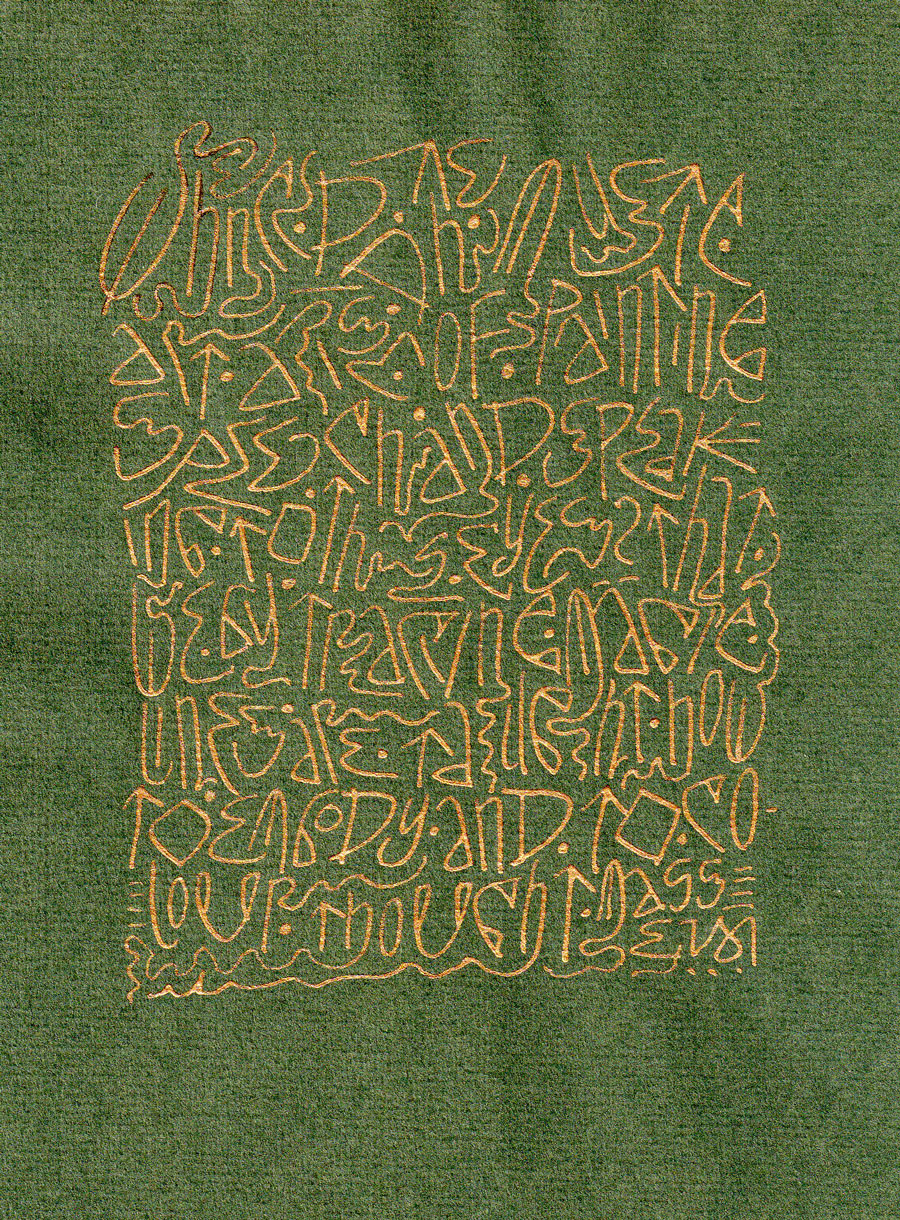
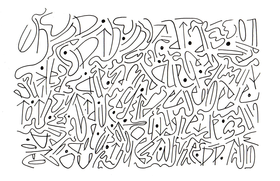
This is fairly small, a sheet torn from a 6″ x 8.5″  book of Canson Mi-Tientes paper, done with Luna metallic watercolors and a #6 Mitchell nib, I think.

Daily lettering – Mohawk Superfine and italic as texture

A little materials testing, a little more abstraction …

2015-01-26-lettering-sumi-on-Mohawk-Superfine

2015-01-26-italic-as-abstract-texture


Moving towards a two-dimensional , flat all-over pattern. I tried to keep the pen-angle, pen-width size, letter order and shape intact, abandoning word spacing and changing only the direction. Sometimes I broke the rules to preserve the texture, but sometimes the broken rules were inadvertent.

Further abstraction from yesterday’s lettering

Now’s it more work — not work, but play, difficult play. And a nice change from the italic exemplar over which I slaved most of today. There is nothing like making an exemplar to point up all the ways my lettering falls short!

2015-01-17 further abstraction


I’m tempted to start again with another set of formal letters, but I may move on.