It’s been a tough year. I can tell from the commission work.

Roman bookhand and sumi ink on watercolor paper. About 11″ x 14″.

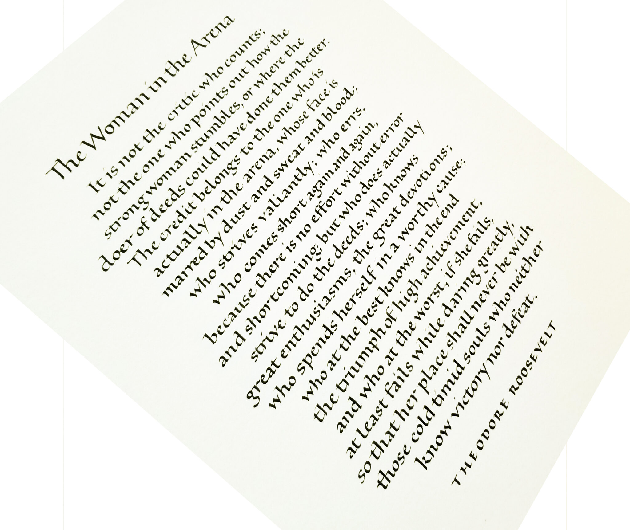
Yes, it’s been tough. Theodore Roosevelt’s famous quotation, “The Man in the Arena” is really resonating these days. I recall only one commission to letter this quote in the past 30+ years. And yet I’ve gotten three requests for it in the past six months! This latest one was gender-adapted for a client who wished to give it to a woman. And that’s appropriate: in many ways, women, especially those with school-age children, have born the brunt of the past 15 months, in the arenas of employment, child care, and housework.

The attentive eye


“To the attentive eye,
each moment of the year
has its own beauty,
and in the same field,
it beholds, every hour,
a picture which was never seen before,
and which shall never be seen again.”

– Ralph Waldo Emerson.

I matted and framed (11″ x 14″) this piece to today for the calligraphy exhibit at Rocky Mountain College’s The Ryniker-Morrison Gallery in Billings, MT.
The watercolor lettering was initially done with a disc-ended Brause Ornament nib –  similar to a Speedball “B” series nib – and then the rough edges and finials tidied square with a bowl-pointed school nib. All on St. Armand handmade watercolor paper, a luxuriously felty, bumpy surface.

More play from the conference goody bag

2015-08-06-goody-bag-testing-3Well, I didn’t get all the goodies from the goody bag put away, and the 50%-off paper I bought at Paper & Ink on the last day of the conference was still out too.

Freely written with a Sakura 3.0mm felt-tip calligraphy marker on Arches MBM paper. I like the skipping quality of the marker. I’m afraid it will start to fill in as the marker ages, but so far it’s still good.

Hope

2015-08-04-hope-quotation

I mentioned earlier that our local calligraphy group has been lettering a quotation on one of ten topics each month. This month we will be deciding how to order and layout the book that we’ll bind from prints of these quotations.

Now that we’re down to it, there are a couple of the quotations I’ve done that are sub-par. With the deadline next week, I’ve been re-doing them. Here’s the final version of the quotation on Hope. I enjoyed painting the negative parts of the letters in a fairly spontaneous way.

Gouache with brush and Brause nibs on Arches Text Wove, at 3″ square.

I’ve shown my earlier earlier version below.

2015-08-04-original-hope-quotationIt just doesn’t hang together well. It’s a good deal larger (about 9″ x 12″, I think), but it’s not good. It needs some vertical element between the two halves of the quotation, but I moved on to something new instead.

Pencil on … Khadi, maybe? I don’t remember.

Quotation – gratitude or pride

Our local calligraphy group here has been choosing a quotation a month from ten qualities that make up what Dr. Barbara L. Fredrickson calls a “joy portfolio,” helping to build resilience in the face of hardship:

  1. Joy
  2. Gratitude
  3. Serenity
  4. Interest
  5. Hope
  6. Pride
  7. Amusement
  8. Inspiration
  9. Awe
  10. Love

We’re at month 8 (or 9, I’ve confused myself as to whether the numbers represent work months or due dates), and I’ve only got a couple of completed. So this month I going to attempt to finish all the unfinished quotations.

I had thought to use the quotation below for “gratitude,” but I’m having trouble finding a quotation I like for “pride,” and this might work for that. I double that either of these is the final version, although they are the 3rd and 4th versions if you count the plain-white-background version as a 2nd version. The backgrounds are scans of watercolor studies (or, if not study, serendipity) that I’ve painted in the past. Maybe I’ll post the 1st version, which was as much finished thumbnail as a draft. So much for progress: I still don’t have a finished piece.

2015-02-09-gratitude-or-pride-quotation

2015-02-09-gratitude-or-pride-quotation-v2