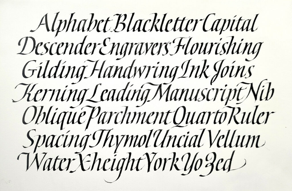
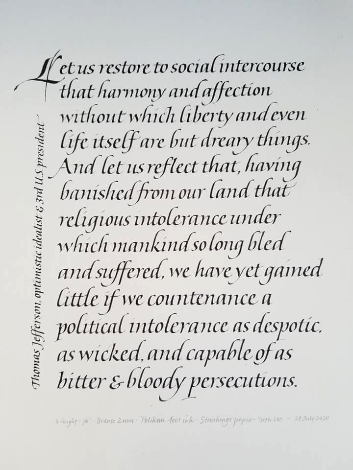
This week I had occasion to write out a poem in letters of nearly 1/2″ x-height. It had been a long time since I had written anything of any length with a 3mm-wide nib, so I began with my go-to practice page, the alphabetical list of related terms. The first page was of upright italic, and then I tried something with a good slanted. The final piece had a slant that was somewhere between these two, but these two sheets were a good starting point and a great warm-up.
I recently finished a wonderful five-week online class with John Stevens. Take a look at his work and you’ll see why anyone would be lucky to study with him. The class was entitled “The Italic Letter”. I had not studied italic calligraphy, per se, for quite some time.
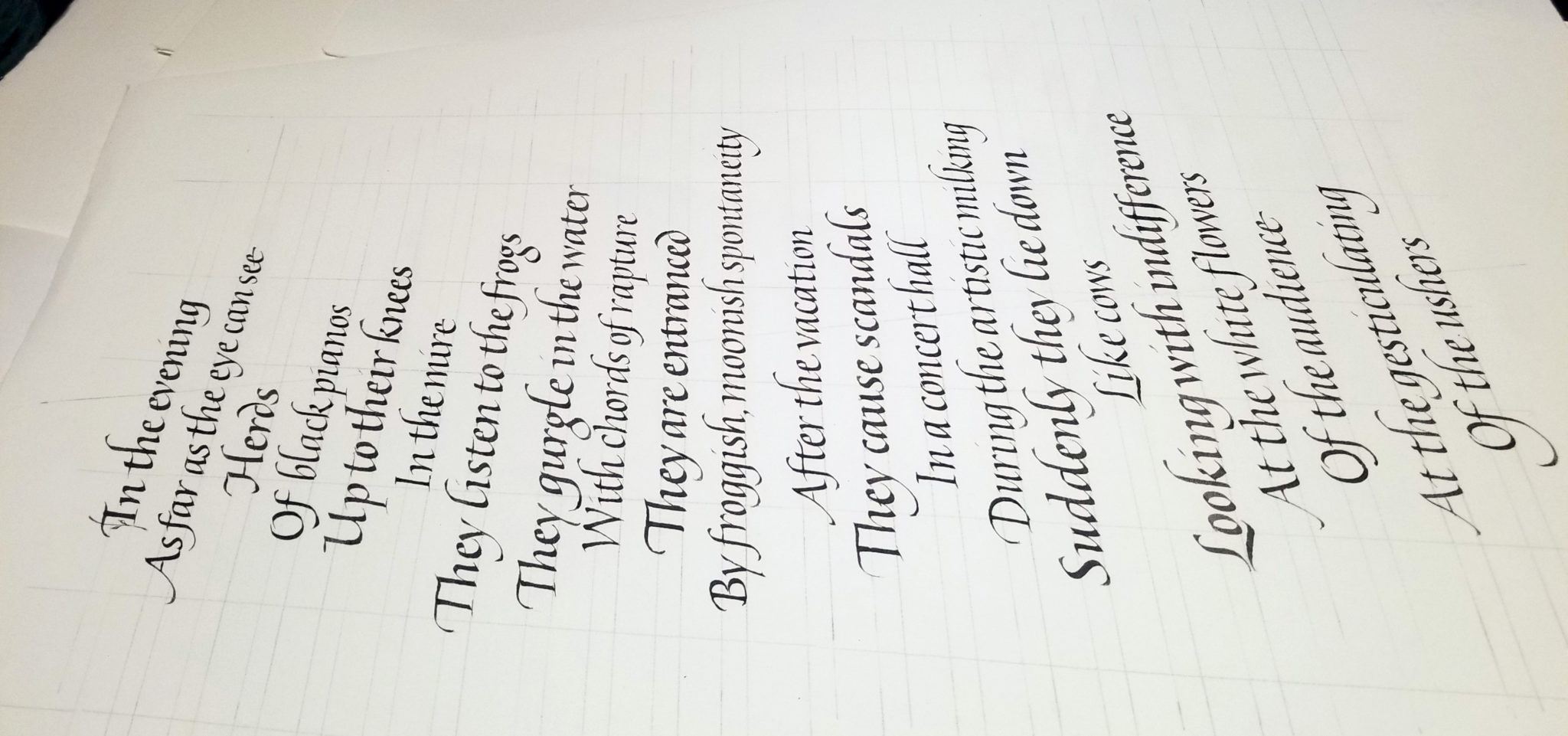
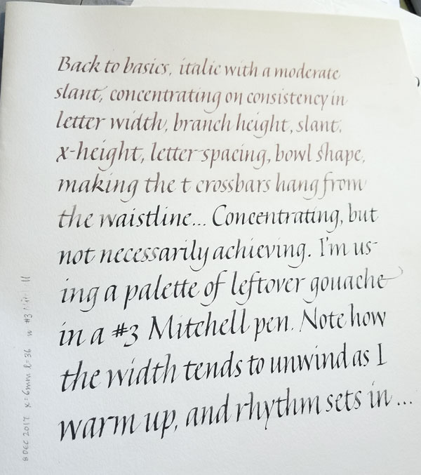
We began with a look at “basic” italic (ha!) and a close look at the basic shape of the strokes. Here’s one of my earlier study pages.
A page of basic italic calligraphy with a particular style of ascenders and descenders
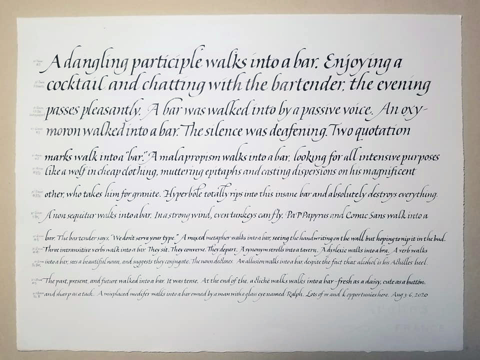
We considered the placement of lettering on the page, and …. well, so much more. Here are two study sheets, one a block of text and the other a study in two weights.
The third sheet is a block of text, considering ledding and layout.
A study of italics in two weights
A block of italic text
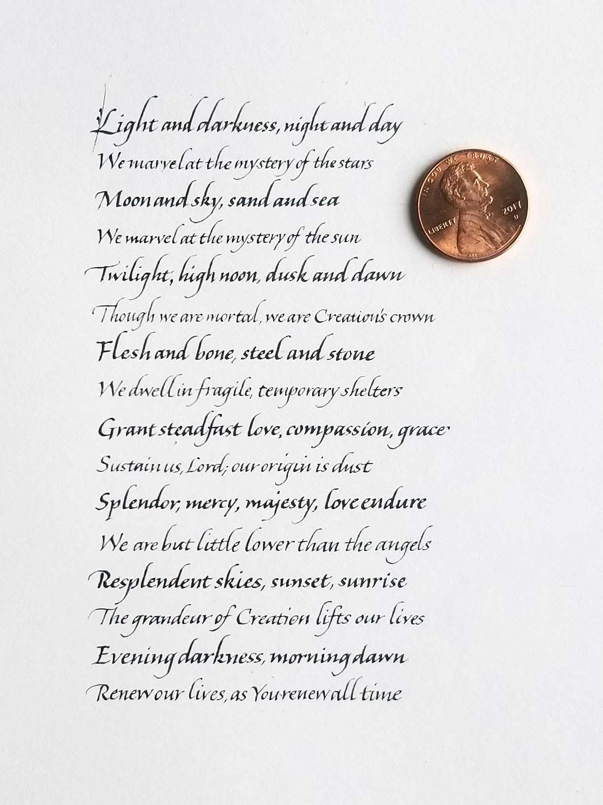
Then we began looking at going smaller. Here is one sheet of diminishing sizes, and another at the smallest size I could manage.
Using various pens, I worked my way down from about 4mm to a pointed pen modified to a very small broad edge.
Just about the smallest italics I could manage, with a penny to give you an idea of size.
John will be repeating the class soon. I highly recommend it! Sign up for his newsletter to be notified of new classes.
Time passes, I travel, I do other things, and suddenly I realize it’s been awhile since I practiced any lettering. Sure, I’ve done an edition of 1-5/8″ x 3″ books with tiny capitals lettering in it, and finished a baby quilt, and done some lettering on mirrors. None of that “counts” towards lettering practice — as is proved by the uncertainty and inconsistency of today’s practice lettering. I’m preparing for a long piece, and this must improve!
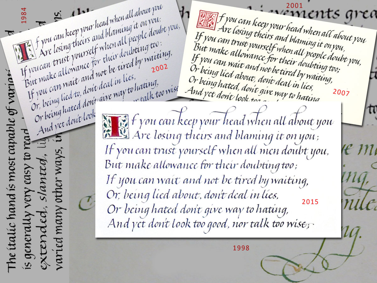
Italic through the years – 1984 through the present
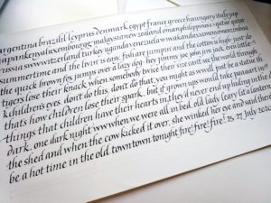
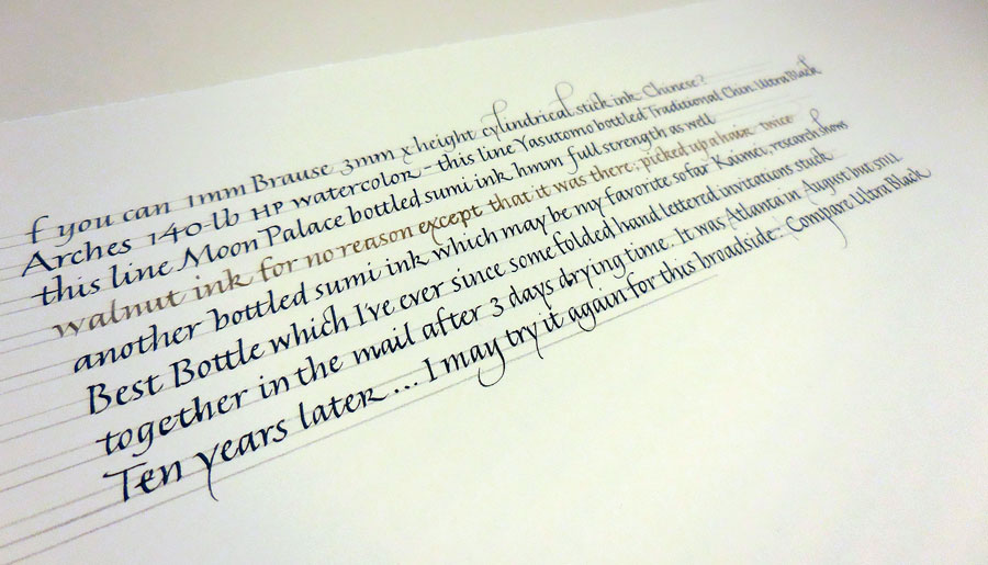
Last month I was commissioned to write out the Kipling poem “If”. Since 1983 I believe I’ve written this poem out at least once every other year. I don’t always keep an image of the poem, but I do have 3 images here, from 2002, 2007 and 2015. (You can click on the image for a closer look.) I usually do the poem in italic, for several reasons. First, it is very long and so I choose something that flows easily from the pen. Second, it is very long and yet people do want to have it framed; so the lettering must be fairly small. Third, even though, and especially because, it is very long, people want maximum legibility. Fourth, a compressed hand is better than a wider hand because two columns of two verses each makes for a good standard frame proportion. Fifth, even though I think a book hand would be a good choice of lettering style, most people don’t think of book hand as “calligraphy”. {sigh}
That 1984 hand running up the left side looks pretty damn good for someone who had been lettering for less than 2 years. The 2002 version of the first verse looks a lot less attractive. The lettering was much smaller, the paper more difficult for me at the time, the slant was clearly problematic, and I think the stress of getting all that text down on a page with consistency and without errors was still a challenge. In 2007, I was in art school and not doing much lettering, and it shows. In the 2015 version, I spent a good deal of time trying out inks on the paper (see here), and still … my consistency could be improved.
Looking at this montage of lettering from 1984-2015, it’s not particularly clear that I’ve progressed, even though I’ve got to think I’ve learned something in the intervening years. I’m reminded of the a quotation (which I can’t find now) that goes something like: “What is learned after the age of 40 can’t be communicated.” Truth or comforting fiction?
Our local calligraphy group here has been choosing a quotation a month from ten qualities that make up what Dr. Barbara L. Fredrickson calls a “joy portfolio,” helping to build resilience in the face of hardship:
Joy
Gratitude
Serenity
Interest
Hope
Pride
Amusement
Inspiration
Awe
Love
We’re at month 8 (or 9, I’ve confused myself as to whether the numbers represent work months or due dates), and I’ve only got a couple of completed. So this month I going to attempt to finish all the unfinished quotations.
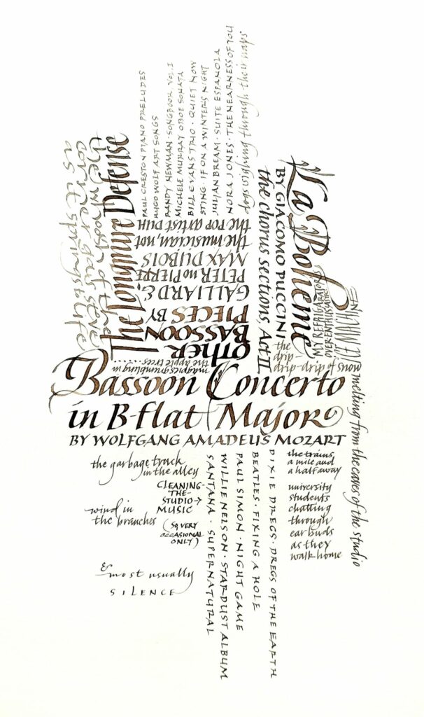
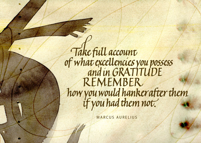
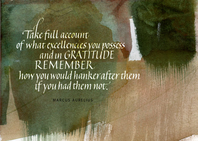
I had thought to use the quotation below for “gratitude,” but I’m having trouble finding a quotation I like for “pride,” and this might work for that. I double that either of these is the final version, although they are the 3rd and 4th versions if you count the plain-white-background version as a 2nd version. The backgrounds are scans of watercolor studies (or, if not study, serendipity) that I’ve painted in the past. Maybe I’ll post the 1st version, which was as much finished thumbnail as a draft. So much for progress: I still don’t have a finished piece.
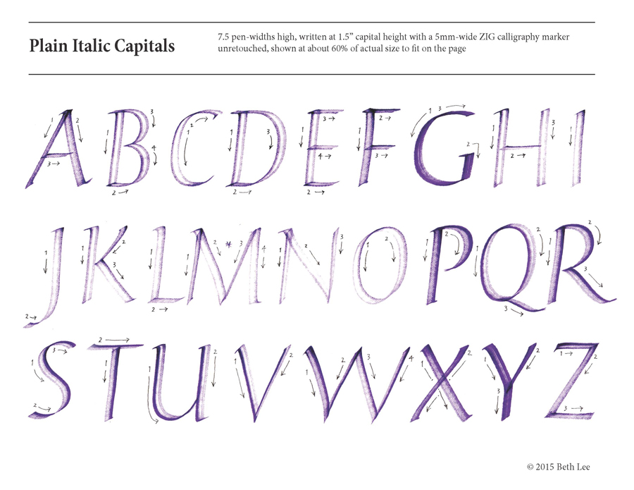
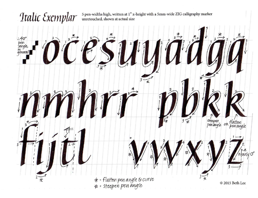
Developing an exemplar is one of the most humbling exercises that a calligrapher can undertake. Having spent hours on this one, a number of thoughts tumble (my original typo “thumble” seems apt) through my head, in no particular order:
In most of my work I usually choose Roman capitals to go with italic minuscules, and it shows here. Which leads me to the specific note …
G: pick an oval, won’t you? That G bears no resemblance to the C or O or Q.
D: doesn’t have much base.
U: there’s an awful lot of skinny in the connecting stroke.
F: looks like it’s mid-jump on a pogo stick; that’s a paste-up error.
M: has a heavy top left shoulder.
W: has an awkward join on the right bottom corner; I’m usually better about that.
Z: well, I don’t know what exactly, but the base is not straight and it looks wooden; perhaps I should have flattened the pen angle a bit more on the horizontals
L: although I didn’t spend much time on kerning, the L is noticeably too close to the M. It’s all crowded but I wanted them as large as possible but still fitting on a letter-size page.
J: also wooden, except where it’s wavy when it shouldn’t be.
Sigh. Well, I do like the P and R … That leaves only 24 letters that need work.
I used a partially dried-out 5mm Zig marker so that students can see how the letters are being made.
Today was not a day for inspired lettering. But I showed up anyway. That’s what it’s all about (all hokey pokey aside). Maybe the muse will be there tomorrow when I show up. And I will show up.
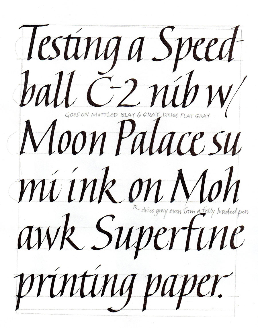
Details of the crime: It was done by the C-2 Speedball nib with the White Schmincke Calligraphy Gouache on the black Artagain paper. The side crime was done by a Mitchell Roundhand #4 nib with Luna silver pan watercolor, mostly to make a comparison of coverage between white gouached and metallic watercolor.
I didn’t use any guidelines, but I did frame the text area using a Fons and Porter white fabric marking pencil, which I like for dark paper and painted backgrounds. The point stays sharp and the eraser that comes with it works well without damaging the paper. Not all of the 9″ x 12″ page is shown. I will eventually bind this folio into a notebook with other lettering trials.
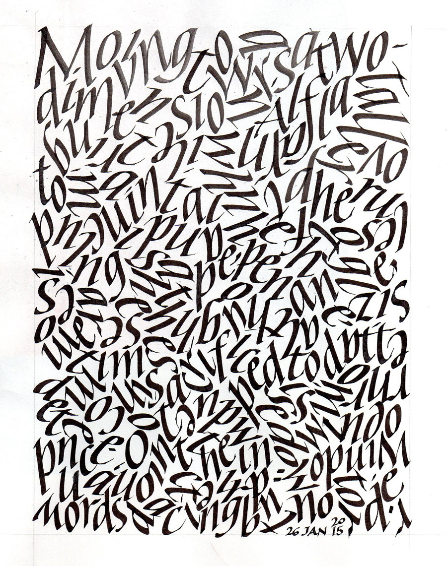
A little materials testing, a little more abstraction …
Moving towards a two-dimensional , flat all-over pattern. I tried to keep the pen-angle, pen-width size, letter order and shape intact, abandoning word spacing and changing only the direction. Sometimes I broke the rules to preserve the texture, but sometimes the broken rules were inadvertent.
What a struggle an exemplar is, no matter how long the study! I struggled over this one for a ridiculous amount of time. Now I’d like to fix the bases of the p and the b, some widths, a slant, the height of the z, and so on.
Contains information related to marketing campaigns of the user. These are shared with Google AdWords / Google Ads when the Google Ads and Google Analytics accounts are linked together.
90 days
__utma
ID used to identify users and sessions
2 years after last activity
__utmt
Used to monitor number of Google Analytics server requests
10 minutes
__utmb
Used to distinguish new sessions and visits. This cookie is set when the GA.js javascript library is loaded and there is no existing __utmb cookie. The cookie is updated every time data is sent to the Google Analytics server.
30 minutes after last activity
__utmc
Used only with old Urchin versions of Google Analytics and not with GA.js. Was used to distinguish between new sessions and visits at the end of a session.
End of session (browser)
__utmz
Contains information about the traffic source or campaign that directed user to the website. The cookie is set when the GA.js javascript is loaded and updated when data is sent to the Google Anaytics server
6 months after last activity
__utmv
Contains custom information set by the web developer via the _setCustomVar method in Google Analytics. This cookie is updated every time new data is sent to the Google Analytics server.
2 years after last activity
__utmx
Used to determine whether a user is included in an A / B or Multivariate test.
18 months
_ga
ID used to identify users
2 years
_gali
Used by Google Analytics to determine which links on a page are being clicked
30 seconds
_ga_
ID used to identify users
2 years
_gid
ID used to identify users for 24 hours after last activity
24 hours
_gat
Used to monitor number of Google Analytics server requests when using Google Tag Manager
1 minute
You can find more information in our Cookie Policy and .


