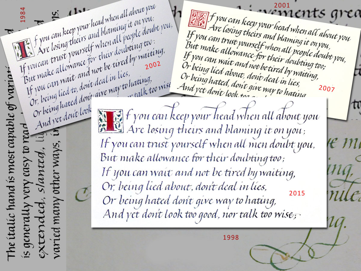
Last month I was commissioned to write out the Kipling poem “If”. Since 1983 I believe I’ve written this poem out at least once every other year. I don’t always keep an image of the poem, but I do have 3 images here, from 2002, 2007 and 2015. (You can click on the image for a closer look.) I usually do the poem in italic, for several reasons. First, it is very long and so I choose something that flows easily from the pen. Second, it is very long and yet people do want to have it framed; so the lettering must be fairly small. Third, even though, and especially because, it is very long, people want maximum legibility. Fourth, a compressed hand is better than a wider hand because two columns of two verses each makes for a good standard frame proportion. Fifth, even though I think a book hand would be a good choice of lettering style, most people don’t think of book hand as “calligraphy”. {sigh}
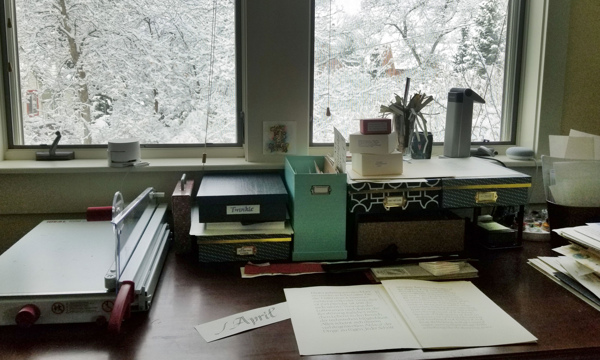
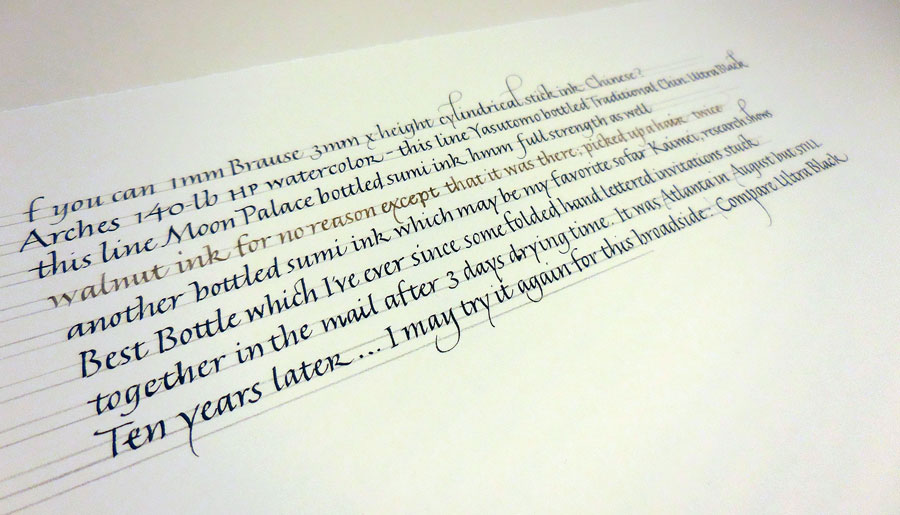
That 1984 hand running up the left side looks pretty damn good for someone who had been lettering for less than 2 years. The 2002 version of the first verse looks a lot less attractive. The lettering was much smaller, the paper more difficult for me at the time, the slant was clearly problematic, and I think the stress of getting all that text down on a page with consistency and without errors was still a challenge. In 2007, I was in art school and not doing much lettering, and it shows. In the 2015 version, I spent a good deal of time trying out inks on the paper (see here), and still … my consistency could be improved.
Looking at this montage of lettering from 1984-2015, it’s not particularly clear that I’ve progressed, even though I’ve got to think I’ve learned something in the intervening years. I’m reminded of the a quotation (which I can’t find now) that goes something like: “What is learned after the age of 40 can’t be communicated.” Truth or comforting fiction?