An online italic calligraphy class with John Stevens

I recently finished a wonderful five-week online class with John Stevens. Take a look at his work and you’ll see why anyone would be lucky to study with him. The class was entitled “The Italic Letter”. I had not studied italic calligraphy, per se, for quite some time.

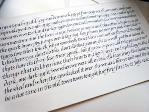
We began with a look at “basic” italic (ha!) and a close look at the basic shape of the strokes. Here’s one of my earlier study pages.

a page of basic italic text with a particular form of finials
A page of basic italic calligraphy with a particular style of ascenders and descenders

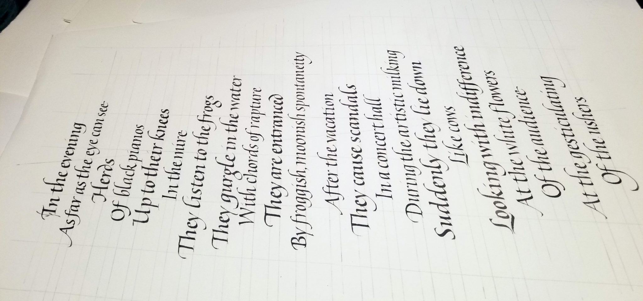
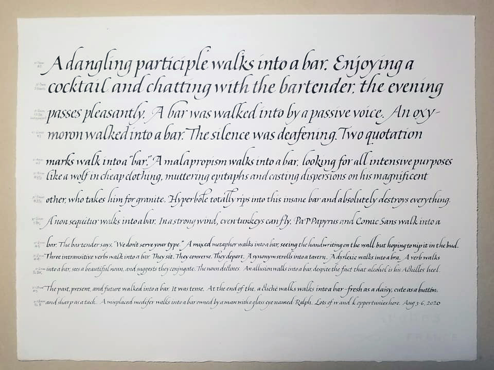
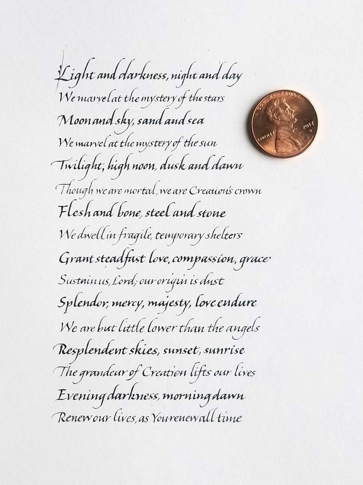
We considered the placement of lettering on the page, and …. well, so much more. Here are two study sheets, one a block of text and the other a study in two weights.

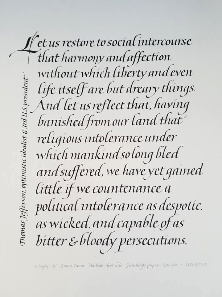
The third sheet is a block of text, considering ledding and layout.

a page of italic in two weights
A study of italics in two weights
a page of italic as a block of text
A block of italic text
Then we began looking at going smaller. Here is one sheet of diminishing sizes, and another at the smallest size I could manage.
a page italics from fairly large to tiny
Using various pens, I worked my way down from about 4mm to a pointed pen modified to a very small broad edge.
Just about the smallest italics I could manage, with a penny to give you an idea of size.

John will be repeating the class soon. I highly recommend it! Sign up for his newsletter to be notified of new classes.