Working in a blackletter class with John Stevens

This online class finished a couple of weeks ago. However, I’m still working on the plethora of blackletter exemplars and examples that John Stevens shared with us. So it not only was a wonderful class, it still is a wonderful class for me.

A folio of Fraktur lettering, with brush-made abstracted Fraktur forms on the left and pen-made text on the right.
Left: flat brush and Nicker poster color on Artagain black paper. Right: 2mm Brause nib and stick ink on unknown difficult paper. Each page 9×12 in.

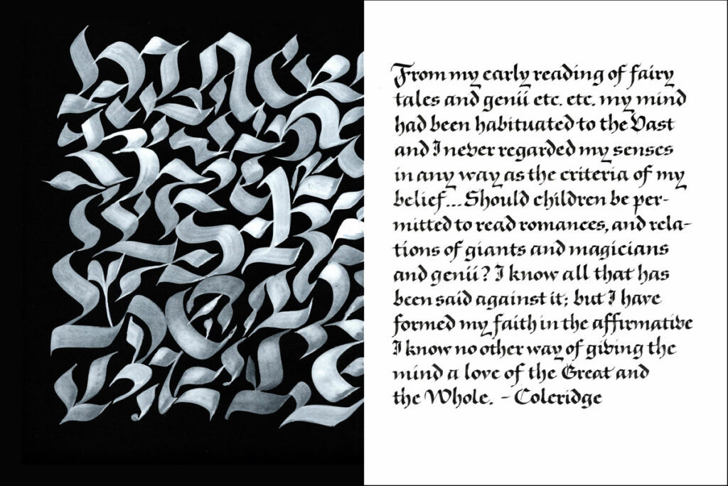
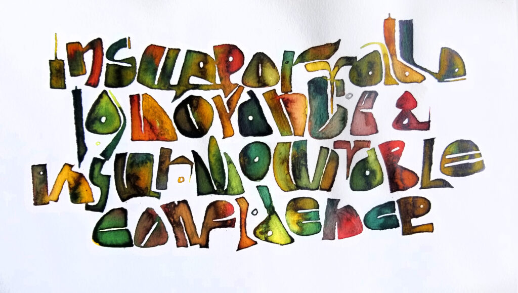
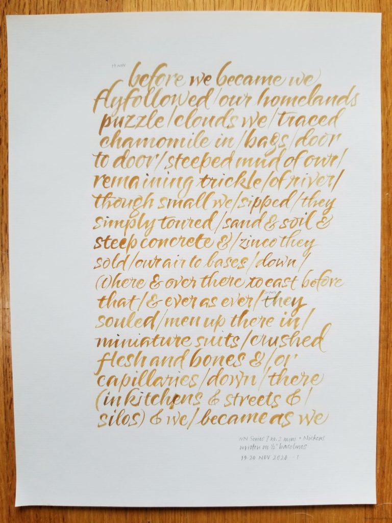
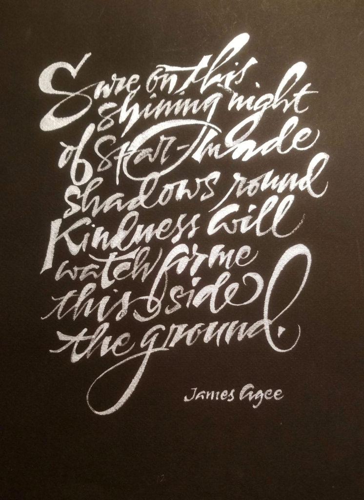
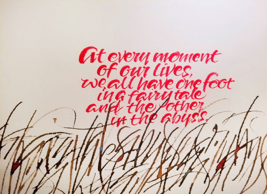
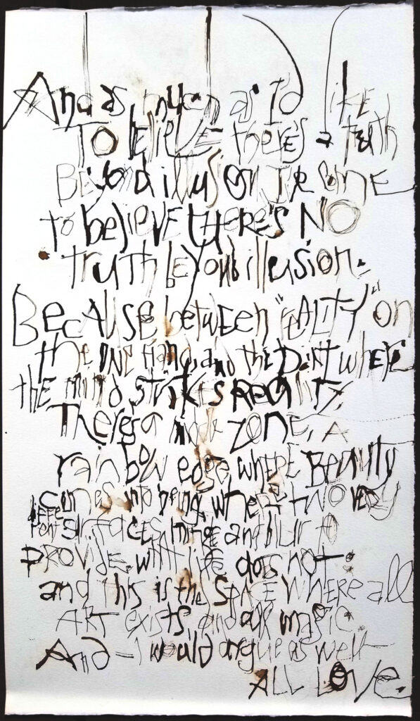
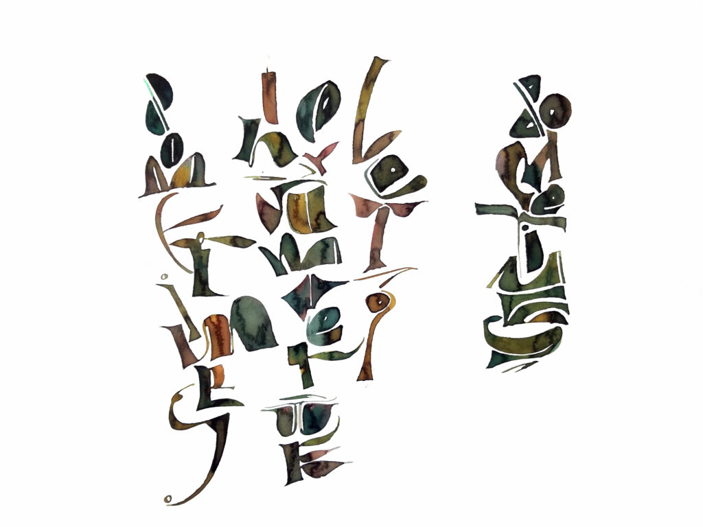
John usually includes layout in his classes. And he often uses the folio to combine image and text on the page together. The work above is a response one of those folio assignments.

I still want to spend some time with double-stroked blackletter (this example of John’s is so luscious), Fraktur capitals with pen and with brush, pattern-filled Lombardic capitals, and some Zapf and Koch exemplars. And more …

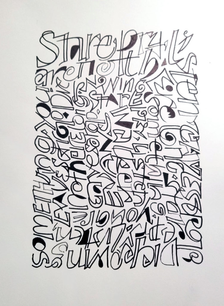
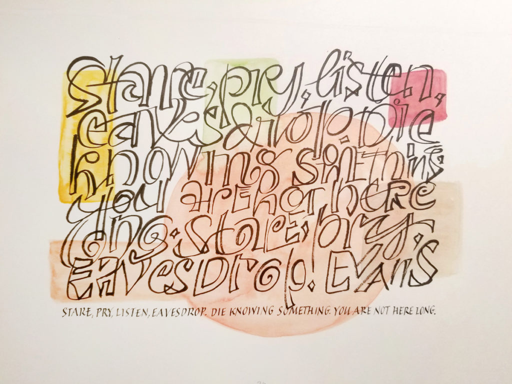
It’s interesting to compare the lettering I did in this class with the blackletter work I did in Luca Barcellona’s class two years ago. I felt more comfortable with that earlier work, even as it was happening. And I wonder why? I think it may be that the earlier class did not present as many choices, as much background. I feel that I came away from the blackletter class with John Stevens with a whole panoply of lettering choices and ideas, and that I learned one style very well in Luca Barcellona’s class. Both have been extraordinarily valuable classes. And I’m glad that I happened to take the two classes in the order that I did.

Whole lotta expressive mark-making goin’ on

Fountain pen on Arches Cover
Some final musings at the end of Donna Tartt’s marvelous book, The Goldfinch. Written with a whelk shell and walnut ink with my non-dominant hand on Arches Cover.

Work done in Brody Neuenschwander’s online class, Series 3, “The Expressive Expressive Line – Part 1”. Here are two of a lot of pages of mark-making.

Once more – with color

Gouache and sumi, Brause Ornamental pen nib and 00 brush, Arches Text Wove, about 10 in x 8 in.

I’ve enjoyed the work so much in Series 2 of Brody Neuenschwander’s online classes that I did another, this time with color in the counters and 3:4 portion of rectangle.  Compare this to the monochrome square figures in my last post.

Actually, I gathered up all the bits and pieces of work/play in this seal-script-inspired vein and was shocked at the height of the pile. I can see a number of applications for this style of working. So much fun!

Inspired by Chinese seal script in Brody’s online class

#5 Brause Ornament nib and gouache on Rives BFK, about 12 inches square. With a hint of another bit of homework in the corner.

Series 2 of Brody Neuenschwander’s online classes is inspired by Chinese seal script. I am loving this shift in thinking from fairly uniform letters with discreet spaces between words to separate word bundles. It’s the difference between a grass prairie and tiered landscaping. Or it can be. I’m fascinated with the way the way of working shifts me toward thinking illustratively. For instance, the word “round” is enclosed by the “O”. And in the corner bit, the word “seed” begins to look like a pea pod. And what a change this improvisational construction is from standard formal Western calligraphy, where the letter placement is fore-ordained!

Click on the image for a much larger look.

If you missed my post on the first series, check it out here.

Brody’s online calligraphy classes are the cat’s pajamas

“Sometimes in summer we let go … sometimes” – Bister ink and cola pen

The first of Brody Neuenschwander’s 8 series of online calligraphy classes has come to a close. It more than met my expectations, and my expectations were high.

A little history

I first met Brody during a week-long workshop at Camp Cheerio in 2000. He and Thomas Ingmire co-taught the workshop, “Textual Reverberations”. A good deal of time has passed, but I still have the book I made in that class. During that week, according to my notes — and perhaps the promotional materials, “we looked at meaning in modern text-based art and worked with more open-ended and suggestive processes. Inventive calligraphic writings were developed based on musical, emotional, rhythmic, visual, linear, and formal themes.”

It was a different workshop than most calligraphy workshops in that it tied calligraphy into the larger art world. Every morning we were treated to a talk about lettering in the contemporary art that included a slideshow of work by Cy Twombly, Jenny Holzer, Bruce Nauman, Barbara Kruger, and many others. During that week we also got see what Brody was doing in that wider world. One evening we watched “The Pillow Book”, directed by Peter Greenaway and including calligraphy by Brody. And we saw another collaboration with Peter Greenaway, “Bologna Towers 2000“, in which his writing was projected the towers of Bologna. For me, at that time, it was an eye-opener.

Edited to add: I wrote a blog post about this 2000 workshop here.

Series 1

The just-completed class series advances this theme of calligraphy in the larger world, taking inspiration from the Kufic form of calligraphy. From copying and then translating elements of those forms into Latin calligraphy, we learned to break the grid that our 26-letter palette and vellum/quill tradition have encouraged.

the text:
pheasant sandwiches
the Dagwood
Sunday-go-to-meeting buns
hot cross buns (left side)
Mrs. Lovett's meat pies
The Host
Emilio's ham & cheese
Hillel sandwich
the best thing since ... since ever
A list of sandwiches and bread in popular Western culture and literature, from Mrs. Lovett’s meat pies to the Hillel sandwich, with hot cross buns down the left side. You can hover over the image for a complete list. Pilot Parallel Pen and ink.

I haven’t begun to describe the class; a full description is beyond me. I’ve shown my homework submission here, but you can enjoy the fantastic work of some of the other students at instagram #brodyonline. Sorry you missed it? You can still take the class as a recording. Series 2 begins in April and looks to Chinese seal script for inspiration. I can’t wait!

Bister inks and cola pen.

Serifed Roman capitals in John Stevens’ Uncials to Capitals Class

Drawn Roman capitals done at 3/4-inch height with pencil on Strathmore Drawing 300.
Serifed Roman capitals done with a 3.8mm Pilot Parallel Pen on white butcher paper at 1-inch height. I don’t think I was that back-sloped at the bottom right; rather, I think I tried to fix the perspective of a not-straight-on camera shot. The stiffness of the strokes and serifs are all mine though, sadly.

These are two homework pages from session four of John Stevens’ excellent five-session course, Capitals to Uncials. Session five was held this weekend, and I’m looking forward to doing the homework from that session.

It’s been such a good class, and John presented about 10 times the material shown by my posted homework. I’ve got enough to work on for a year without stopping, and I’m sure that that year’s work would lead to another year, and so on.

John Stevens’ class on uncials and Roman capitals is a welcome challenge

Judging from the disappointed post of fellow calligraphers worldwide, I was awfully lucky to make it into this 5-week class on Uncials and Roman capitals taught by John Stevens. This is week 2. Here are the 2 pages of homework I was willing to share with the class.

I could easily work on this class full time! I’m quite sure that some of my fellow students have been doing so, and even working overtime. I’ve been drawn into spending much more time on it than I realized. So now I’m scrambling to get to all of the work piling up in my studio. Today and tomorrow will see me caught up (she says, optimistically).

More in Elizabeth McKee’s pointed brush lettering class

Have I mentioned how much I’m enjoying Elizabeth McKee’s brush lettering class? Well, it bears repeating. Here are just a few pages of the homework I did in November, the 3rd month of classes.

I’ve mostly been writing with Pentel Color Brushes (all four tips), Winsor & Newton Series 7 pointed brushes (1, 2, 2 mini), and the Pentel Pocket Brush. I’ve mostly been using fountain pen ink, Schmincke gouaches, Winsor & Newton watercolors, Dr. Martin’s Pro White, and FineTec metallic watercolors.

I’m happily balancing this kind of work with the formal, slower work of study in Elmo van Slingerland’s Roman minuscules class through the Society of Scribes … and the geometry and paper handling of folding portfolio folders and fulfilling orders for my ABC portfolios. I’ll post some of my work in the Roman minuscules class next time.

Workshop with Mike Gold

I enjoyed this past weekend’s workshop hosted by Chicago Calligraphy Collective. Taught by Mike Gold, the workshop was entitled “Over and Over”. All weekend we focused on taking one text and lettering it over and over, using different approaches.

My quotation for the workshop was this: “Stare, pray, listen, eavesdrop. Die knowing something. You are not here long.” – Walker Evans. (But if an exercise didn’t lend itself to the quotation, I chose something else.)

In this workshop with Mike Gold, it was instructive to see the work of my fellow workshop students, a gathering of accomplished calligraphers. The work was so widely varied! You can see some of this work on instagram here. The Chicago Calligraphy Collective has really got it going on, especially as an online presence for those of us members who are not local.

Mike Gold is teaching this class to other guilds via Zoom. For instance, the Columbus guild is hosting this workshop October 24 & 25. If you’re interested, sign up!

An online italic calligraphy class with John Stevens

I recently finished a wonderful five-week online class with John Stevens. Take a look at his work and you’ll see why anyone would be lucky to study with him. The class was entitled “The Italic Letter”. I had not studied italic calligraphy, per se, for quite some time.

We began with a look at “basic” italic (ha!) and a close look at the basic shape of the strokes. Here’s one of my earlier study pages.

a page of basic italic text with a particular form of finials
A page of basic italic calligraphy with a particular style of ascenders and descenders

We considered the placement of lettering on the page, and …. well, so much more. Here are two study sheets, one a block of text and the other a study in two weights.

The third sheet is a block of text, considering ledding and layout.

a page of italic in two weights
A study of italics in two weights
a page of italic as a block of text
A block of italic text
Then we began looking at going smaller. Here is one sheet of diminishing sizes, and another at the smallest size I could manage.
a page italics from fairly large to tiny
Using various pens, I worked my way down from about 4mm to a pointed pen modified to a very small broad edge.
Just about the smallest italics I could manage, with a penny to give you an idea of size.

John will be repeating the class soon. I highly recommend it! Sign up for his newsletter to be notified of new classes.