This weekend I hosted five high-school boys plus our own for a four-day meeting. I have been driving and driving and driving. And cooking. I am pleased to have done something creative every day during it all. I got out some exemplars and worked on some new capitals before I started addressing the invitations … there are 400 invitations to this wedding, so I’ll be doing a lot of pointed pen work during the next couple of weeks. The x-height of these letters is about 1/8″.
Journal – Friday, January 11

There is nothing more to be said about today.
January 10 – Pointed Pen Script
 One day a year is inadequate for World Literary Day, so I’m continuing the theme today.
Pointed pen is not my first tool of choice in lettering. I’ve never had a class in pointed pen scripts — copperplate, engrossing, Spencerian, business hand, etc. — so what I know I’ve mostly picked up on my own … and mostly from the folks in Ornamental Penmanship discussion group at Yahoo. The resources available there are simply incredible.
Broad-edged pens are more familiar to me. But I’ve just finished addressing 450 double-envelope wedding invitations in my own brand of pointed pen script, and it’s starting to feel a little more comfortable than usual. The shoulder, now, that’s not so comfortable at the moment …
Journal – January 9

Today’s post. Note the 11:47pm time, 13 minutes before midnight. Oh, the power of a deadline. The white in the italic calligraphy is the shine of still-wet gouache. I do like lettering with no guidelines every once in awhile. It’s been a long, busy day.
World Literary Day

Some quotations in honor of World Literary Day. All done at 4 pen-widths high with a worn-out metal #3 Mitchell nib. (I have no idea why I hang onto these corroded, disgusting pens. Is it a sort of self-flagellation for the sin of neglecting to clean my pens properly? Scottish parsimony? I don’t know.) All in gouache, except that the black is Moon Palace sumi ink.
The green drove me crazy, glopping off the pen — you can see the unevenness in the close-up view. Since it was only the green that was a problem, I think it was the lemon yellow that was causing it, because the ultramarine and the touch of vermilion were fine in the other mixtures. Or perhaps it was the combination of the lemon yellow and ultramarine — mixing them seems to me something like mixing low-fat milk and Kool-Aid.
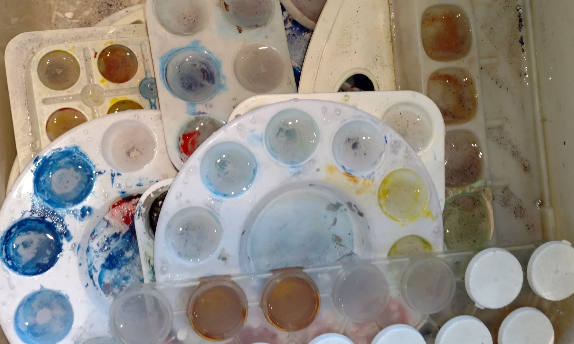
I’m not recommending the color scheme! I’m still cleaning out old palettes — more parsimony, perhaps, and the pleasure of exploring color in a serendipitous manner.
I can’t remember what this paper is. It’s something to do with printmaking — very, very smooth and more of an eggshell color than it looks here. Superfine Letterpress, perhaps?
First Day of School
 It’s another new beginning today: the first day of school.
I had thought to make naive letter forms, and partially succeeded. I failed mostly in that I could not bring myself to abandon the Roman capital proportions, and thoughtlessly (without thought) kept the verticals more heavily weighted than the horizontals.
But I was more interested in making letters that were difficult, awkward to make, required thought, were not automatic. In this I succeeded: I worked to keep the pen angle at 90 degrees to the stroke, which required a constant change of pen angle to the writing line. Very awkward to do.
Epiphany
 A quotation from Milton about epiphanies, on this day of Epiphany.
The red blob at the bottom of the page was the first mark on the paper, made when I leaned over to look past the board and my brush, held at the ready, connected with the paper in a most untimely manner. This is a signature of my journal, though, and so I continued on from that inauspicious first mark.
The illustration came from who-knows-where. I don’t know who the woman might be, or what the broom-like appendage signifies. That’s creativity for ya, eh?
Journal – January 5
 I’m reading The War of Art, by Steven Pressberg. It’s an empowering book, although I sometimes wonder at the pugilistic tone. The left side of the journal spread is a quotation from that book, about Somerset Maugham. The right side uses up the gouache that remained in a mysterious color palette that I don’t remember at all.
The Alphabet, Improvised

Doodling on a grid. Done with Moon Palace sumi ink and a #4 Mitchell dip pen, except that the bottom two rows were done with an 01 Zig Millennium marker.
Black Tie Exchange
 Finally … something calligraphic!!
Here are the 4 envelopes I mailed yesterday for the Black Tie Exchange over at the Yahoo group, Calligraphy Exchange. The rules: Use a black envelope and either white or gold “ink” address in calligraphy.
I made my envelopes out of Strathmore Artagain black paper — comes in a 9″ x 12″ pad. The two insert square are on Arches cover black, I think. I used my favorite gold ink — Dr. Martin’s Copper Plate Gold.
Names and addresses blurred to protect the innocent.
As usual, click on the image for a closer look.