I’ve just been teaching a fun take on one of Ben Shahn’s personal lettering styles. The Ocala Calligraphy Guild explored this amusing but challenging folk hand with me as a one-day online workshop. I’ll teach it again in more depth for a guild in southern California, also online. It’s such a happy hand! Encouraging improvisation and fun, it also introduces the compound stroke and pen manipulation in a low-stakes way. (You may remember that I posted about teaching “Ben Shahn-ish” last year.)
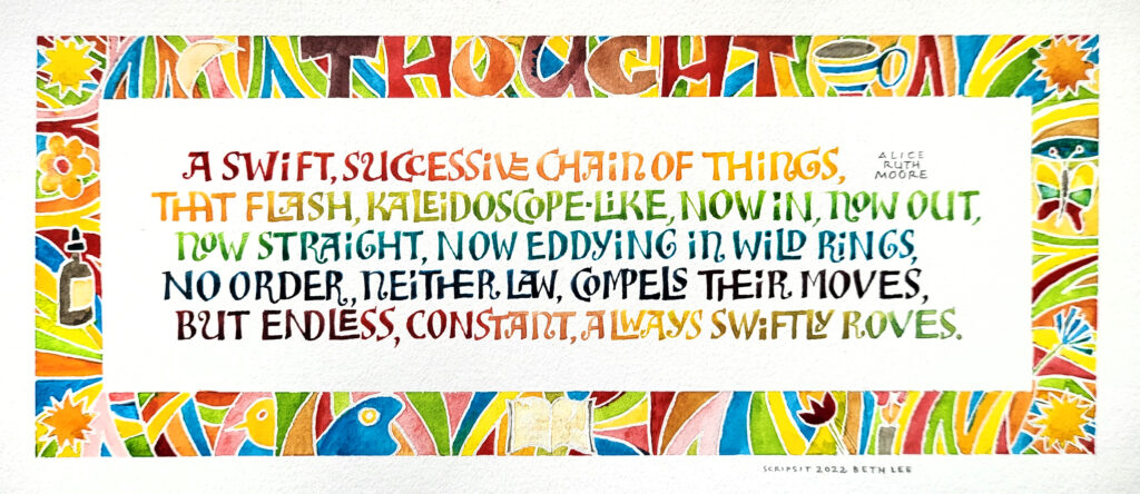
The text is from a poem titled “Impressions” by Alice Ruth Moore. This is the section subtitled Thought. The page design is done in the style of a page from the book *I Am Loved* that Bryan illustrated. Like Ashley Bryan, Moore used her art for social justice. I chose a Ben Shahn style of lettering because Bryan and Shahn led mostly parallel lives in the the social realism art genre, sometimes intersecting in the mural work on public buildings in the 1950s. (Bryan’s “Harpist” in this Tweet looks for all the world like a Ben Shahn drawing.)