H is for Hans-Joachim Burgert. Thanks to Brody Neuenschwander’s translation, we English-speaking calligraphers have access to Burgert’s book The Calligraphic Line. This book looks at calligraphy from the perspective of two-dimensional design, and primarily a line in two-dimensional design. But that description is limited; the book is much more. Burgert struggles with definitions of calligraphy. He applies formal critique to calligraphy, setting it firmly in the modern art world. There is no similar book to be found, and I consider it to be part of the central canon of calligraphy literature.
As I wrote in today’s daily lettering, this book is one that I return to again and again, to learn from (and argue with) his critiques, and to re-ground my thinking about calligraphy.
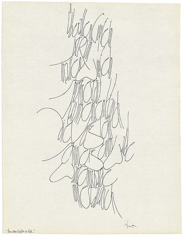
Over the years, I have studied the lettering in several of his pieces. This is the lettering I associate with him (found in this collection but not easily pointed to in situ).
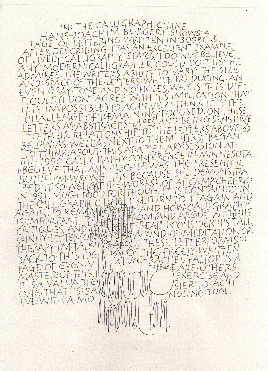
Today’s lettering is mostly freely made capitals written with a size 005 Zig Millennium marker on a 9″ x 12″ page. It is a response to a statement (or challenge) he makes about a piece of calligraphy written circa 300 BC. He admires the writer’s ability to write so freely and yet maintain an even texture and color, and he states,”I do not believe that any modern calligrapher could do this.” I tried it. Towards the bottom I quoted him one of his lettering styles which I’ve studied in the past. Click on the thumbnail for a larger view.