G is for Gail Rubini, who taught typography and print design at Florida State University when I was studying for my Fine Arts degree in Graphic Design.
 In one of the print design classes I developed a typeface, Split Uncial, scanning in letters made with the scroll end of a scroll-and-brush marker. Making the vector letters were easy, the kerning, not so much. Of course, it was just an exercise in how to design a typeface, not a finished typeface. Here are a couple of posters I made with my typeface.
Later, I collaborated with Gail’s team on an installation: My Alaska, Too. I programmed the six-screen interface which pulled in current images of Alaska from the Internet, looping and updating the feed at set intervals.
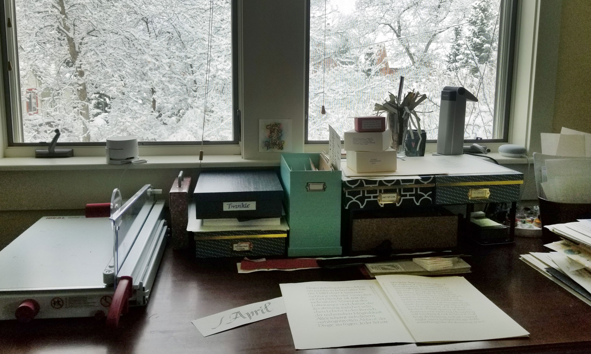
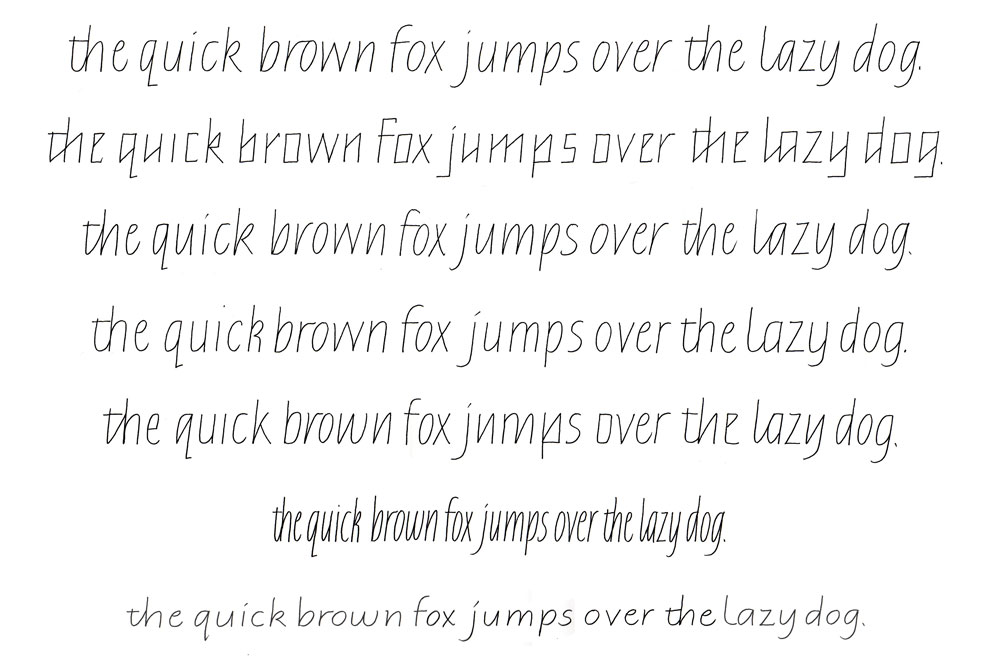 Today’s lettering was done in preparation for teaching a calligraphy class. These italic variations will be part of a handout to help students critique their practice lettering. Variations are as follows: standard italic, 5° slant; italic made up of straight lines to demonstrate both rhythmic underpinnings and the way that the oval is influenced by the stick; low-branching joins (from baseline; high from waistline); high-branching joins (from baseline; low from waistline); a demonstration of inconsistency in shape and branching, but not in width or spacing; condensed italic, half the width of the standard line; expanded italic, written at half the height of the standard line but keeping the width the same.