Brush lettering and studio organization

Today I spent an inordinate amount of time searching my studio for a set of color trials that I just know are in here somewhere. It’s so frustrating. I made glair, the book pages are ready, the copy-fitting has been worked out, and I’m ready to do it. I just don’t know what colors, exactly.
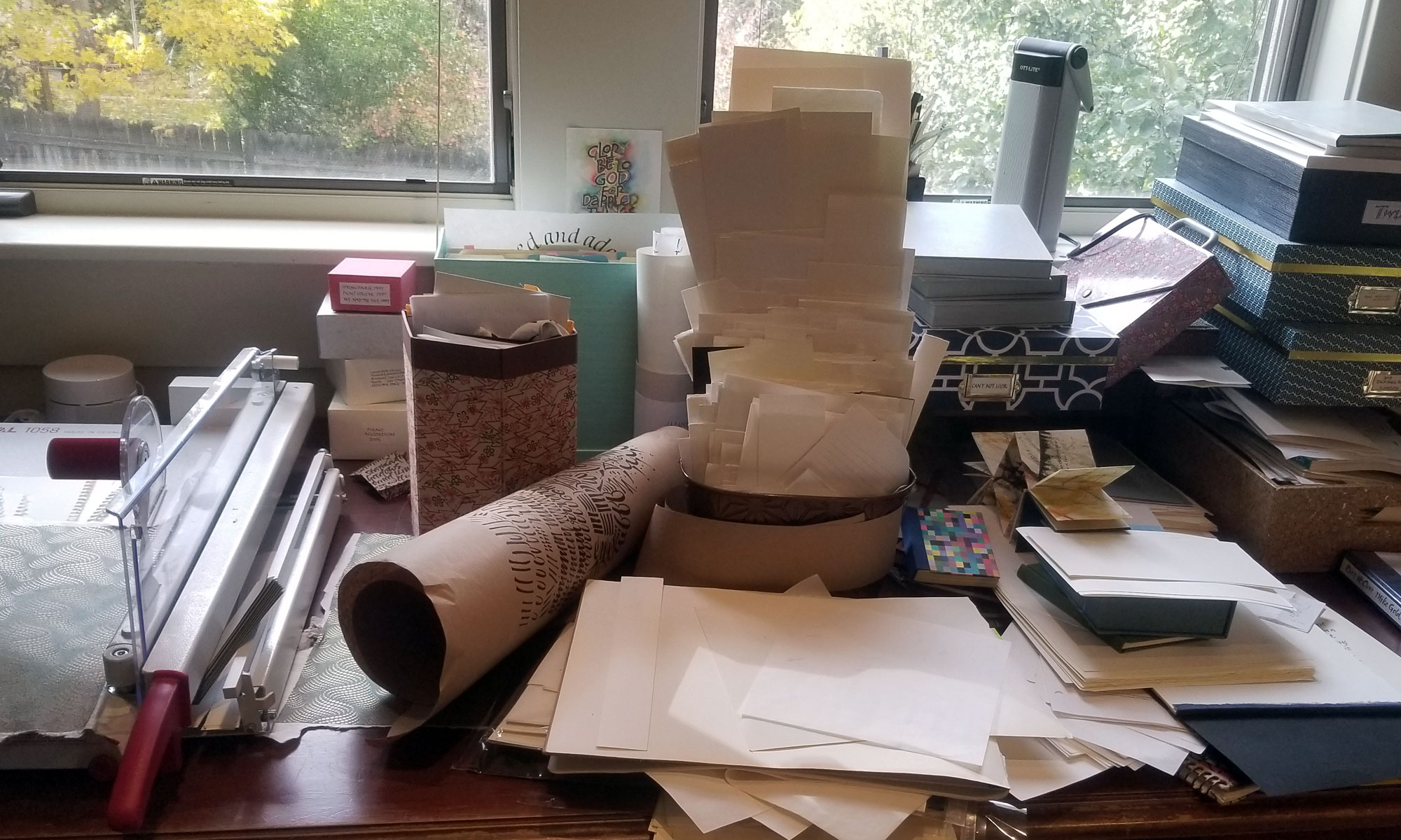
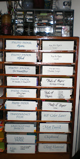
Towards the end of the day I cleaned out the right two columns of my post office boxes, taking the opportunity to practice some brush lettering on the labels. Okay, not exactly practice, but at least pick up the brush and do something with it. The “brush” was the other end of a Zig Scroll-and-Brush marker, or a Pentel color brush or a Copic brush. No guidelines, no do-overs, but it added a little fun to a tedious (and slightly alarming — how did all this stock accumulate?) chore.

Brush Lettering and Vacation

I just returned from a week or so in Oregon, where I took a 2-day brush lettering workshop with Carol DuBosch and then toured around Oregon.

As one calligrapher in a town which contains two (and, in the past 25 years, has never contained more than about five at any one time), it was simply amazing to me to sit in a classroom in a sold-out calligraphy workshop with 23 local calligraphy students. Sure, I’ve sat in a class of 20+ calligraphy students before, but they’ve always been a collection from around the state or around the country or even around the world — a Florida retreat, or a week at Camp Cheerio or a class at the annual international calligraphy conference. I had lunch with a pediatrician who was taking this annual brush lettering workshop for the second time; she has taken weekly calligraphy lessons for several years (ten? or was that someone else in the workshop?). Imagine. I’ve had exactly one opportunity to take weekly calligraphy lessons, and that was in 1988-89. And then Beth McKee, my first long-term calligraphy teacher, who had arrived from Ottawa to spend the school year here, took off for Bangladesh, and that was that. From then on out — except for a year of 2-day class meetings to which I drove 3 hours each way each month — my education has been a series of trips to learn from quite famous calligraphy teachers for a week here and a week there.

My education compares to the education of Portland students as an annual gourmet meal compares to weekly community potluck. My meals may be exotic and glamorous, but theirs have been healthier, more regular and filling. Not that I’m knocking my exotic, glamorous meals. Still.

Work in progress/regress/progress

It’s been very, very hectic here. This semester I’m taking Figure Drawing and LoFi Video. Both fun, but the scheduled is doubled up, so it will be a sprint for the next 5 weeks.

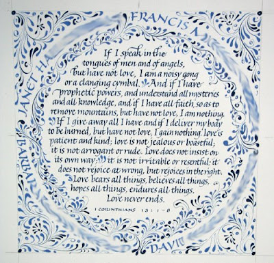
This piece (detail doesn’t include personalization stuff at the bottom) is almost finished. Frustratingly, I discovered that the last name of two of the parents (shown here blurred around the circle) was misspelled as sent to me. Aargh. I’m waiting for an absolutely completely dry correction and the intestinal fortitude to take the knife to it.

Web Design project

We’re starting an interesting project in my web design class. Groups of 4 people get together and agree on a basic narrative story and then each contribute 5 images that connect to the story. Then each person creates a website using the narrative and at least 1 image from each person in the group.

Our group narrative includes the following elements:

  • going to sleep;
  • a forest setting;
  • a fish named Lord Elric and a turtle named Sam, recurring characters;
  • being sent on a quest;
  • eat something, get special powers;
  • a monster or impossible situation;
  • wake up, write dream down, link to other narratives.

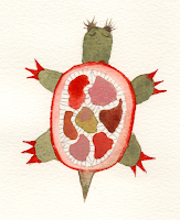
Here are 4 of the images I’m sharing. I have no idea what the others will contribute; I hope these will work. The lettering looks so much better than it would have before I’d worked with lettering in Illustrator. I’m pleased with it.

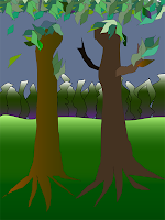
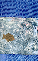
This last image is my very first attempt (well, 2nd, but I had to trash the first one because of a basic minunderstanding about paths) to make a drawing in Adobe Illustrator. I’ve done quite a lot now with type and converted images, but had never started from scratch to make an image in Illustrator. It’s a weird result, but I’m pleased that I was actually able to accomplish it.
As usual, click on the thumbnails for a closer view.

January 31 — camera-ready invitation

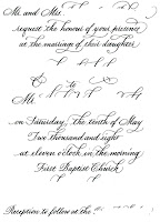
Well, this is work, but it’s also creative. I’ve been working on this camera-ready invitation for awhile now, and the time had come to finish it up, call it done, and send it in. So I did. And I’m much happier with it than I thought I’d be when I was working on it. I don’t have a lot of confidence in my pointed pen work, and swashes are for the very experienced penman only. Well, I’m experienced. And when I compare this to some of the swashed pointed pen invitations I see, I’m brilliant. And then I compare this to the work of our present-day master penman, and … well, that’s the way of the world now, isn’t it?

In today’s global village it isn’t possible fool oneself into thinking one is the best. On the other hand, we all have instant access to the very best models, which wasn’t possible until the Internet.

January 29 – Thoreau redux

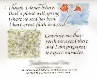
All right, here it is with the missing word and comma, and the last word corrected. (As usual, you can click on the thumbnail for a closer look.) I like it much better than yesterday’s attempt. I tightened the line spacing in the main text area, which made the quotation block hang together better and allowed more space for the bottom text to sit in its own space. I also did the names at the bottom smaller (which you can’t see, since I blurred them) and more condensed to make a more identifiable contrast between that and the quotation. And then I changed the flower to grow from the second half of the text rather than the first, so that each watercolor block is now connected to a block of text, rather than having both watercolor blocks connected to the first half of the text, and the second half of the text connected to … nothing. And besides the fact the flowers now able to grow more vertically, the main flower points back into the text rather than pointing out of the frame. Now all I’ve got to do is find a place to write the attribution (maybe in the grass?) and pop it in the mat.

January 28 — Thoreau quotation

This Thoreau quotation was commissioned as a wedding gift. So I’ve blurred out the names and date. I like the quote, and I think I like what I’ve done with it. I’ll have to look at it awhile before I’m sure. The paper is Arches 70# hot-pressed watercolor paper. I don’t know why the scan resulted in seemingly gray paper behind the bottom half of the quotation. And now I realize that I’m going to have to re-do it. The last word should be “wonders”, not miracles. Oh well, it’s a good first draft. I have a few things I want to change anyway.

January 24 — Handwriting, continued

On January 24, I continued my survey of handwriting, this time a survey of my current handwriting with variations in spacing and writing utensils.

I’ve currently got two large chunks of work — 450 certificates, 400 wedding invitations — and this little divertissement was just what the doctor ordered.

January 23 – National Handwriting Day

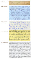
In honor of National Handwriting Day, I’ve gone through various boxes of memorabilia to create a survey of my handwriting throughout the various stages of my life. I’m amused.

I like to say that I got into calligraphy out of sheer stubbornness: In elementary school the only subject in which I couldn’t get an A was … handwriting. I’ve been working on it ever since.

If you click on the thumbnail at left you’ll see my handwriting at 5-1/2, 11, 16, 24, and 42. The big gap in there could possibly be filled only by locating the children’s artwork with my explanatory labels on it; the years of rearing young children evidently didn’t provide much free time for longhand.

Journal – January 22

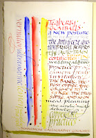
I’ve got so much work at present, it’s a pleasure to sit down and mix paints and doodle in my journal. I’m into the second signature of the journal. When I get a sufficient number of signatures done, I’ll bind them. I’m looking forward to it.

Schmincke Calligraphy Gouaches are a real pleasure to letter with. These are three of the six colors I most often work with: vermilion red, ultramarine deep, and lemon yellow.