Day 2: Design Something Every Day. A minimalist C — first one off this morning. The ink didn’t penetrate the inner tines of the Stimudent pack, and I knew I wouldn’t be able to duplicate it for the next 30 letters or so. So this is it.
Stick-and-Band Books + Bookmarks + Lettering

A couple of weeks back, I made some stick-and-band books and some bookmarks for a tiny little crafts fair. I took pictures of the lot of them, but discovered later that the card wasn’t in the camera. Here’s a photo of the one remaining book (+ a cover that I changed out for a customer), some of the bookmarks, and some lettering I did in preparation for making collage greeting cards. I never got around to making the greeting cards, though. Maybe some day.
“Old age and treachery will overcome youth and skill.”
I think this is a good quote for a birthday card. Speaking of which, I’m planning to be a lot better about sending out birthday cards this year. (It wouldn’t take much to be a lot better!) Now I’ve got a good reason to finish the greeting cards.
P.S. I meant to mention that I was reminded of this stick-and-band structure by this post on Pam Sussman’s blog.
Day 2: DSED
Day 2: Design Something Every Day. I’m continuing in the Stimudent vein for awhile.

Design Something Every Day – Circadian Characters
Happy New Year! This year I’m taking on the challenge of Smashing Magazine to Design Something Every Day.
My plan, dubbed “Circadian Characters,” is to create and blog a letter a day. The theme for the first 26 letters, at least, is “Wood.” Here’s the first Character of the New Year, done with a pack of flat wooden toothpicks (Stimudents):
Exchange envelopes: catching up

With all the chaos here, I had gotten behind in my exchange envelope commitments. Not anymore. I’m all caught up … until July 1. In keeping with these hard economic times, the theme for these is Frugality. Recycled envelopes, a dried-up Zig calligraphy marker, and a re-purposed Zig Millennium mark cut to a chisel edge with an X-acto blade.
The envelopes frame a bit of doodling. I don’t know what to do with it, so it just sits on the table reproaching me for my indecisiveness.
As usual, click on the image to get a closer look.
Print Design — a double spread

Click on the thumbnail above for a larger image.
Some fun with type punched out over a pasted-painted background, and hand lettering over a wall of Velvenda Cooler type, done for Print Design class. The quotation is from Henry Adams. I’m working toward integrating hand lettering with type. “Toward” being the operative word here. The print version of this has better contrast, by the way, and at 11″ x 17″ the background type on the right was a more noticeable and readable list of adjectives.
Time across two pages
 This two-page spread (click on the thumbnail picture for a full-size image) was created for the centerfold of a 12-page book designed in typography class this past semester. These were the only pages that had no photographic images, and my aim was to try to synthesize my experience of lettering into a modern piece that would work as hand lettering in a typography setting. I don’t know that I succeeded, but the experiment was interesting. All of the quotations in this piece revolve around the theme of the book: time.
When I was in high school, well before I took up lettering (or maybe not, now that I think about it!), I made these elaborate doodles I called “scribbles”, which relied more on color for their design. Looking back through this blog, I see that I’ve never posted one of those, although I still have several of those early scribbles. I’ll plan to do that sometime.
Postage stamps by type designers
 Kat Ran Press has a display of stamps designed by type designers. The list includes such luminaries as Hermann Zapf, Adrian Frutiger, and Eric Gill, and even reaches back to Peter Behrens and W.A. Dwiggins.
I’m showing Julian Waters‘ stamp lettering here in honor of Veteran’s Day. Besides being a great type designer, Julian is a brilliant calligrapher. His childhood was filled with calligraphy on his mother’s side and book conservation on his father’s side. Boy, do I envy him that. (He envies me my childhood piano lessons, but really, I just don’t think they begin to compare.)
via zeldman.com
De Stijl and random lettering

The current assignment in History & Theory of Graphic Design is this: Design a deck of playing cards, or a chess set, in the graphic design period of our choosing. Assuming I choose De Stijl as my period, these are elements of my design at the left. The card denominations will be rendered in this “font” made by creating a 5×9 black-block grid (+1 for the tail of the Q) and subtracting blocks from it for each character.
Following are the four suits:
1 – Van Doesburg
2 – Mondrian
3 – Van der Leck
4 – Huszar (not completed yet)
It’s a whole lotta square.
Edited to add: Looking at this post I realize I’m missing an A for Ace. It’s the zero in the Roman numerals of cards, I guess.
 Here’s a bit of an antidote to all that square. A somewhat random image, I know, with stream-of-consciousness text, but randomness and stream-of-conscious are just what’s needed after a bout with De Stijl.
I broke out the pen and ink this morning. This nib was on its last legs but I only had three lines of sample lettering to send via email to a client, so I powered through.
Later I went back to the drawing table for the somewhat unfamiliar pleasure of lettering, and to convince myself to throw the nib away. I’m convinced.
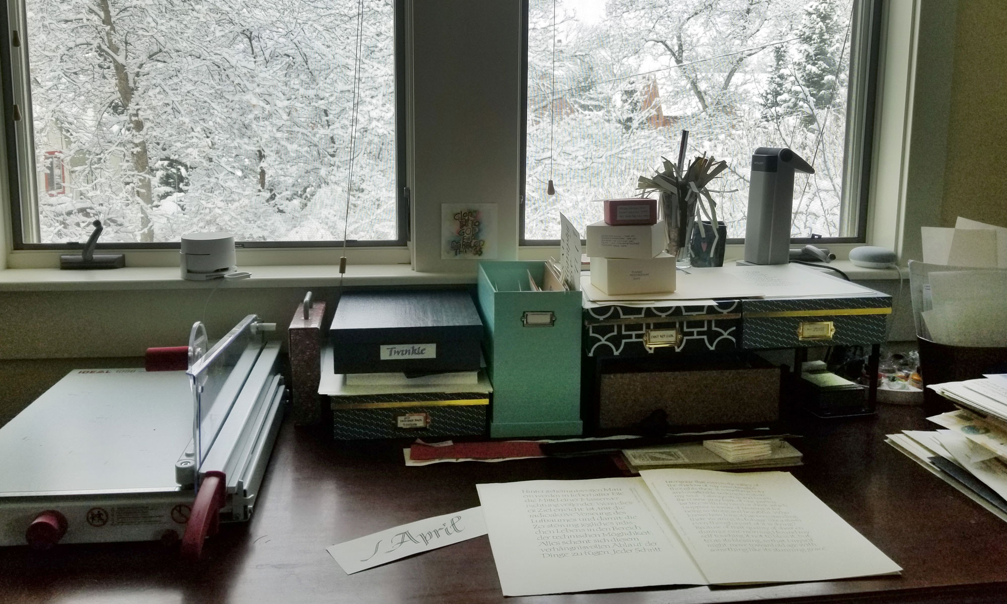
Just some experimental writing
 Not much to show lately. It’s all been either wedding invitation addresses or learning software or typographic exercises.
I recently addressed 75 envelopes made of handmade paper that seems to have been abandoned at the pulp stage. Throughout the work, my thoughts kept circling around to how many decades of experience it’s taken for me to arrive at the point where I could actually letter on such a surface. But a blog post can’t really illuminate that particular battle.
I could show you my really lame 1st video in Final Cut, but really, why would you want to see it? In short, I made a vector-art flowerpot pretend-water three pen-drawn flowers so that they grow. It’s a steep learning curve, and I’m slow.
The typographic exercises are nothing to write home (or here) about. During the last exercise I kept thinking how much easier it would be to hand letter. Maybe I’ll do a comparison in another post.
Shown here is something I did last night during a telephone meeting, when my hand was mostly disengaged from the brain. The pen is a Speedball nib and the Schmincke gouache was left over from drawing the flowers for the Final Cut project …