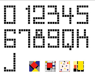
The current assignment in History & Theory of Graphic Design is this: Design a deck of playing cards, or a chess set, in the graphic design period of our choosing. Assuming I choose De Stijl as my period, these are elements of my design at the left. The card denominations will be rendered in this “font” made by creating a 5×9 black-block grid (+1 for the tail of the Q) and subtracting blocks from it for each character.
Following are the four suits:
1 – Van Doesburg
2 – Mondrian
3 – Van der Leck
4 – Huszar (not completed yet)
It’s a whole lotta square.
Edited to add: Looking at this post I realize I’m missing an A for Ace. It’s the zero in the Roman numerals of cards, I guess.
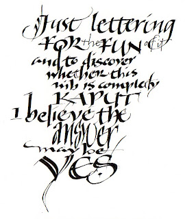
 Here’s a bit of an antidote to all that square. A somewhat random image, I know, with stream-of-consciousness text, but randomness and stream-of-conscious are just what’s needed after a bout with De Stijl.
I broke out the pen and ink this morning. This nib was on its last legs but I only had three lines of sample lettering to send via email to a client, so I powered through.
Later I went back to the drawing table for the somewhat unfamiliar pleasure of lettering, and to convince myself to throw the nib away. I’m convinced.

