I had a wonderful time last weekend teaching my workshop, “Capitals as Text & Tiny Paintings as Graphical Elements,” to my own state guild. We had a good time studying a fragment of this 5th-century manuscript book written in square capitals (see this earlier post), improving our tiny nibs, making tiny broad-edge nibs from pointed nibs, and getting into the weeds with pens, gouache, and paper. It is nourishing to be among friends who share our love of all things alphabetic!
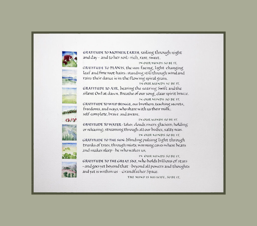
Mohawk prayer made in celebration of Earth Day. 6″ x 6.5″ content area.
The workshop name is problematic: “Capitals as Text & Tiny Paintings as Graphical Elements,” “Tiny Capitals & Tiny Painting,” “Small Capitals & Landscapes” — perhaps some day I’ll settle on a cogently brief name.
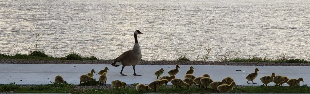
This is only the second workshop our state guild has hosted since the pandemic, and it was so good to be together again. Many thanks to my friend Mary Jo who put me up in her lovely house. I’m amazed at what a stellar job she and Ruth did in organizing the workshop. (AND we got to see baby geese!)
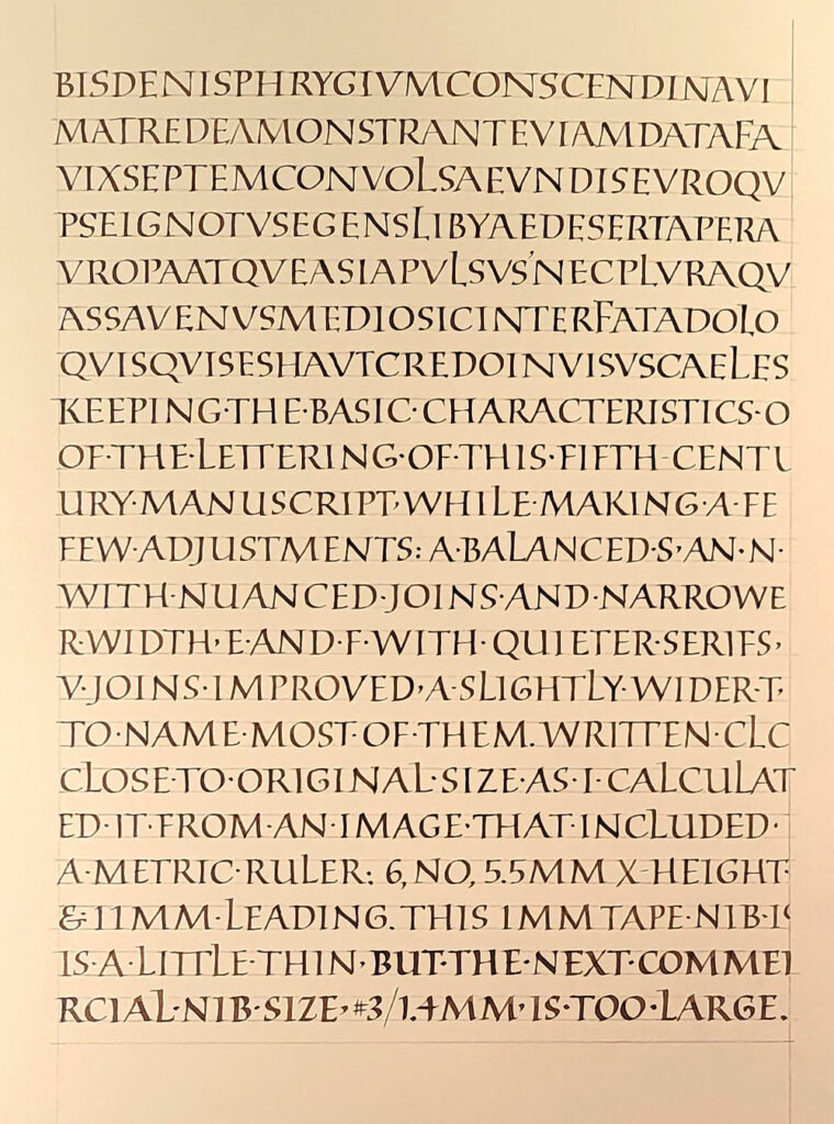
The first 7 lines are a fairly close copy of the manuscript page. After that, I began making adjustments. Walnut ink and 1mm Tape nib on Strathmore Drawing 400. Yeah, it’s a horrible photograph. I may try again in daylight.
Square capitals
I have become particularly interested in capitals as a text hand. If you read this blog regularly, you may have noticed that I have long been drawn to capitals as a way to create texture on a page. (See this post and this one and this one. ) And square capitals are one of the styles of capitals that are found as a text hand in historical manuscripts.
I first began teaching the class, “Capitals as Text & Tiny Paintings as Graphical Elements” at the end of 2020. (See this blog post for more information.) I was able to organize my thinking about capitals as a text hand when I took an inspiring class with John Stevens in early 2021.
Then I took a really interesting class with Ewan Clayton in October and November. Six hour-long lectures traced the development of capital letters from the beginning of writing to contemporary times, and they were jam-packed with examples and information. And I mean jam-packed: there were sometime more than a hundred images covered in an hour!
Historical manuscripts
During the course of that survey of capitals square capitals caught my attention. They are found in only two historical manuscripts (that we know of so far), but it is thought that this hand was used in many more documents that have since been lost. One of the two manuscripts is Vergilius Augusteus, written around the 4th century, and only seven leaves survive. I found an image of page ruler (https://digi.vatlib.it/view/MSS_Vat.lat.3256), which enabled me to figure that the original letters on that page had been written at 5.6 – 6.0 mm high, and that the distance from the first baseline to the last was 200mm. When I divided by 18 lines, I got a line leading measurement of 11 mm. The calculations gave me my guidelines.
Codex Sangallensis 1394, written in the 5th century, is the only other extant example of square capitals as a manuscript hand. Only eleven leaves — partial leaves, really — survive. You can see them here: https://fragmentarium.ms/overview/F-r237
I began this page in my daily journal by copying the first seven lines of this page as closely as possible: https://fragmentarium.ms/view/page/F-r237/6/103 and then began to make adjustment for quirks that I wanted to leave out. I’ll keep working for another few pages, at least.
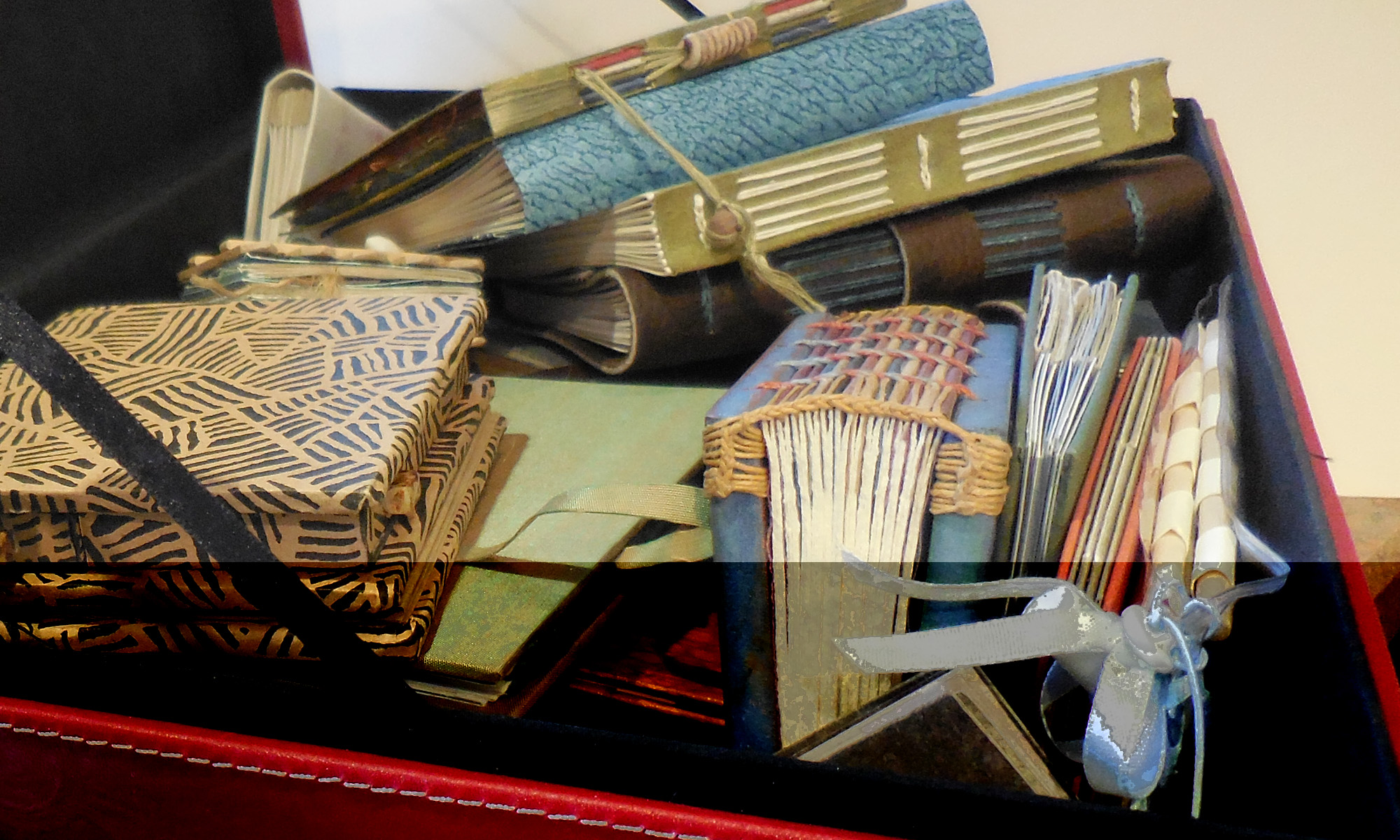
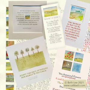
Various examples of work that pairs small capitals as a text hand with small painted landscapes.
About this workshop: The idea of monumental Roman capitals is intimidating for many calligraphers. But making and arranging small capitals on a page can help us to connect with the fun of lettering while focusing on some basic design principles.
Great for beginners and the experienced letterer alike, this workshop explores the use of text capitals and creation of texture in our texts. We’ll do this with small broad-edged and pointed pens through the manipulation of letter spacing, color changes, and other design decisions. We’ll also examine how the act of writing creates rhythm and movement. In the second session, we’ll create tiny painted landscapes as a graphic element. And we’ll make them meld beautifully with our texts through the magic of color theory.
Depending on the length of the workshop, some of the following topics also covered include optimizing our working space, tools, and materials; developing layout options, including a variety of strategies for planning and making guidelines; painting and color theory.
I have now taught this workshop several times through various calligraphy guilds, and will teach it at least three more times in February and March. I have developed this workshop to work in several formats:
a two-session workshop, two hours per session one week apart
a three-session workshop, two hours per session one week apart
a two-day in-person workshop
If your guild is interested in hosting this workshop, let me know.