The first prompt of the year in our FB group is “Clean Slate”. I like the idea of a clean slate, but I’m not so sure I believe in ’em. A well-scraped palimpsets, maybe: they’re way more interesting, anyway.
Calligraphy & more — the studio of Beth Lee, Redmond, WA
The first prompt of the year in our FB group is “Clean Slate”. I like the idea of a clean slate, but I’m not so sure I believe in ’em. A well-scraped palimpsets, maybe: they’re way more interesting, anyway.
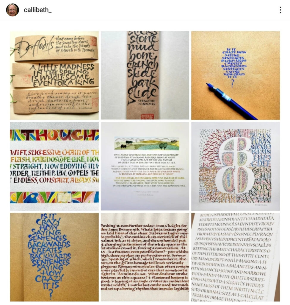
Here are my nine most popular posts on Instagram in 2022. The app tells me that I had 2.6K likes in 2022 on a total of 24 posts. Gives me a warm, fuzzy feeling 🙂
Some of these images I’ve posted on this blog. You can get a better look at the bottom right one here (my second blog post of the year). And two weathergram images are the subject of this blog post in March. And this March blog post show the Ben Shahn lettering of the middle left image.
I evidently didn’t look for my top nine in 2021, but you can see my top nine in 2020 here on Instagram. In some ways, it’s a very different look. Oh, I’ll just put them here, so you can see them on the same page.
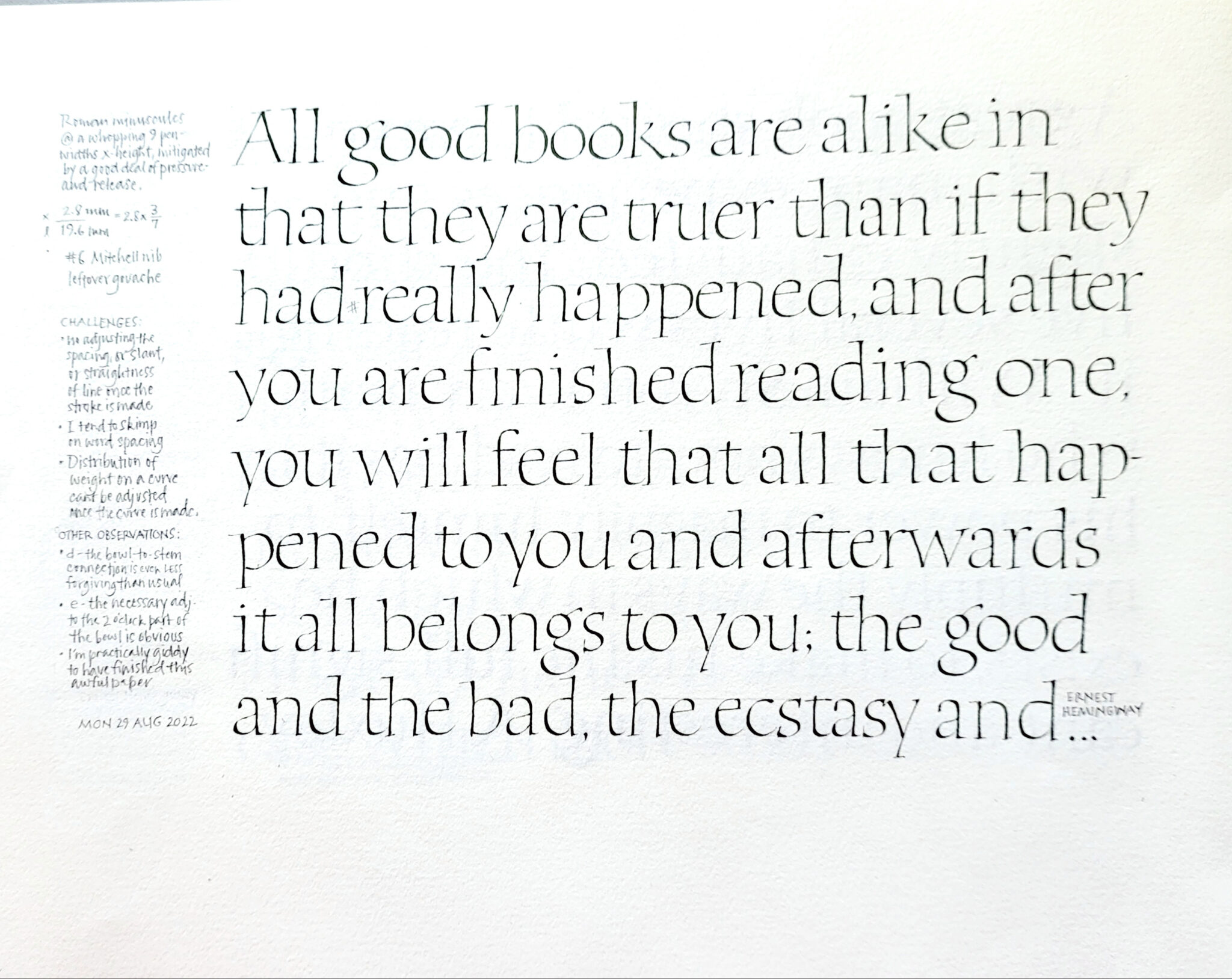
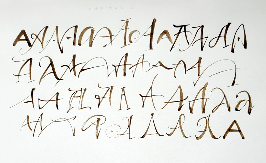
I can’t believe it’s been so long since I posted anything at all! Life has been jammed up with political things (my husband’s re-election campaign, for instance), and I’m finally getting a chance to begin to catch up and take a deep breath. I’ve gotten back to Roman text capitals, which don’t want to let me go.
I’ve also been teaching more. Last month I taught a two-day workshop on Roman text capitals, color, painting and design to a delightful group of calligraphers in Albuquerque. Every time I teach this workshop, it evolves some more. (You may remember this blog post about my study of 6th century square capitals.)
Here is one of the samples I brought along to the workshop this time.
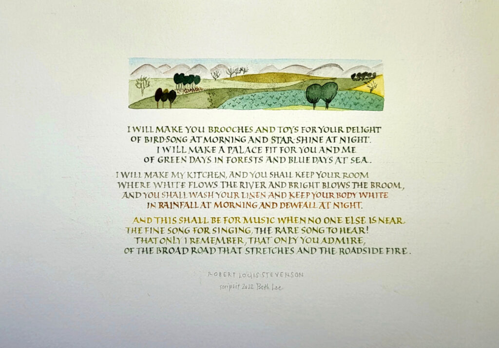
I can never see this poem without hearing in my head the Ralph Vaughn Williams setting of it. I’ve played the piano accompanied for many a baritone student at the university. You can hear Bryn Terfel sing it here. The entire song cycle is pretty wonderful.
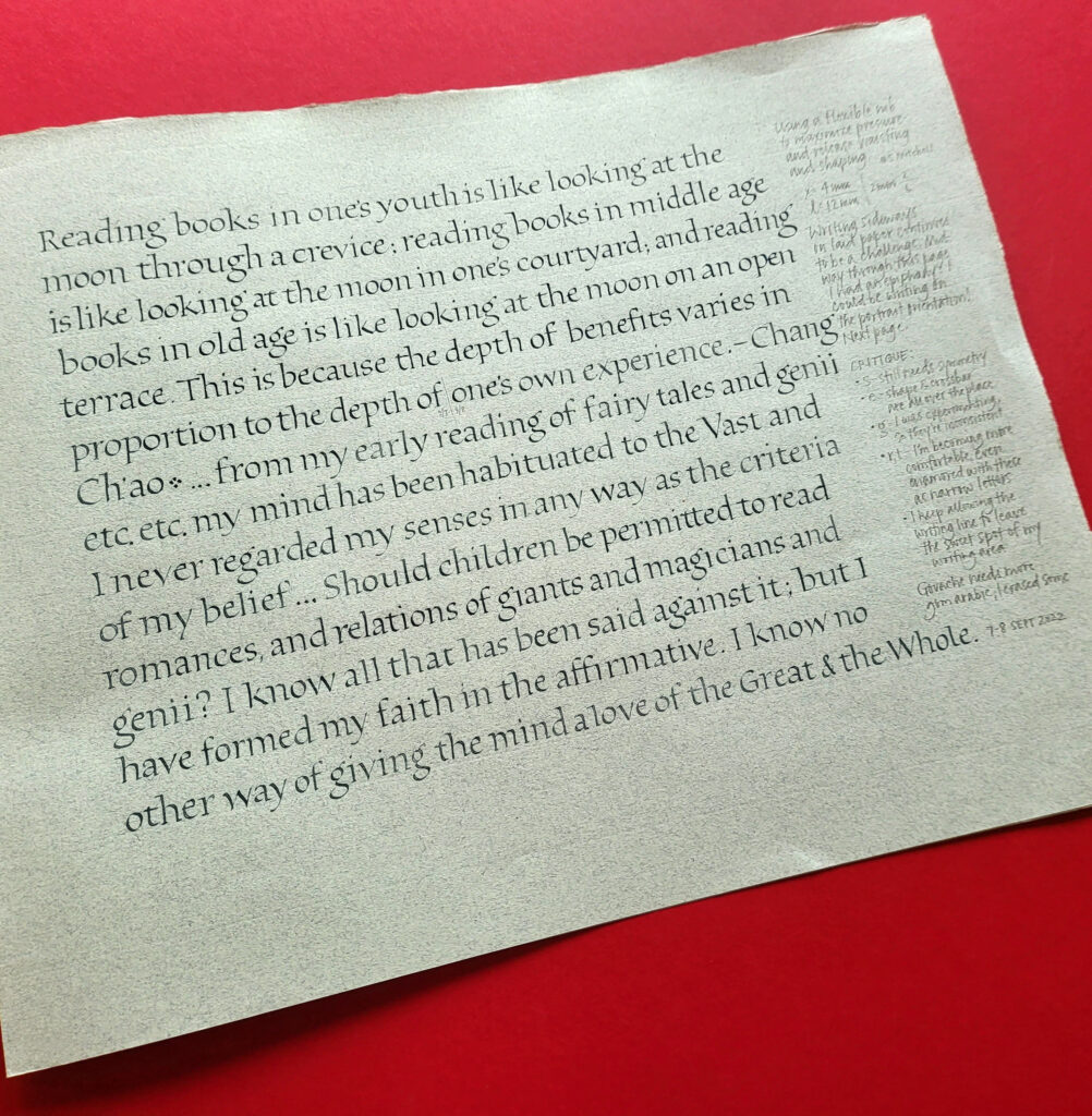
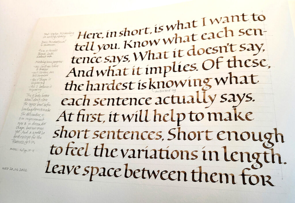
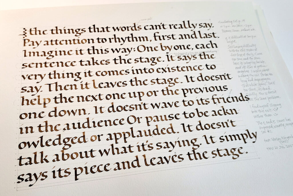
I’m up to page 37 in my Roman minuscules practice journal. It’s strange how you begin to think you’ve run out of what to do next, and then suddenly more possibilities appear, and more, and more … I’ve become absorbed in the process, and I have ideas for another 37 pages, at least.
Since mid-July, I’ve been steadily building a journal of Roman minuscules practice. This is today’s work: page 36, towards the end of my 3rd section. I’ll be happy to get off of this paper (Somerset Book?). And I’m looking forward to the Zerkall German Ingres that is the next folio.
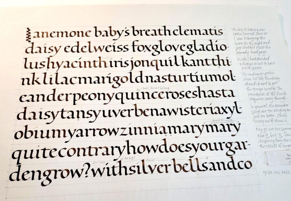
At this point I’ve worked my way through the entire copious batch of handouts from Elmo van Slingerland’s 3-week online class. I’ve been branching out in a couple of ways. For a few pages, I followed some experiments to their logical conclusion, changing up size and boldness and shape. I have a lot more to do there. But then I branched out another way, emulating some pages I had long admired by past masters.
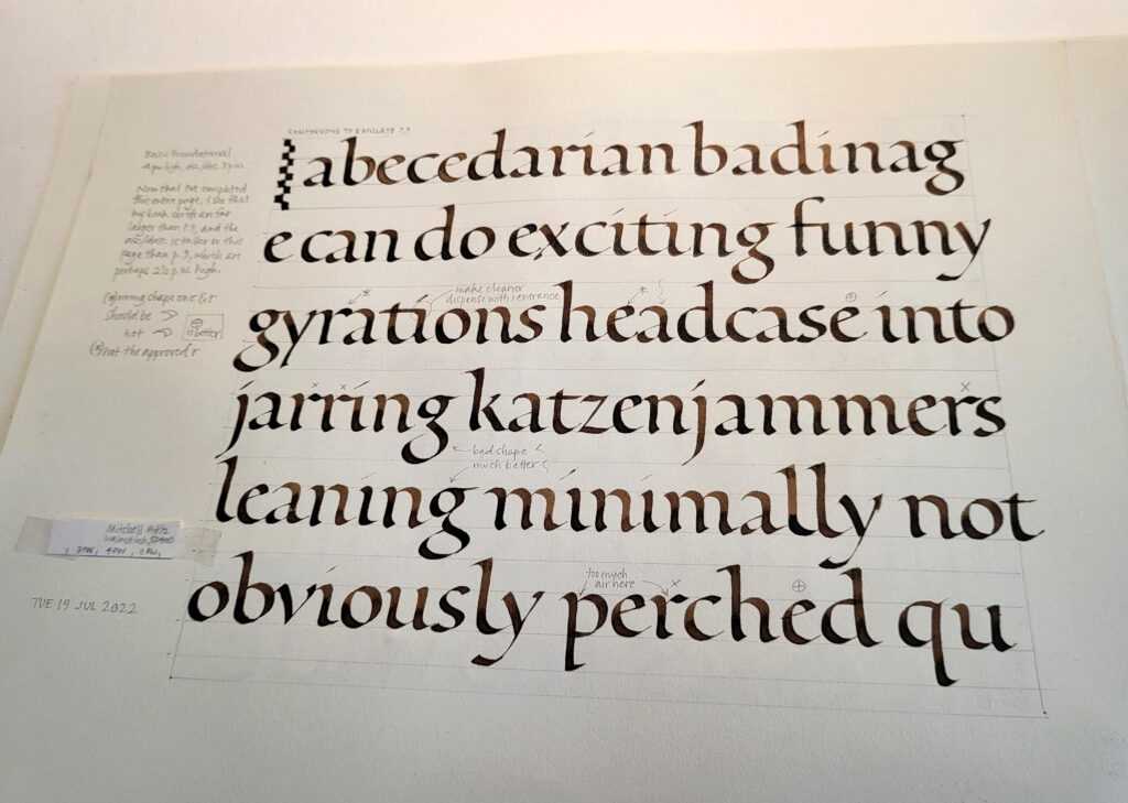
I had wandered into built-up pointed-pen Roman minuscules, thanks to a gorgeous page of those by Werner Schneider. (I don’t see it anywhere online, but trust me, it would blow you away.) They were a bear to do, and I actually had a little temper tantrum over them — rather out of character and most immature, but rather satisfying, in a way — before settling down to work on them seriously.
After the difficult work of building up monoline Roman minuscules, I took a break to do this page with a #6 Mitchell and pressure-and-release, curious to see whether I could approximate the general texture of the built-up monoline letters. The answer is: yes, sort of.
I believe I’ll repeat both the built-up pointed-pen and #6 Mitchell pressure-and-release experiments on the next two pages, if only to confirm for myself how much better life is on Zerkall German Ingres.
Elmo van Slingerland (@lettertetter) is coming to teach Roman minuscules in Montana this September, and I’m in! It’s time to get my Roman minuscules groove on. I’ve begun a practice journal of 9.5″ x 12″ Strathmore Drawing 400 sections. Here are some of the first pages.
A year and a half ago I took his Roman minuscules class through the Society of Scribes, and it was a wonderful opportunity to work on these hands. I’m looking forward to another round.
To anyone who reads my blog, it’s fairly obvious that I like Roman minuscules.
Mark Twain riffing on the Southern watermelon is one of my favorites. This is from his book Pudd’nhead Wilson. I have saved it since high school, I think, when I first read the book.
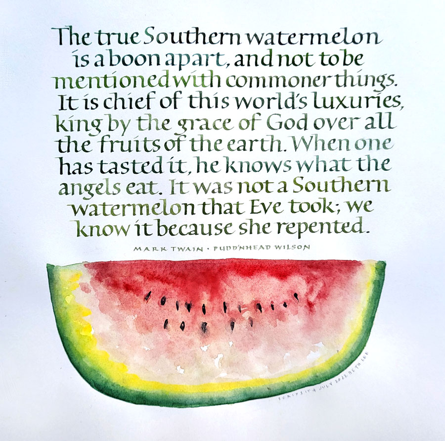
Pudd’nhead Wilson’s calendar entries are quoted at the top of each chapter, and some are quite harsh. Here’s one that I delighted in when I was young. “He is useless on top of the ground; he ought to be under it, inspiring the cabbages.” The book is a biting commentary on humanity, particularly the socio-racial times in which he lived. You can read it for free thanks to Gutenberg Press.
I haven’t done any watercolor in awhile, and am rather pleased with this simple watermelon. Yes, it’s lopsided, but then so are the best-tasting watermelons, in my experience.
I had some serious fun in a recent pointed-brush class with Yves Leterme this spring. Very serious. So often, classes in lettering concentrate on the individual letters, with some attention paid to letter- and word-spacing. These weird, wild letters needed attention and care, but the true challenge was in making them work together as a texture. This required some serious attention and difficult decisions. And this is work I need to be doing. So I will be continuing this for awhile.
If you want to check out work by others who took this class, search Instagram for #pointedbrushlettering. You can fairly easily tell which of those posts are related to Yves’ class.
This is the third online class I’ve taken with Yves. I took his class on Built-Up Capitals two years ago, which you may also remember from these posts here and here. I also took his Homegrown Trajans class four years ago, which was more serious fun.
His instruction is always interesting and his critiques are always helpful. I also like to look at his critiques of other students’ homework.
I believe I’ve mentioned before what a wonderful education venue Harvest provides as Acorn Arts.

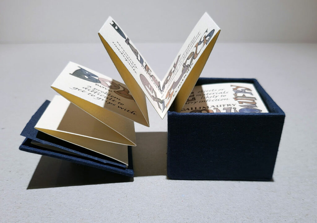
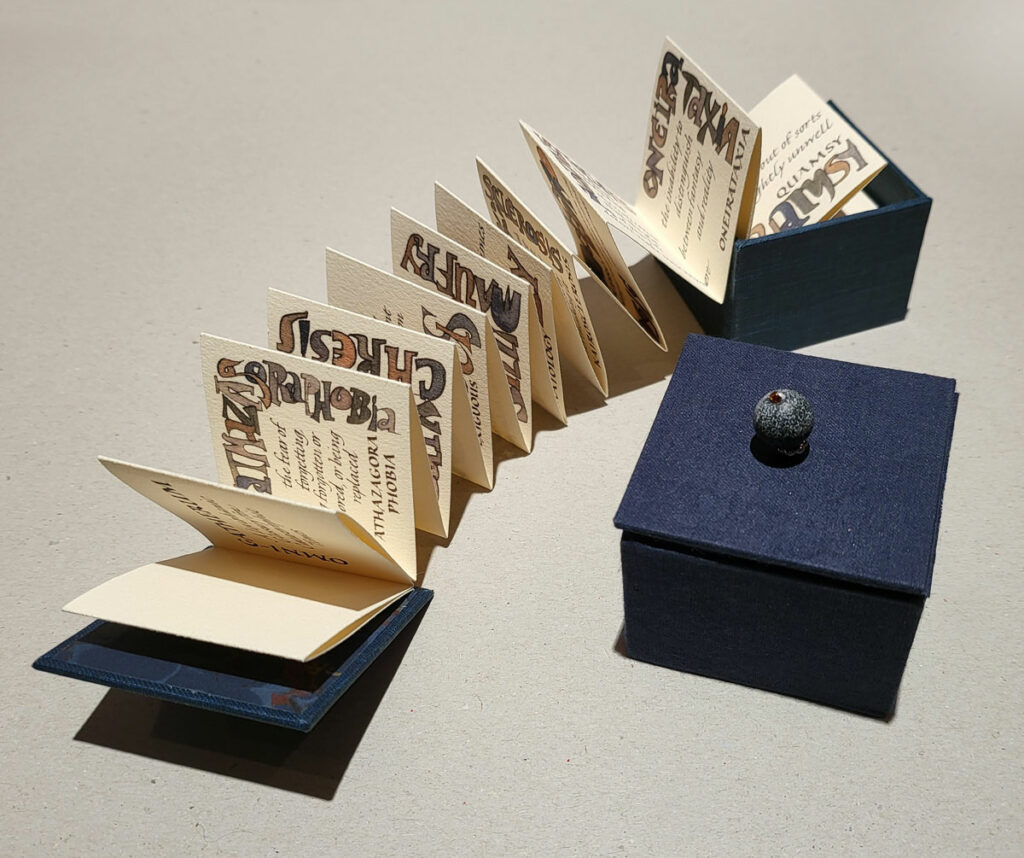
My latest artist book, Omnigatherum: A Lexiphanic Glossary for Catastrophic Times, continues my slight obsession with weird and wacky words. I’ve never posted photos of my latest artist book edition, completed December 2021. It’s time!
The text is a compendium of obscure words that each have a relationship to my experience of life during the pandemic. Many of these words are the ones I used last year in this broadside, which sold during the course of my solo exhibition in Missoula.
The box lid serves as a front cover for this inkjet-printed accordion that emerges and keeps emerging, for something like six feet of length, 2 inches at a time. The enclosing box is just 2 in x 2 in x 2in. Cloth-covered boards make up the box, and the accordion fold is giclee printed on Arches Text Laid paper. A stone bead serves as the handle on the box.
There are currently three books remaining in the edition. You can purchase one here.
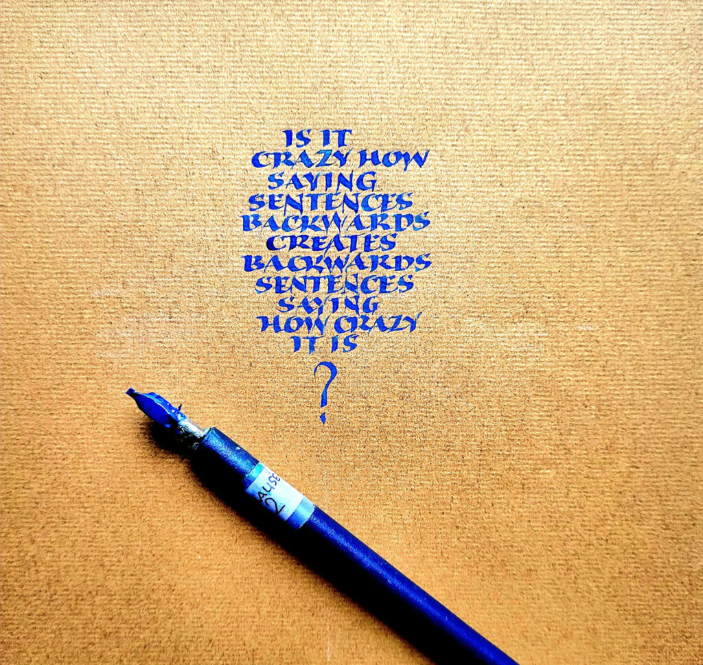
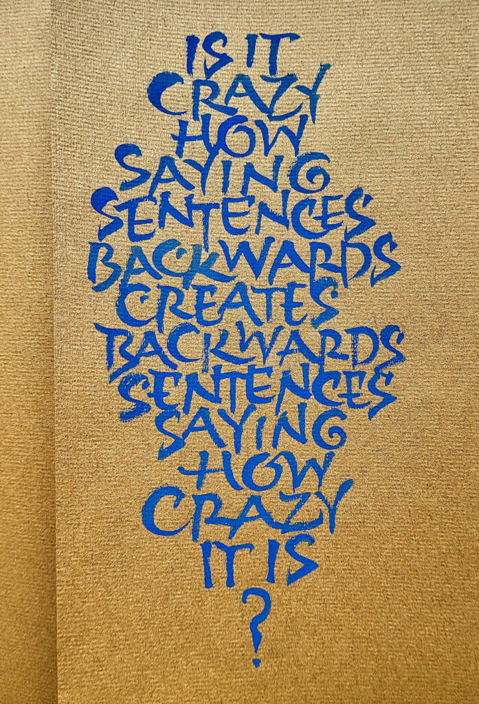
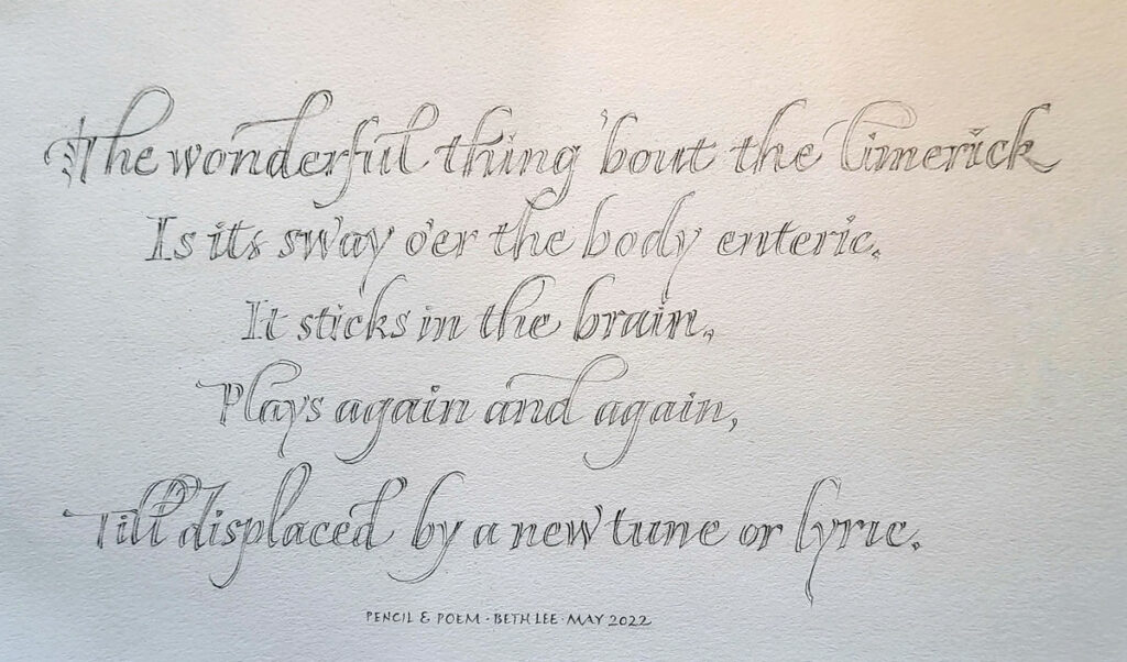
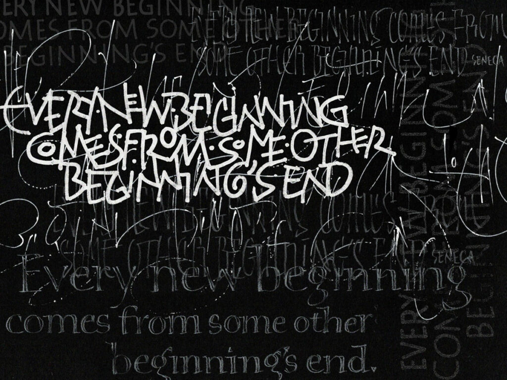
It’s been awhile! I didn’t realize how long. A road trip, a dead laptop, extensive house repairs … how the time flies. I have managed to get some calligraphy work done in those tiny cracks of time available. Here are few responses to a couple of the weekly prompts in an online calligraphy group: