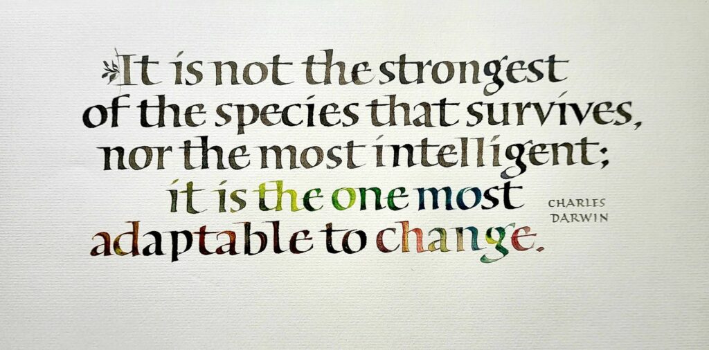
Roman minuscules done in gouache with a 3mm Brause pen on Arches Text Laid. Text area 10 x 4 in.
I lettered this quotation by Charles Darwin on adaptability in Roman minuscules fairly quickly. There wasn’t much time for lettering this week.
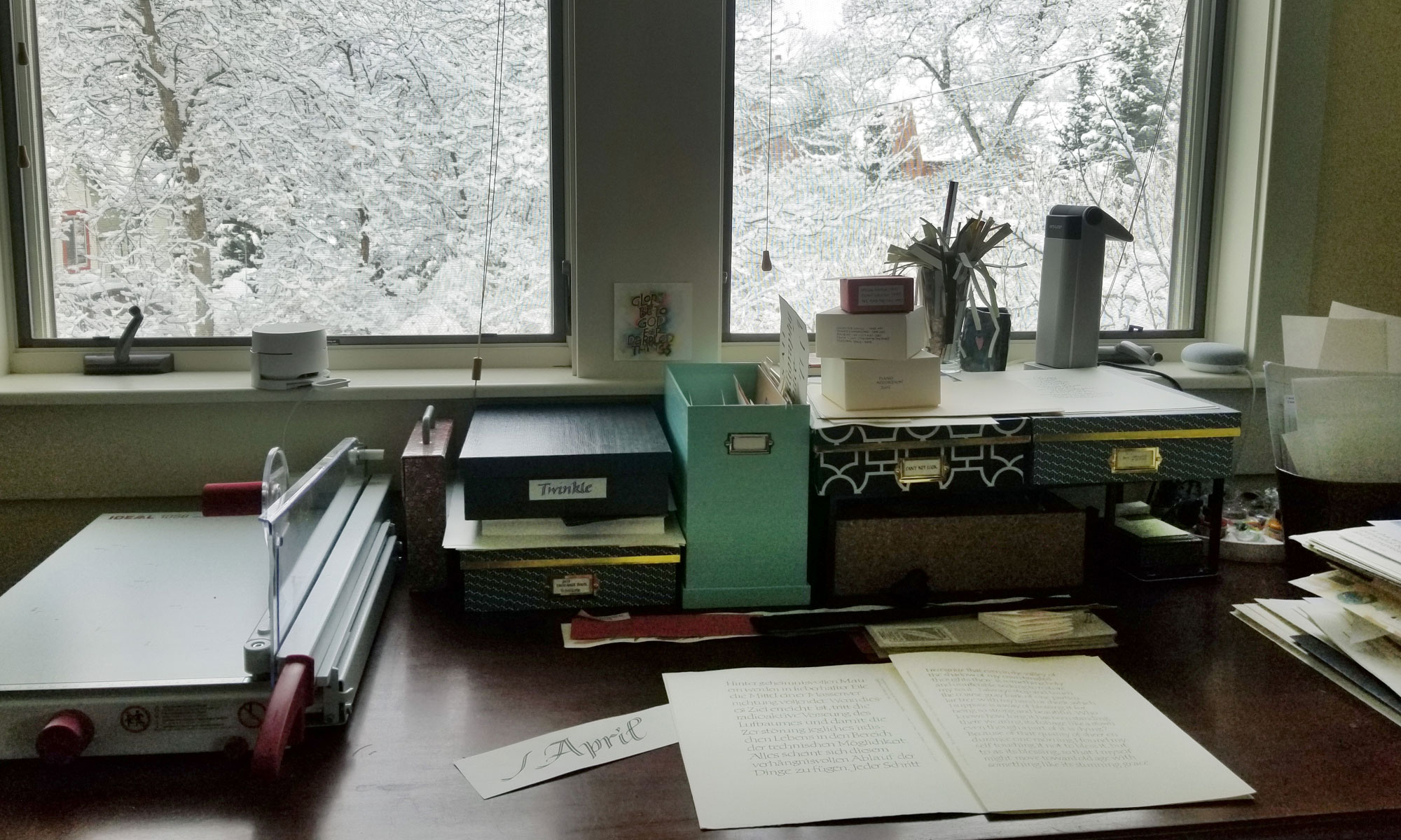
I don’t have much to show for what I did do this past week. The 6-pound beef brisket cooked in 7 pounds of caramelized onions and the even larger quantity of spring vegetables are mostly gone. I didn’t even take a photo, even though it was gorgeous. Our fellow diners brought even more delicious things, and it’s been some time since I’ve eaten so well!
Regardless of the text shown above, this annual meal has not changed since 1995. That’s a good thing, too.
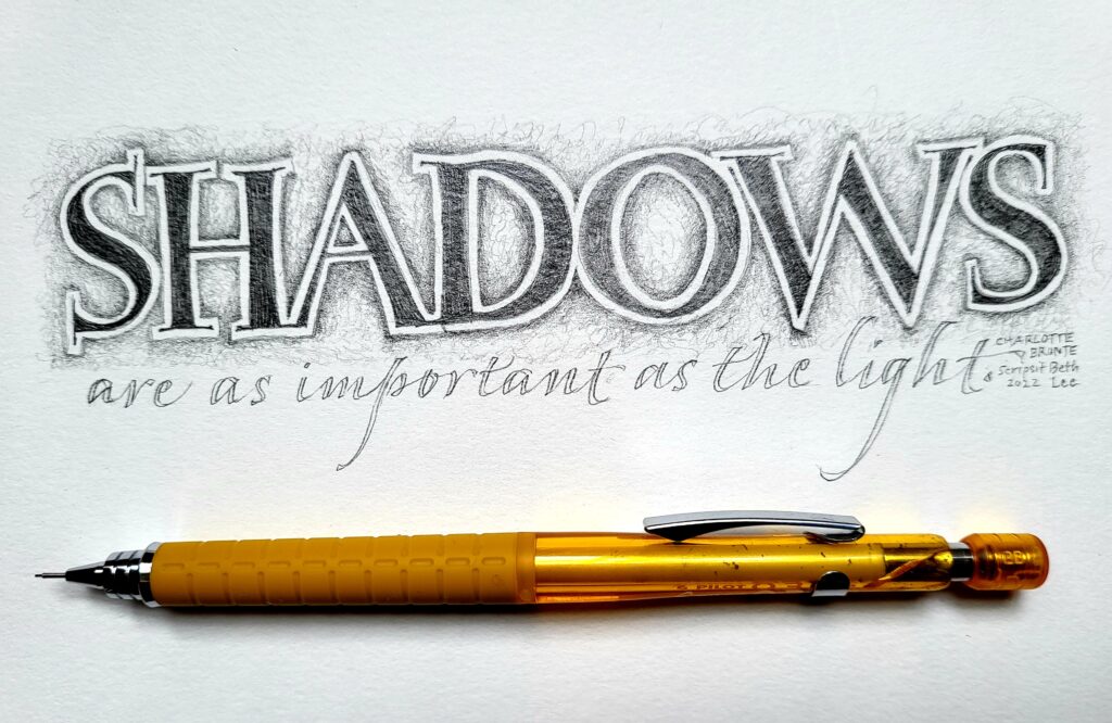
Blackwing pencil, lettering about 9 in wide, on mystery watercolor paper.
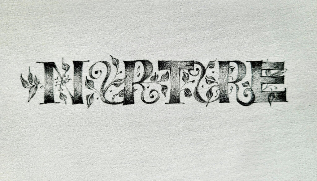
The Ben Shahn lettering continues! In a private Facebook group, the weekly prompt was “one word”. I chose “Nurture”. And because I have just finished teaching two online workshops titled “Ben Shahn-ish”, those letter forms are on the mind and in the hand.
This is not my first post about Ben Shahn-ish letters. You can read more here.
Palomino Blackwing pencil (black) on drawing paper. Text is 9 in wide.
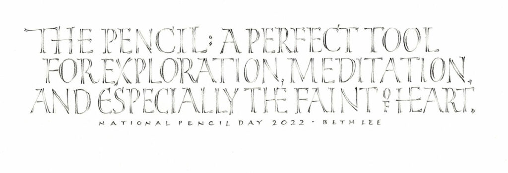
Although I’m a little late, I didn’t want to miss commemorating National Pencil Day this year. It marks the day in 1858 when Hyman Lipman received US patent number 19,783, for the first pencil-eraser combination. And we all know how important the “other” end of the pencil is! Lipman also began the first envelope company in the US. Given the current state of envelopes in US (vis a vis actually writing on them with pen and ink), Lipman may be turning over in his grave. Nevertheless, we scriveners owe him a lot.
I love pencils, those non-leak, portable, low-stakes drawing tools that take up no room in the purse or luggage. Beyond National Pencil Day … If you read this blog regularly, you will know that I love pencils and have posted lots of pencil work over the years.
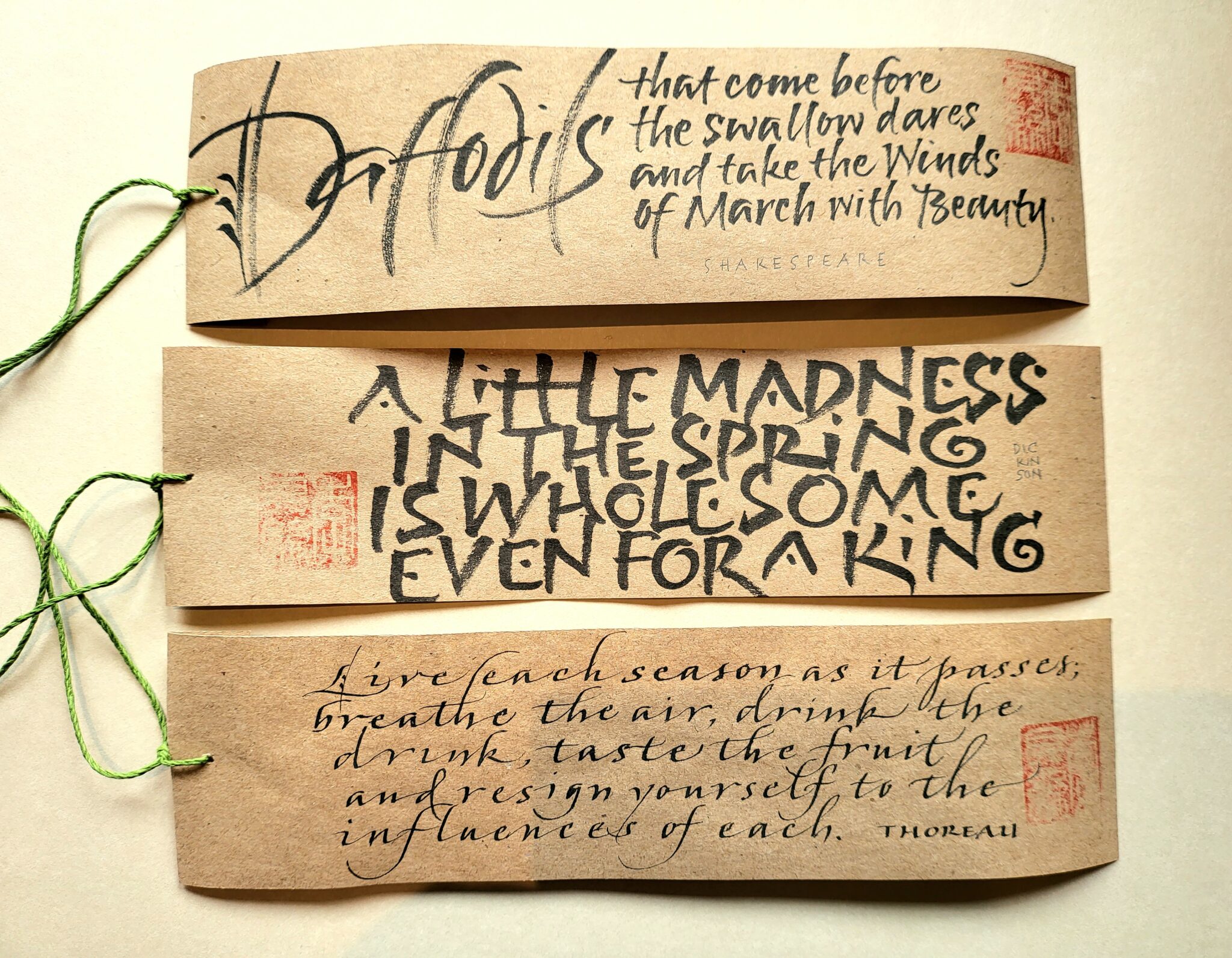
Hewing more closely to the rules of weathergrams, this is black and red, with a chop, in portrait format. I did not include, however, a vermilion initial capital, as recommended.
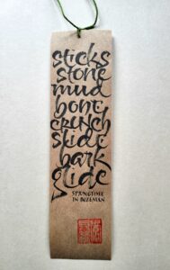
It’s unseasonably warm for March in Bozeman. Ski season will end early, and the mud is just about everywhere. Earlier this month the trails on the 38 acres of Snowfill in the Bridger foothills mud and slush on top of slippery ice. My most exciting purchase lately has been a new spin mop 🙂 Time for some more weathergrams. You may remember this post, autumn before last, and this one a few weeks later, showing those weathergrams after they had weathered some.
These will, once again, be distributed throughout the trails in town. This one is almost out of date, but the memory of slippery mud is still fresh.
Weathergrams should be short, original insights, 8-10 words long. I did not follow that rule for these next ones, which are not my own words and are longer texts. If you wish to follow the suggested format, more guidance may found here in the form of Lloyd Reynolds’ book Weathergrams in PDF format.
These don’t follow the exact rules for weathergrams, but I like the freedom of the longer line length.
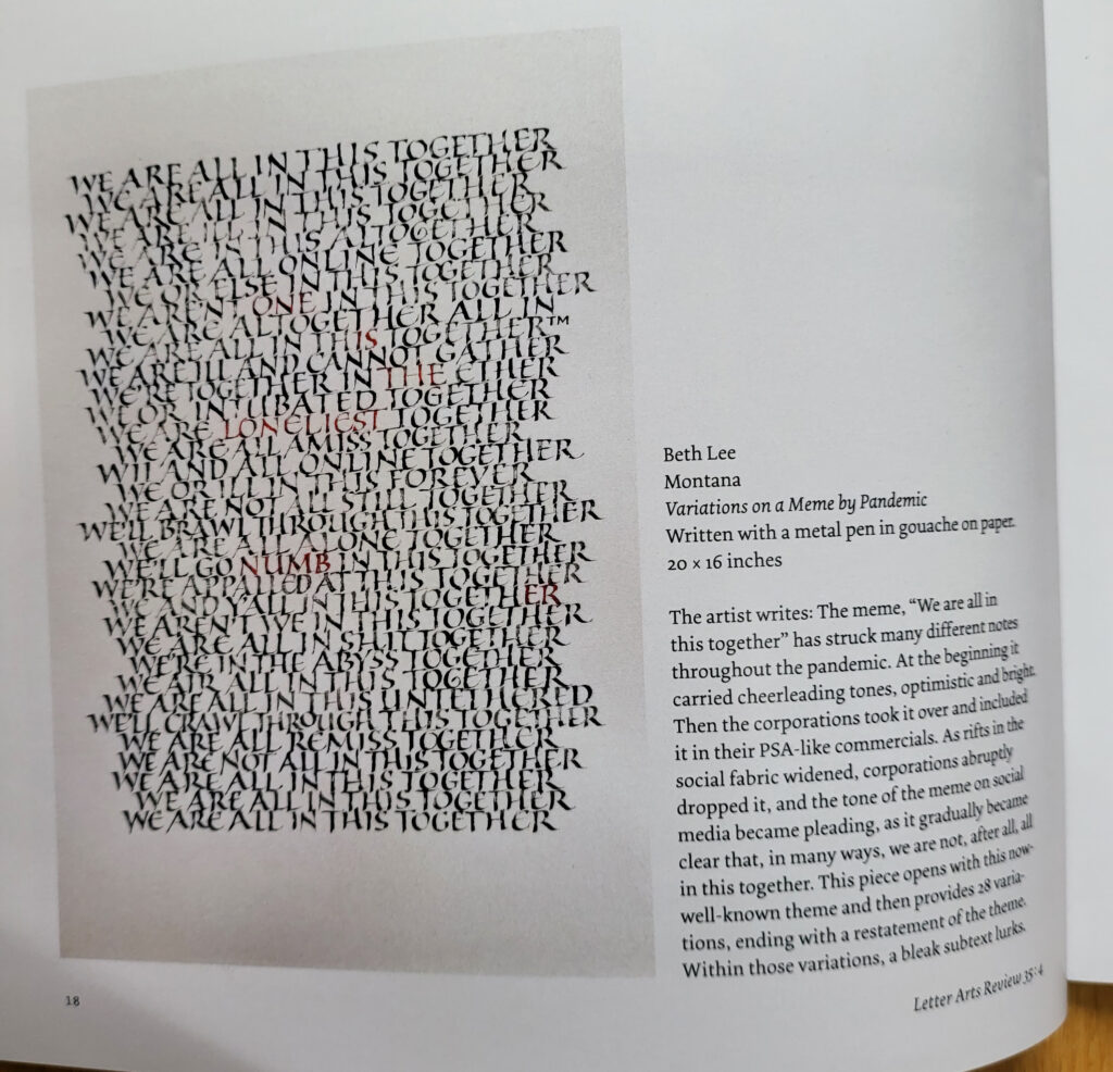
I’m so honored to be included once again in the juried annual issue of Letters Arts Review!(Once again, my copy arrived creased. The regular issues arrive in pristine condition, but the annual reviews: not so much. Go figure.) The title of the piece is Variations on a Meme by Pandemic.
Variations on a Meme by Pandemic. Gouache and metal pen on paper. 16 x 20 in.
The meme, “We are all in this together”, has struck many different notes throughout the pandemic. At the beginning it carried cheer-leading tones, optimistic and bright. Then the corporations took it over and included it in their PSA-like commercials. As rifts in the social fabric widened, corporations abruptly dropped it, and the tone of the meme on social media became pleading, as it gradually became clear that, in many ways, we are not, after all, all in this together. This piece opens with this now-well-known theme and then provides 28 variations, ending with a restatement of the theme. Within those variations, a bleak subtext lurks.
This was made for my solo show at The Artists’ Shop last year. (The initial spark was Variations on a Theme by Paganini. I wandered rather far afield, but that was the starting point.)
Gouache, resist, and metal pens on student-grade watercolor paper. 10 in x 4 in.
I’ve just been teaching a fun take on one of Ben Shahn’s personal lettering styles. The Ocala Calligraphy Guild explored this amusing but challenging folk hand with me as a one-day online workshop. I’ll teach it again in more depth for a guild in southern California, also online. It’s such a happy hand! Encouraging improvisation and fun, it also introduces the compound stroke and pen manipulation in a low-stakes way. (You may remember that I posted about teaching “Ben Shahn-ish” last year.)
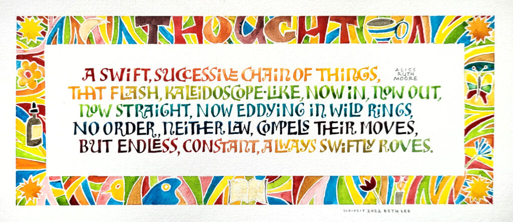
The text is from a poem titled “Impressions” by Alice Ruth Moore. This is the section subtitled Thought. The page design is done in the style of a page from the book *I Am Loved* that Bryan illustrated. Like Ashley Bryan, Moore used her art for social justice. I chose a Ben Shahn style of lettering because Bryan and Shahn led mostly parallel lives in the the social realism art genre, sometimes intersecting in the mural work on public buildings in the 1950s. (Bryan’s “Harpist” in this Tweet looks for all the world like a Ben Shahn drawing.)
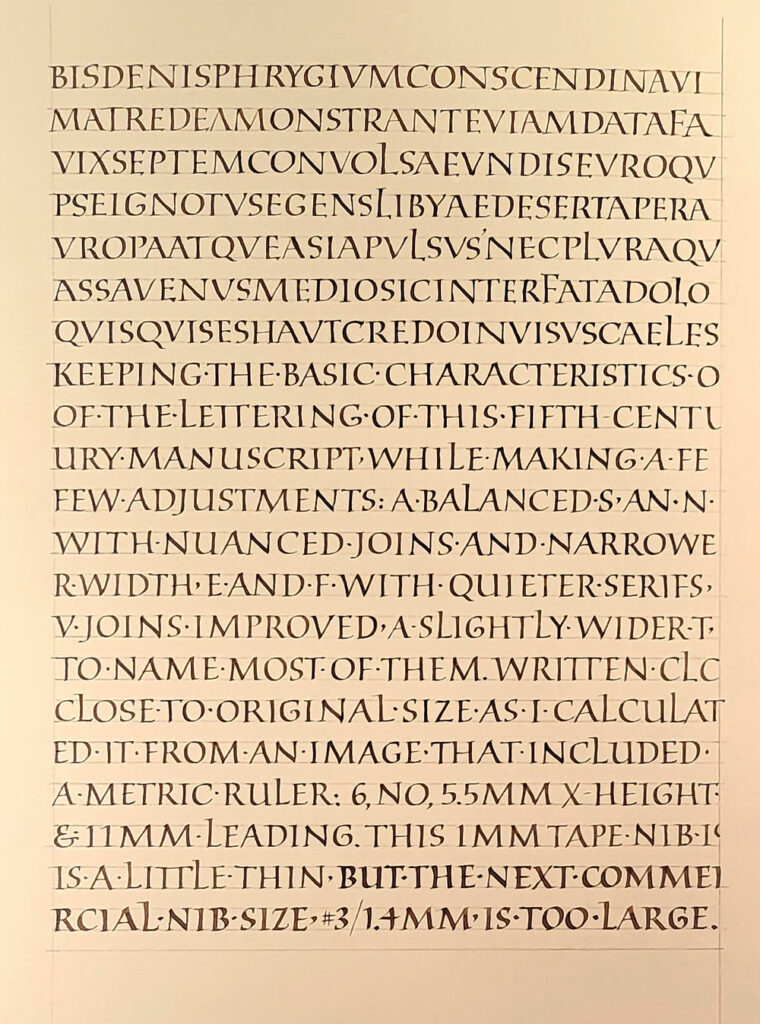
The first 7 lines are a fairly close copy of the manuscript page. After that, I began making adjustments. Walnut ink and 1mm Tape nib on Strathmore Drawing 400. Yeah, it’s a horrible photograph. I may try again in daylight.
Square capitals
I have become particularly interested in capitals as a text hand. If you read this blog regularly, you may have noticed that I have long been drawn to capitals as a way to create texture on a page. (See this post and this one and this one. ) And square capitals are one of the styles of capitals that are found as a text hand in historical manuscripts.
I first began teaching the class, “Capitals as Text & Tiny Paintings as Graphical Elements” at the end of 2020. (See this blog post for more information.) I was able to organize my thinking about capitals as a text hand when I took an inspiring class with John Stevens in early 2021.
Then I took a really interesting class with Ewan Clayton in October and November. Six hour-long lectures traced the development of capital letters from the beginning of writing to contemporary times, and they were jam-packed with examples and information. And I mean jam-packed: there were sometime more than a hundred images covered in an hour!
Historical manuscripts
During the course of that survey of capitals square capitals caught my attention. They are found in only two historical manuscripts (that we know of so far), but it is thought that this hand was used in many more documents that have since been lost. One of the two manuscripts is Vergilius Augusteus, written around the 4th century, and only seven leaves survive. I found an image of page ruler (https://digi.vatlib.it/view/MSS_Vat.lat.3256), which enabled me to figure that the original letters on that page had been written at 5.6 – 6.0 mm high, and that the distance from the first baseline to the last was 200mm. When I divided by 18 lines, I got a line leading measurement of 11 mm. The calculations gave me my guidelines.
Codex Sangallensis 1394, written in the 5th century, is the only other extant example of square capitals as a manuscript hand. Only eleven leaves — partial leaves, really — survive. You can see them here: https://fragmentarium.ms/overview/F-r237
I began this page in my daily journal by copying the first seven lines of this page as closely as possible: https://fragmentarium.ms/view/page/F-r237/6/103 and then began to make adjustment for quirks that I wanted to leave out. I’ll keep working for another few pages, at least.
Contains information related to marketing campaigns of the user. These are shared with Google AdWords / Google Ads when the Google Ads and Google Analytics accounts are linked together.
90 days
__utma
ID used to identify users and sessions
2 years after last activity
__utmt
Used to monitor number of Google Analytics server requests
10 minutes
__utmb
Used to distinguish new sessions and visits. This cookie is set when the GA.js javascript library is loaded and there is no existing __utmb cookie. The cookie is updated every time data is sent to the Google Analytics server.
30 minutes after last activity
__utmc
Used only with old Urchin versions of Google Analytics and not with GA.js. Was used to distinguish between new sessions and visits at the end of a session.
End of session (browser)
__utmz
Contains information about the traffic source or campaign that directed user to the website. The cookie is set when the GA.js javascript is loaded and updated when data is sent to the Google Anaytics server
6 months after last activity
__utmv
Contains custom information set by the web developer via the _setCustomVar method in Google Analytics. This cookie is updated every time new data is sent to the Google Analytics server.
2 years after last activity
__utmx
Used to determine whether a user is included in an A / B or Multivariate test.
18 months
_ga
ID used to identify users
2 years
_gali
Used by Google Analytics to determine which links on a page are being clicked
30 seconds
_ga_
ID used to identify users
2 years
_gid
ID used to identify users for 24 hours after last activity
24 hours
_gat
Used to monitor number of Google Analytics server requests when using Google Tag Manager
1 minute
You can find more information in our Cookie Policy and .