Recent work & philosophy on learning

The shop is hopping!

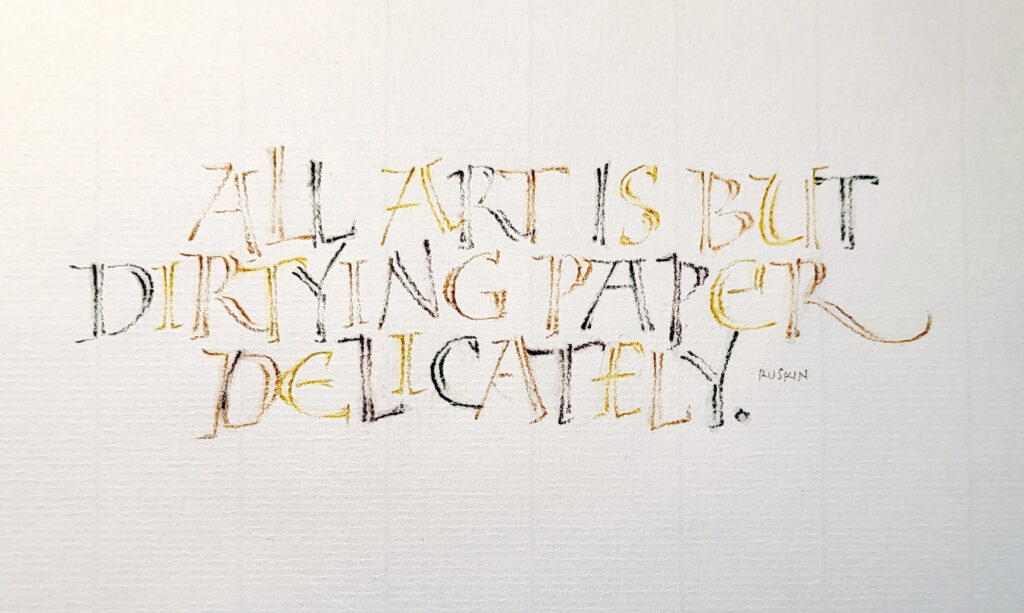
Later I’ll discourse at length on a philosophy of learning, but first: There’s a lot going on in the studio! But I have very little to show here. Nearly all of my recent work has been commissioned for weddings and other occasions. I’ve also updating the workshops I will teach this summer and fall.

In the past few weeks, I’ve completed a ketubah with watercolored maple trees, a Quaker-style marriage certificate (on mat board, unusually), place cards, menus, chopstick tags, invitation addresses, and more. And I’ve been developing new handouts for my updated “Ben Shahn-ish” workshop.

How we learn

I often use the pages of my daily journal to determine lengths, plan layouts, and explore scripts and script variations. When sharing my daily journal with my (awesome!) critique group last week, someone asked me how I switch so easily between calligraphy hands. I didn’t have an answer then, but I’ve been thinking about the question a lot.

It has something to do the way we learn. I vaguely remember that the ancient Greek philosophy of education asserted that when we learn one subject, we apply that learning to the next subject we learn, and we also learn how to learn, and so on. I think it’s called constructivism in modern jargon.

It’s all coming together

So when I first learned Edward Johnston’s foundational hand, I learned to analyze shape and spacing. Later, I learned pointed pen lettering and the important kinetics of pressure-and-release and gestural writing. When, much later, I circled back around to bookhand, that learning gave me the tools to do the pressure and manipulation required for a nuanced bookhand such as Civilité or those taught by Elmo van Slingerland. That’s just one example.

My point is that, after a mere 40 years of lettering, the disparate disciplines have come together for me, both intellectually and kinetically. Every hand has its mix of shape, counter-shape, gesture, tempo, rubato, pressure, nuance, and more. At this point, to sit and write in an italic hand and then switch to an uncial hand is, at its simplest, a matter of changing up the combination of these elements.

… except when it’s not, of course

This is not to say that I can perfectly render every hand at any time. Not at all! To write my very best bookhand, for instance, I’d need to write a lot of bookhand for several weeks. And I’d have to write with focused intention. This is true for just about any hand. And it’s true for broad-edge pens, pencils, and pointed pens. (I’m least tutored in the latter). The brush lettering is creeping its way into the tent, though I may not live long enough for the brush to join the other tools fully.

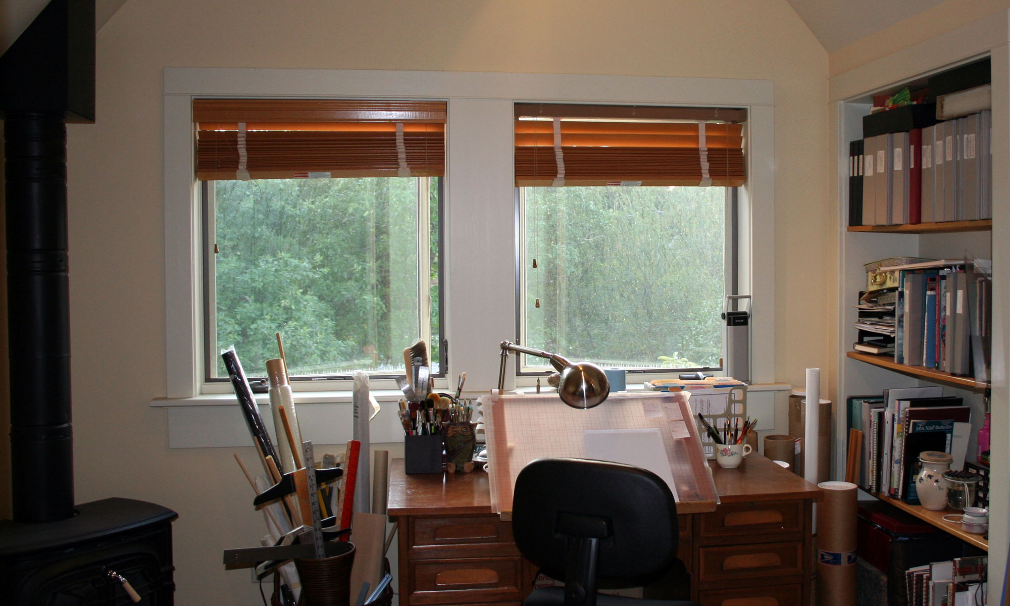
This is how I feel today. Tomorrow, I may sit down at the desk that my great-grandfather built for his son, the desk I’ve sat at for the past several decades, and find that I know nothing whatsoever about lettering. It has happened often enough now that I know to expect it.
Studio tools and guidelines

Calligraphers are always on the lookout for cool studio tools and guideline makers. Hanging out on social media can net you some great resources; online guidelines generators are some of these.

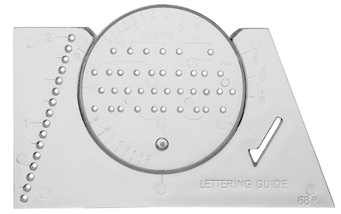
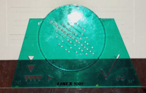
These are good, but give me one of those green lettering liners any day. Too bad they’re not made anymore. The closest equivalent is the Ames lettering guide, but I don’t use those. It took me awhile to figure out what was wrong with them. There just aren’t enough of the holes that I use for pencil guidelines. The Linex (Koh-i-noor and Steadtler also made them) liner, on the left below, has 16 holes, compared to the Ames lettering guide on the right, which has only 10 holes down the center. The Linex lets you do a lot less repositioning, which means you can do it in a lot less time.

Linex lettering liner
Linex lettering liner. Antique, as you can see.
Ames lettering guide

These lettering liners are far from intuitive. There’s a great tutorial at JetPens that explain how to use all the features of the Ames lettering guide. I only use the center row; the holes in that row are equidistant. But perhaps I should try the other rows, which allow for an x-height that 2/3 of the capital height, or an x-height that is 2/3 the capital height.

Guidelines are a constant source of interest to calligraphers. I’m amused to re-read my post on guidelines from more than 10 years ago on the subject. I still mourn the demise of Calli-Graphic, an app that allowed one to make straight and even circular guidelines with a desired x-height and leading.

Happy new year!

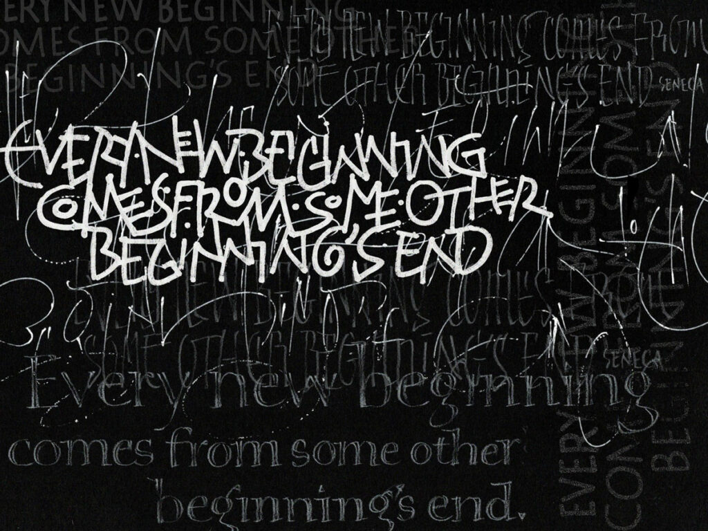
Various tools — Derwent white pencil, Molotow liquid chrome marker, pointed pen and white ink — on Strathmore Artagain black paper, collected and layered in Photoshop.

The first prompt of the year in our FB group is “Clean Slate”. I like the idea of a clean slate, but I’m not so sure I believe in ’em. A well-scraped palimpsets, maybe: they’re way more interesting, anyway.

Catching up

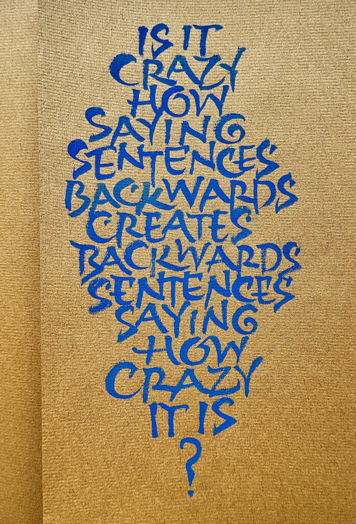
It’s been awhile! I didn’t realize how long. A road trip, a dead laptop, extensive house repairs … how the time flies. I have managed to get some calligraphy work done in those tiny cracks of time available. Here are few responses to a couple of the weekly prompts in an online calligraphy group:

palindromic sentence in gouache
Gouache on Fabriano Ingres paper.
palindromic sentence in gouache on Fabriano Ingres paper
Another go at it. Gouache on Fabriano Ingres paper.
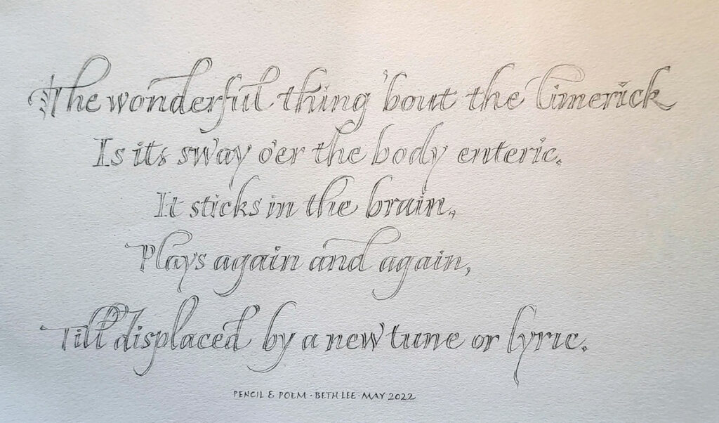
The wonderful thing 'bout the limerick
Is its sway o'er the body enteric,
It sticks in the brain,
Plays again and again,
Till displaced by a new tune or lyric.
My attempt at some literary nonsense. Pencil, paper.

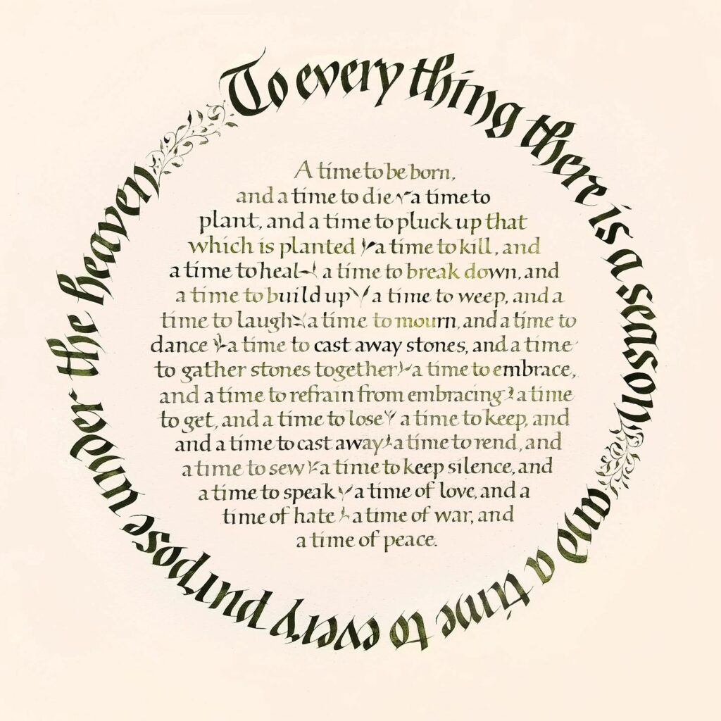
2021 roundel calligraphy – Ecclesiastes 3:1-8 at The Artists Shop

“To Every Thing There Is A Season” – gouache on paper, 24 in x 24 in

This is one of my pieces no hanging at The Artists Shop all month long in downtown Missoula, Montana. I’ll be there September 20 & 21. I’d love to see you there!

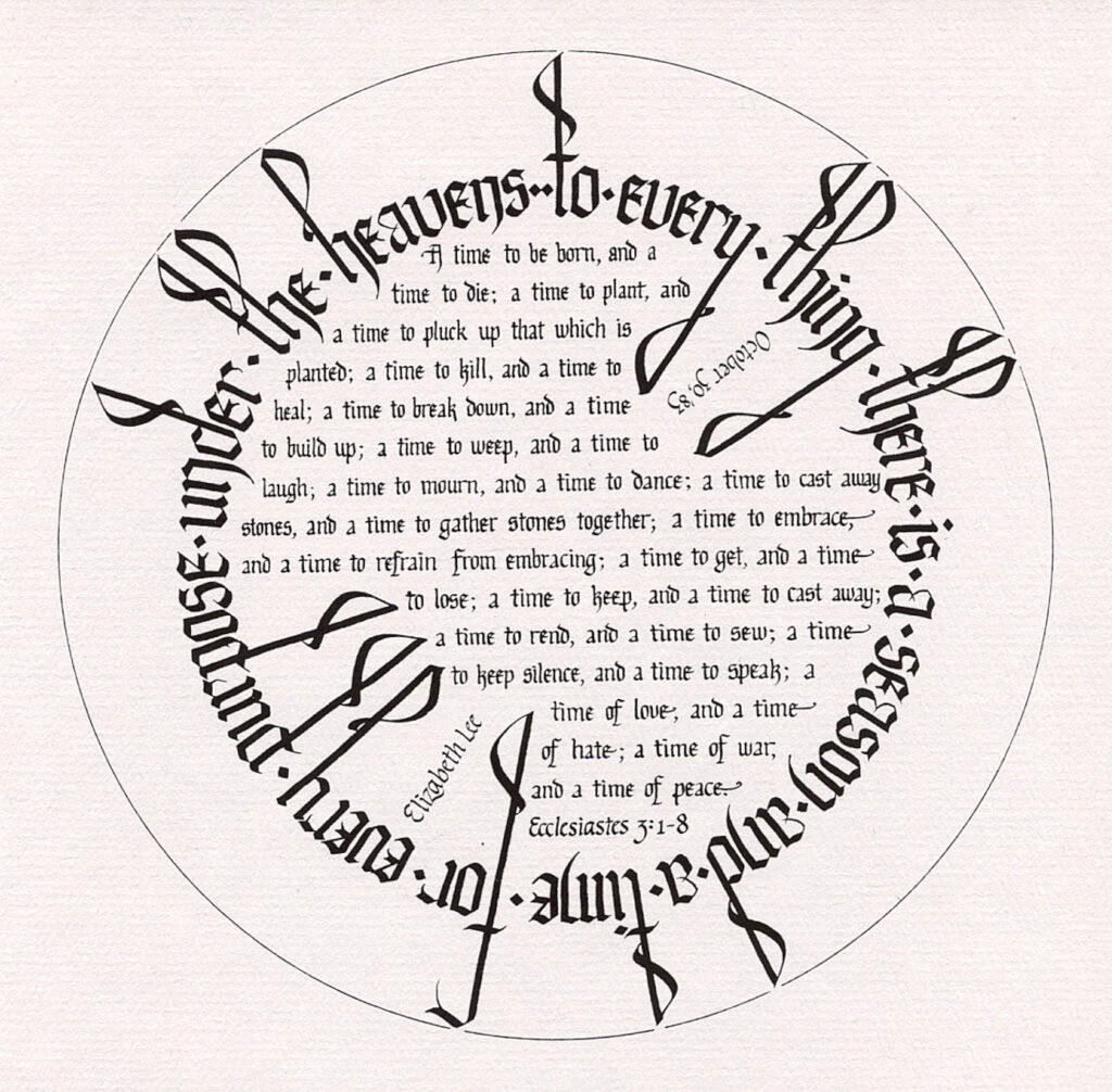
I have done this basic layout several times since the first time I tried it in 1983. It’s a kind of capstone piece, I guess.

In 1983, I was a rank beginner, and completely self-taught at that point, and I believe it is the first “finished” piece I ever did. Just for, I don’t know, entertainment, here’s an image of that first piece. I’m pretty sure it’s a scan of a photocopy of the original, which I gave to my mother way back then. So young and ignorant I was! But so enthusiastic, and I remain so after all these years.

I believe I did the original with a Schaeffer fountain pen (ack!) on the then-current version of Paper for Pens by Pentalic. The pad of paper was 11 in x 14 in, so this was about 10 in square in the original.

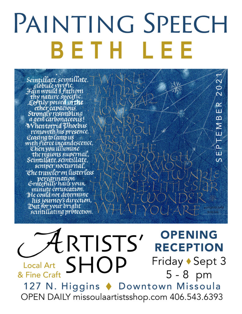
Come see a solo exhibition of my calligraphy in Missoula during September

The postcard for a solo show of my calligraphy at the Artists' Shop in downtown Missoula

I’m so honored to have another solo exhibition of my calligraphy at the Artists’ Shop in downtown Missoula. Thank you, Ann Franke, for all your support! Ann will be hanging this show, and I’m looking forward to seeing what she does with such a disparate collection of pieces.

If you’re in Missoula during the month of September, please stop by. If you do stop by, please let me know your impressions. Unfortunately, I can’t attend the opening reception on September 3. But I’ll be there sometime after that date to see the show.

During the month of September I’ll be posting a few of the pieces here. So if you can’t get to Missoula, watch this space! As you can tell from the postcard, the show will, at the very least, include a broadside version of “Scintillate, Scintillate”. A manuscript book in this edition will be on display as well.

My artist book “Can’t Not Look” has sold!

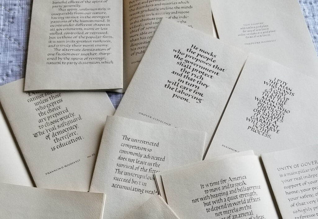
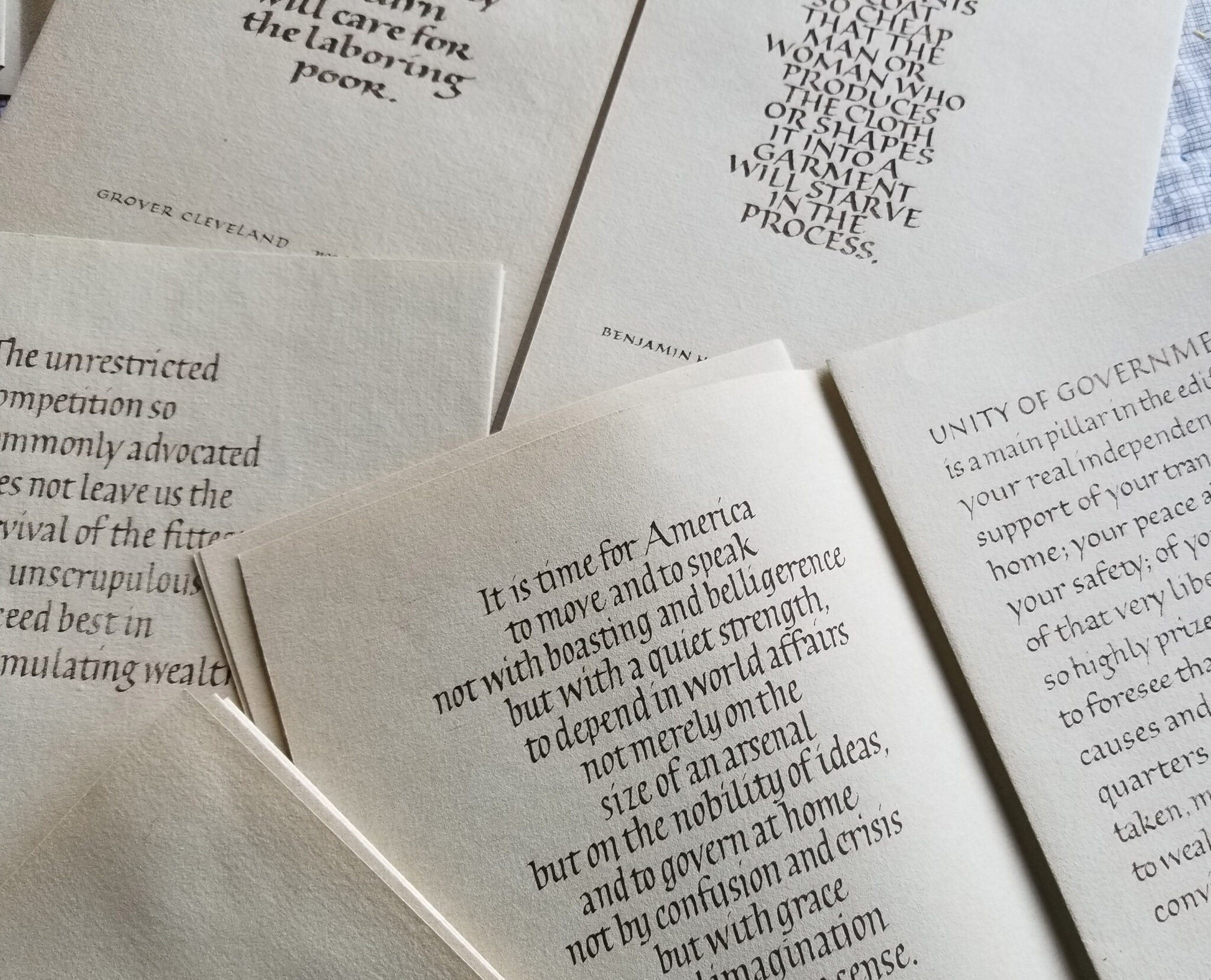
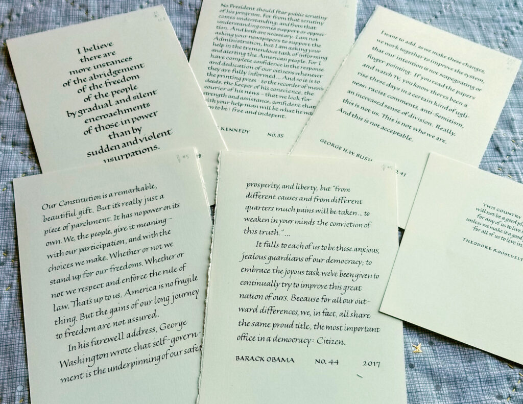
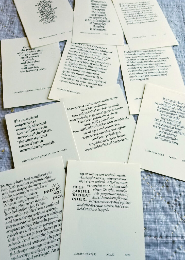
I’m so pleased that my artist book, Can’t Not Look: Democracy in America, has sold to the Bainbridge Museum of Art. I’ve written about it here, and I had contemplated making three of them. I had planned to update the tweets foldouts for two successive eras of the 45th presidency. Books 2 and 3 were completed except for the tweets. Those tweets were difficult enough to write in the first (and now only) book; now I find myself even more unmotivated to write them out. I also completed a camera-ready print version, but have made no move to get those printed. Here are images of a few more pages of quotations by our first 44 US presidents.

Can't Not Look - unfinished spreads
Unfinished manuscript book series – a few spreads.
Can't Not Look - unfinished spreads
Unfinished manuscript book series – a few more spreads.
Spreads from the camera-ready version of a contemplated commercially printed version.
Can't Not Look - unfinished camera-ready version
More spreads from the camera-ready version of a contemplated commercially printed version.

“The Water is Wide”: An edition of painted artist books as pandemic comfort art

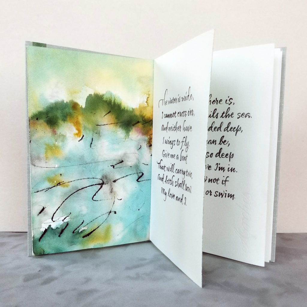
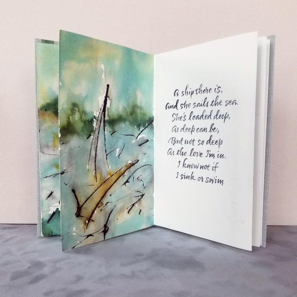
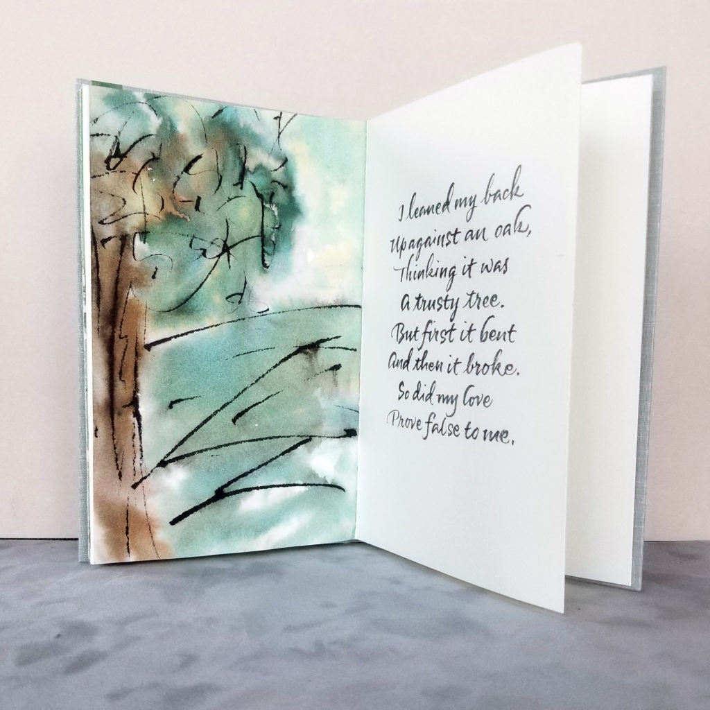
I realize that I’ve never shared the variable edition of 12 manuscript books that I made last fall. Here are photos of the three verses of The Water is Wide. 5 x 8 in, Bister and sumi inks on Arches Text Wove, lettering done with a no. 2 round sable brush. Book cloth over hard cover.

These books were the “comfort food” of the studio this past fall. The melody that goes with these traditional lyrics is the kind of tune that sticks in your brain, but it’s soothing.

Learning Fraktur blackletter style with Luca Barcellona

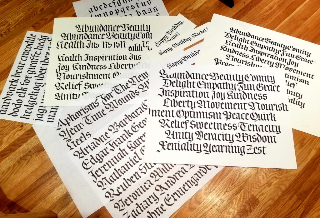
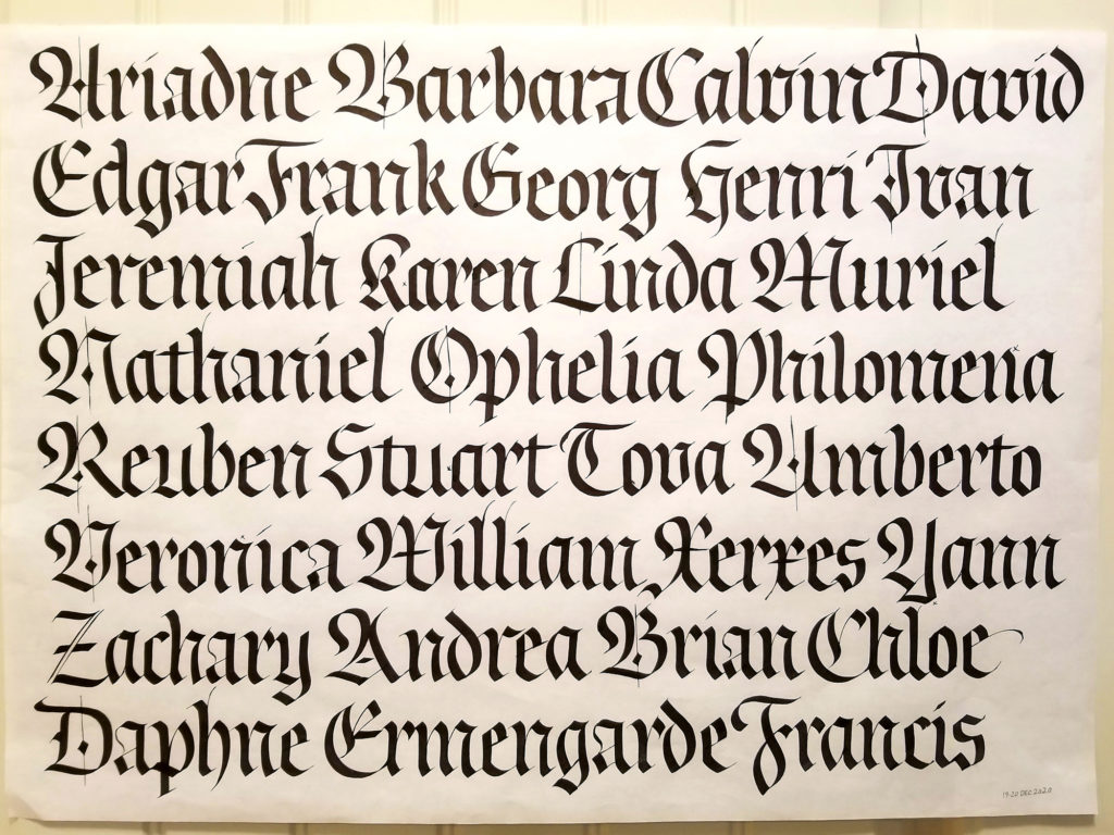
  • Fraktur blackletter practice sheets
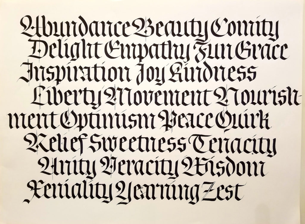
  • Fraktur blackletter practice sheet
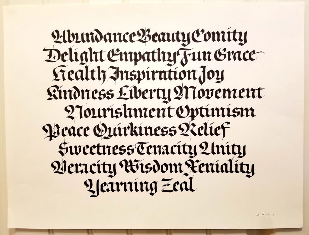
  • Fraktur blackletter practice sheet
  • Fraktur blackletter practice sheet

I’m taking Luca Barcellona’s Advanced Fraktur blackletter class through the Society of Scribes, New York City’s calligraphy guild. The last of the three session will take place at the end of next week. Meanwhile, the floor of my studio is simply littered with sheets of blackletter practice. After a similarly structured class with Elmo van Slingerland, I’ve become a little more accustomed to working large. Most of the sheets pictured above are 18 in x 24 in. I’ve done these with a 6mm Pilot Parallel Pen on sheets cut from a roll of white butcher paper. Creamier-toned sheets are Strathmore Drawing 400 paper.

I haven’t taken blackletter from a teacher before, at least not in the past 25 years, and this has been a valuable experience. I missed the previous intermediate class, but I think I’ve been able to catch up. (Having taking two classes through Society of Scribes now, I’ve got to say that Phan Nguyen is the best facilitator ever. He makes the online experience a real pleasure.)