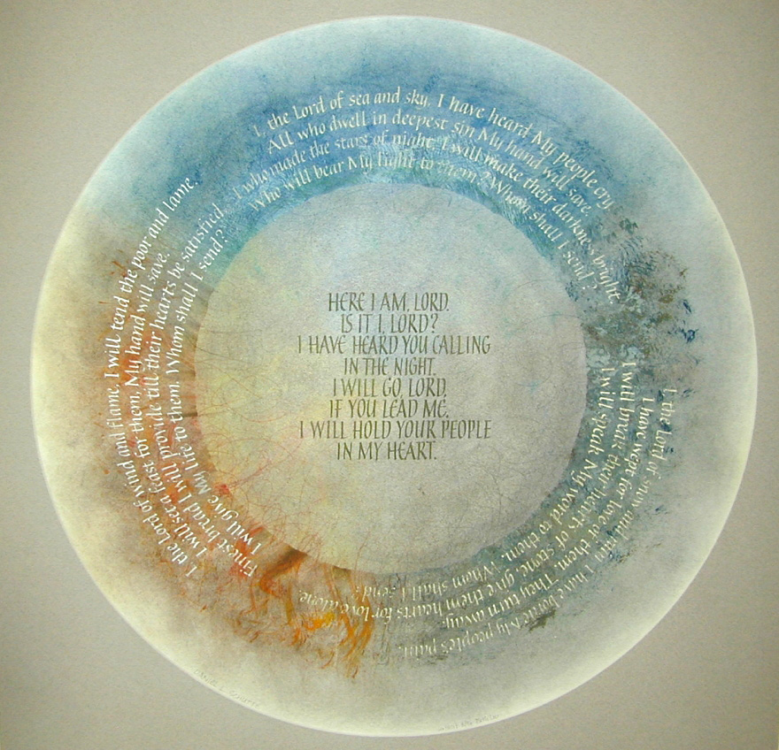
As I work on cards and presents for the holiday season, I think fondly of presents past. One of my very favorite pieces I ever made was for my mother. The text is the lyrics to “Here I Am, Lord,” one of her favorite hymns. The verses are ranged around the circle, surrounding the chorus in the center. It is hard to believe that I made this 24 years ago.
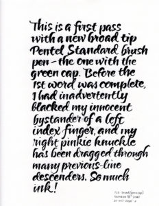
First pass at the broad tip Pentel Color Brush, written between 5/8″ guidelines on Strathmore Charcoal paper.
It has been a real joy to explore brush calligraphy with new confidence. I had known about the standard and extra-fine sizes of Pentel Color Brushes, and that the black barrels carry dye-based ink while the gray barrels carry pigmented ink. Through JetPens (do not click the link before you’ve hidden your credit card from yourself), I discovered that there are several more brush tips in the Pentel Color Brush collection. I really like the green-cap, “broad tip”, brush, although the amount of ink output was something to get used to
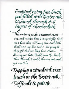
Experiments with various brushes and Bister inks.
I also tried out the PCB that I filled with Bister ink in this post. I think it’s working fairly well, although, as you can read, that one long hair is driving me crazy.
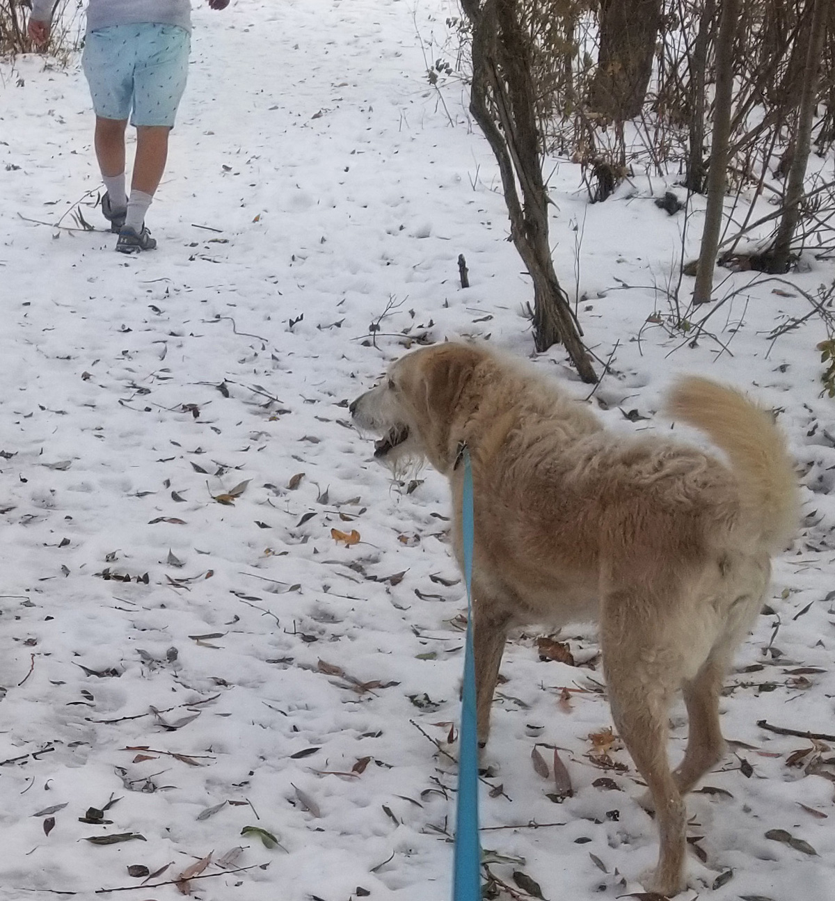
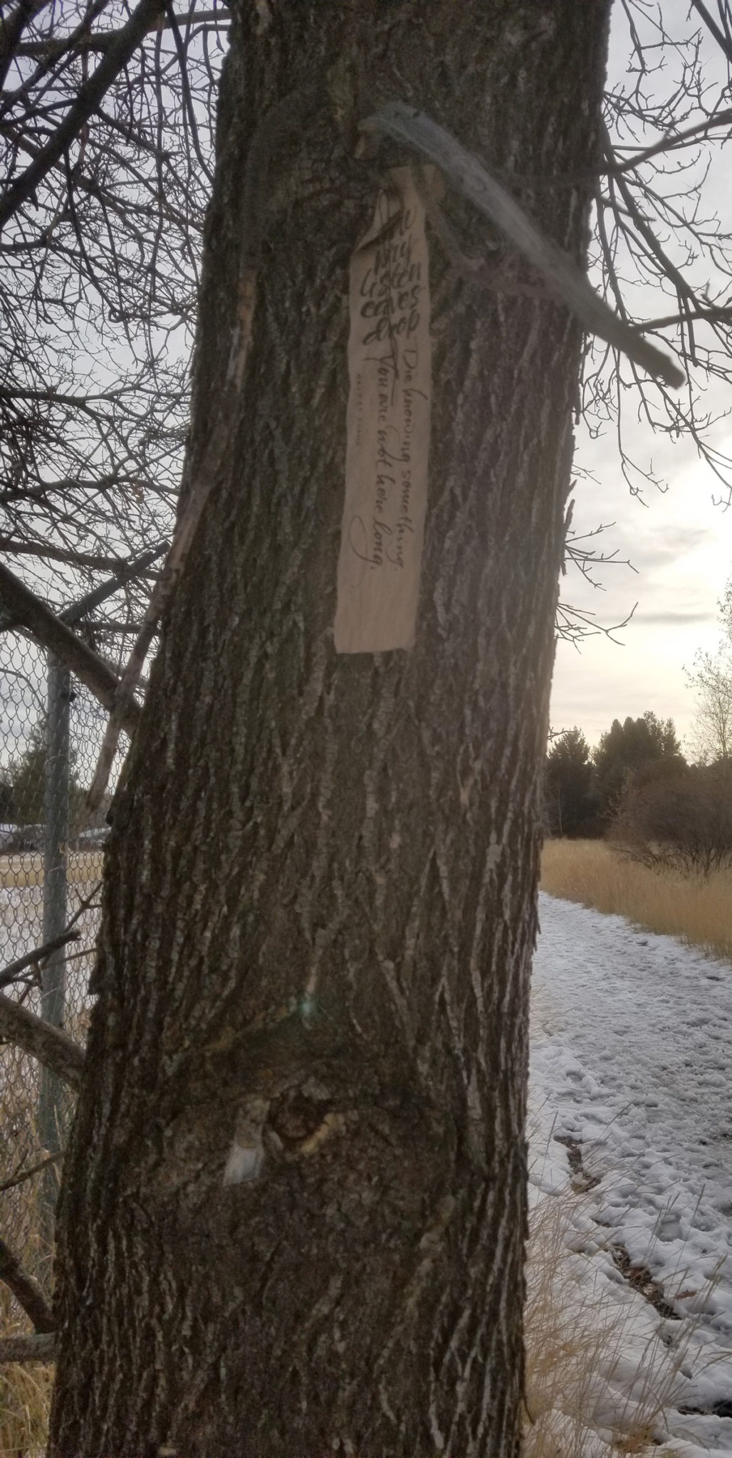
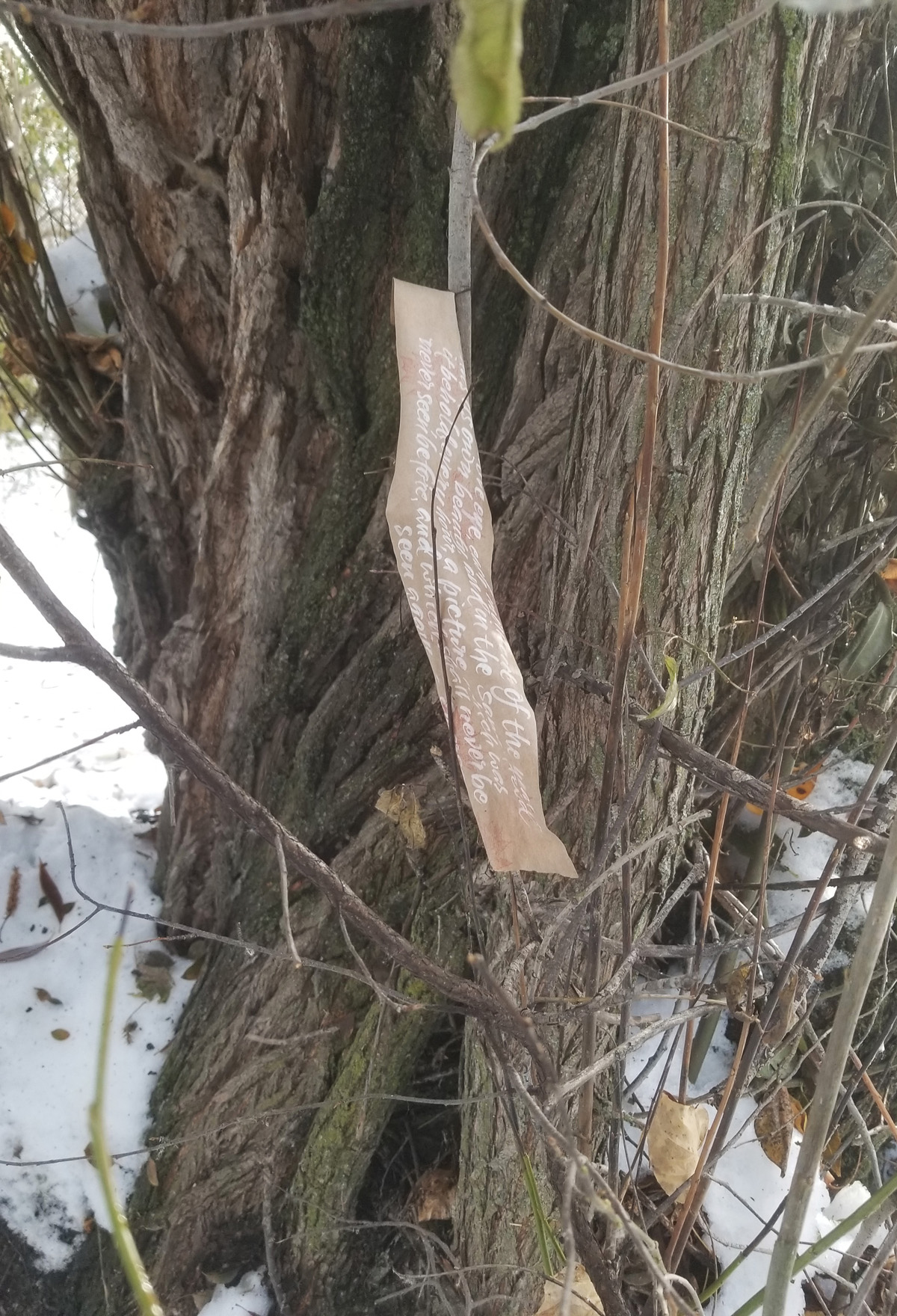
The Pentel Color Brush and weathergrams go together well, and I wanted to check up on my weathergrams. But last weekend it snowed about 10″ and the resulting piles of snow and slippery surfaces temporarily dampened my enthusiasm for walking. By Wednesday, the dry atmosphere had evaporated much of that snow, and we went out to see how the weathergrams are faring. Most of them are gone, but here are a couple that have survived. And the other photo? Well, there is a lunatic fringe of weather/fashion sense in Bozeman. Yes, it had been below zero for a couple of days, and yes, was up in the 40s when I took this shot, but really? Shorts and tennis shoes? As you can see, even Zeke was somewhat taken aback by this guys’ clothing choices.
Pentel Color Brushes are the bomb! And so are Bister inks. It was only a matter of time before I would combine them.
I’m continuing to enjoy Elizabeth McKee’s brush lettering class, so much so that my current book edition (going out the door tomorrow) is brush lettered. I’ve fiddled around with the Pentel Color Brush (PCB) a lot — emptying them, dipping them in watercolors and other inks, even using them as-is. The other day I emptied a nearly spent extra-fine PCB and refilled it with Bister inks. I have also been experimenting with making videos. So … here’s a video of me refilling a PCB with Bister inks. It turns out that Pentel Color Brushes and Bister inks go together well. I strained my ink through cheesecloth to keep out the undissolved Bister crystals.
Filling a Pentel Color Brush with Bister Inks
I show the PCB already taken apart. Taking apart a PCB is a simple operation. Grasp that black ring at the top of the black barrel with a needle-nose pliers and pull. The central tube will come out pretty easily. Then rinse out (or wash) both the barrel and the central tube. That’s it!
My favorite store for Pentel Color Brushes is JetPens. I’ve used them a lot over the years, especially when I was doing daily alphabets.
How are you doing, 7 months in? I’m sometimes finding it difficult to focus. Read on for an example of my pandemic life in the studio.
Today, Thursday, which I know because Ed and I had a discussion last night about whether it was Tuesday or Wednesday, and were gratified to be able to determine that it was Wednesday without the aid of a phone or other digital device—um, what was I saying? Oh, yes. Today I came into the studio to continue work on a book edition whose deadline is rapidly approaching. (Do you remember last year’s book edition?)
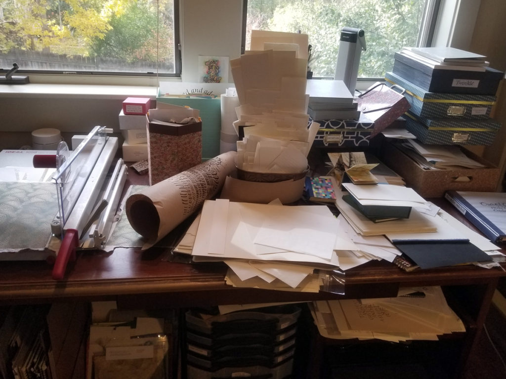
But first, I decided, I should tidy up. The library table was especially cluttered.
A couple of days ago, I had lost the smaller half of the two-piece tip to my 0.2mm mechanical pencil when I was reaming a clogged lead. It had rolled off my drafting table to somewhere on the floor. I decide that this will be my starting point. Pulling away the chair, the portfolios, the rolling cart, stools, I find the tiny bit of metal almost immediately. Wow! It’s going to be a productive day, I think. So I ream the tip and put the pencil back together, and it works! Better and better. On a roll, I pull the other 0.2mm mechanical pencil out of the mug and fix the clog on it.
Things are going swimmingly. But I’ve pulled all this stuff away, so I take the opportunity to vacuum and mop the floor before replacing everything. On my hands and knees to scrub up a spot of pink paint, I see a dried trickle of ink on the wall. As I’m scrubbing that off as best I can, I ruminate on how long ago I might have spilled this Quink. (I can tell it’s Quink by the bluish color it turns as my scrubbing dilutes the ink.) Now sitting on the floor, I see other spots and flotsam that simply require action — the push pin, the dusty floorboard … the absolutely filthy floor protector! What happened here? Did I crush a pencil lead between the floor protector and the floor? Cue the vacuum, the mop, the scrubbing sponge.
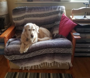
Zeke in the studio.
I turn around to see our dog on the futon chair. He looks so adorable, I snap a picture of him and send it to my son. Logan is always happy to have another photo of Zeke. He messages back, do I have any “press(ing) needs” he can build me for Christmas. As if this is a question. Happy to take break, I look at bookbinding equipment for awhile. And learn a couple of tips about backing that I hadn’t known before, and yes, there are couple of things I would like. Of course.
But back to what I was doing: At this point, my studio is so far from being a suitable place for work on a book edition, that my courage almost fails. I clean and replace everything I took apart — to find the tiny pencil piece, remember. I do this, resisting the temptation to open the new issue of Alphabet that arrived in yesterday’s mail and sits invitingly on the surface of my drafting table. Instead, I clean under Alphabet.
Focus!
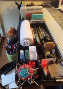
The tray of the drafting table
I take everything out of the divided tray attached to the drafting table, and proceed to clean, organize and replace nearly everything, labeling envelopes for stamps, tabs, labels, abrasive papers, translucent sheets, etc.— all the small flat paper-like things I use so often in my work. As I organize, I briefly wonder at how I managed to acquire 25 different black pointed markers and somehow decide that I needed every single one of them immediately at hand. I discover three—count ’em, three—beeswax holders, seven random business cards, and three triangles. I decide that all three triangles must stay. When I finally finish, it is beautiful, at least to me.
New direction
I never do get to the library table. But somehow this cleaning and rearranging also rearranges my work on the book edition. When I settle down to work, I am heading in a new direction with renewed enthusiasm.
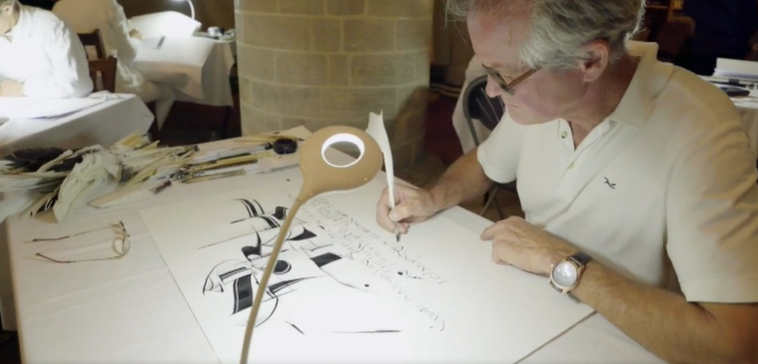
Don’t miss this great new PBS Nova television series on writing, “A to Z”. I did miss seeing the premier showing of “A to Z: The First Alphabet” last week. It’s the first of PBS Nova’s really good two-part program on the history of writing. I was able to see it online here: https://www.pbs.org/wgbh/nova/video/a-to-z-the-first-alphabet/. Brody Neuenschwander, shown above, designed the program
Brody Neuenschwander writes: This series has been twelve years in the making and four years in the filming and editing. The first program investigates the origins of writing, seen globally. Writing was invented four times and in four places: Egypt, Sumer, China and Central America. In each case the same steps were followed, which leads one to ask important questions about the very nature of writing. But the alphabet was invented only once, and from this single origin spread around the world. In this program stunning footage from Australia, Egypt, China and Europe will show how hieroglyphs and cuneiform were first created and how they function in a very similar way to Chinese and Maya script. The leap to the creation of the first alphabet came in a surprising way and in an unexpected place: the wastes of the Sinai desert. As this alphabet spread and evolved, it replaced pictographic systems everywhere except China, Japan and Korea. In so doing, the alphabet changed the course of history.
The second program looks at the materiality of writing and the differences between the world’s three major writing systems: the Latin alphabet, Arabic and Chinese. How do these systems function and how are they different? How did these differences influence the history of each culture? And what part did different writing materials play in the development of written communication (papyrus, parchment, paper)? The influence of all these factors on the development of printing will be shown, helping us to understand how the shapes of letters can have an immense impact on the history of whole societies.
There is a third program on “script and identity” that will not be shown in this PBS/Nova series, but will appear later online. However, all three episodes areto be broadcast on BBC4. The manipulation of script for political purposes will be investigated, as will fascinating questions such as “How do the Chinese adapt their script to digital technology?” and “How do young people in the Arab world send text messages?”
For those of you who love the sculptural elegance of Egyptian hieroglyphs, the grace of the Chinese brush in action, the brilliance of medieval manuscripts sparkling with gold—this will be two hours of pure pleasure. And we guarantee: you will learn some things you never knew or even thought about!
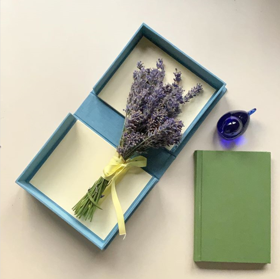
Clamshell box and flat-back cased-in book.. Lavender from my friend Rose.
Early in the summer I came across the “Summer Bookmaking Series”, a variety of online summer offerings of University of Utah’s book arts program. You can see what was taught here (you may have to scroll down). One could sign up for the whole series, or do it a la carte, which is what I did.
I took the Flat-Back Case Binding on August 3, and made the green book pictured above with Emily Tipps during the two-hour session. I was impressed by both Emily, for teaching it so clearly in the allotted time period, and me, for following along successfully in that same two hours! The recordings of the classes are available a month after the live class. (Yes, I have some shiny spots on the spine front of my book. I could have avoided that by taking a little time taken to cover the surface when bone folding, or by using a Teflon folder instead. It’s a model. I’m happy.)
The Clamshell Box was not part of the series, but a stand-alone class. I signed up too late (in May!) to get into the live August 15 class, but there was an option to buy the session recording and materials kit. This is what I did. When the recording became available a few days after the live class, I watched the seven videos and made my clamshell box with very little trouble.
I’m very pleased with what I learned in both classes, and will make a few more of each before my time for viewing the recordings runs out.
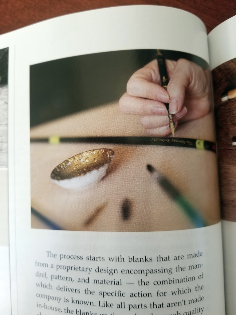
I’m in a recent issue of Big Sky Journal! Well, my hand is. That clenched grip is *surely* an anomaly, right? but writing on the curved surface of a 4-weight (or 3-weight!) fly rod with fast-drying gold paint is a challenge. This is a fly rod in progress at Tom Morgan Rodsmiths in Bozeman, Montana.
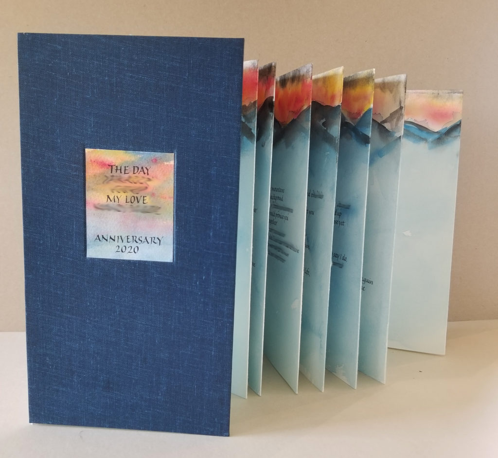
Commission work. Poem lettered for accordion book. Covers: bookcloth over boards. Text: Stonehenge, sumi ink, gouaches, watercolor. About 5 in x 9 in.
Last month I had the honor of lettering and binding a poem written for a wedding anniversary. I was quite pleased with the result, and so were they. (Lettering blurred for privacy considerations.)
On the right, stepping it down to 4.1mm x-height (never mind the pencil, which was wrong) and a 3/4mm Brause nib with walnut ink on Strathmore Drawing 400 heavyweight paper.
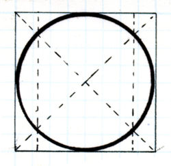
I am still studying, still enjoying the hand Karlgeorg Hoefer used in his “Appel an die Völker der Erde”. David Sedaris wrote, “Whenever I read a passage that moves me, I transcribe it in my diary, hoping my fingers might learn what excellence feels like.” As a calligrapher, I really connect with that sentiment. The more I get into this hand, the more I admire Hoefer’s sensitivity and understanding of Roman bookhand. I begin to see that this seemingly idiosyncratic hand actually adheres strictly to the classical Roman Trajan forms. His pen angle matches that of Trajan Romans. The finials are a nod to Trajan serifs. He honors the structure that underlies Trajan Romans, the circle in a square with vertical lines at the intersections of the diagonals. The weight is similar to Trajans.
Structure upon which classical Roman capitals and bookhand letters are based.
As I copy out the letters, I begin get into his PacMan ‘e’ — to admire his vision of the classical ‘e’ shape based on the Roman structure, the swing of the foot lengthened to accommodate the next letter. (Because, Trajans or no, this is a minuscule bookhand.) I feel his understanding of the classical arch of the ‘h’ and ‘n’, executed so beautifully in the ‘n’ and ‘m’ forms. I kinetically get his understanding of the way the bowl of an e leads into the vertical stroke of the next letter, and how the entrance stroke of that next letter is adjusted. I struggle not to turn that connection into a caricature of itself. I delight in the subtle shape of the folded-over endings of his ‘f’ and ‘a’ and ‘J’. I mull over his two-story ‘g’ with the upper-story rounded rectangle (called a “stadium”?). Has he widened and flattened this circle to keep it as open and airy as the rest of the letters? I get into the rhythm of flattening my pen angle for the serifs, and slightly steepening it for the next letter, flattening again, steepening again.
I spent an uninterrupted six hours in the studio today. I discovered a good many things that didn’t work, spilled more than one container of liquid — e..g. acrylic ink, gesso — and I scraped out and smoothed over more than one lettering error. At the end of the day it looked as though I had pulled out every tool, jar, paper, and storage box.
But … I now have a solution for a difficult problem — which I will implement tomorrow. I didn’t tramp in too much muddy snow on my newly mopped studio floor. The studio was tidied up quickly. And I have another page of daily lettering.
Freely written capitals using that same palette of leftover gouaches and a 1.5mm Brause nib.
I’m thinking that the little meander book (2.5 x 3.5 in or so) in the corner may be how I got this leftover palette of gouache in the first place. The colors match. If so, then I began with three primaries (warm yellow and blue, cool red), and that’s it.
At this rate, I’ll be binding another journal of daily lettering soon.
Contains information related to marketing campaigns of the user. These are shared with Google AdWords / Google Ads when the Google Ads and Google Analytics accounts are linked together.
90 days
__utma
ID used to identify users and sessions
2 years after last activity
__utmt
Used to monitor number of Google Analytics server requests
10 minutes
__utmb
Used to distinguish new sessions and visits. This cookie is set when the GA.js javascript library is loaded and there is no existing __utmb cookie. The cookie is updated every time data is sent to the Google Analytics server.
30 minutes after last activity
__utmc
Used only with old Urchin versions of Google Analytics and not with GA.js. Was used to distinguish between new sessions and visits at the end of a session.
End of session (browser)
__utmz
Contains information about the traffic source or campaign that directed user to the website. The cookie is set when the GA.js javascript is loaded and updated when data is sent to the Google Anaytics server
6 months after last activity
__utmv
Contains custom information set by the web developer via the _setCustomVar method in Google Analytics. This cookie is updated every time new data is sent to the Google Analytics server.
2 years after last activity
__utmx
Used to determine whether a user is included in an A / B or Multivariate test.
18 months
_ga
ID used to identify users
2 years
_gali
Used by Google Analytics to determine which links on a page are being clicked
30 seconds
_ga_
ID used to identify users
2 years
_gid
ID used to identify users for 24 hours after last activity
24 hours
_gat
Used to monitor number of Google Analytics server requests when using Google Tag Manager
1 minute
You can find more information in our Cookie Policy and .