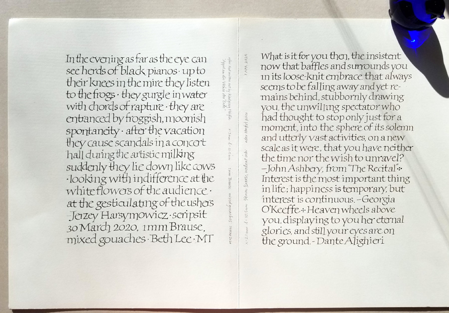
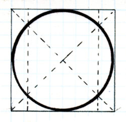
I am still studying, still enjoying the hand Karlgeorg Hoefer used in his “Appel an die Völker der Erde”. David Sedaris wrote, “Whenever I read a passage that moves me, I transcribe it in my diary, hoping my fingers might learn what excellence feels like.” As a calligrapher, I really connect with that sentiment. The more I get into this hand, the more I admire Hoefer’s sensitivity and understanding of Roman bookhand. I begin to see that this seemingly idiosyncratic hand actually adheres strictly to the classical Roman Trajan forms. His pen angle matches that of Trajan Romans. The finials are a nod to Trajan serifs. He honors the structure that underlies Trajan Romans, the circle in a square with vertical lines at the intersections of the diagonals. The weight is similar to Trajans.
As I copy out the letters, I begin get into his PacMan ‘e’ — to admire his vision of the classical ‘e’ shape based on the Roman structure, the swing of the foot lengthened to accommodate the next letter. (Because, Trajans or no, this is a minuscule bookhand.) I feel his understanding of the classical arch of the ‘h’ and ‘n’, executed so beautifully in the ‘n’ and ‘m’ forms. I kinetically get his understanding of the way the bowl of an e leads into the vertical stroke of the next letter, and how the entrance stroke of that next letter is adjusted. I struggle not to turn that connection into a caricature of itself. I delight in the subtle shape of the folded-over endings of his ‘f’ and ‘a’ and ‘J’. I mull over his two-story ‘g’ with the upper-story rounded rectangle (called a “stadium”?). Has he widened and flattened this circle to keep it as open and airy as the rest of the letters? I get into the rhythm of flattening my pen angle for the serifs, and slightly steepening it for the next letter, flattening again, steepening again.
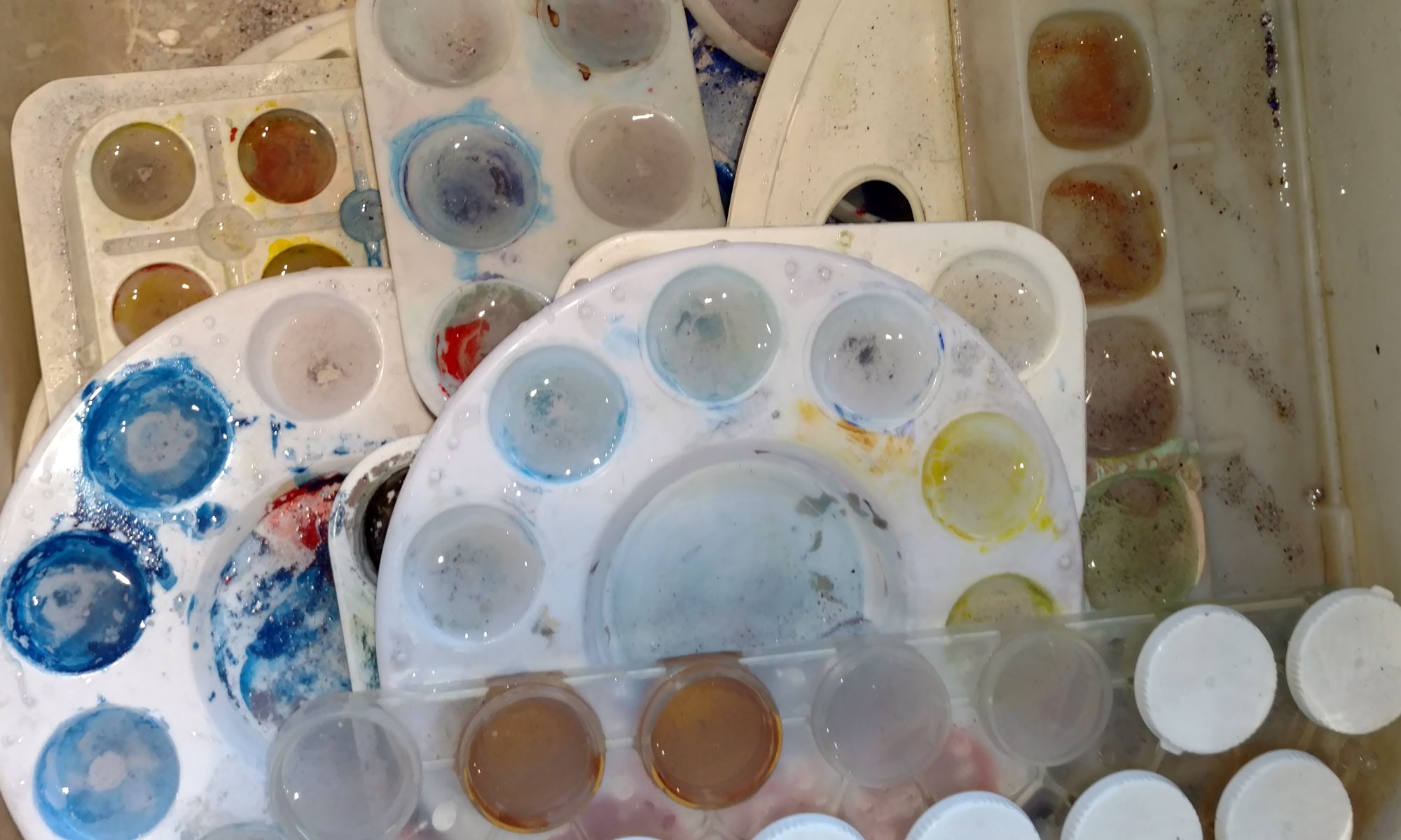
I spent an uninterrupted six hours in the studio today. I discovered a good many things that didn’t work, spilled more than one container of liquid — e..g. acrylic ink, gesso — and I scraped out and smoothed over more than one lettering error. At the end of the day it looked as though I had pulled out every tool, jar, paper, and storage box.
But … I now have a solution for a difficult problem — which I will implement tomorrow. I didn’t tramp in too much muddy snow on my newly mopped studio floor. The studio was tidied up quickly. And I have another page of daily lettering.
A good day all around.