I am excited to be teaching this 4-week class again. We will explore built-up capitals and some of the many variations. The class begins Tuesday evening, October 29. (The class now in progress sold out and so I’m offering a second chance here.)
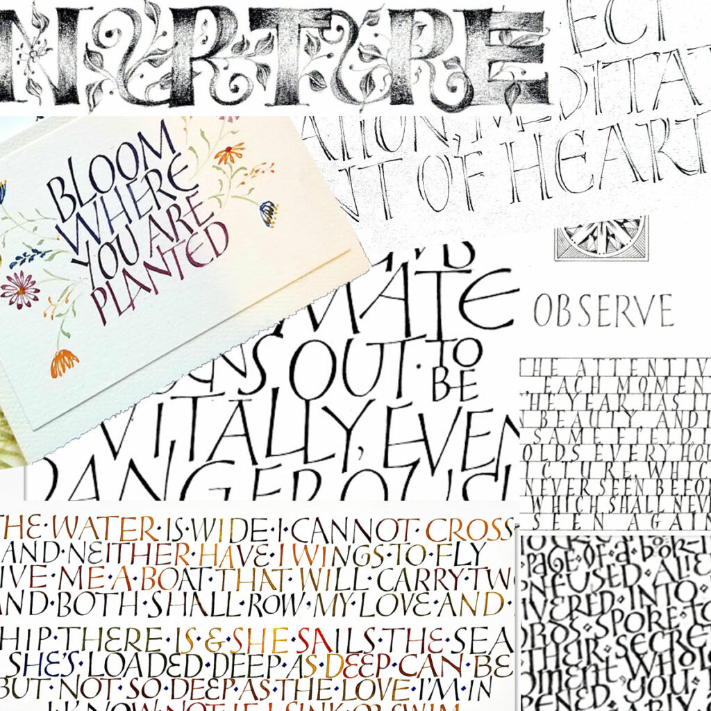
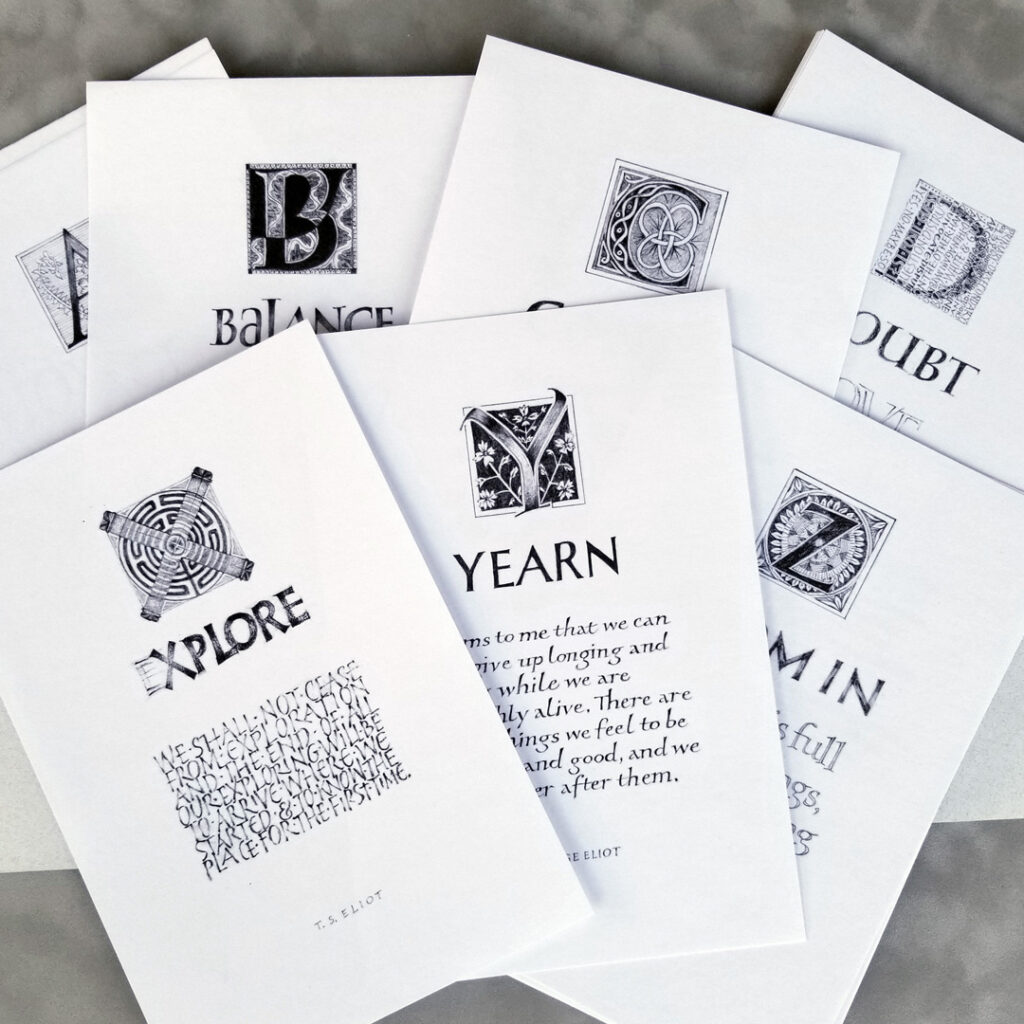
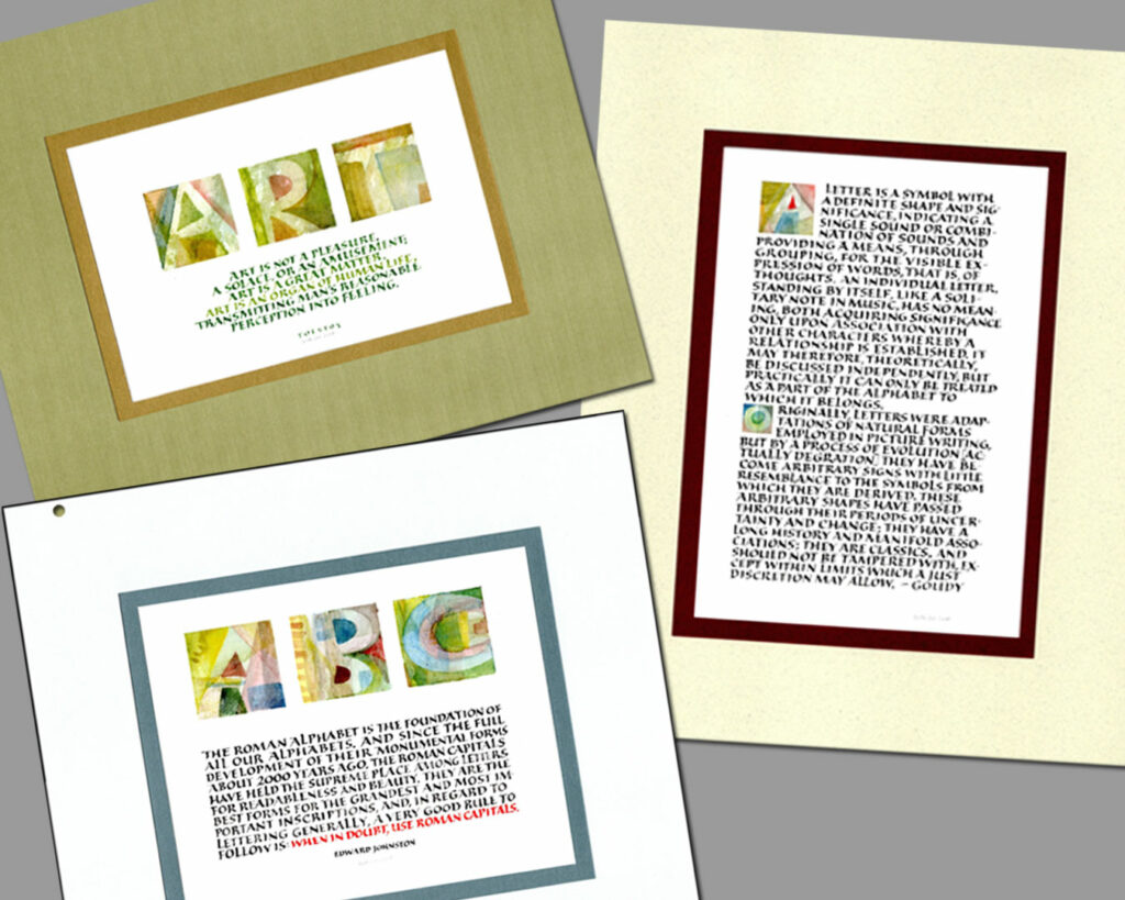
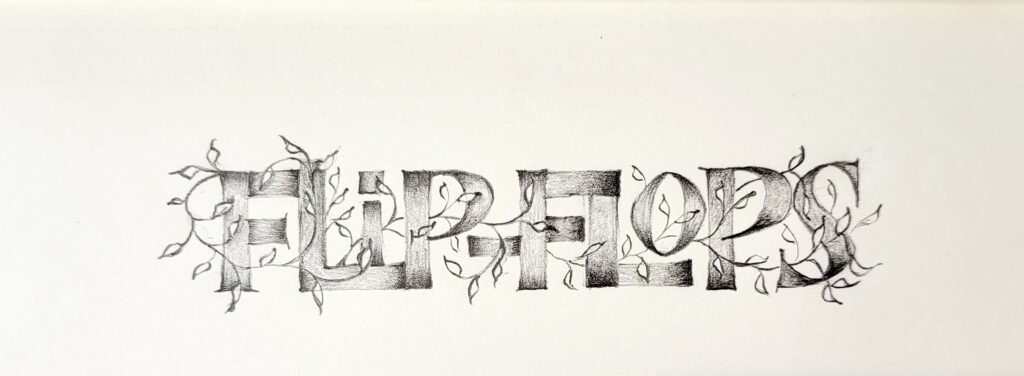
Built-up capitals are slow to make, but they allow the maximum control over the letter forms. They also provide a deeper understanding of the shapes and spaces that make up our alphabet. The opportunity for variations is practically unlimited, from Trajan-like elegance to casual flair to playful silliness. And these variations can work together seamlessly.
We will begin with penciled monoline capitals. Then we’ll building on those monoline capitals to built-up capitals, first with pencils and then with broad-edge pens.
Then the fun will continue with variations in letters, layout, and rhythm. We’ll explore how and why these elements are so dramatically different in capitals than in minuscules.
Suitable for beginners and experienced letterers alike.
This class was held 6:30-8:30 PM Mountain Time on these Tuesday evenings: Oct 29 and Nov 5, 12, and 19.