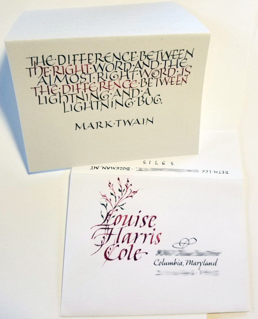
After a hiatus of some years, I’ve rejoined an 11-months-long monthly decorative envelope exchange. I’m enjoying it. We aren’t required to include anything calligraphic in the envelope — although we do have to include something. I’m putting calligraphy in mine.
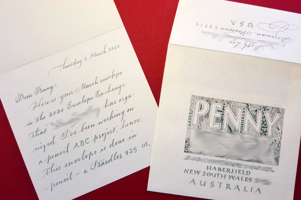
My February envelope, using that palette of leftover gouache (that just keeps on giving).for the card inside.My March envelope. The blurring kind of obscures the design, but you get an idea, anyway. All done in pencil, which is what I’ve mostly been doing in my studio lately.
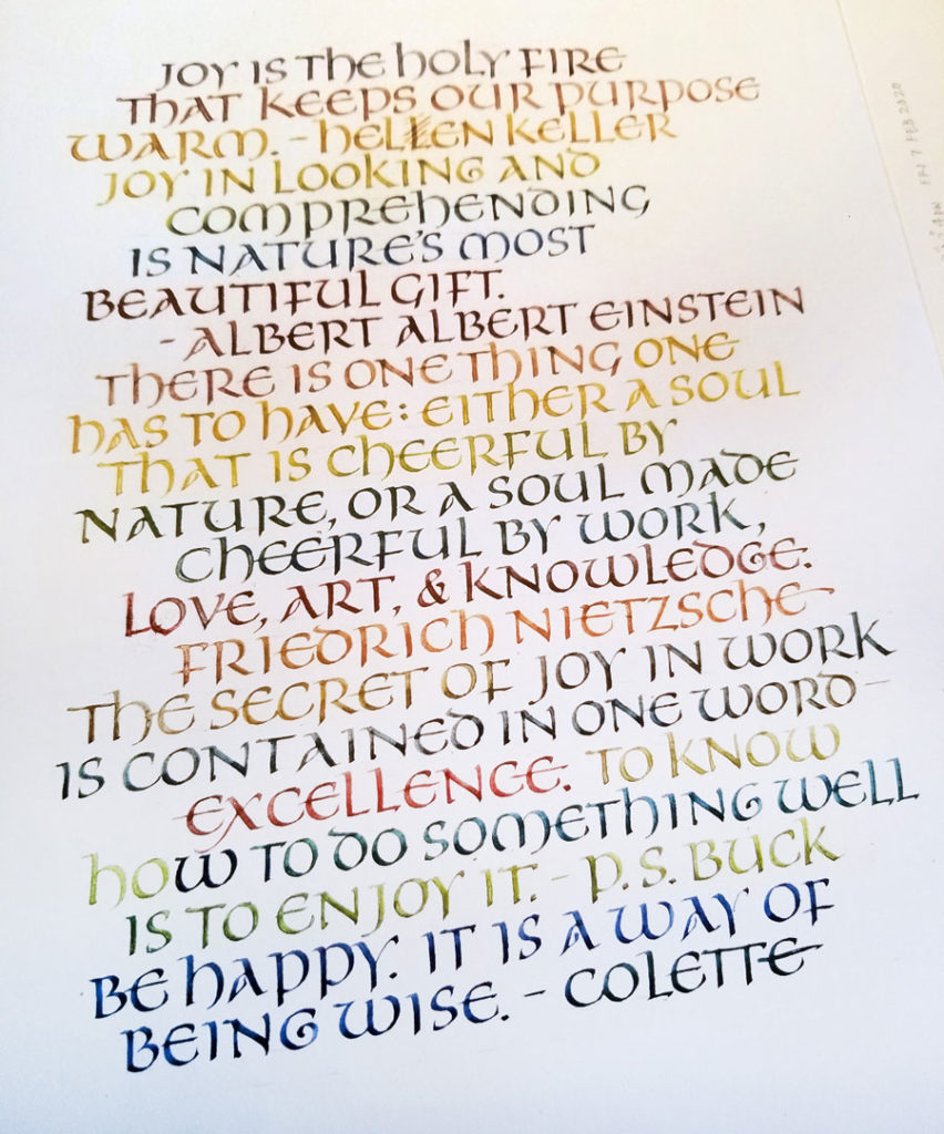
Freely written capitals using that same palette of leftover gouaches and a 1.5mm Brause nib.
I’m thinking that the little meander book (2.5 x 3.5 in or so) in the corner may be how I got this leftover palette of gouache in the first place. The colors match. If so, then I began with three primaries (warm yellow and blue, cool red), and that’s it.
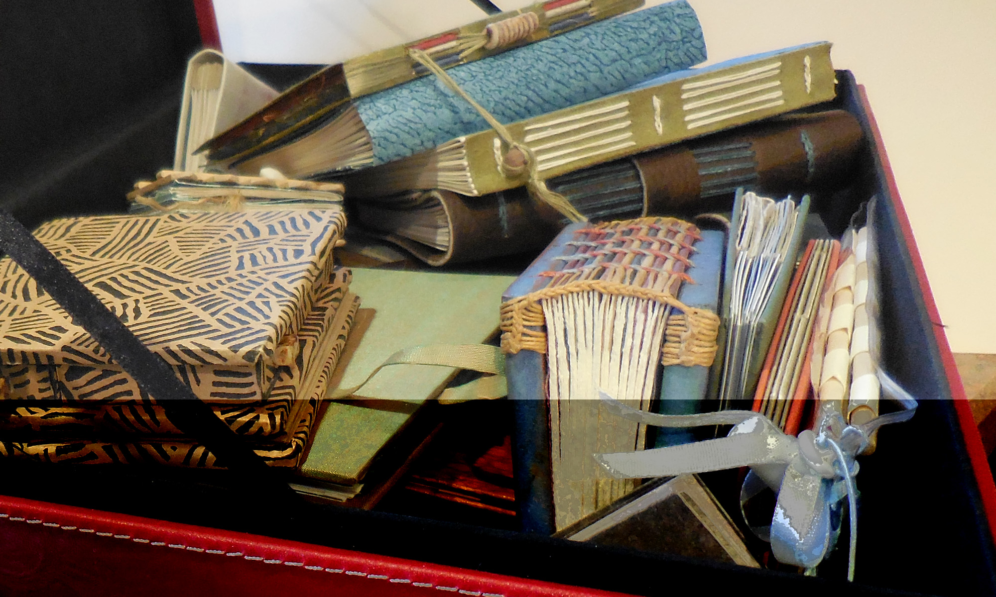
At this rate, I’ll be binding another journal of daily lettering soon.
Uncial calligraphy practice, leftover gouache, on a 9in x 12in page of Strathmore Drawing 400.Uncial calligraphy practice, x-height 6mm, 1.5mm Brause nib, leftover gouache, on a 9in x 12in page of Strathmore Drawing 400.Uncial calligraphy practice, x-height 6mm, 1.5mm Brause nib, leftover gouache, on a 9in x 12in page of Strathmore Drawing 400.
The past few days’ daily lettering have been all about uncials, particularly one old exemplar that is unlabeled except for “late XII England”.
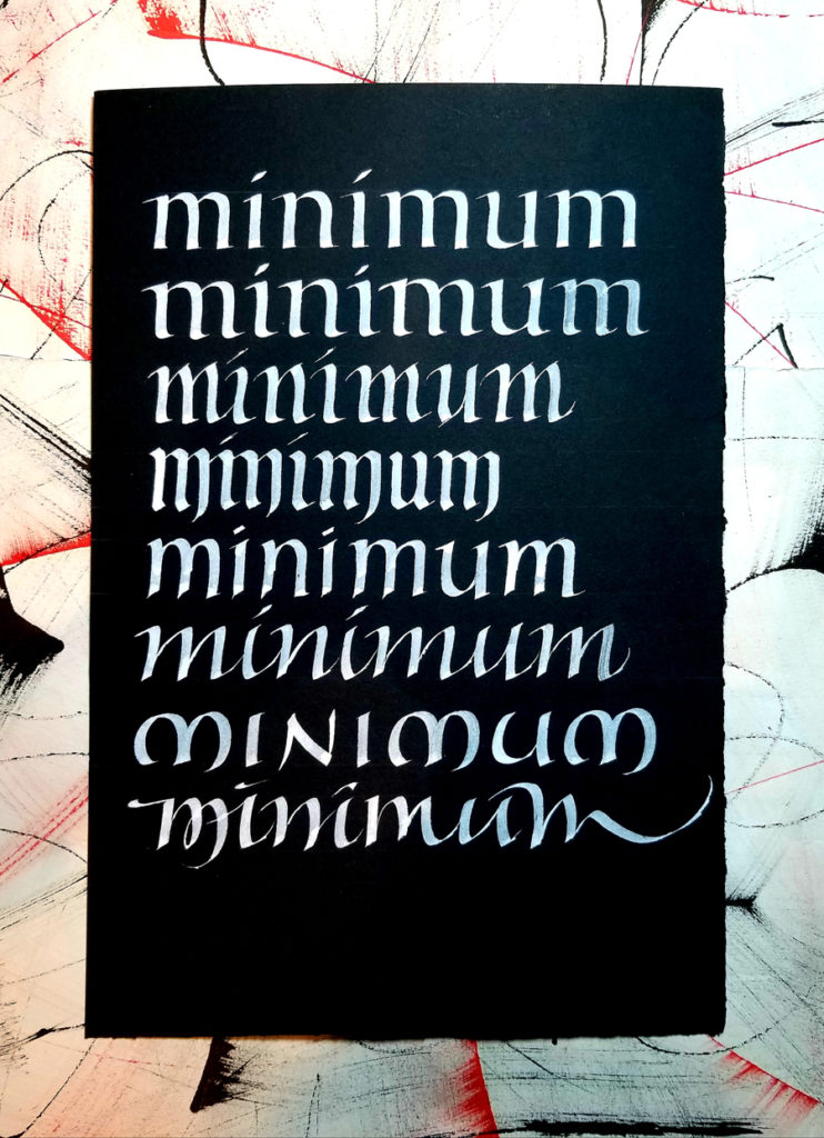
Speedball “C” nib and Pro White on unknown scrap of black paper.
As “the quick brown fox jumps over the lazy dog” is considered to be the quintessential abecedarium, so “minimum” is the stock word for practicing letter spacing. Here the challenge was to change the style each line while keeping each line as consistent as possible. Difficult! Here were the styles/rules I had in mind on each line:
foundational connections and proportions with flat base;
foundational connections with classic two-part triangular serif at top and rounded exit strokes at bottom;
gothicized italic with flattened horizontal-ish exit strokes (copy of Edward Johnson’s version);
a rather softened style of blackletter;
a hybrid of bookhand and italic which requires a pen-angle change on the branching, with exaggerated pen-angle stops at the base;
italic with a very low branch point;
uncial;
springy italic with increasingly erratic um, unrestrained gestural strokes.
practicing one script : working/playing in this manner :: practicing a straight scale : improvising a Hanon exercise using a jazz scale and syncopated rhythm
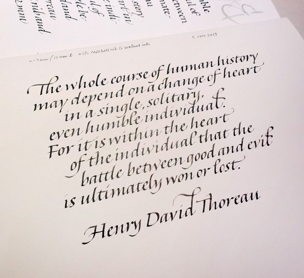
1.5 mm Tape nib and walnut, x-height 2 mm, line leading 10 mm. Understandably inconsistent bookhand. Tomorrow will be better, and so will the day after tomorrow.
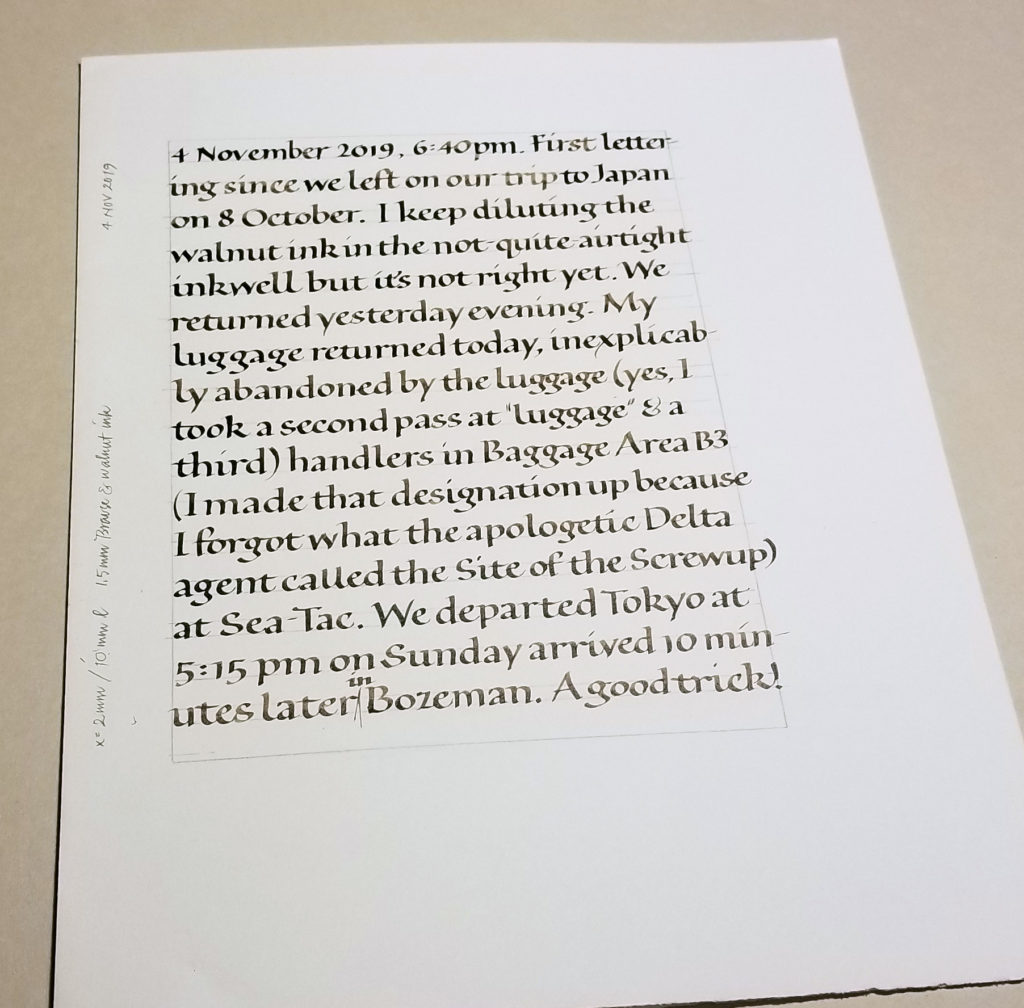
Home again, after a month in Japan. And back to daily lettering practice.
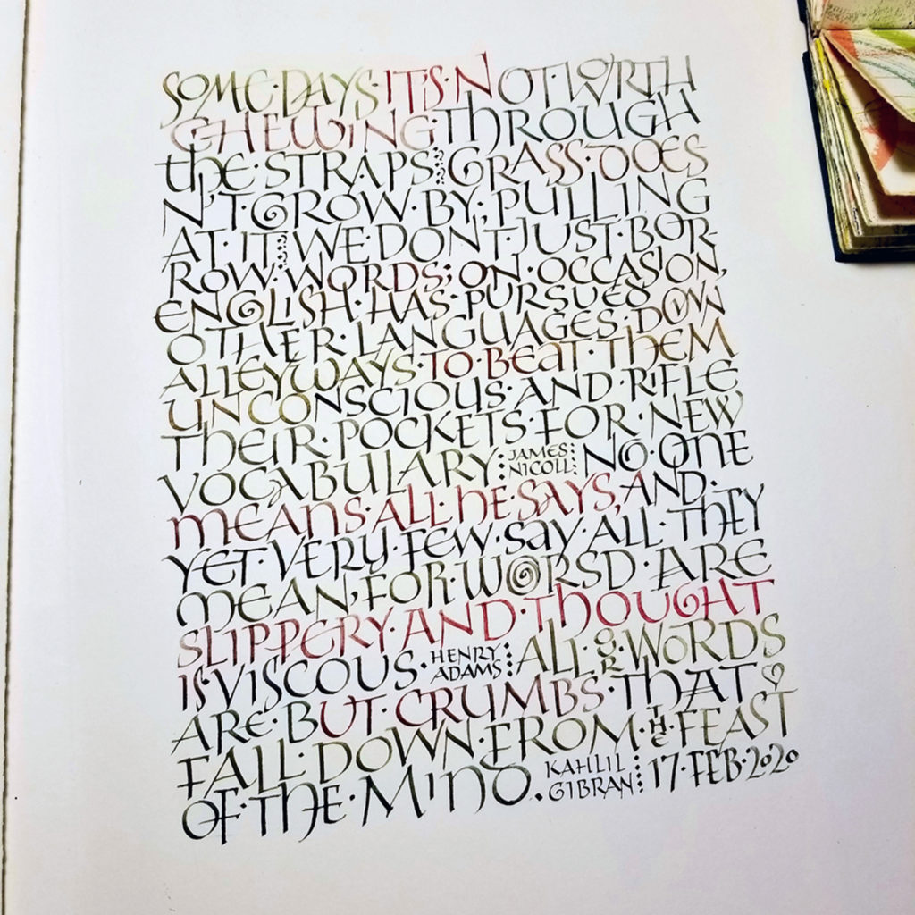
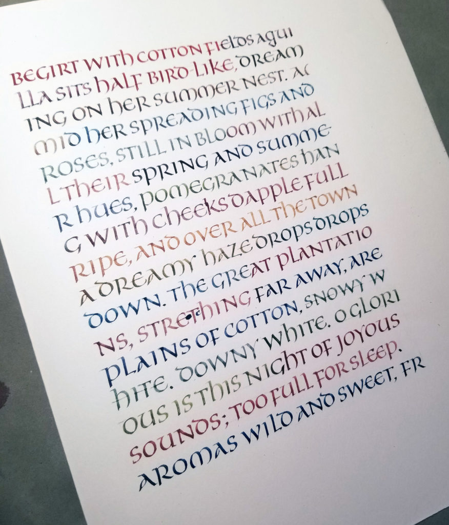
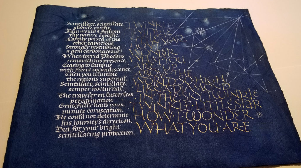
Sometimes in the making of a book edition, you get stuck. I am, or was. I’ve been working with a few texts about stars, and had dyed a stack of Arches Text Wove. The possibilities for structure and order and style having overwhelmed me, I took a step back and chose just one of the texts for a broadside. Nothing like a deadline to get the ink flowing. This was made for submission to “Inktober” an exhibit whose main requirement was that it include ink. The theme for the exhibit is “a few of my favorite things”. Stars are more than a few of my favorite things.
Contains information related to marketing campaigns of the user. These are shared with Google AdWords / Google Ads when the Google Ads and Google Analytics accounts are linked together.
90 days
__utma
ID used to identify users and sessions
2 years after last activity
__utmt
Used to monitor number of Google Analytics server requests
10 minutes
__utmb
Used to distinguish new sessions and visits. This cookie is set when the GA.js javascript library is loaded and there is no existing __utmb cookie. The cookie is updated every time data is sent to the Google Analytics server.
30 minutes after last activity
__utmc
Used only with old Urchin versions of Google Analytics and not with GA.js. Was used to distinguish between new sessions and visits at the end of a session.
End of session (browser)
__utmz
Contains information about the traffic source or campaign that directed user to the website. The cookie is set when the GA.js javascript is loaded and updated when data is sent to the Google Anaytics server
6 months after last activity
__utmv
Contains custom information set by the web developer via the _setCustomVar method in Google Analytics. This cookie is updated every time new data is sent to the Google Analytics server.
2 years after last activity
__utmx
Used to determine whether a user is included in an A / B or Multivariate test.
18 months
_ga
ID used to identify users
2 years
_gali
Used by Google Analytics to determine which links on a page are being clicked
30 seconds
_ga_
ID used to identify users
2 years
_gid
ID used to identify users for 24 hours after last activity
24 hours
_gat
Used to monitor number of Google Analytics server requests when using Google Tag Manager
1 minute
You can find more information in our Cookie Policy and .