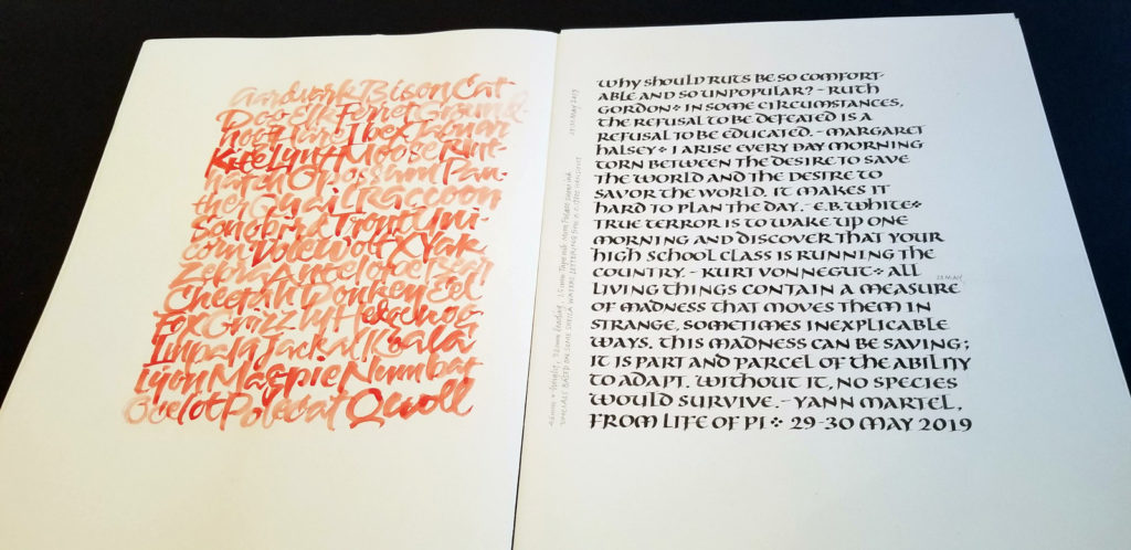
After just a few days off, the hand seems to slip through my fingers when I lose focus, but I am enjoying gothicized italic. This page was done June 11.

Calligraphy & more — the studio of Beth Lee, Redmond, WA
After just a few days off, the hand seems to slip through my fingers when I lose focus, but I am enjoying gothicized italic. This page was done June 11.
I’ve been negligent here on my blog — has it really been two months? to the day! — but I’ve been working pretty steadily in my studio. Here are a few pages of daily lettering, mostly delving into gothicized italic and uncial letter forms.
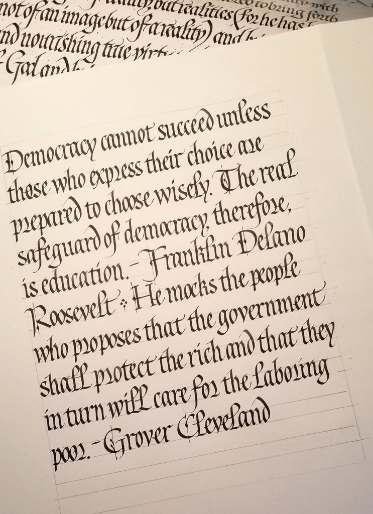
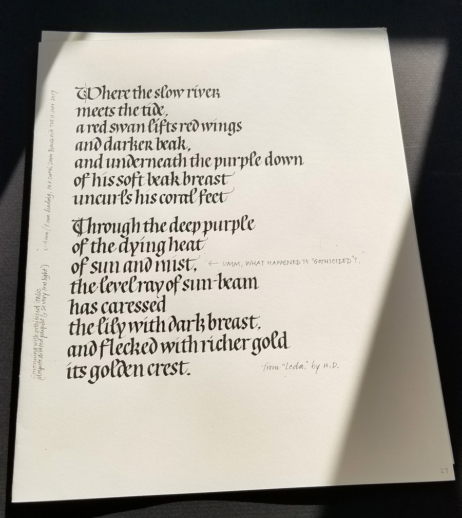
I’ve been studying gothicized italic, a hand I’ve never mastered. I began by analyzing a handout of a Lincoln quotation that Sheila Waters provided in a long-ago workshop. I determined the x-height and pen-width, lined up a sheet of paper, penciled in the bare bones of the letters, and had at it. As I worked I made notes about surprising discoveries: “the s is wider than I had thought”, “the final stroke of the e continues diagonally and does not go horizontal”, and so on. Then I repeated the exercise without penciling in the skeletal letters. (I won’t sully Sheila’s reputation — or mine — by reproducing my practice sheets here!) Next, I put up another handout from Sheila, a reproduction of a piece of Edward Johnston’s gothicized italic writing. You can see a portion of that handout in the image above. Once again, I analyzed it, ruled up a sheet, and copied the lettering as closely as possible, making notes as before.
Finally, I wrote out this sheet, choosing another text. My goal was to stick to Johnston’s lettering closely yet adhere to some best calligraphy practices and to make it more my own. I didn’t care for the long thin finials on his t and h, and his standard r is so wild and woolly that the next letter must be shorter to compensate. Next time around I will work on letter width and spacing to better match Johnston’s: mine were both two wide. Also, I regretted the use of the alternate r on the 2nd line. It seems to work best next to another oval letter such as a p.
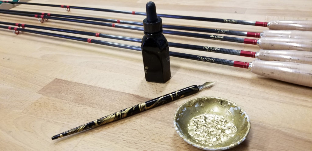
One of the interesting aspects of a freelance calligraphy studio is the wide variety of work. Lettering for Tom Morgan Rodsmiths is a great example. I appreciate getting to contribute my expertise to these hand-crafted fly rods.
I use sumi ink on the bamboo rods and gold ink on graphite and composite rods. Laying down the gold ink is sometimes a challenge. Also a challenge: writing on the curved surface of the rods with a pointed metal nib.
A few weeks ago I had the pleasure of attending Harvest Crittenden’s workshop hosted by the Big Sky Scribes in Helena. The subject: Spencerian script. I had never studied this hand before. Harvest is very organized and clear, and we learned a lot in a short time. Now all we have to do is … practice, of course.
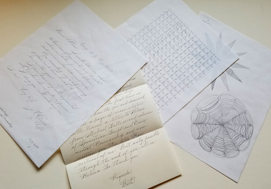
I haven’t been as regular about it as I could wish, but yesterday I sat down to practice in earnest again. I began with 2 pages of warm-up exercises designed to build kinetic memory. After the page of cross drills, I decided to simply trace, in pencil, a letter written in the 19th century in Spencerian. It helped to teach myself the rhythm of the script, and I was surprised to discover by that method a few things I had been glossing over. Then I wrote a letter in Spencerian using a ball-point pen. I have this lovely ball-point pen with a 0.3 mm point, and I didn’t want to get out ink.
Spencerian practice using a pencil and ball-point pen on B&R layout paper and Crane stationery.
Deadlines are looming and inspiration is elusive. I tidy my studio, clear out some old practice sheets .. and make some more. It’s a never ending cycle.
To entice the muse, I sit down to play a little. I’m thinking of another little book (and just now remembering I’ve never posted the last little book), so I experiment with a number inks/paints and a #6 Mitchell nib. The lettering is 1.5 mm x-height.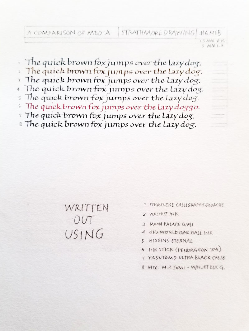
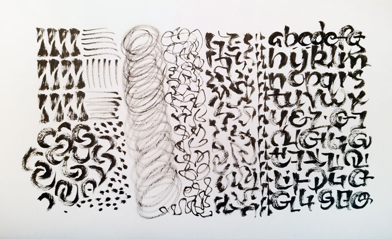 In anticipation of the upcoming conference, and the class that will be taught by Carl Rohrs, I get out a brush and do … something. It’s not much, but it reminds me what a pointed brush feels like in the hand. I feel some of the kinetic learning of a recent Spencerian workshop creeping in. That’s good.
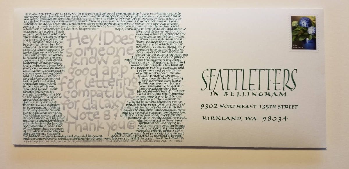
Here’s my submission to the envelope contest that John Neal Books hosted in association with Seattletters. The deadline was April 20. The gray lettering is a post I read in a calligraphy group on social media. I surrounded it with text from an 1888 article by A. J. Scarborough which had been posted in 2000 to the Cyberscribes discussion list. I like the contrast in approaches 🙂
I penciled baseline guidelines 2mm apart for the small lettering, making the x-height about 1mm. I clipped a pointed nib (a blue Esterbrook of some sort, I think) to make a tiny broad-edge nib. Seattleletters address is #5 Mitchell nib, I think.
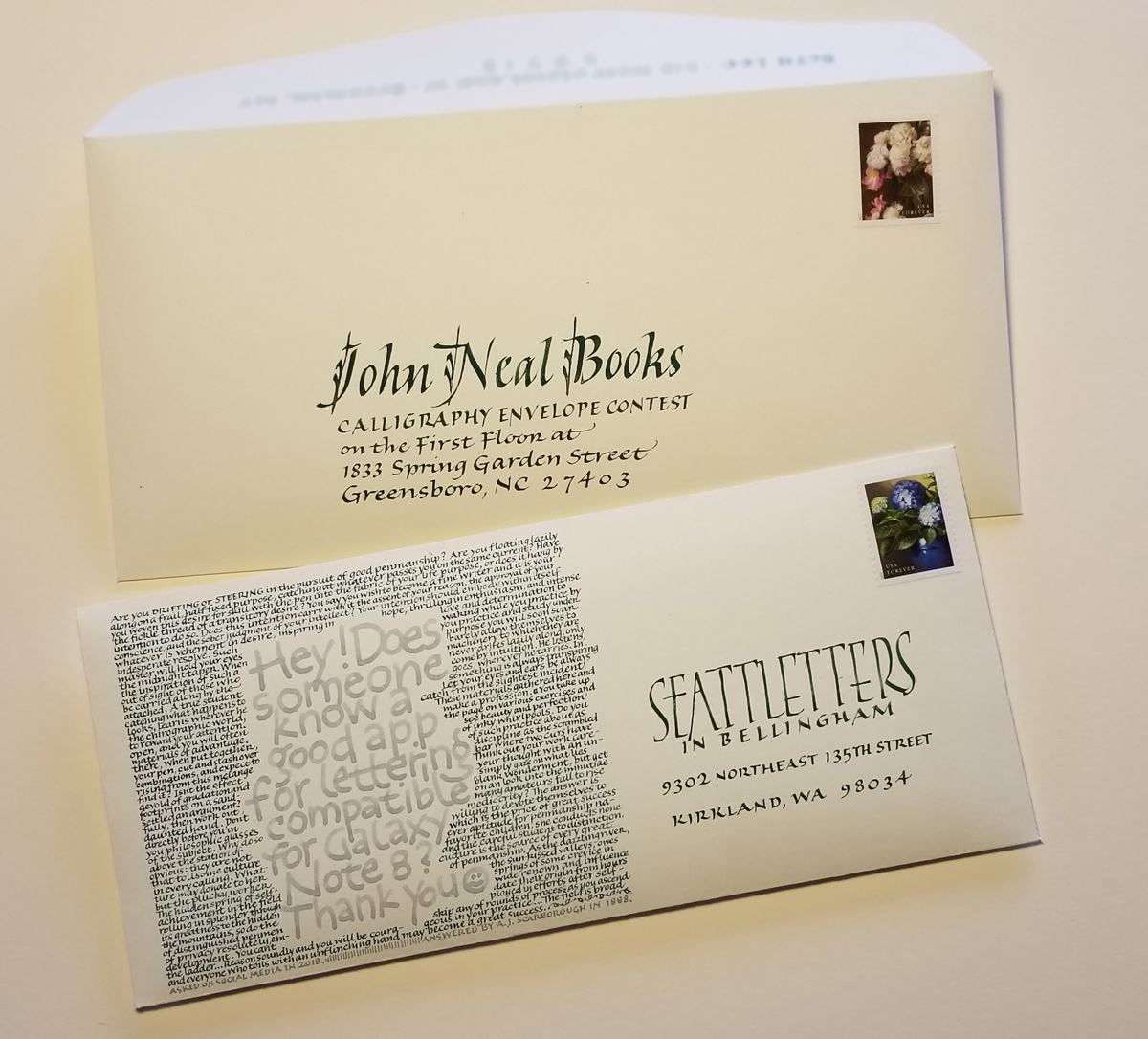
After all that work, I couldn’t bear to send it through the US Mail unprotected, so I made another envelope, just ¼” larger in each direction, to house the submission.
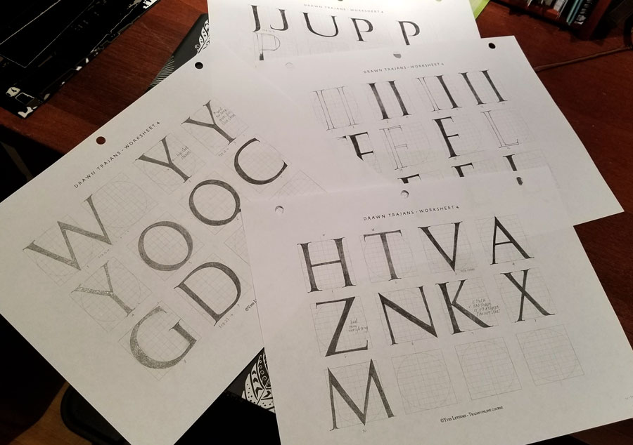
I’m taking my very first online calligraphy course. “Homegrown Trajans” is taught by the wonderfully clear and thorough master Yves Leterme via Harvest Crittendon’s site, Acorn Arts. It’s as rigorous as anyone could wish for, and I’m already just a tiny bit behind. Week 3 posted today, but these are my worksheets from week 1 (complete) and week 2 (not quite complete). I think some of these students have no other demands on their time! Or perhaps I’m just incredibly slow. Either way, I’m buckling down tonight and catching up.
It’s been a hectic month, but I’m hoping to get back to this soon. Latter portions of the alphabet have been neglected for too long.