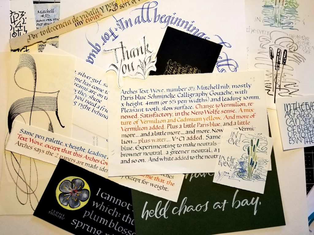
Have I mentioned how much I’m enjoying Elizabeth McKee’s brush lettering class? Well, it bears repeating. Here are just a few pages of the homework I did in November, the 3rd month of classes.
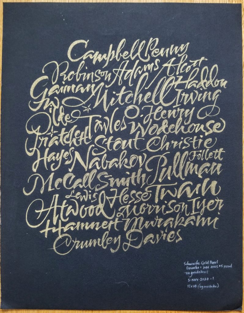
A low-tech word cloud of favorite authors 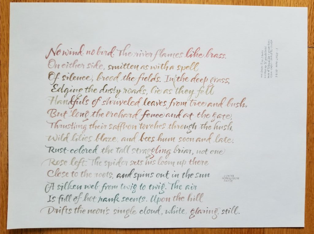
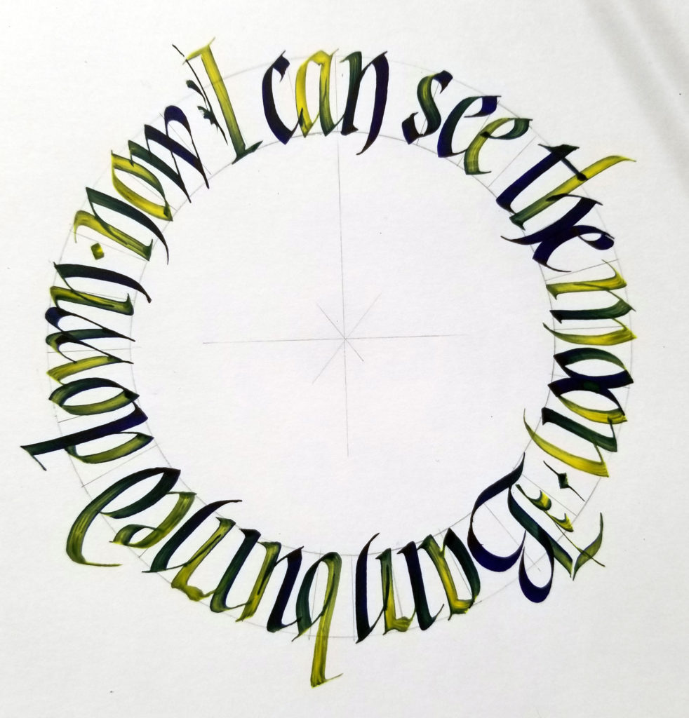
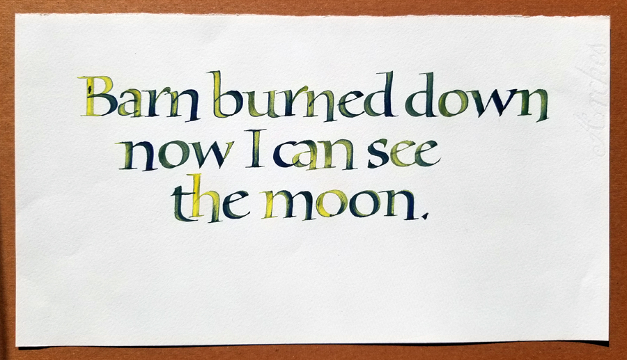
Lizette Woodworth Reese – WN Series 7 + gouaches 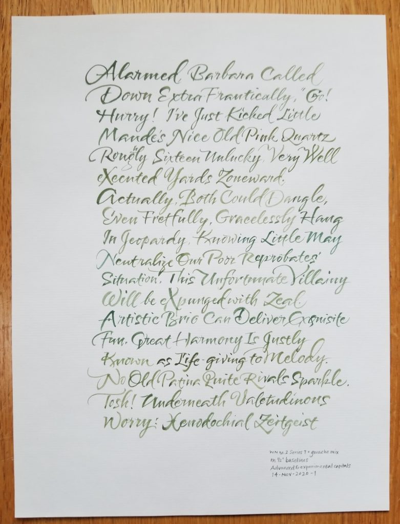
Improvisational sentences in alphabetical order 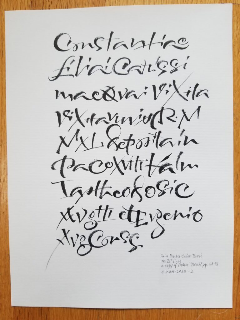
Copying Carl Rohrs for the kinetic knowledge 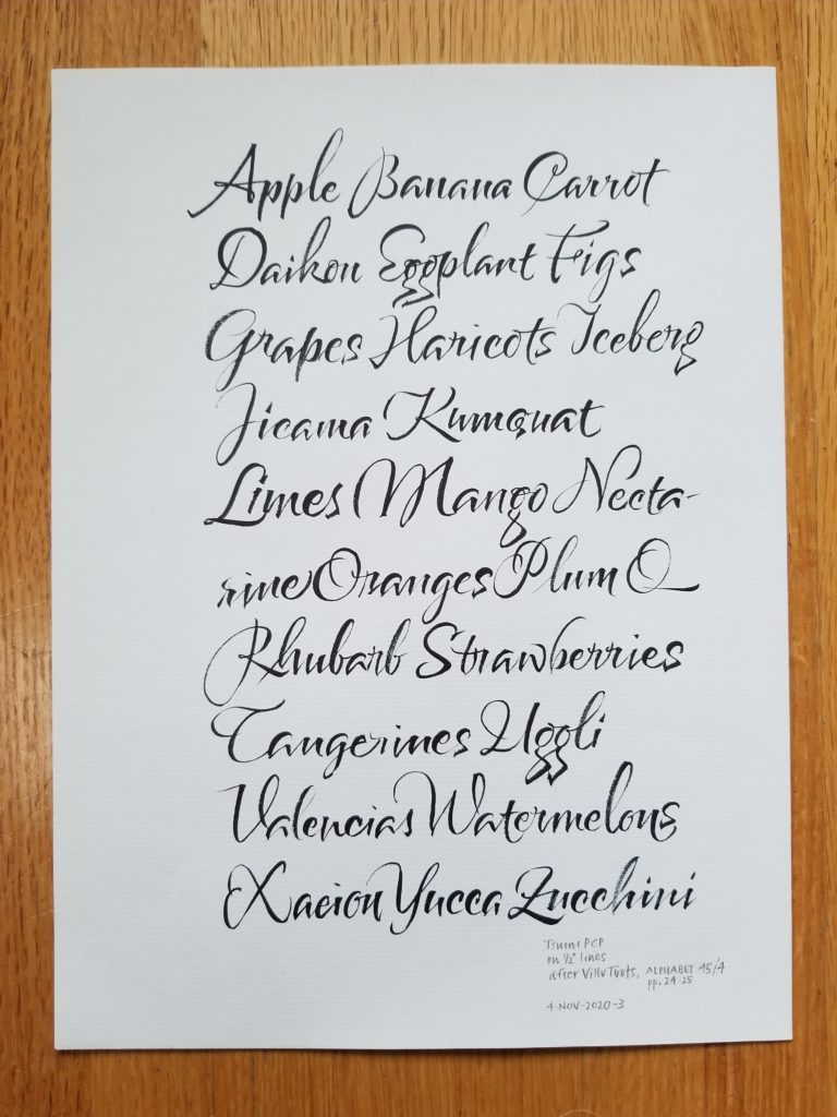
Studying Villu Toots’s capitals 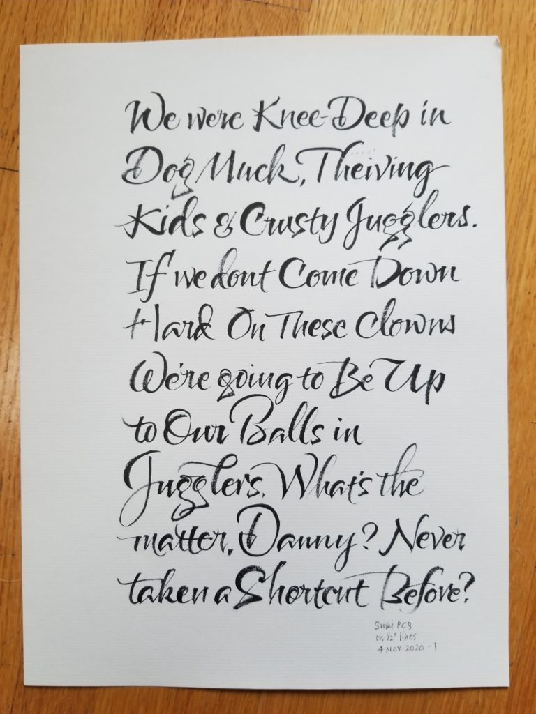
Hot Fuzz and Pentel Color Brush, suki tip 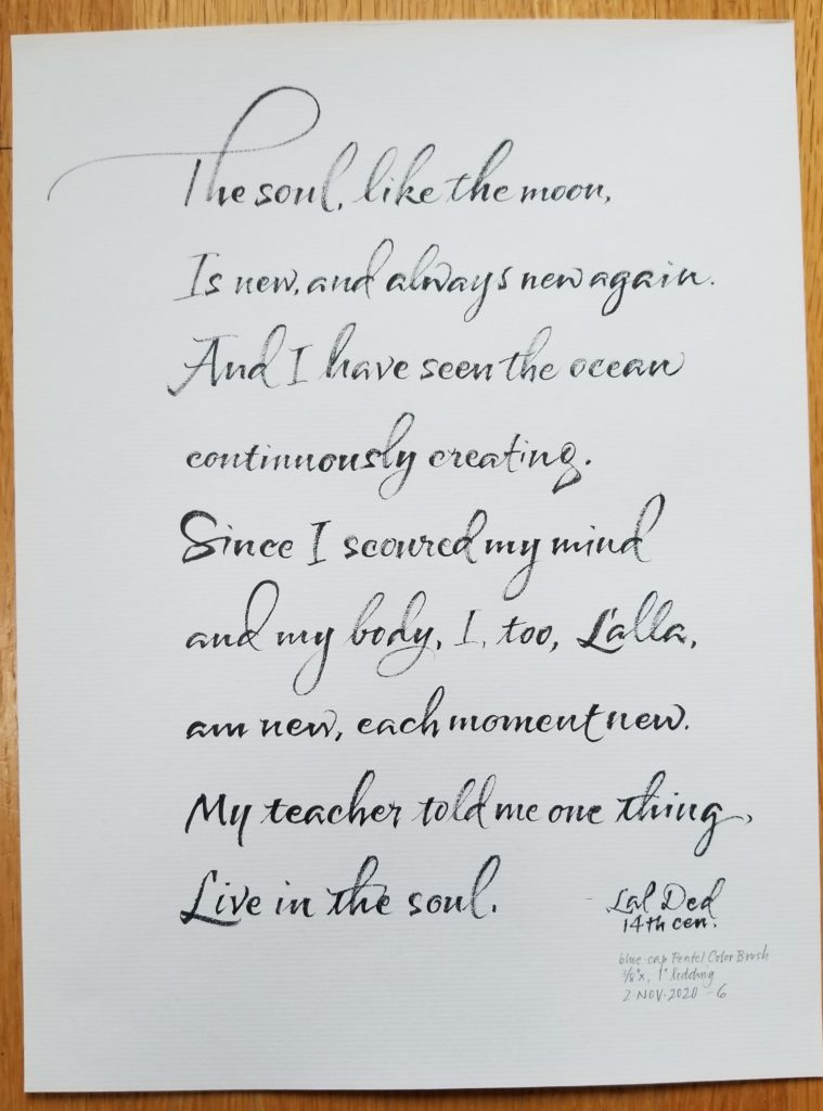
Going for longer ascenders and descenders 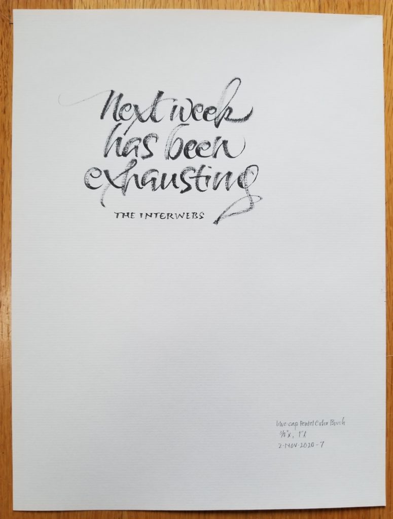
Fun ligatures 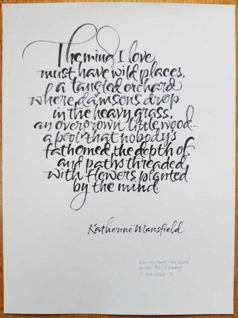
Very little line leading 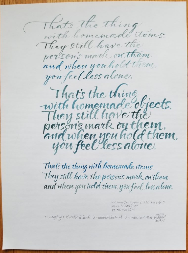
Importing some things I learned in John Stevens’ italics class 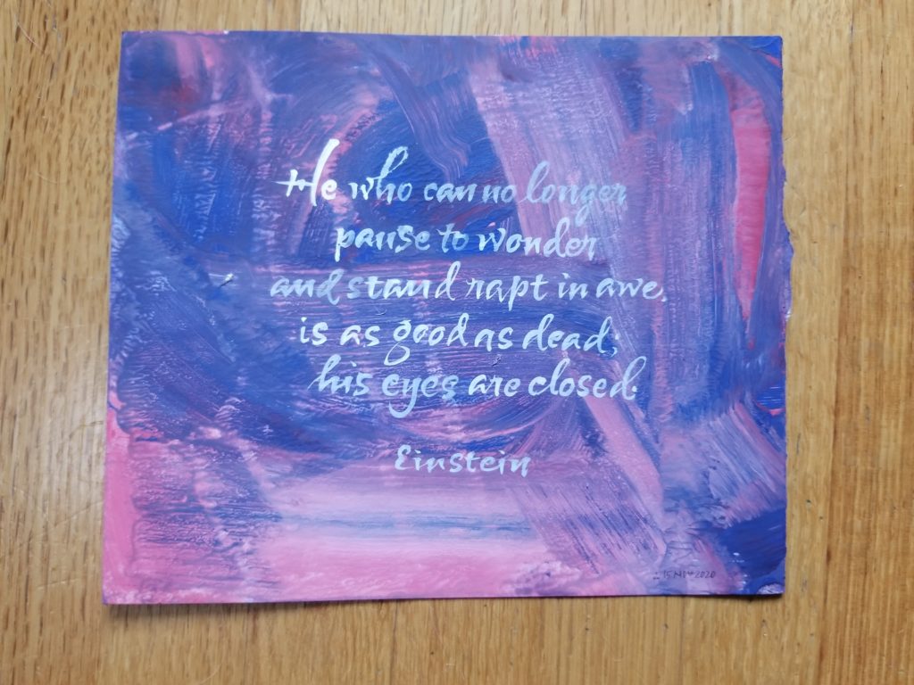
Writing on acrylic ground 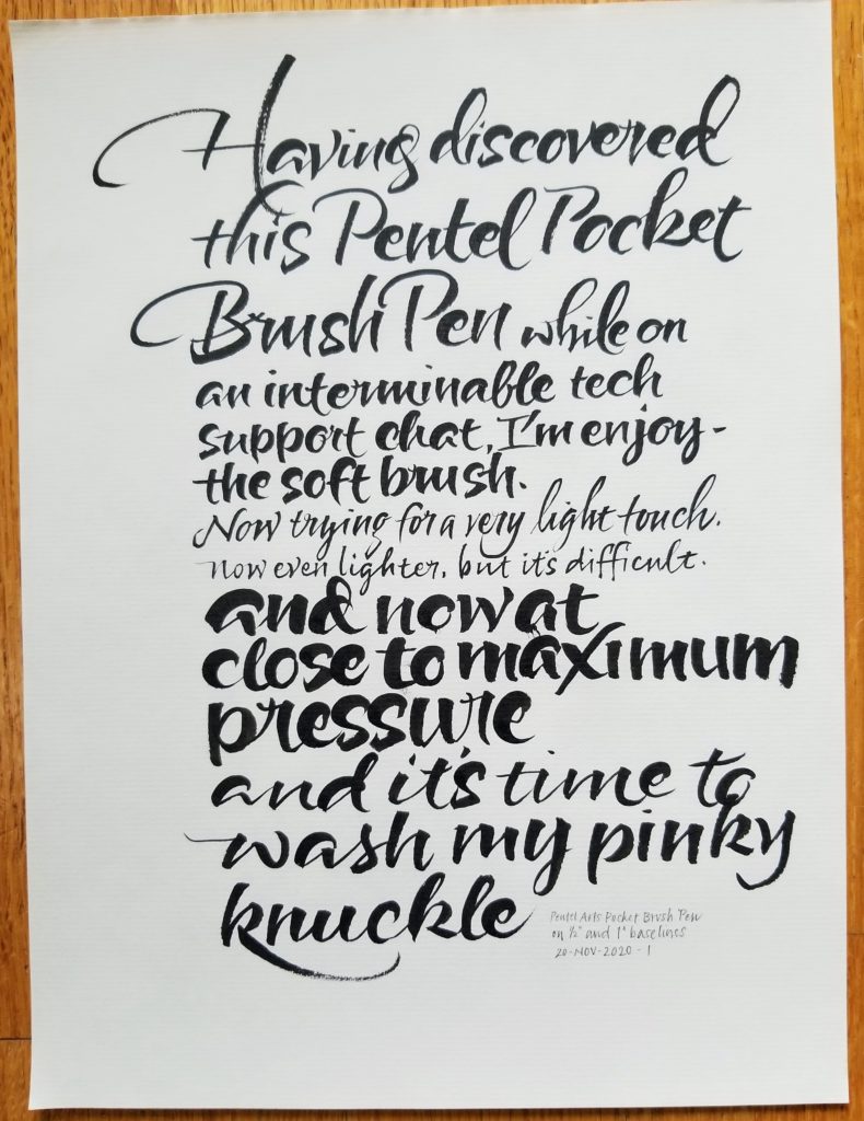
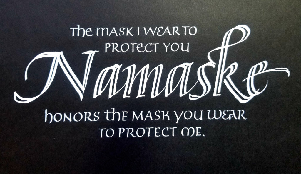
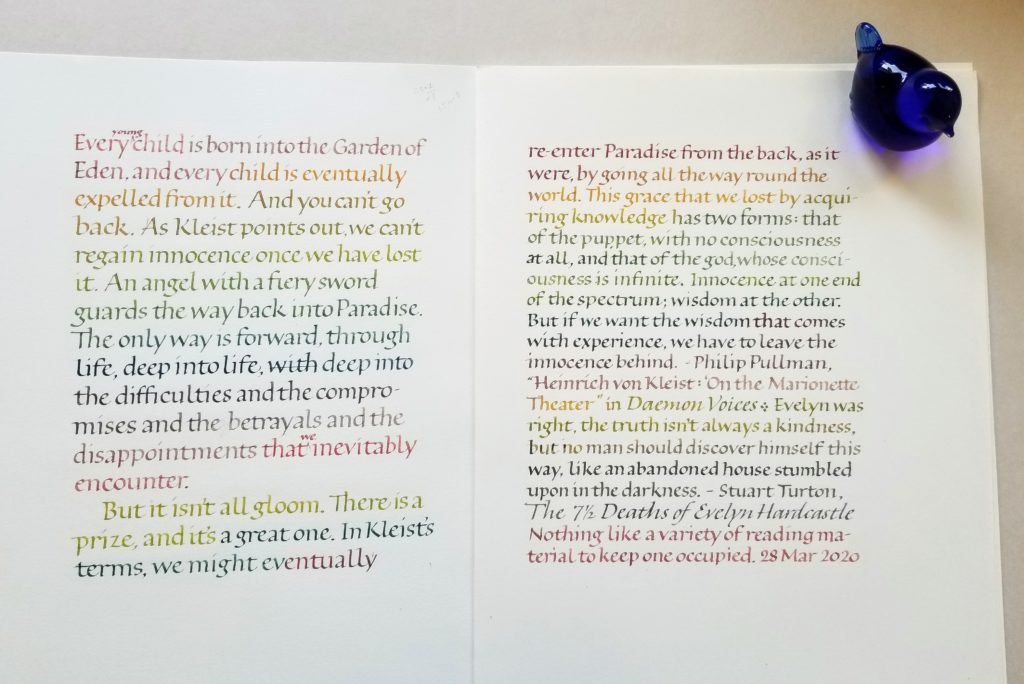
The text says it all 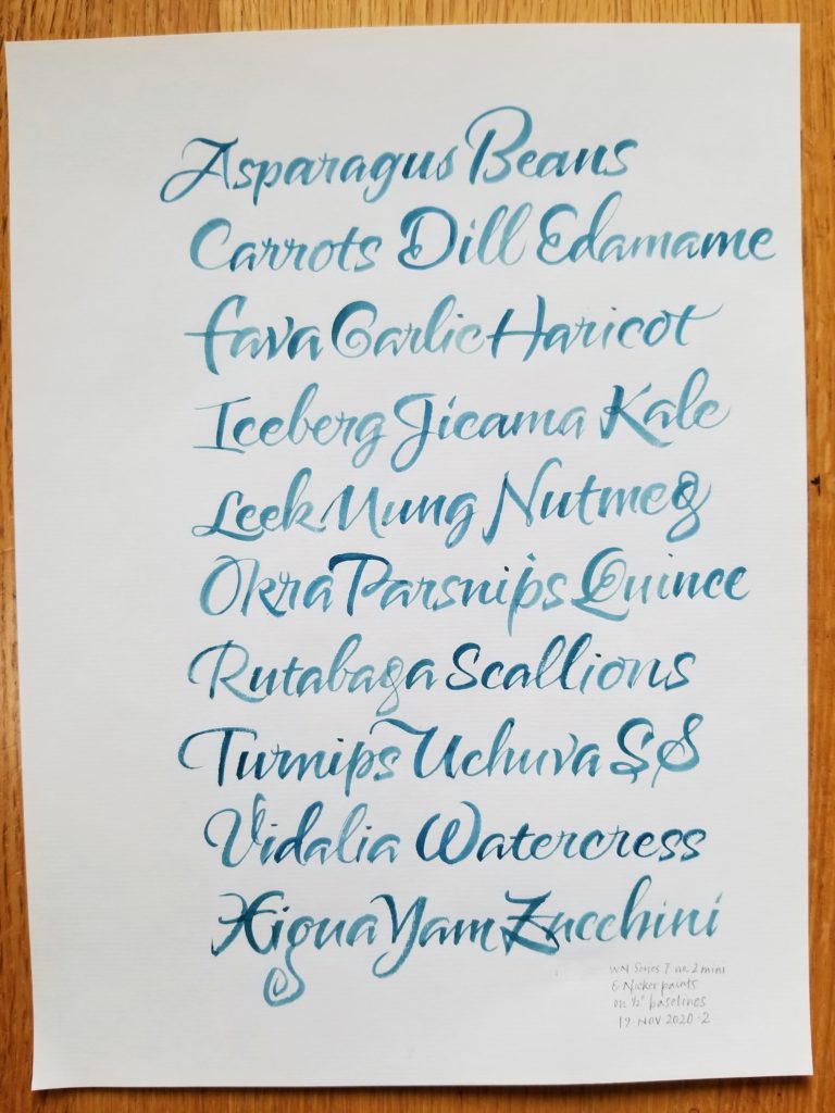
More capitals practice 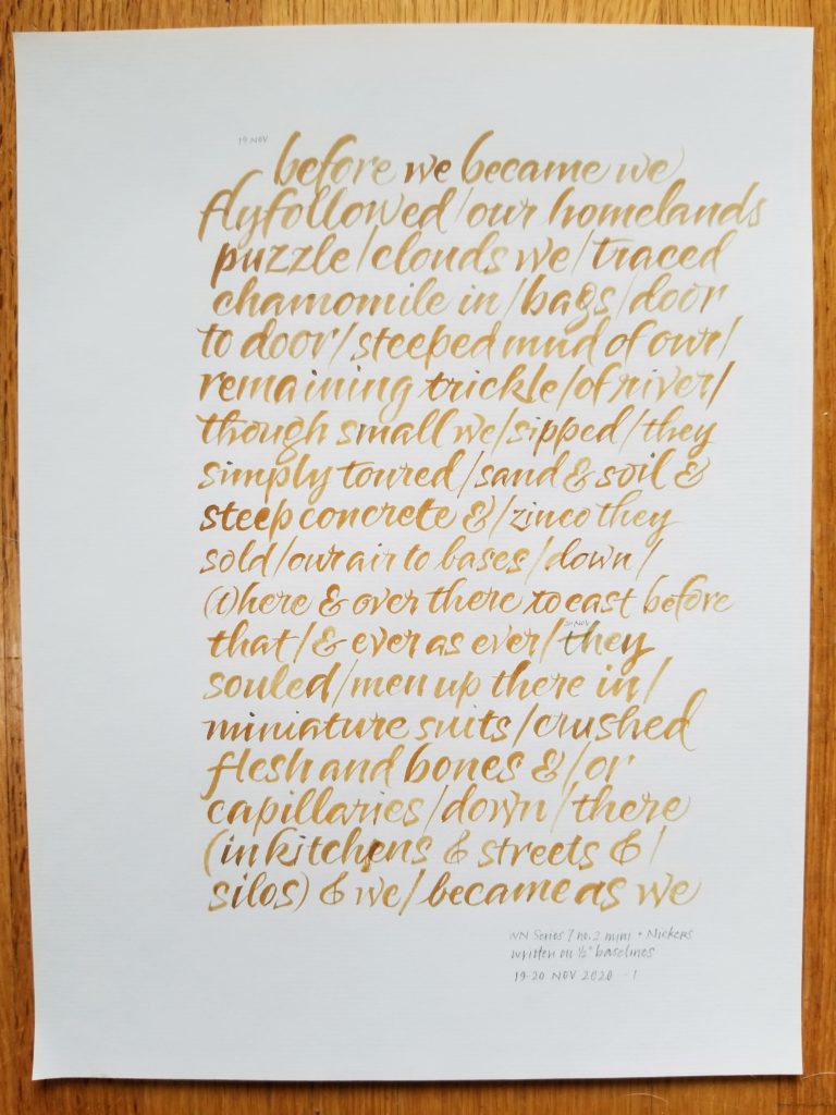
WN Series 7 + Nicker paints 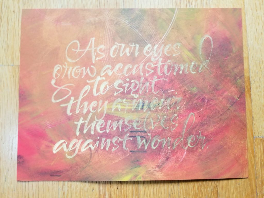
Gold gouache on acrylic-painted ground
I’ve mostly been writing with Pentel Color Brushes (all four tips), Winsor & Newton Series 7 pointed brushes (1, 2, 2 mini), and the Pentel Pocket Brush. I’ve mostly been using fountain pen ink, Schmincke gouaches, Winsor & Newton watercolors, Dr. Martin’s Pro White, and FineTec metallic watercolors.
I’m happily balancing this kind of work with the formal, slower work of study in Elmo van Slingerland’s Roman minuscules class through the Society of Scribes … and the geometry and paper handling of folding portfolio folders and fulfilling orders for my ABC portfolios. I’ll post some of my work in the Roman minuscules class next time.