Testing inks

Testing inks on Aches 140# HP watercolor paper with a Brause nib

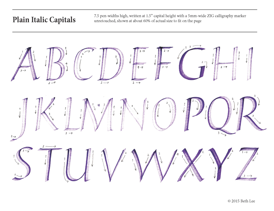
Today’s SAT analogy: Experimenting is to finished calligraphy as the tip of the iceberg is to the iceberg. One of the things that Christopher Haanes focused on in the workshop was sharpness of writing. His description of the differences between Chinese and Japanese stick inks has changed my thinking about them. (Don’t get me started on how bottled sumi ink bears no relation to stick sumi ink.)

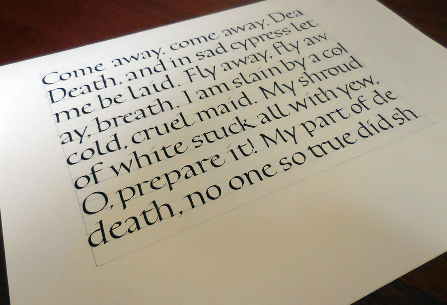
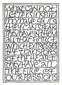
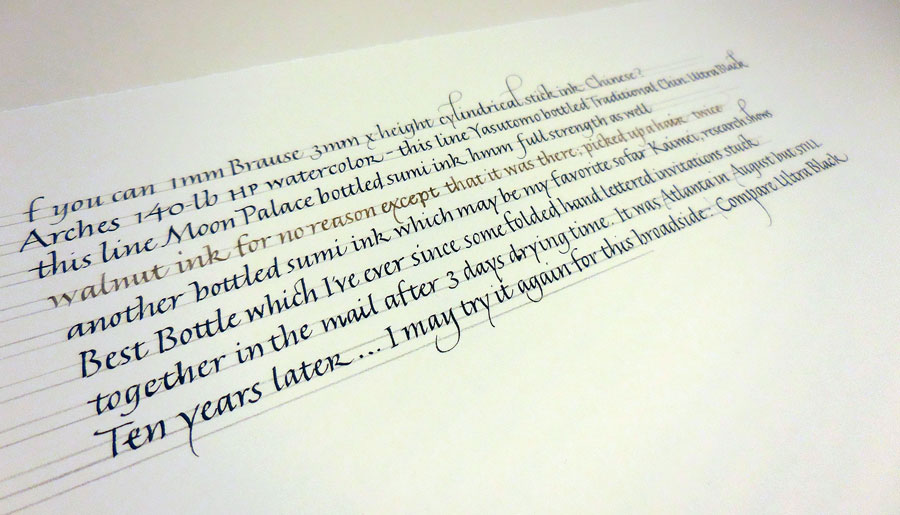
Before I did the poem I mentioned in a recent post, I got out a bunch of inks and tested them on the paper I planned to use. This took forever, but was an interesting exercise. Of course, all the information is only useful with that paper and that nib …

rainbow writing
A bit of fun

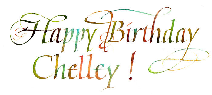
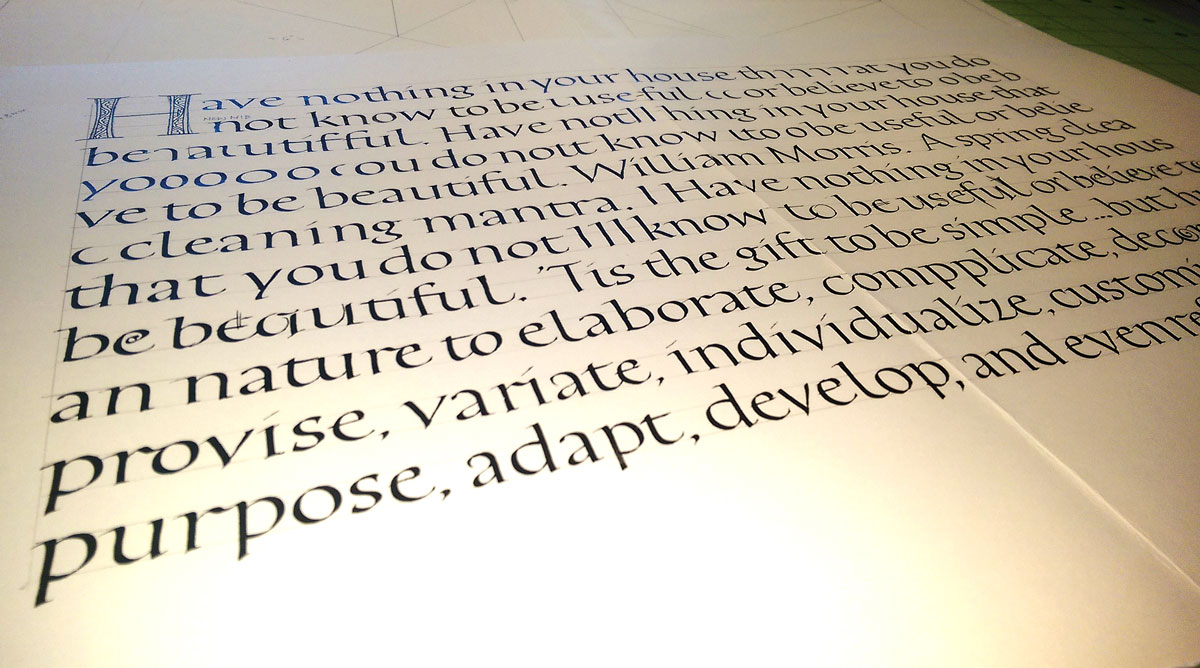
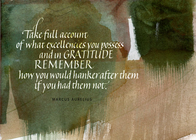
And then I took a break and had a good time with paints  left over from an earlier piece. It looks better in person.

Daily lettering – thank-you notes


thank-you notes
Thank-you notes

Some days the daily lettering actually has another purpose besides just practice. As it does today. These are four of a bunch of thank-you notes I wrote today. I was way behind.

I also finished a commission. I may show an image of it in a month or so, when it’s no longer a surprise to the recipient. I’ll give you a hint, though: it’s a poem that is requested often. I think I did it the first time in 1986, and have probably done it every other year, on average, since then. It’s long and oh so androcentric. I was quite pleased with the way this iteration turned out.

Bookhand after the workshop

Daily lettering after the Christopher Haanes workshop

Working on Zerkall smooth with a Brause 3mm nib, the pen is sticking in the turns.  Yes, I have a good cushion. The ink is stick ink, maybe Chinese, but I’m not sure. It’s a round cylinder of a stick ink. Tomorrow I’m switching to something else — changing both paper and ink, probably. These are some of the letters — or at least they want to be the letters — that we studied over the weekend with Christopher Haanes.

Like all good workshops, this workshop was like suspending one’s regular workout practice at the gym to work with a personal trainer for a little bit. At the gym, you know in the back of your mind that you haven’t really doing those squats properly, and you tend to skimp on triceps reps, and maybe it’s been awhile since you even visited that corner of the gym that houses the medicine balls.

Along those same lines, at this workshop I revisited ink choices, spent some much-needed time with pen manipulation and pressure. Oh, and it had been a good while since I had visited that very large corner of calligraphy that houses the Roman capitals.

Daily lettering: preparation for the Big Sky Scribes spring workshop

Bookhand practice - day 1
Bookhand practice – day 1

I’ve been doing some blackletter work recently, and I’ve been doing some Hebrew lettering. (This latter is more a labor of love than of skill, so I doubt you’ll be seeing any of it here.)

But the spring workshop sponsored by the Big Sky Scribes guild is coming up soon. I’m really looking forward to the workshop, which Christopher Haanes will be teaching. Today Amity Parks posted a practice sheet that she had just completed in preparation for the workshop and I realized hey, I need to be getting ready too! After today’s daily lettering session, picture here, it’s even more clear that hey, I need to be getting ready!

This is Moon Palace sumi ink, a Mitchell #2.5 nib, and Strathmore Drawing 400 heavyweight paper. Smartphone photo in poor light.

Blackletter

2015-04-11 blackletter trialsI have little affinity for blackletter styles and clients request blackletter (“Gothic”) calligraphy only a few times a year, so I don’t work on it much. This year my study of the Fraktur exemplars which Yukimi Annand generously shared with me has made work on these historic register certificates more enjoyable.

Lemons into lemonade

My daily lettering earlier this week was pretty uninspiring. I had been trying all kinds of gouache tints with various mark-making tools, all on a big sheet of black Arches Cover. It was a mess. I often tell myself this is a good piece of the collage bin. This time I cut out as many 2″ x 4″ windows as I could find on the piece and assembled it into this flag book.

2015-02-25 flag book Arches Cover black


The photo still has a slight purple cast to it, but nothing like the electric blue cast it had straight out of the camera.

Cover boards are wrapped in old scraps of amateur homemade book cloth — made a long time ago, before I convinced myself not to use synthetic fabric. I painted the end papers when I couldn’t find anything that looked right. The book is propped up on the book box I made of more Arches Cover and off cuts of the lettering practice. Renaissance wax on the book box doesn’t seem to have been a great choice, but I may try adding another couple of layers later.

Quotation – gratitude or pride

Our local calligraphy group here has been choosing a quotation a month from ten qualities that make up what Dr. Barbara L. Fredrickson calls a “joy portfolio,” helping to build resilience in the face of hardship:

  1. Joy
  2. Gratitude
  3. Serenity
  4. Interest
  5. Hope
  6. Pride
  7. Amusement
  8. Inspiration
  9. Awe
  10. Love

We’re at month 8 (or 9, I’ve confused myself as to whether the numbers represent work months or due dates), and I’ve only got a couple of completed. So this month I going to attempt to finish all the unfinished quotations.

I had thought to use the quotation below for “gratitude,” but I’m having trouble finding a quotation I like for “pride,” and this might work for that. I double that either of these is the final version, although they are the 3rd and 4th versions if you count the plain-white-background version as a 2nd version. The backgrounds are scans of watercolor studies (or, if not study, serendipity) that I’ve painted in the past. Maybe I’ll post the 1st version, which was as much finished thumbnail as a draft. So much for progress: I still don’t have a finished piece.

2015-02-09-gratitude-or-pride-quotation

2015-02-09-gratitude-or-pride-quotation-v2


Exemplar as an exercise in humility

Developing an exemplar is one of the most humbling exercises that a calligrapher can undertake. Having spent hours on this one, a number of thoughts tumble (my original typo “thumble” seems apt) through my head, in no particular order:

  • In most of my work I usually choose Roman capitals to go with italic minuscules, and it shows here. Which leads me to the specific note …
  • G: pick an oval, won’t you? That G bears no resemblance to the C or O or Q.
  • D: doesn’t have much base.
  • U: there’s an awful lot of skinny in the connecting stroke.
  • F: looks like it’s mid-jump on a pogo stick; that’s a paste-up error.
  • M: has a heavy top left shoulder.
  • W: has an awkward join on the right bottom corner; I’m usually better about that.
  • Z: well, I don’t know what exactly, but the base is not straight and it looks wooden; perhaps I should have flattened the pen angle a bit more on the horizontals
  • L: although I didn’t spend much time on kerning, the L is noticeably too close to the M. It’s all crowded but I wanted them as large as possible but still fitting on a letter-size page.
  • J: also wooden, except where it’s wavy when it shouldn’t be.

Sigh. Well, I do like the P and R … That leaves only 24 letters that need work.

I used a partially dried-out 5mm Zig marker so that students can see how the letters are being made.

2015-02-06 italic plain caps exemplar