Slow down, you move too fast


2015-01-10 rainbow page of even texture freely written caps

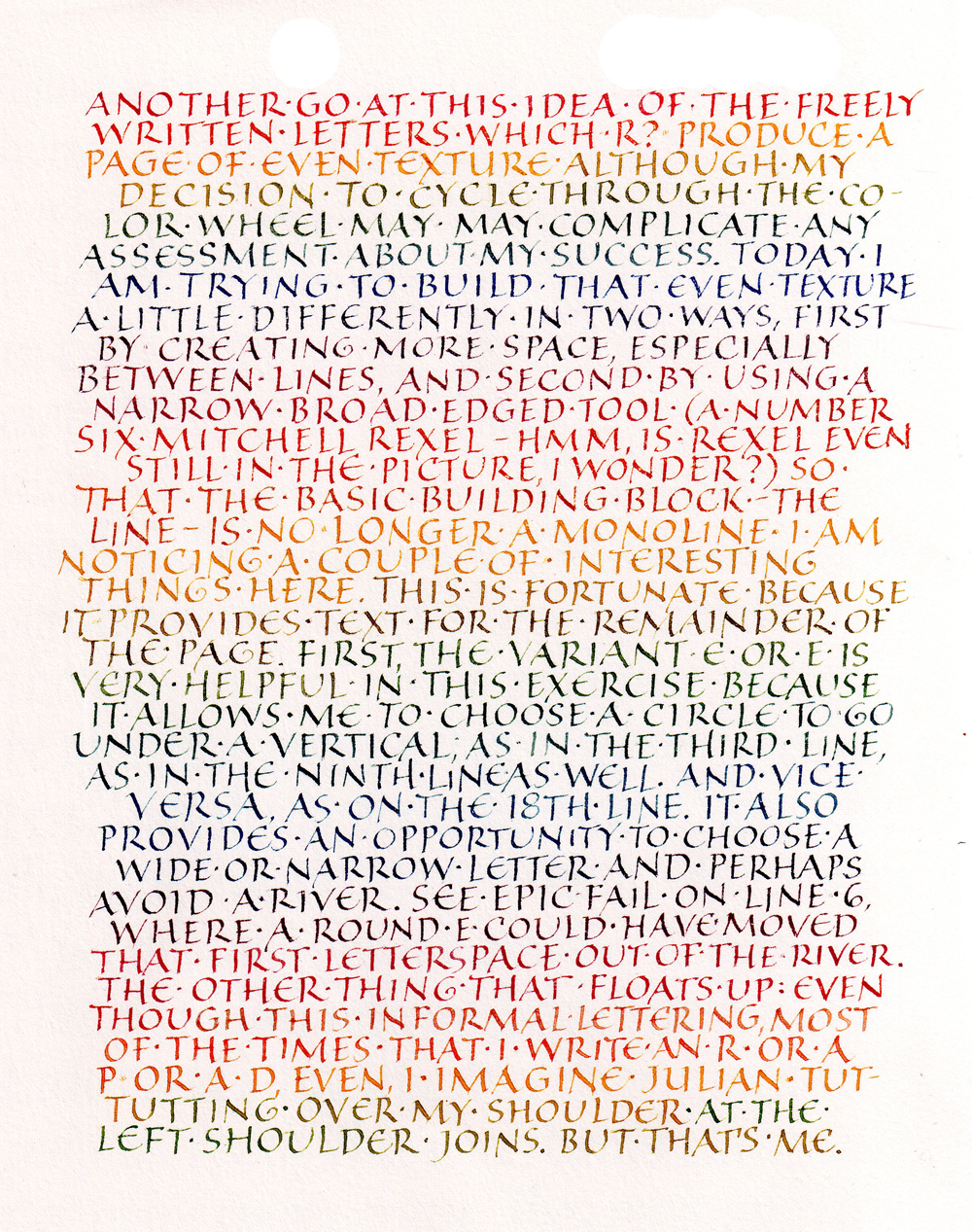
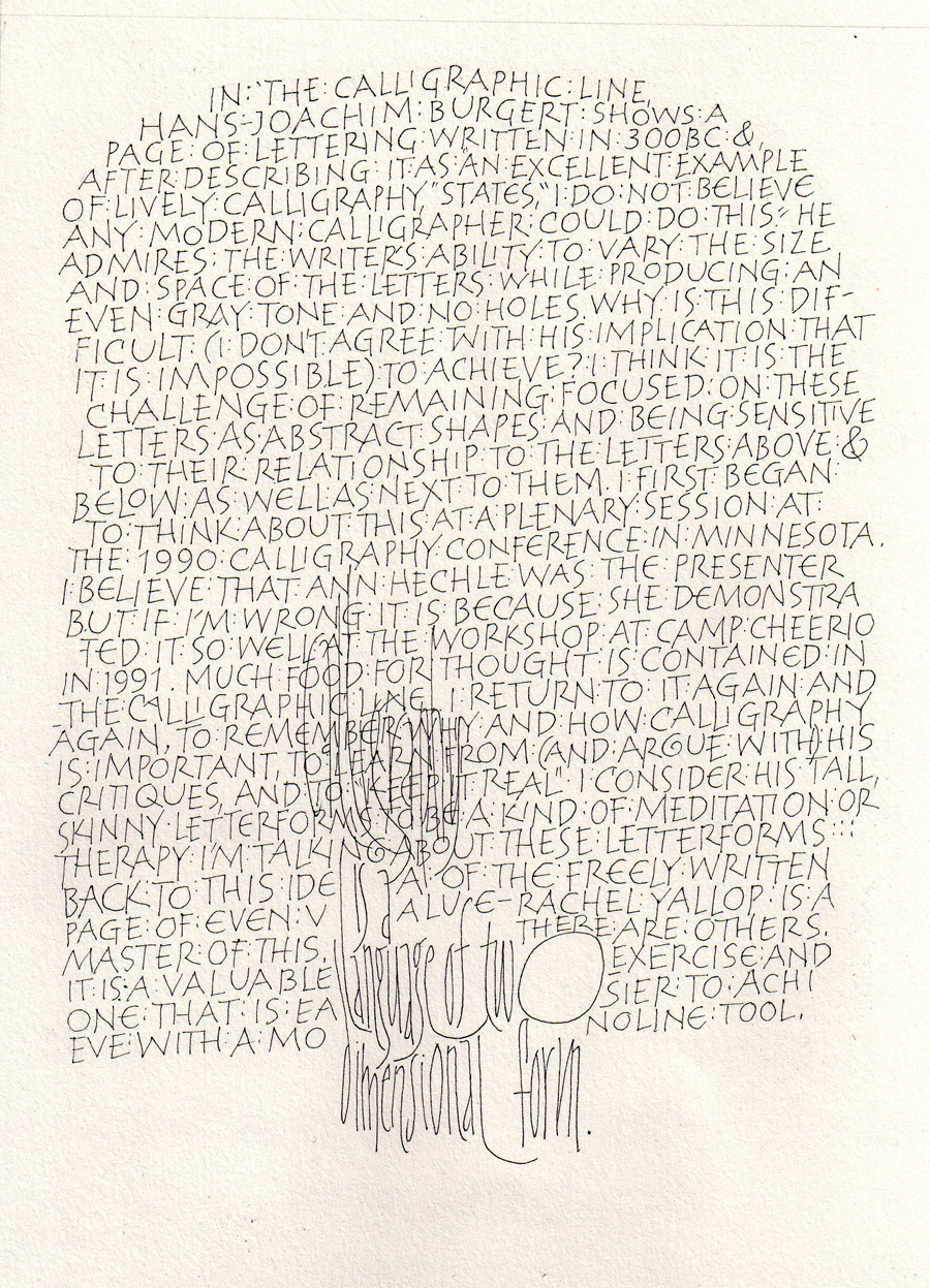
I had planned to write about Irene Wellington today, but I’m still back at that page of even texture that Hans-Joachim Burgert discusses in The Calligraphic Line. I tried it again today. I have things to say about it, but most of it is on the page itself, so why repeat myself? If you want to read it, click on the image to get a larger image.

I did try to have a more open texture than yesterday, but as I progressed down the page I reverted to my “default” density, I guess. Something to work on. There’s always something to work on.  There are always multiple  things to work on. I was particularly aware of the left shoulders of letters like R, P, and D.

This 9″ x 12″ page (IRL the margins are somewhat larger) was BK Rives Heavyweight, which is rather grainy, especially at an x-height of something less than 1/4 inch.

H is Hans-Joachim … Burgert

H is for Hans-Joachim Burgert. Thanks to Brody Neuenschwander’s translation, we English-speaking calligraphers have access to Burgert’s book The Calligraphic Line. This book looks at calligraphy from the perspective of two-dimensional design, and primarily a line in two-dimensional design. But that description is limited; the book is much more. Burgert struggles with definitions of calligraphy. He applies formal critique to calligraphy, setting it firmly in the modern art world. There is no similar book to be found, and I consider it to be part of the central canon of calligraphy literature.

As I wrote in today’s daily lettering, this book is one that I return to again and again, to learn from (and argue with) his critiques, and to re-ground my thinking about calligraphy.

Over the years, I have studied the lettering in several of his pieces. This is the lettering I associate with him (found in this collection but not easily pointed to in situ).

Today’s lettering is mostly freely made capitals written with a size 005 Zig Millennium marker on a 9″ x 12″ page. It is a response to a statement (or challenge) he makes about a piece of calligraphy written circa 300 BC. He admires the writer’s ability to write so freely and yet maintain an even texture and color, and he states,”I do not believe that any modern calligrapher could do this.” I tried it. Towards the bottom I quoted him one of his lettering styles which I’ve studied in the past. Click on the thumbnail for a larger view.

2015-01-08 Hans-Joachim Burgert thoughts monoline free caps

G is for Gail … Rubini

G is for Gail Rubini, who taught typography and print design at Florida State University when I was studying for my Fine Arts degree in Graphic Design.

2015-01-08-TypePoster-20082015-01-08 splituncial_poster 2008In one of the print design classes I developed a typeface, Split Uncial, scanning in letters made with the scroll end of a scroll-and-brush marker. Making the vector letters were easy, the kerning, not so much. Of course, it was just an exercise in how to design a typeface, not a finished typeface. Here are a couple of posters I made with my typeface.

Later, I collaborated with Gail’s team on an installation: My Alaska, Too. I programmed the six-screen interface which pulled in current images of Alaska from the Internet, looping and updating the feed at set intervals.


2015-01-08-monoline-italics-variationsToday’s lettering was done in preparation for teaching a calligraphy class. These italic variations will be part of a handout to help students critique their practice lettering. Variations are as follows: standard italic, 5° slant; italic made up of straight lines to demonstrate both rhythmic underpinnings and the way that the oval is influenced by the stick; low-branching joins (from baseline; high from waistline); high-branching joins (from baseline; low from waistline); a demonstration of inconsistency in shape and branching, but not in width or spacing; condensed italic, half the width of the standard line; expanded italic, written at half the height of the standard line but keeping the width the same.

F is is for Friedrich … Neugebauer

F is for Friedrich Neugebauer.

I never met Mr. Neugebauer, but his book The Mystic Art of Written Forms was a profound inspiration in my early calligraphy studies. This was the first calligraphy book I read that was not grounded in the English stream of calligraphy that grew out of the Arts & Crafts Movement.

Mr. Neugebauer taught typography and graphic design in the University of Arts and Industrial Design Linz, a school which was allied with Bauhaus and German Werkbund values. I didn’t know that back then, but I did recognize that this was a very different style of calligraphy. The focus on materials and geometry was apparent even before I understood it Constructivist roots. Even though this book is an instructional book — the subtitle is “An Illustrated Handbook for Lettering” — I regarded the book as inspirational rather than instructional. The beautiful, stylized serifs which characterize Neugebauer’s work was were evident but not explained in the book, or perhaps I missed it because I was so far from ready to understand them.

2015-01-07 study of Neugebauer uncials
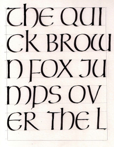
I don’t think I’ve explained that it is my intention to spend at least 30 minutes a day on daily practice. It’s a modest goal, but attainable. When the backlog of holiday-schedule chores abates, I plan to return to my one-hour minimum. Today’s lettering, shown here, is a first copy of Neugebauer’s Uncial exemplar. Although his exemplar is shown at about 11 pen-widths high, I chose to do mine at about 9 pen-widths with a Speedball “C” nib. The slightly flared finials are a Neugebauer trademark; at this size I achieved it with double strokes rather than pressure, which is what I’m sure he did. The horizontal serifs are partially drawn, although with a little practice they could be made with one stroke and some pen twisting.

These forms are based on Roman Uncials and influenced by the graphic design movements of mid-20th century Europe. They look very different from the Uncial of the English stream of calligraphy, which was influenced by Insular forms of England and Ireland.

I should have used a bigger piece of paper but I only had about 20 minutes 🙂


E is for Ewan … Clayton

E is for Ewan Clayton.

I have taken several workshops with Ewan over the years, and it is always a wonderful experience. Most recently, at the 2013 calligraphy conference Legacies II in Dallas, Texas, we explored a pseudo-primitive lettering style developed by Ben Shahn. Earlier, in 2003, I also studied “Color and Environment in Artmaking” with Ewan and Hazel Dolby at Camp Cheerio. And before that, in 1990: “Spirituality in Calligraphy” at Calligraphy Connection at St. Johns University in Minnesota.

Ewan Clayton’s recent book entitled The Golden Thread: A History of Writing is a must-read for any calligrapher. If there is a canon of calligraphy literature, this book stands firmly in the center with just a few others. I reviewed this entertaining and educational book in the June 2014 issue of the Guild of BookWorkers Newsletter.

2015-01-05 Ewan Clayton workshop my piece 2013This is a not-very-good image of one of the pieces I did in Ewan’s 2-day class at the 2013 conference. I believe I photographed it with my smartphone while it lay on the floor of the workshop room.

Later in the year I spent some more time with these letters and thoroughly enjoyed myself.

2015-01-05 thank-you notes and moreMy daily lettering today consisted of one quotation and several thank-you notes. Shown here is the outside of one of the thank-you notes as well as two of the envelopes.

D is is for Denis … Brown

D is for Denis Brown.

In 2004, a group of Florida calligraphers met at Lakewood Retreat near Brooksville for a week-long workshop with Denis Brown, a well-known Irish calligrapher. The subjects were “Rhythmic Writing” and “A Modern Celtic Hand”.

A couple of years ago I revisited the hand we studied, and did this piece:

2015-01-04 after Denis workshop modified half uncila Rumi


I had planned to do some of this lettering today, but was still taken with the pointed brush. Here’s what I did in the 15 minutes I had available today:

2015-01-04 daily lettering brush


C is for Carl … Rohrs

C is for Carl Rohrs.

2015-01-03-Carl---my-piece-today
3 Jan 2015 — picking up a brush again after a long hiatus


Letterforum, the 1995 annual international calligraphy conference, was held at St. Mary’s College in Maryland. I took two 2-day workshops with Carl: “Pointed Brush Laboratory” and “Signs and Broadsides”. This was my first education in brush lettering, I believe. To watch Carl wield a brush was an eye-opener, introducing me to the concept of brush sensitivity that John Stevens has explored so eloquently in his book, Scribe.

Here is one of the pieces that I did in that workshop. (I thought that I had read the quotation in a Madeleine L’Engle book, but I’ve never been able to find it since.)

2015-01-03 Carl - my piece in 1995 workshop
White ink and pointed brush on Canson Mi-Tientes, done in a 1995 workshop with Carl Rohrs


B is for Brody … Neuenschwander

B is for Brody Neuenschwander.

He and Thomas Ingmire taught a week-long workshop entitled “Textual Reverberations” at Camp Cheerio in September 2000.

We spent time each morning looking at text-based art by Jenny Holzer, Bruce Nauman, Gillian Wearing and the YBAs (Young British Artists), etc. I believe this was my first introduction to the work of Hans Joachim-Burgert. Here I finally began to get a big picture of the continua of lettering styles, traditions, and influences which included graphic design, the Arts & Crafts Movement, modern conceptual art and so on. Many of the ideas I began to look at after this workshop went into a paper I wrote in an art history class nearly 10 years later, entitled “Text and Image”.

In the workshop we developed a book that intertwined three quotes in three styles of lettering, looking at ways to handle text differently throughout the book. We morphed text, changed up the rhythm, altered the orientation, and much more. Today’s lettering reflects combines three lettering styles, but the text is all one quotation rather than three. Of these three, only the top line resembles one of my three lettering styles, although the style in the book was less linear and less legible.

2015-01-02 Brody 3 styles


The workshop part of this class was, in many ways, over my head at the time, although fortunately I didn’t have the good sense to recognize then. But I learned a lot, and continued to learn from that workshop for many years afterwards.

A is for Alice

Happy New Year! I begin this new year with gratitude for all the teachers who have enriched my calligraphy education over the past … OMG, 34 years. Because it is calligraphy, I’m going to make it an alphabetical listing of them. A, A, what who begins with A?


Alice Koeth.

In October 1998, I was privileged to take a workshop with Alice at Camp Cheerio. Although the putative subject was pen-made flowers, the true subject was line. By getting away from letter forms (is this letter too narrow? is my pen angle too steep? how do I get this space to look right?), we focused on the quality of the line itself. We were taught to be aware of subtle serif choices. We saw how using the same pen for lettering and drawing can marry the two elements of a layout. And we learned how to make adjustments to pens, their corners and edges, to make them work for us. And, of course, we learned much more than these, but these were the most important things I was ready to learn at the time.

I made this illuminated “A” today as a codification and review of some of the things I learned in that workshop 14 years ago.