More play from the conference goody bag

2015-08-06-goody-bag-testing-3Well, I didn’t get all the goodies from the goody bag put away, and the 50%-off paper I bought at Paper & Ink on the last day of the conference was still out too.

Freely written with a Sakura 3.0mm felt-tip calligraphy marker on Arches MBM paper. I like the skipping quality of the marker. I’m afraid it will start to fill in as the marker ages, but so far it’s still good.

Hope

2015-08-04-hope-quotation

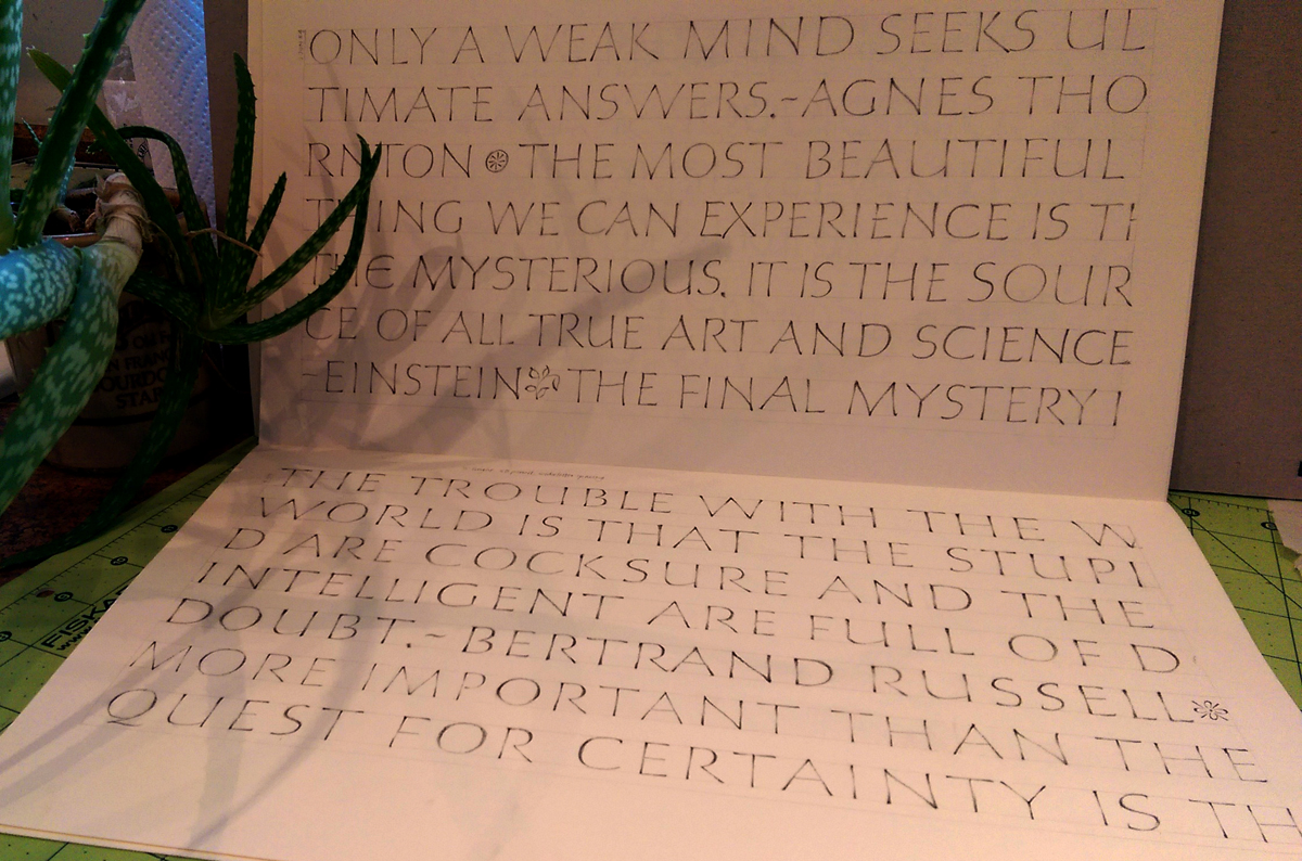
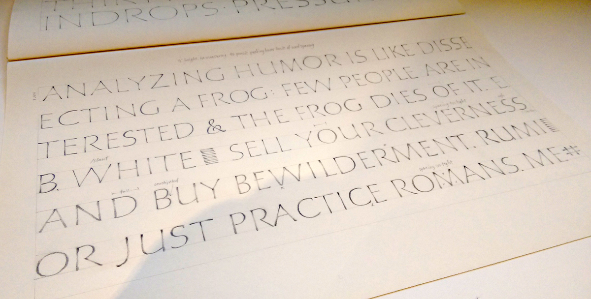
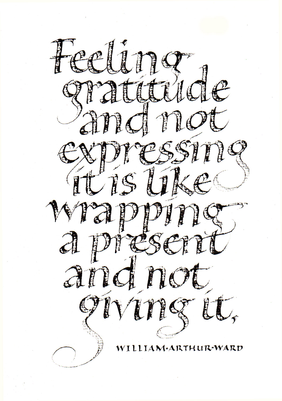
I mentioned earlier that our local calligraphy group has been lettering a quotation on one of ten topics each month. This month we will be deciding how to order and layout the book that we’ll bind from prints of these quotations.

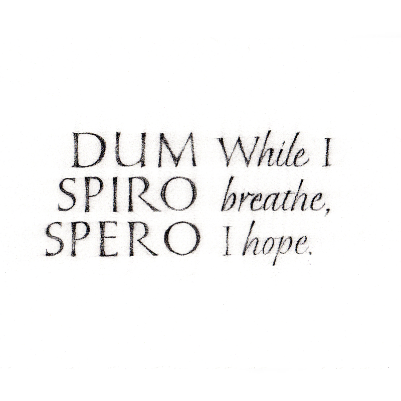
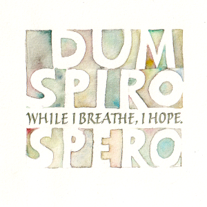
Now that we’re down to it, there are a couple of the quotations I’ve done that are sub-par. With the deadline next week, I’ve been re-doing them. Here’s the final version of the quotation on Hope. I enjoyed painting the negative parts of the letters in a fairly spontaneous way.

Gouache with brush and Brause nibs on Arches Text Wove, at 3″ square.

I’ve shown my earlier earlier version below.

2015-08-04-original-hope-quotation
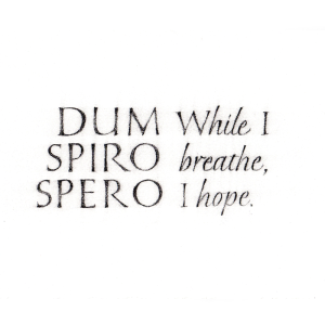
It just doesn’t hang together well. It’s a good deal larger (about 9″ x 12″, I think), but it’s not good. It needs some vertical element between the two halves of the quotation, but I moved on to something new instead.

Pencil on … Khadi, maybe? I don’t remember.
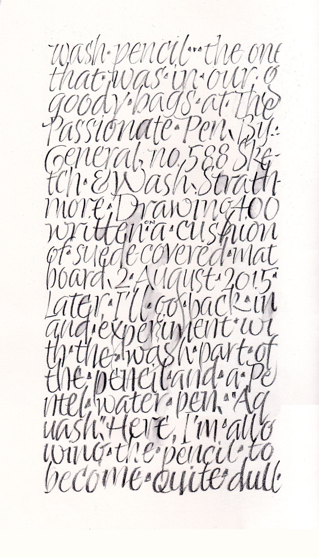
More pencil lettering, now with a wash pencil

2015-08-02-wash-pencil-italicsBack in my studio, I’m pleased to have most of my gear unpacked, and the spilled ink cleaned up. And I’m also pleased to get back to a daily lettering practice. In the conference goody bag was a General’s Sketch & Wash Pencil No. 588. When I was unpacking, it caught my eye, so I lettered a page of Strathmore Drawing 400 using it. Then I went back in with a Pentel water brush to see what would happen. I’ll probably do more on it later, but right now the kitchen is calling …

As usual, click on the image for a closer look.

Returning from The Passionate Pen calligraphy conference

2015-08-02-Burgert-layout-in-pencil-08-01

Yesterday I returned from The Passionate Pen in Sonoma County, California. It was a wonderful week seeing old friends and new work, experimenting with new ideas, tools and materials. I was surprised to find myself working with a pointed brush most of the week. I’ll post more about the conference in the days to come, but today I’ll share the page I did in the Oakland airport and on the plane to Salt Lake City. I learned more about “form themes” in Ewan Clayton’s four-day workshop, especially during the study of Hans-Joachim Burgert’s work. On this page, my form theme includes condensed capitals, line leading that is smaller than the height of the letters, and three rogue letters that are not condensed. The choice of three letters changes in each of the three blocks. It was a good way to spend the hours in the airport coming down from the conference.

Bic 0.5mm #2 mechanical pencil on a Strathmore 400 Drawing (heavier weight) sheet about 9×12.

Pointed pen practice

Pointed pen practice
Pointed pen practice – Leonardt Principality nib, McCaffery Penman’s Ink and Moon Palace sumi ink on Strathrmore Drawing 400

It’s been so hot that I’ve been working in the dining room on the main floor of the house. My studio over the garage is an oven this summer, especially in the afternoons. For the past couple of days I’ve been addressing wedding invitations, which is good from a “venue” standpoint: the tools and materials needed are finite and portable.

Pointed pen is so different from broad-edge pen lettering, that when I switch from one to the other that I must practice to get back in the groove. Shown above are two of the three pages done to prepare for job. For the first page (not shown) I lettered in my default pointed pen script. Because the invitation was printed in Bickham Script, on these two pages I developed a script style that incorporates some of the characteristics of Bickham.

Sample from Bickham Script Pro font

A few Bickahm characteristics I chose to incorporate in my script:

  • small x-height
  • 50º slant (or more)
  • weight on the heavy side
  • “y” descender with no loop but an exit stroke on the right
  • “o” exit stroke beginning from the middle right side of the oval
  • “f” with a lower loop as well as an upper loop
  • entrances to letters such as i, j, m, n, and especially u, w, y are more pointed than curved, allowing for tighter letter spacing

I’m always aiming for a balance between contrasting and complementing the printed invitations. Too little contrast, and it looks like inept printing. Too much contrast, and there is no connection between the addressed envelope and what’s inside.

Daily lettering – President Obama’s eulogy of Reverend Pinckney

2015-06-26-Obama-eulogy-Rev-Pinckney

Today was a big day in US public life, for at least three reasons. First, the Supreme Court upheld the Affordable Health Care Act in King v. Burwell. Second, it also upheld the right to same-sex marriage in all 50 states. And third, President Obama eulogized Reverend Pinckney, who was gunned down in his church in South Carolina last week.

Today’s daily lettering was a meditation on this inspiring eulogy. I could call it an exercise in improvisational layout, or practicing pencil Roman capitals and pressurizing down strokes. But I often forgot these technicalities while absorbing the text.

Counting down to the workshop this weekend

June 12 and 13 pencil Roman caps
June 12 and 13 daily lettering – pages 18-19
2015-06-16-pencil-Roman-caps-on-06-15
June 15 daily lettering – page 20

All that bicycling in Crete took its toll on my back, but I’ve been soldiering on – most days – on the homework for Peter Thornton’s workshop in Missoula this coming weekend.

Last Friday, page 18: Experimenting with changes in orientation, size, spontaneous layout. (I had to do something about that the horrendously large space in the O, which could have been fixed by wider letter spacing or a narrower O … but wasn’t.)  Page 19, done on Friday and Saturday, was an attempt to keep the three main width groups of Romans but condense them all by about 25%. Not a success, except that I learned that it would probably be better to move toward a more consistent letter width at that level of compression. None of the following work: condensation, condensing, condensement.

Yesterday, page 20: I dispensed with guidelines and line leading, experimenting with variations in orientation and size, and trying to get the spaces to “talk” to one another.

Daily lettering – pencil Roman capitals

day 10, pages 12-13, 6B pencil
day 7, pages 12-13, 6B pencil

These letters are slowly seeping into my kinetic memory. Spacing is still problematic (story of my life), and 3 o’clock to 6 o’clock on O, Q, C, G, D is just not happening with any regularity at all. That area of the circle is like trying to scratch the itch between my shoulder blades: I can get there, but not natural and it’s not elegant.

Daily lettering – pencil Roman capitals

daily lettering - pencil Roman capitals
daily lettering – pencil Roman capitals

Daily lettering – homework in preparation for a workshop with Peter Thornton later this month. Nothing like Roman capitals to make you feel like a child again. Day 6, page 9, progress … maybe.
Strathmore Drawing 400 paper (80#), 4B pencil, 1/2″ height. I started the homework at 1″ height for a few pages, moved to 3/4″ height for a few more pages, and this is the first page done at 1/2″ height.