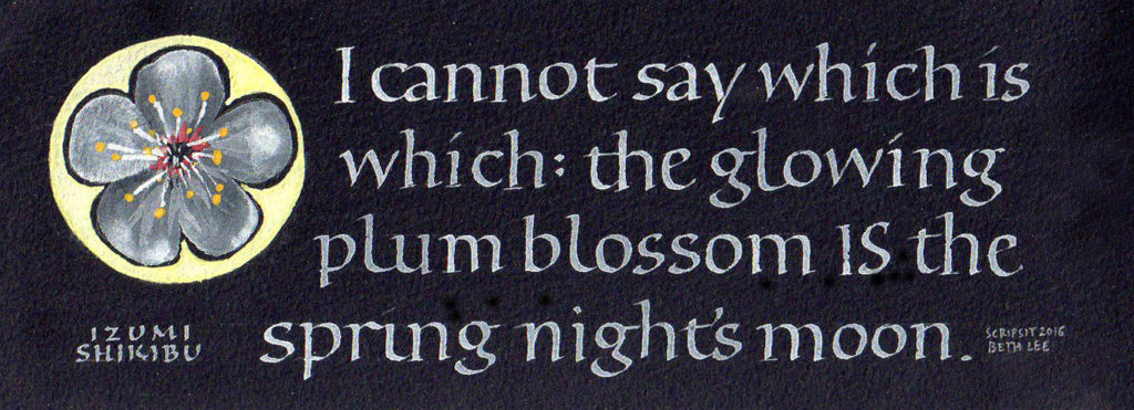
Bookhand doesn’t have to be boring. I like the simplicity of it, and the rigor.
A little bookhand practice
Got to keep ahead of the students, you know. Text by unknown of author, as is often the case with internet memes.
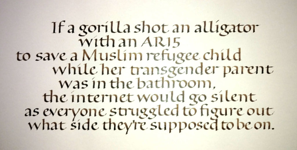
Very poorly shot.
A truly foundational bookhand
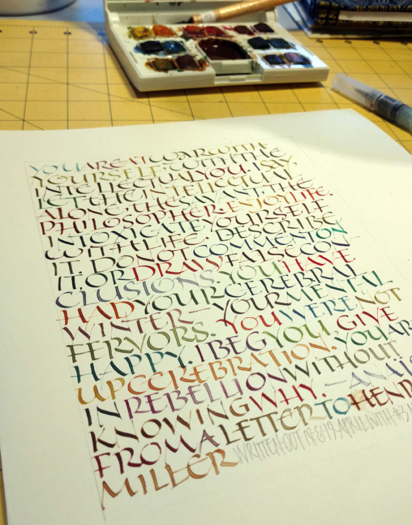
I’m teaching a calligraphy class this summer in Bozeman. The subject: bookhand. I didn’t want to teach the standard Johnstonian bookhand, which seems dated and, well, English. So I’m teaching a pared-down bookhand which uses the same proportions of Johnston’s foundational hand and Humanist bookhand, but has no serifs to speak of.
I’ve assigned homework, but of course I must do the homework myself so I can talk about the problems and pitfalls of the hand as well as the problems and pitfalls of practicing. I’m learning / remembering.
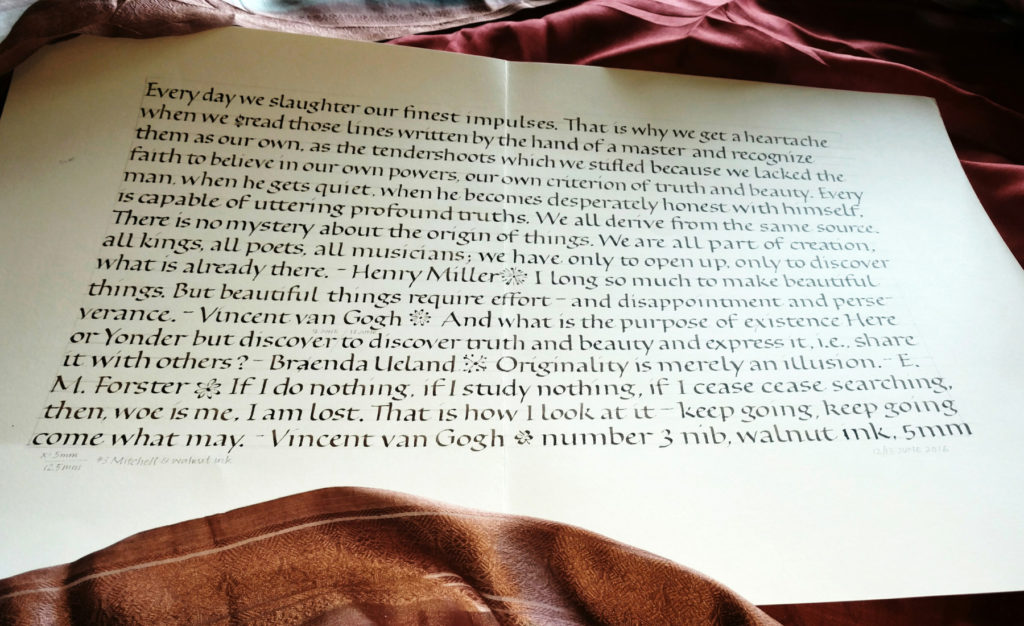
Calculating a 4 pen-widths x-height with a #3 nib … that comes to 6mm (4 x 1.5mm manufacturing spec). But my nib must have been customized as some point, because 4 pen-widths actually came to 5mm. So that’s what I used.
I’m ba-a-a-ck!
Getting back to formal pointed pen lettering … some more
Another day of pointed pen lettering, this time with McCaffery’s ink and my favorite pointed pen, the Principality. I’m not making much progress. This was done the same day as the copy-fitting exercise, which is to say, last Friday.
Copy-fitting and layout on the fly
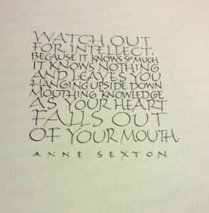 Sometimes the daily lettering isn’t about working on letter forms or loosening up with gestural strokes. On Friday, it was a sort of on-the-fly copy-fitting exercise, right-brained and hard to describe. Two or three things are going on, I think.
First, there is the guestimating about horizontal space − evaluating how big the letters should be, and how compressed or expanded. I was running out of room on the third line … but I kind of like that my choice for “so” makes it stand out. It almost gives “Valley Girl” emphasis to the phrase, which amuses me.
Second, though, there is the goal of making the current letters respect (and also with respect to) the line of letters above it. I added an entrance stroke to the “k” on “knowledge” to avoid having its spine line up with the spine of the “p” on the line above. “Falls out” doesn’t work very well here, opening up a big space between the “a” and “l” which connects to the space on the line above between “as” and “your” to make a big blob of white. I don’t mind the space between “falls” and “out” because it leaves room for “heart” to fall through to the last line. But “falls out” is just two few letters to work well on that line.
Third, there is the question of whether the letters should be larger or smaller than the others, given their importance to the content. Looking this over, I like my choices. I can read simply:
Watch out for intellect,
as your heart falls out of your mouth.
Or:
Watch out for intellect,
it know nothing and leaves you
as your heart falls out of your mouth.
Describing this process breaks it down and destroys the flow of the process. As Jacob Bronowsky said in a lecture memorialized in The Origins of Knowledge of Imagination, “It is an essential part of the methodology of science to divide the world for any experiment into what we regard as relevant and what we regard, for purposes of that experiment, as irrelevant. We make a cut. We put the experiment, if you like, into a box. Now the moment we do that, we do violence to the connections in the world … we are always decoding a part of nature which is not complete. We simply cannot get out of our own finiteness.”
After a commercial lettering job, formal pointed pen practice
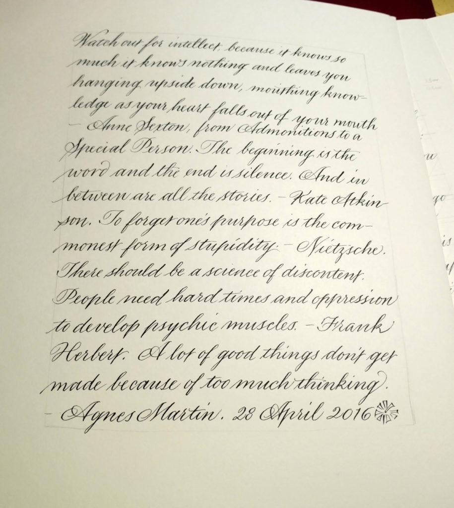
I just finished (I think) an interesting bit of work with a publishing company. I provided the lettering for historical documents that a character in a book of fiction has unearthed: journal entries, letters, and so on. It was interesting and challenging to come up with appropriate handwriting styles for four very different characters. Afterwards, the pen nibs weren’t worth much, and neither was my formal penmanship. This page was a start at getting back to a formal hand suitable for, for instance, some upcoming place cards.
Daily lettering
Pointed pen practice
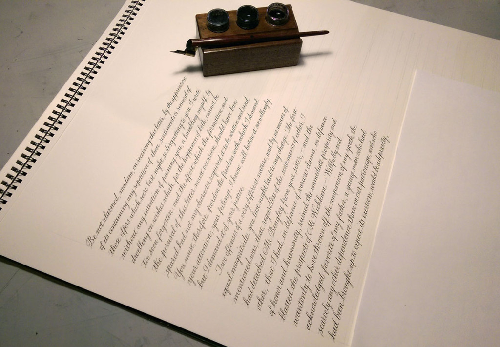
Today’s work included the final lettering for a commission: a long text in pointed pen script. I haven’t done much pointed pen lately, so I did this piece as a warm-up. It’s the beginning of the famous letter from Darcy to Elizabeth in Pride and Prejudice. Fun stuff. Good thing this wasn’t the real commission: there is a hando (rather than a typo) at the end of the very first line. The pen nib was new but awful. I had to change it out before starting on the actual commissioned piece.
Book project with local guild
Our local guild, Bridger Mountain Scribes, has been working on a collaborative book for the past year. (See more about the project on the front page of the website.) I did the layout (the digital paste-up, I mean) and the lettering for the book extras (title pages, footers, intro text), and yesterday I picked up the printing proofs. We are going to print a couple of copies each and hand bind them ourselves. Fun project!
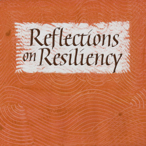
Here’s a shot of some of the raw lettering and backgrounds that I used, and here’s the title page, which gives you idea of how I approached the section heading pages as well.
