Books, Boxes and Wraps

Second Edition

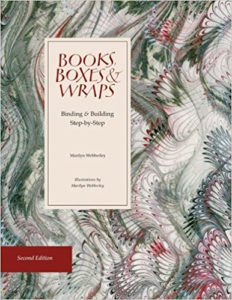
I simply cannot believe that this book is already out of print again!

Books, Boxes & Wraps: Bindings & Building Step-By-Step, by Marilyn Webberley, has been a go-to book for me since I bought the first edition of the book in about 1997.

This second edition, updated in 2014, is advertised as an expansion and a refinement of the first. I see that it is no longer available except as a used book. I’ve ordered a copy to see what new things were added.

Versals after workshops with Gemma Black

I was one of the lucky ones at LetterWorks this summer in Ogden, Utah: I got into the 5-day class taught by Gemma Black, “The Versal and the Book“. Even luckier, Gemma came to Montana earlier this month to teach a 2-day workshop on versals to Big Sky Scribes, the state-wide guild, and I got into that workshop too.

I might be finally getting the idea of versals. My goal has been to letter a page a day. Most days I’ve been making that goal. As shown below.

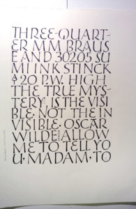
Dave-Jones-like versals with a 1mm Brause nib and sumi on 100# Strathmore Drawing 400 folio. This was Wednesday.
3/4-mm Brause nib and sumi stick ink on 100# Strathmore Drawing 400 folio. This was Thursday.

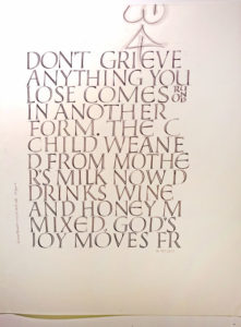
On Wednesday, I was shooting for a rhythm. Which is harder than you might think, since it is drawing and filling in. But I still think a rhythm is important, even when drawing.

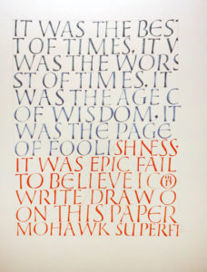
On Friday (see below), I tried to make thinner-than-normal weight, but I kept defaulting to a standard weight. The Mohawk Superfine paper was a bear to write on, especially with gouache, and especially because of the drawing-and-filling-in thing which caused the paper to shred.

Open traditional versals. 3/4-mm Brause nib with stick ink on 100# Strathmore Drawing 400 folio. This was also Thursday.
Traditional versals. 3/4-mm Brause with Schmincke Calligraphy Gouache on Mohawk Superfine, for some unexplainable (and indefensible) reason. This was Friday.

How technology is ruining our young people, c.

Last month, I was amused to read this Slate article  by Rachel Adler, entitled, “The 19th Century Moral Panic Over … Paper Technology”. The subtitle is this: “Before Snapchat and Instagram ruined young people, there was cheap paper.”

The article states that a 500-folio page could sell for 30 florins in 1422, but that by the 1470s that price could be 10 florins. I wondered what this meant in terms of purchasing power.  A little unsubstantiated googling seems to indicate that a gold florin (equivalent to a ducat in Venice) was worth 117 soldi. Only big purchases employed florins, and you can see why: manual laborers were paid only 8 soldi per yer, and mason were paid 15 soldi per year. that architect of the Florence cathedral made 100 florins per year, and that city houses ranged in price from 200 to 3500 florins.

But in the 19th century, the price went down some more, thanks to major developments in print and paper technologies. Rachel Adler writes:

Books remained, however, far outside the range of the common man or woman, until the price plummeted once again in the 19th century. No longer was literacy necessarily a signifier of wealth, class, and status. This abrupt change created a moral panic as members of the traditional reading classes argued over who had the right to information—and what kind of information ought to be available at all.

It’s an interesting read.

Opening night at The Artists’ Shop in Missoula

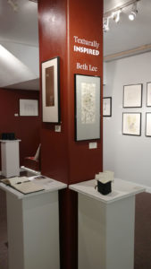
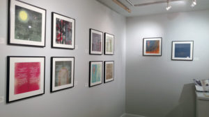
I had a wonderful time Friday night at the opening of my solo show in Missoula. I took these photos just before the opening began. It’s a good thing I did because, although I thought I’d get some more photos later, I forgot all about it once people began arriving. It doesn’t matter much; my photography skills can only be described as underwhelming.

It was gratifying to see it all come together so well. Thanks so much to Ann Franke and my husband Ed for helping to hang the show. Actually, I think the better characterization is that I helped them hang the show!

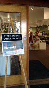
Entrance to The Artists’ Shop, 127 N. Higgins, Missoula, Montana.
So nice to see my name up on the wall! Two Mady poems, an artist book entitled “Letters Inspire I”, plus guest book, etc.


A few of the Mady poems. There are 15 Mady poems in the show.
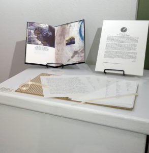
An artist book plus a piece entitled “So Long, Darcy: Fact-Checking Jane Austen”.
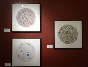
Three circular pieces.

A sneak preview of a couple of pieces in the solo show in Missoula

A solo show of my work opens on Friday at The Artists’ Shop in Missoula. I’m almost ready. Here are a couple of things to see in the show:

Presidential Premonishment

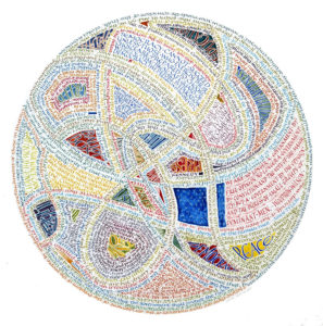
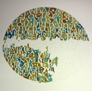
Gouache and a #6 Mitchell nib, lettered to fill a 12″ circle on soft-pressed Fabriano Artistico. I began doing this style of whatever-it-is in high school, long before I discovered calligraphy. The text come from 32 speeches by US presidents 1-44. I have found it a comfort to ruminate on the words of our previous US presidents, from Washington to Obama.

I’ve done several circular pieces for the show, including the paper mosaic, Fragments,  that I posted about earlier.  It was finally completed last week. 

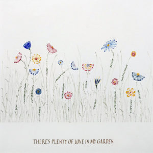
There’s Plenty of Room in my Garden, by Madeleine Y. Gomez

Many pieces in the show are the originals of work I did for a commissioned book of poetry. I re-did this one, this time without regard to the center gutter. You’ll probably have to click on the image to read the list of words that make up the stems of most of the flowers. Size is 12″ square.

Solo show at the Artists’ Shop in Missoula

I know I’ve been quiet. I’ve been keeping my head down and getting the work done. In between, I made a quick trip to Chicago to take a bookbinding workshop on forwarding basics with Karen Hanmer. What an excellent teacher! I’ll post more on that … when I get a little more done.

The show runs September 1 – 30.

A show of my work opens on Friday, September 1, at the Artists’ Shop in MIssoula. It’s been a long time since I had a solo show, and I had partially forgotten all the work that goes into one.

I’ll be showing 14 pieces from the book that poet Madeleine Gomez  commissioned. I’ll also have some newer broadsides and books.  Lately I’ve been into circular designs (see one example below).  I’ve become enamored of texture, specifically textures formed by our alphabet, and the circular format. I’ve always liked the square format; a circle shares properties of a square but is more dynamic, moving the eye.

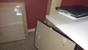
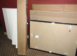
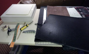
Ready to work. That tall skinny box houses the framing chops, while the two large flat boxes propped against the wall hold mat board and foam core. A portfolio of some finished pieces, some cut-up foam core, and a few pieces of Plexi lie on the corner of the work table. (That frame on the floor is for a print we bought in Cuba. While all the framing stuff is out, I’d better get that done too.)
I’m accumulating off-cuts of mat board and foam core. When I’m finished framing I’ll probably cut them down to standard frame sizes for storage.
In progress: A stack of mat sandwiches shows progress; 3 originals and another portfolio of finished work await mats and back.

Orders for framing supplies – mat board, foam core, framing chops, Plexiglas – had been arriving for the past week. In preparation, I assembled a matting/framing station in the basement TV room: work table on cinder blocks on towels, cutting mat, mat knives, 4-foot metal ruler, Logan mat cutter and knife, empty trash can, and so on. Last night I started. I queued up some “Father Brown” mysteries, which I’d never watched before, and got to work. A mere 4 hours later, I had 12 finished mat sandwiches awaiting the construction of their frames, plus hole-less mats and foam-core backs for 6 more pieces. Not bad for an evening’s work, given how long it’s been since I did much framing. And the Father Brown mysteries were quite enjoyable.

In progress: paste-painted paper mosaic fills the counters of the text to the poem “Fragment,” by Amy Lowell. On watercolor paper.

About a month ago I though it would be a good idea to do this Amy Lowell poem as a paper mosaic. It’s looking more and more as though this piece may be finished in time for the show.


At The Met

To continue the account of my recent art feast …

The day after I went to the Grolier Club, The Frick, and The Morgan, Ed and I visited The Metropolitan Museum of Art. This time, for a change, we took a tour of the highlights of the museum. It was interesting enough, but afterwards we wandered, and some things particularly caught my eye.

Gallery 690 displays a rotating selection of The Met’s prints and drawings. We made it a point to visit this gallery to enjoy the etchings by Rembrandt and Castiglione that were on view. The costume studies by Leon Bakst were also incredible.

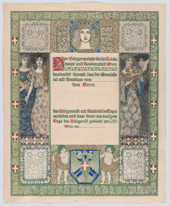
I was interested to see examples of the graphic design of Erwin Puchinger, an Austrian who designed for Viennese newpapers and periodicals at the beginning of the 20th century. According to the information provided by The Met, this design for a certificate of Viennese citizenship shows his early exposure to the English book illustrations of the Arts and Crafts movement, its four allegorical figures are reminiscent of Pre-Raphaelite, and the decorative borders show Moorish influences.

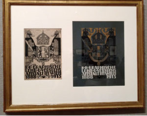
This framed piece shows the black-and-white design of a book cover with notes indicating color and adjustments, as well as the 3-color-printed piece on blue cloth. Puchinger was chair of the manual graphics design department of the Viennese Graphic Design School  and this was 1913 publication honored the school’s 25th anniversary.

You can see images of everything on display in Gallery 690 here. Take a look at Leon Bakst’s illustrations!

What a summer

This summer, the lyrics to the Johnny Cash song, “I’ve Been Everywhere” are apropros. My version:

I’ve been to:
Cuba, Minnesota, Ogden, Chicago, 
New York, Miami, Asheville, Charlo,
Yellowstone, Montreat, Caribou-Targhee,
Ft. Lauderdale, Quinn’s Hot Spring, Trinidad, and golly gee,
I’m a … traveler.

I’ll start with the last – no, the penultimate â€“ place we’ve been: New York City. While husband and son were at a Yankees game, I visited some of my favorite place to see art in the city.
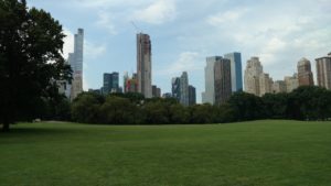
From the Upper West Side, I walked across Central Park to get to the Grolier Club on 60th. It was a beautiful way to start the day.  I was to log 20,000+ steps visiting seeing art that day.
The highlight: “The Calligraphy Revival – 1906-2016” on exhibit at the Grolier Club. Wow! One room, nearly every major calligrapher beginning with Edward Johnston, one piece per calligrapher, nearly all of the artwork from the the collection of Jerry Kelly, the curator. Wow! I’m getting the catalog, which is available from John Neal Bookseller and Oak Knoll Books. At $45, it’s not cheap, but … wow! There are pieces you won’t see anywhere else.
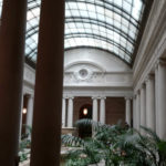
Then I walked up Park Avenue to The Frick, where I discovered that The Frick, The Morgan, and Neue Galerie have now collaborated to offer the Connoisseur Pass, which gives you admission to all three places for roughly the price of two. (I didn’t make it to the Neue Galerie this time, but the pass saved me $2 anyway.) I promptly sat down in the lovely courtyard for a rest. Like The Morgan and Neue Galerie, this building was originally a private home and the owner’s collection formed the basis for the museum’s holdings.

I had planned to walk on up to the Met, but I thought I might be able to persuade my husband to visit there the next day. (I was right.) So instead I took the subway down to The Morgan, perhaps my favorite place to see art.  Their exhibits are always to interesting to us manuscript people, and it’s not overwhelming.  The most interesting thing I saw there that day: drawing of “Poussin, Claude, and French Drawing in the Classical Age“. The images of the exhibit at The Morgan website can’t begin to do them justice.

It was a lovely day in New York City.

Some image collections worth looking at on the internet

This was posted within the past week; I saw it in several places:

  • 2,500 Japanese woodblock prints including some amusing prints depicting London life by a Japanese printmaker who never visited London. I just read about this one this week.

And these are all historical manuscript collections which I return to from time to time:

And, while I was drafting this post, this came my way: a comprehensive list of online collections, twitter accounts and blogs having to do with medieval manuscripts. Wonderful! The article is by Robert Miller at College and Research Libraries News, via the Book-Art-L.