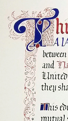
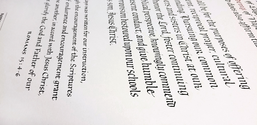
I recently had the pleasure of making two testimonials for a pair of sister schools. As usual, they took much longer than I anticipated. But it was fun.
Calligraphy & more — the studio of Beth Lee, Bozeman, MT
I recently had the pleasure of making two testimonials for a pair of sister schools. As usual, they took much longer than I anticipated. But it was fun.


This article about the resurgence of #bauhaus on social media on the AIGA website caught my interest when it was first published on January 8. I’ve kept open in a browser tab ever since, returning to read it several times since. And now I’m posting about it so I can close the tab 🙂 (Housekeeping is such chore.)
The article raises a few separate issues that resonate.
First, what does it mean when a hashtag gains popularity? Do those who post it know what they’re saying? We don’t know because it arrives with little or no context. And #bauhaus in particular! a concept that is all about context and interdisciplinary work, and which sought to weave art and craft into the fabric of everyday life.
And yet. And yet. As the article points out, social media has succeeded beyond every expectation in weaving itself into our everyday activities — without much of the art/craft, one could say. But new ways of communicating, the memes, the construction of meme generators — many of these are so creative and on-point.
As the article points out, both the Bauhaus school and the social media companies have attempted to present a neutral face, letting their students/users take the political stands. It hasn’t worked out well for Bauhaus or Facebook.
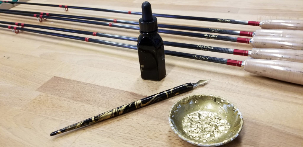
One of the interesting aspects of a freelance calligraphy studio is the wide variety of work. Lettering for Tom Morgan Rodsmiths is a great example. I appreciate getting to contribute my expertise to these hand-crafted fly rods.
I use sumi ink on the bamboo rods and gold ink on graphite and composite rods. Laying down the gold ink is sometimes a challenge. Also a challenge: writing on the curved surface of the rods with a pointed metal nib.
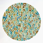
Remember this post about my paper mosaic “Fragment” in Letter Arts Review? I just revisited the exhibition at the Guild of BookWorkers site and was pleasantly surprised to see a beautifully organized online presentation of the exhibition. Here’s my page.
And here’s the remaining schedule of “Formation”:
Robert C. Williams Papermaking Museum
Georgia Tech
Atlanta, GA
November 1, 2018 — March 7, 2019
Charles E. Young Research Library Lobby Gallery
University of California, Los Angeles
Los Angeles, CA
March 15 — May 25, 2019
North Bennet Street School
Boston, MA
June 5 — July 27, 2019
University of the Arts
Philadelphia, PA
August 1 — October 30, 2019
In November I received an interesting book from Elizabeth Simmonds. It was four inches square, and I had never seen the structure before. I wrote to Liz and asked her about it. She told me that she had learned it from Anne Cowie, who made these as smaller books. I made a few models of the book.
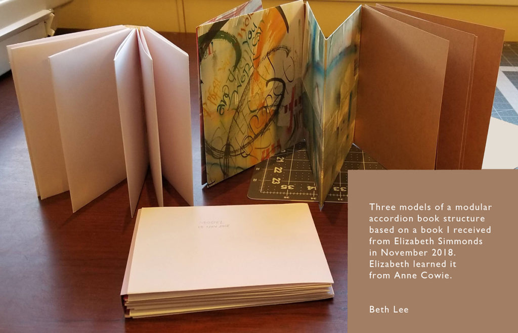
One of the attractive features of this structure is that it is modular; that is, you can add as many pages as you like and each element is only two pages, so that if you make a mistake on a book page, you can simply cut another piece of paper and re-do that two-page spread.
Here are some I things learned in making those models.
The book consists of three categories of parts: the folios, the page wrappers, and the removable spine. The folios are standard folios: a piece of paper folded in half vertically. The page wrappers are the same width as the folios but double the height. Like the folio, they are folded in half vertically. But they are also folded horizontally twice: once 1/4 of the height from the top, and once 1/4 of the height from the bottom, so that the central vertical division of the page is equal to the height of the folios and the top and bottom division fold around the folio to meet in the back.
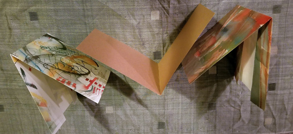
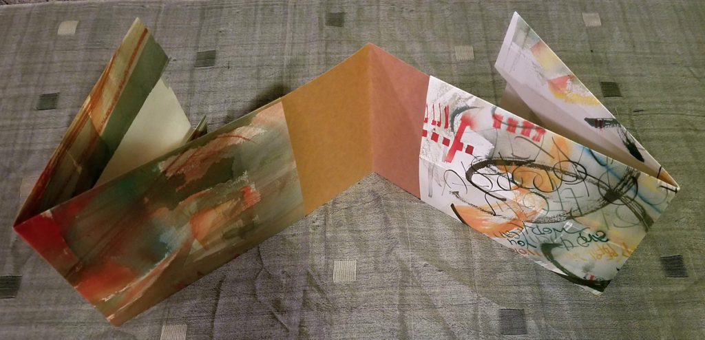
The folios and page wrappers are then assembled in a daisy chain, ad infinitum (theoretically).
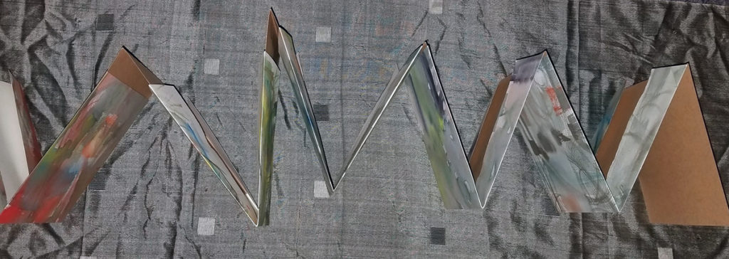
A five-inch-square may be the largest optimal size but this depends on the materials used. The optimal length of the book, 8 to 20 pages. (That’s 4 to 10 folios and 4 and 10 page wrappers.) Any less and the structure isn’t apparent; any more and the book becomes chunky.
In Elizabeth’s four-inch-square book, the folios were made of card stock, the page wrappers of Arches Text Wove, and the spine of a card-weight paper. In choosing your materials, the folios should be heavier and stiffer than the page wrappers..
A small sliver of the folios will be revealed in the gutter area (at the center fold of each page opening), which can be a nice feature. If you don’t like that reveal, you can trim width the folio pages later.
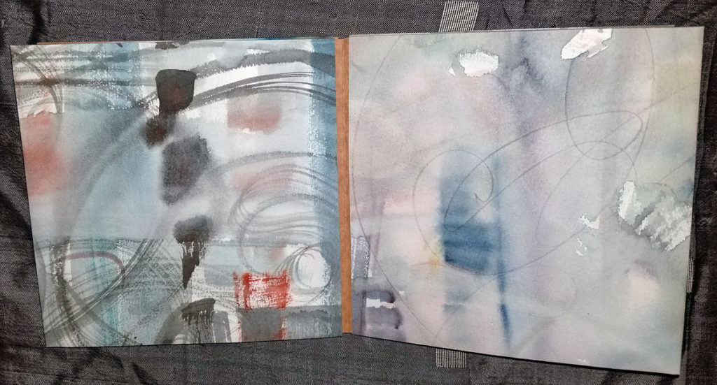
After (you think) you’re done, you can add a removable spine to make it more of a codex structure. You can see one in the top photo. I’m thinking I’ll add a board insert in the front and back to the first and last pages more “cover”-like. Since it’s all non-adhesive, if you add more pages, you can simply move the board insert to the new last page.
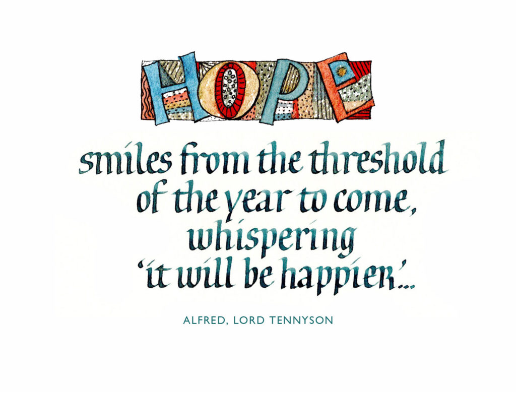
Long time no post! We’ve been traveling, and I’ve been Instagramming, and … well, honestly, inspiration has been sparse on the ground. Anyway, remember this artist book I was working on? I mostly finished it shortly thereafter, but never posted any photos. I had a few binding chores left on the last couple in the edition, and I worked on that recently … which reminded me that I had never properly photographed it. Here are some images from the book.
A variable edition of 12 manuscript books; 4 are still available. The books are small at 1-5/8 in x 3 in x 1/2 in, and lettered in gouache with a metal pen.
A few weeks ago I had the pleasure of attending Harvest Crittenden’s workshop hosted by the Big Sky Scribes in Helena. The subject: Spencerian script. I had never studied this hand before. Harvest is very organized and clear, and we learned a lot in a short time. Now all we have to do is … practice, of course.
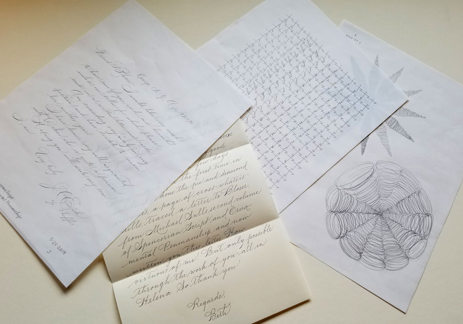
I haven’t been as regular about it as I could wish, but yesterday I sat down to practice in earnest again. I began with 2 pages of warm-up exercises designed to build kinetic memory. After the page of cross drills, I decided to simply trace, in pencil, a letter written in the 19th century in Spencerian. It helped to teach myself the rhythm of the script, and I was surprised to discover by that method a few things I had been glossing over. Then I wrote a letter in Spencerian using a ball-point pen. I have this lovely ball-point pen with a 0.3 mm point, and I didn’t want to get out ink.
Spencerian practice using a pencil and ball-point pen on B&R layout paper and Crane stationery.
Deadlines are looming and inspiration is elusive. I tidy my studio, clear out some old practice sheets .. and make some more. It’s a never ending cycle.
To entice the muse, I sit down to play a little. I’m thinking of another little book (and just now remembering I’ve never posted the last little book), so I experiment with a number inks/paints and a #6 Mitchell nib. The lettering is 1.5 mm x-height.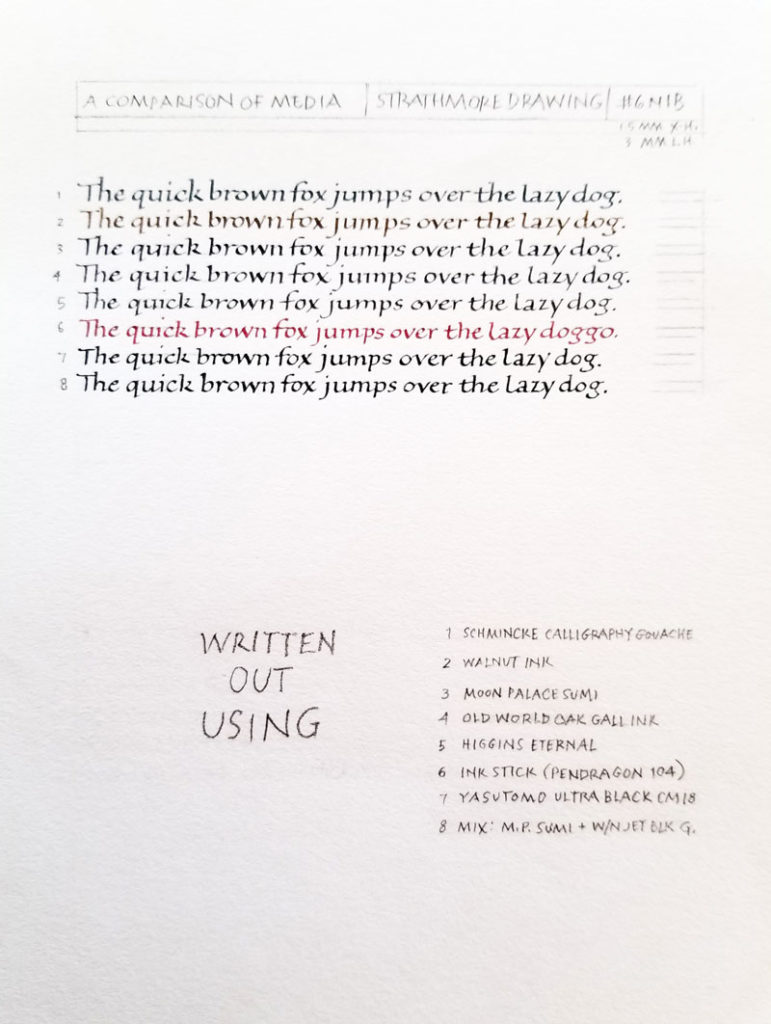
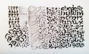 In anticipation of the upcoming conference, and the class that will be taught by Carl Rohrs, I get out a brush and do … something. It’s not much, but it reminds me what a pointed brush feels like in the hand. I feel some of the kinetic learning of a recent Spencerian workshop creeping in. That’s good.