
Gouache and pen. About 5″ square.

Calligraphy & more — the studio of Beth Lee, Bozeman, MT

This week in the bookhand class I’m teaching, we talked about layout and copy-fitting strategies. One strategy is to write the quotation, cut up the lines and rearrange them to fit the space allotted. I did the first part here:
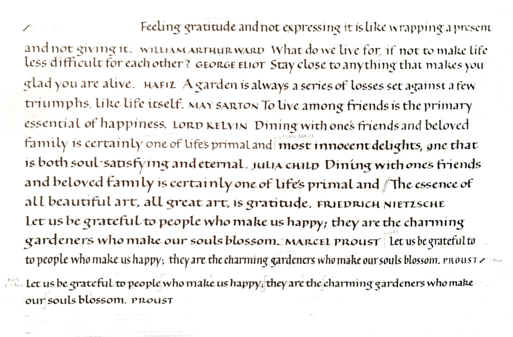
I didn’t actually cut up the lettering, but I did measure the lines and begin each line based on those measurements. I did a series of cards based on the one Proust quotation. As shown below, I can get very different looks using the pen and the same basic centered layout. What I’ve changed: writing fluid, ground (paper), line leading. In a couple of cases I wrote the lettering with no guidelines, and so the x-height and line leading are also variable. Also in a couple of cases, I wrote “bloom” instead of “blossom.” Oops.

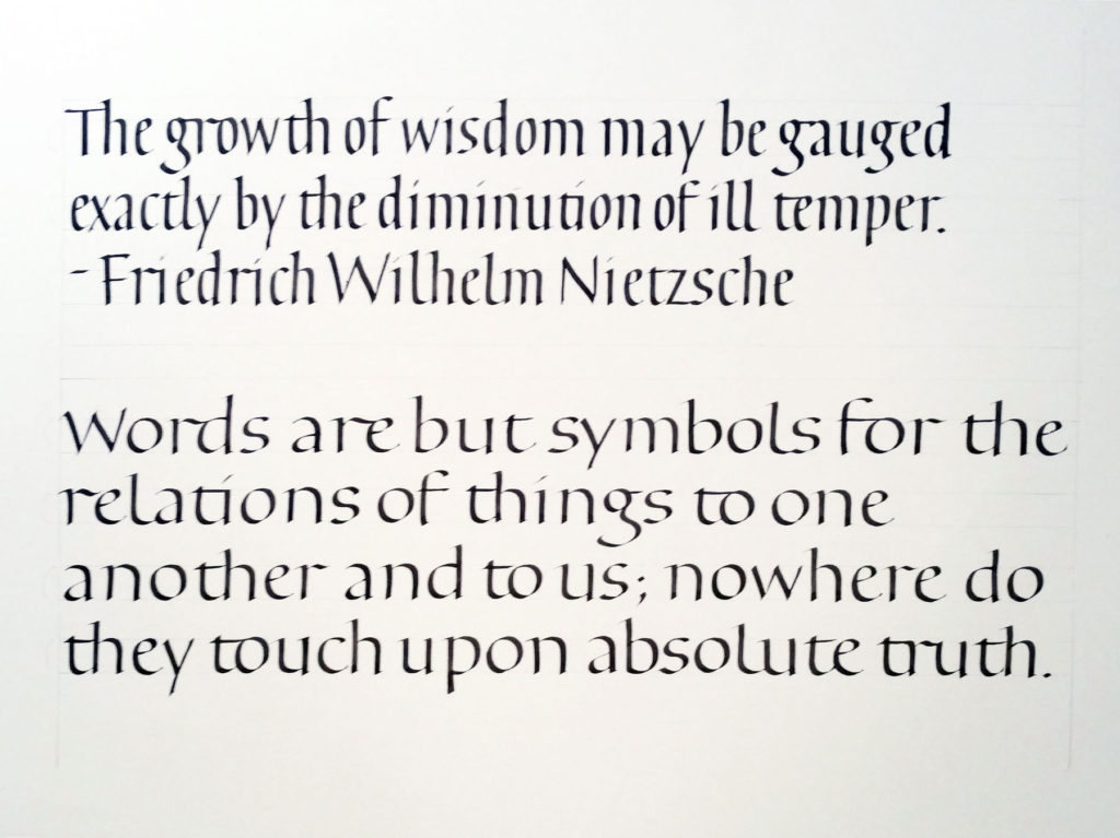
I always try to do the homework I’ve assigned. In this bookhand calligraphy class, part of the homework this week is to do work with the following specific intentions:
In the above 2 examples, my intentions were roughly as follows (I should have made notes — and let that be a lesson to you students!):
It’s hard to switch from compressed to expanded without warming up. I also noticed that once I expanded the width of the letters I had to fight to keep the pen angle as steep as it had been for the compressed lettering.
Got to keep ahead of the students, you know. Text by unknown of author, as is often the case with internet memes.
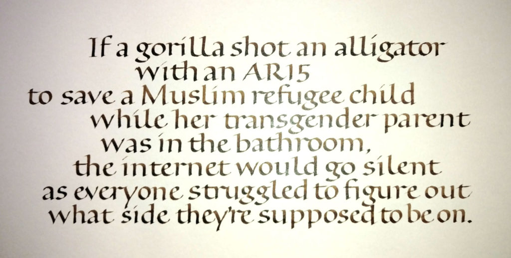
Very poorly shot.
I’m teaching a calligraphy class this summer in Bozeman. The subject: bookhand. I didn’t want to teach the standard Johnstonian bookhand, which seems dated and, well, English. So I’m teaching a pared-down bookhand which uses the same proportions of Johnston’s foundational hand and Humanist bookhand, but has no serifs to speak of.
I’ve assigned homework, but of course I must do the homework myself so I can talk about the problems and pitfalls of the hand as well as the problems and pitfalls of practicing. I’m learning / remembering.
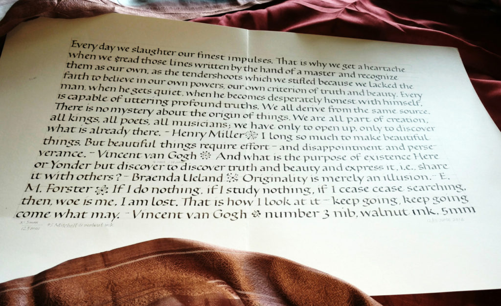
Calculating a 4 pen-widths x-height with a #3 nib … that comes to 6mm (4 x 1.5mm manufacturing spec). But my nib must have been customized as some point, because 4 pen-widths actually came to 5mm. So that’s what I used.
Some days the daily lettering actually has another purpose besides just practice. As it does today. These are four of a bunch of thank-you notes I wrote today. I was way behind.
I also finished a commission. I may show an image of it in a month or so, when it’s no longer a surprise to the recipient. I’ll give you a hint, though: it’s a poem that is requested often. I think I did it the first time in 1986, and have probably done it every other year, on average, since then. It’s long and oh so androcentric. I was quite pleased with the way this iteration turned out.
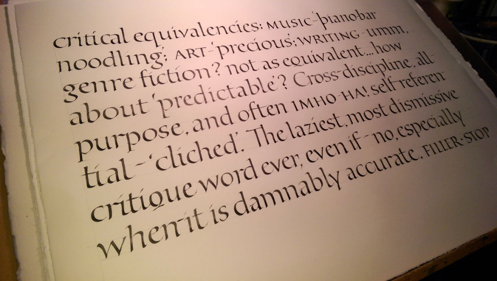
Working on Zerkall smooth with a Brause 3mm nib, the pen is sticking in the turns. Yes, I have a good cushion. The ink is stick ink, maybe Chinese, but I’m not sure. It’s a round cylinder of a stick ink. Tomorrow I’m switching to something else — changing both paper and ink, probably. These are some of the letters — or at least they want to be the letters — that we studied over the weekend with Christopher Haanes.
Like all good workshops, this workshop was like suspending one’s regular workout practice at the gym to work with a personal trainer for a little bit. At the gym, you know in the back of your mind that you haven’t really doing those squats properly, and you tend to skimp on triceps reps, and maybe it’s been awhile since you even visited that corner of the gym that houses the medicine balls.
Along those same lines, at this workshop I revisited ink choices, spent some much-needed time with pen manipulation and pressure. Oh, and it had been a good while since I had visited that very large corner of calligraphy that houses the Roman capitals.