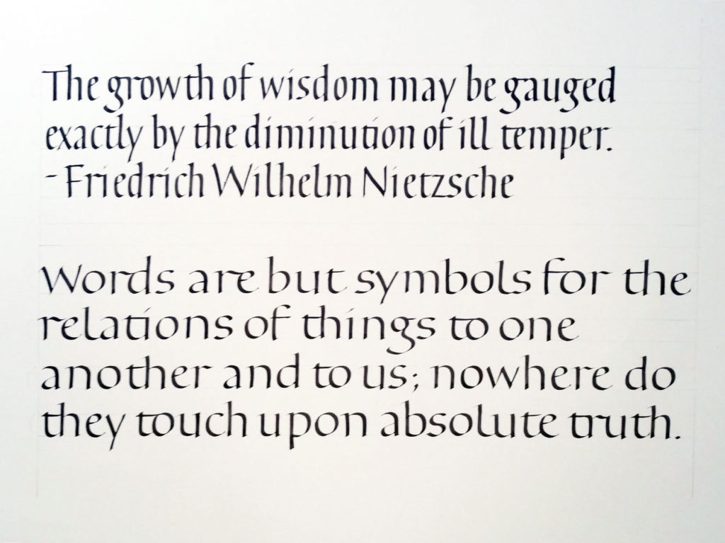
The bookhand homework
I always try to do the homework I’ve assigned. In this bookhand calligraphy class, part of the homework this week is to do work with the following specific intentions:
- x-height of your choice, expressed in terms of pen-widths (between 3 and 5);
- pen angle — your choice, but keep in mind that if you have few pen-widths in option 1, it will be natural to flatten your pen angle, and vice versa (between 15º and 40º);
- compression — your choice, keeping “o” and “n” as touchstones;
- letter spacing — partially a function of option 3;
- ascender/descender size — should be partially a function of options 3 and 6; and,
- line leading — partially a function of options 1 and 5, but also consider the size of your lettering in relation to the page, and also the length of your lines.
- serif — simple lead-in, beak, slab, or nothing.
My choices for the bookhand variations
In the above 2 examples, my intentions were roughly as follows (I should have made notes — and let that be a lesson to you students!):
- x-height is 4 pen-widths high in both cases, maybe a little more;
- pen angle is 30-35º in both cases;
- compression is roughly 2:1 (h:2) in the first sample, and 1:1.2 in the second sample;
- letter spacing is necessarily tighter in the first sample than in the second;
- ascender/descender height is the same for both, at about 2/3 the x-height; and,
- line leading is the same in both cases, being simply the addition of the x-height + ascender height + descender height, with no additional space between upper descender and lower ascender.
- the serif for first sample was beaked; for the second sample it was a simple lead-in.
It’s hard to switch from compressed to expanded without warming up. I also noticed that once I expanded the width of the letters I had to fight to keep the pen angle as steep as it had been for the compressed lettering.
