
Calligraphy & more — the studio of Beth Lee, Bozeman, MT
 Last week a friend pointed out a Facebook post by John Stevens: some “wrong weighted”
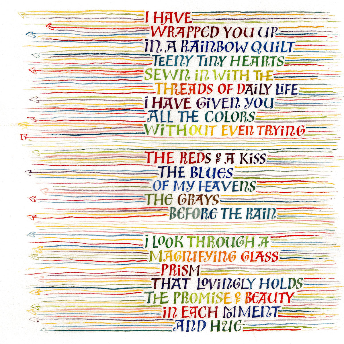
lettering, as he calls it, that she was working to emulate. I can’t find an example on his website, but if you’re on Facebook you might be able to see it here. I think it requires some time and enough kinetic familiarity to get a good rhythm going so that the strokes have more life than mine do. In the Facebook post, John calls it the “syncopated rhythm of Ben Shahn mixed with broad pen calligraphy.” In earlier posts here and here, you can see some of my attempts at the Ben Shahn lettering he references. Later, I used that lettering in a book commission of poetry by Madeleine Gomez:


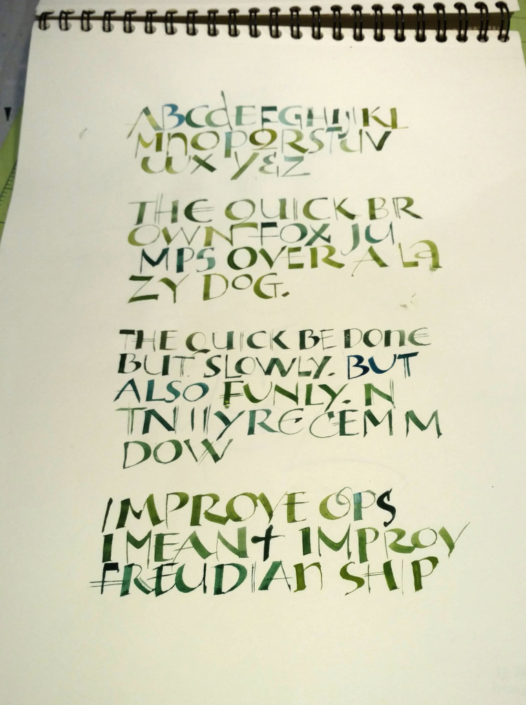
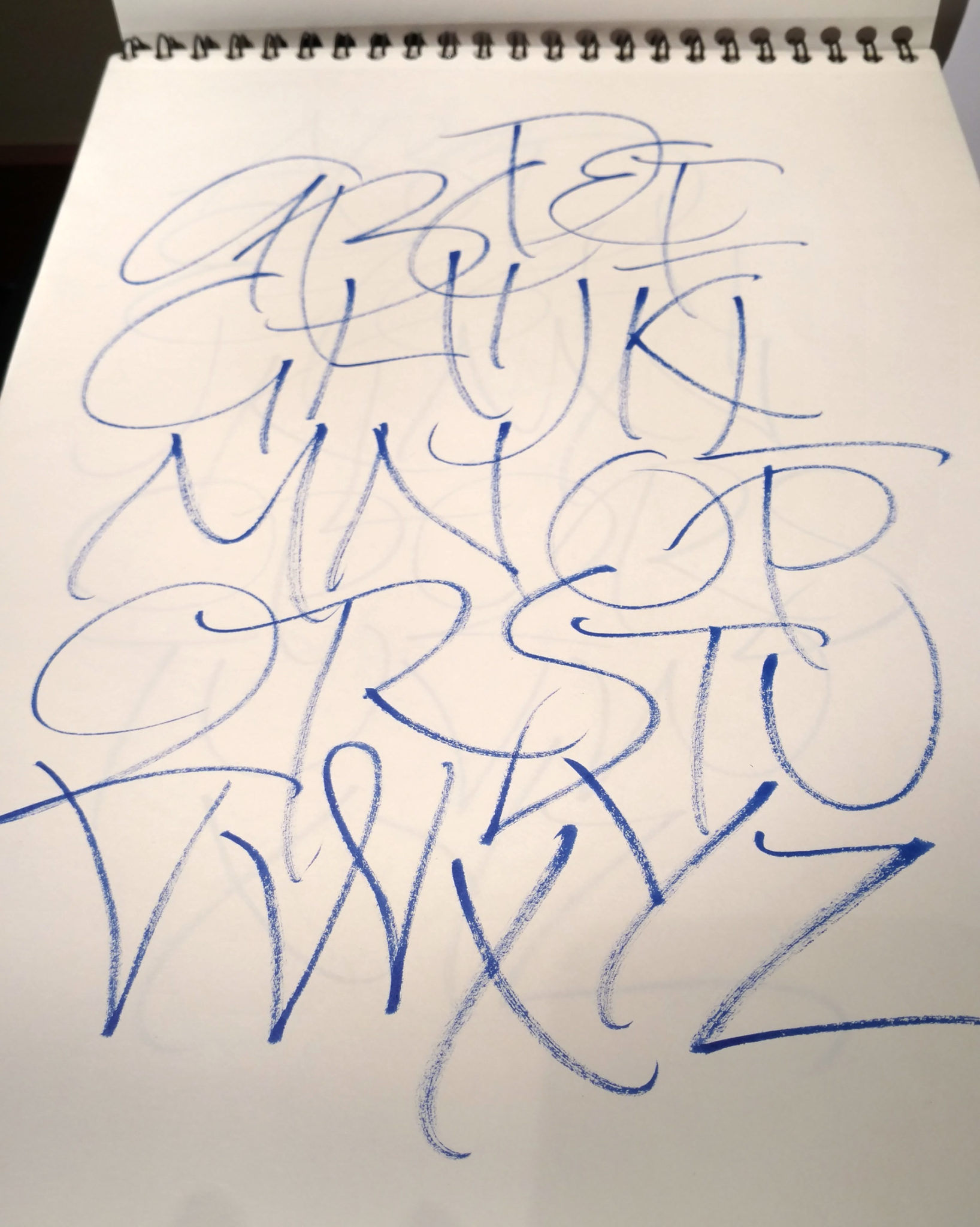
So I got this ZIG Clean Color brush pen from my dealer, with a note wishing me happy holidays and inviting me to “enjoy this free gift”. This is a good thing, right? So why does it feel like they’re just hoping to engender a new dependency on a new drug writing tool?
It’s an interesting brush pen, very brush-y rather than pen-like.
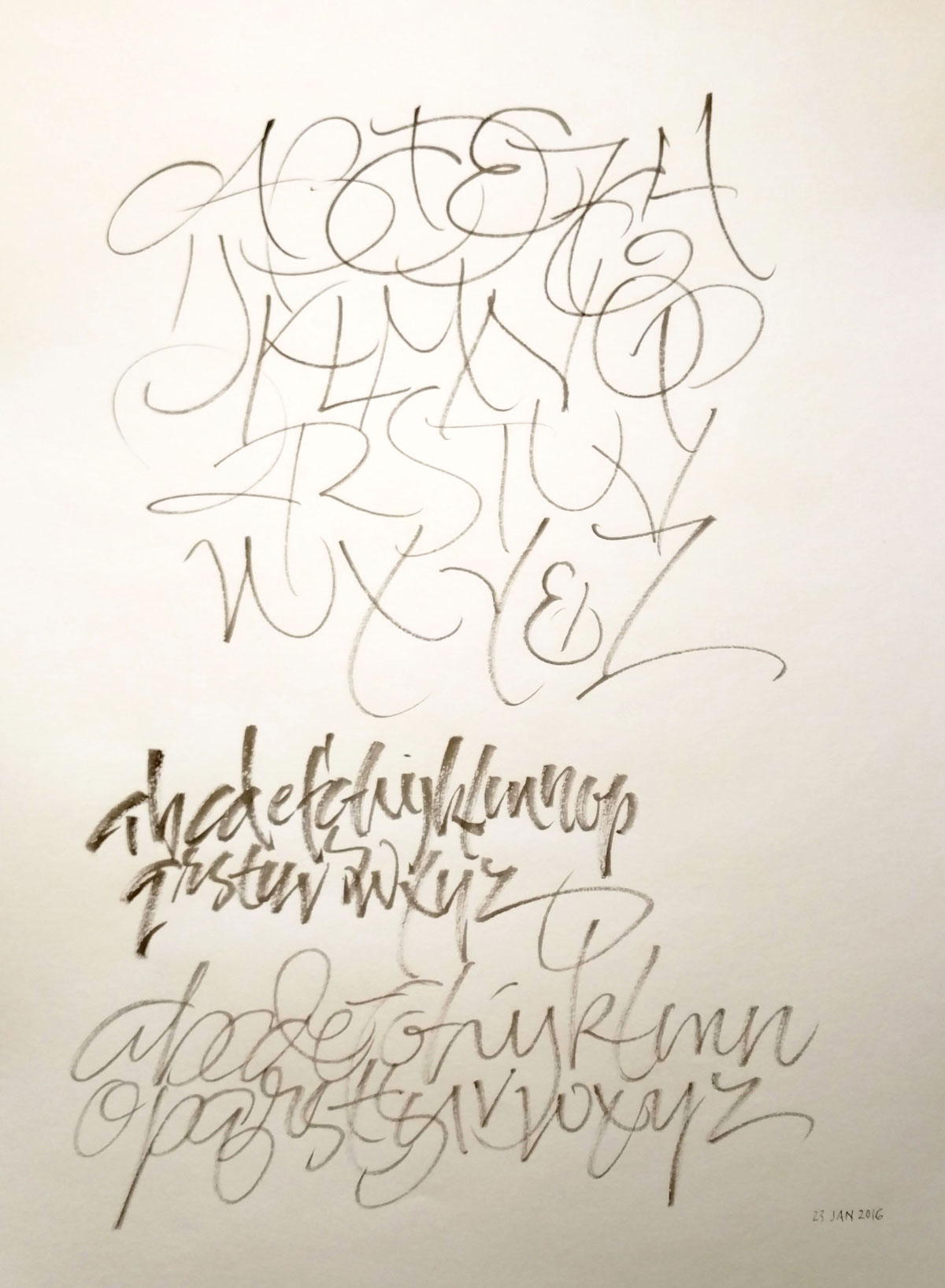
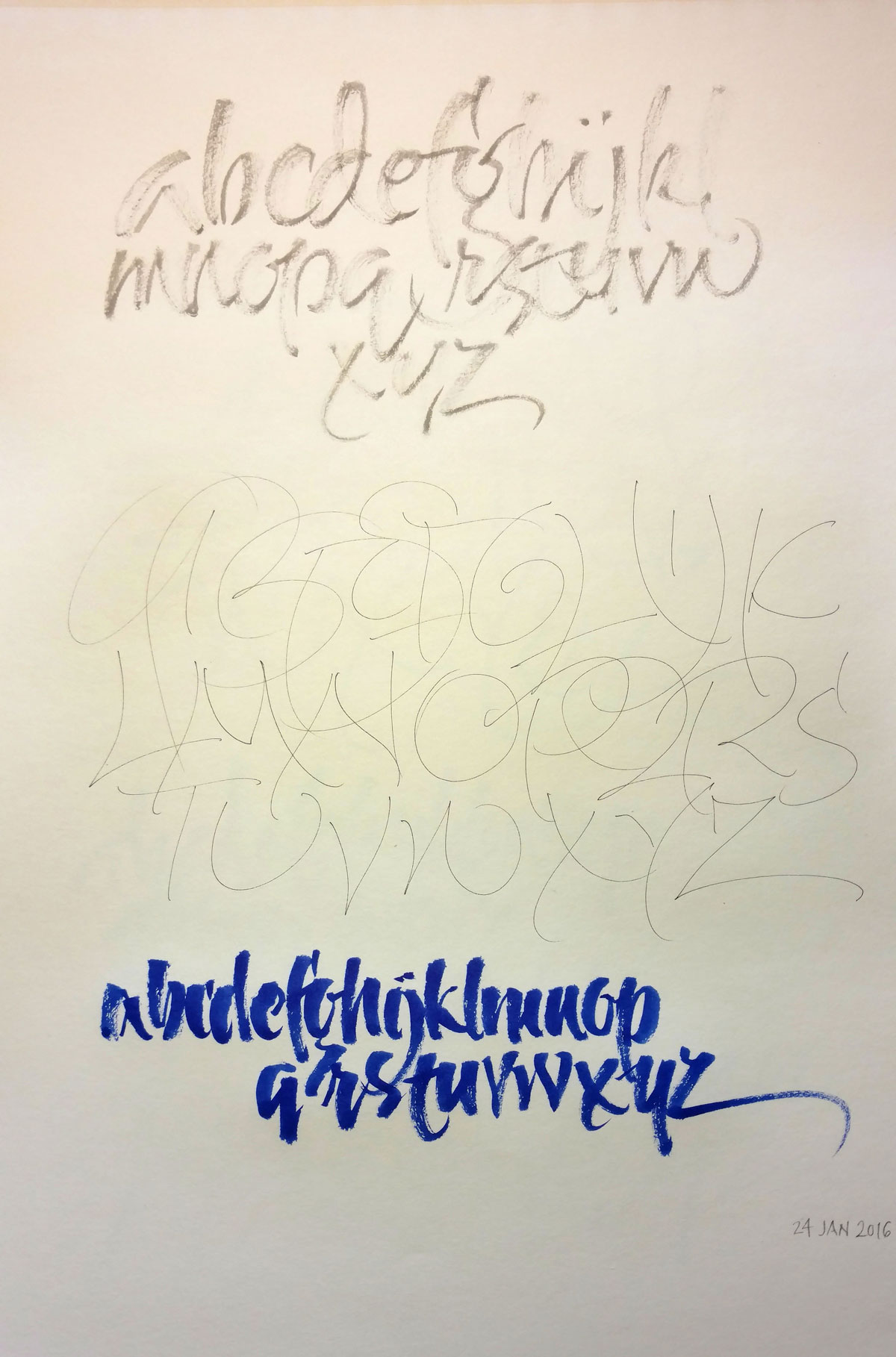
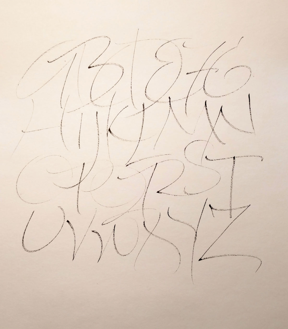
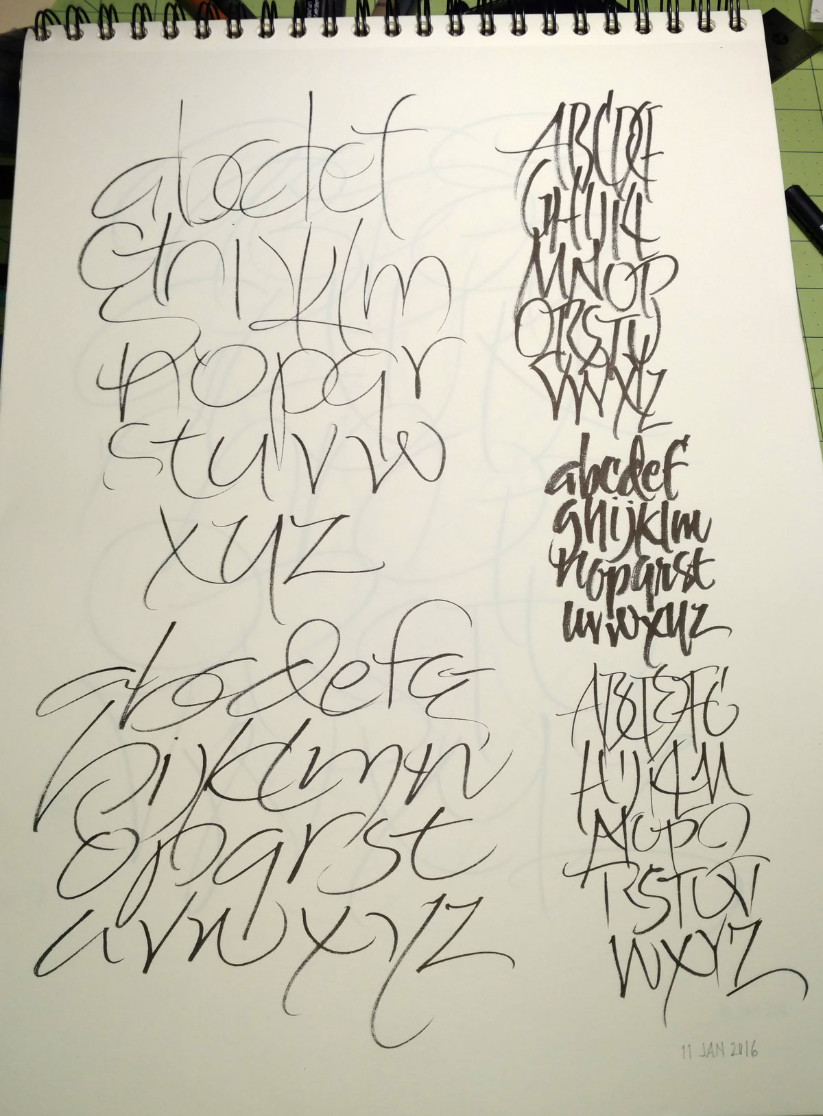
 Daily gestural ABC. That is all.
Happy New Year!