I’ve been continuing to re-read Burgert’s book, The Calligraphic Line. At the beginning, he writes that calligraphy is two-dimensional design using a limited set of symbols with a limiting set of rules. He discusses the spectrum of legibility -> abstract 2D design, and the concomitant spectrum of typography -> fine art. (Or something like that; I don’t have the book in front of me.)
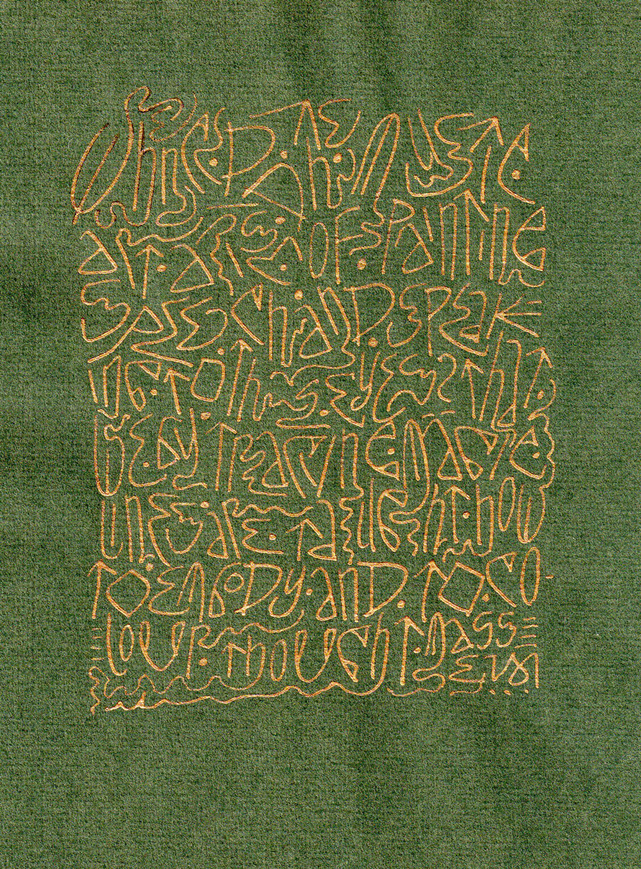
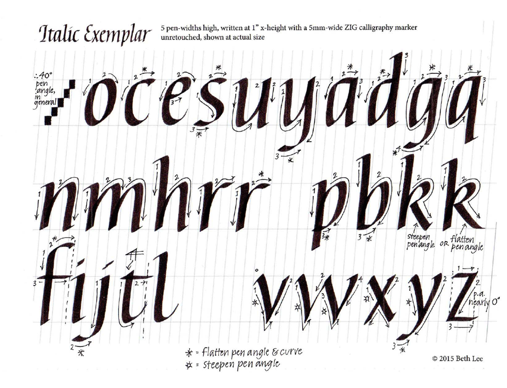
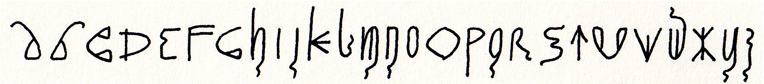
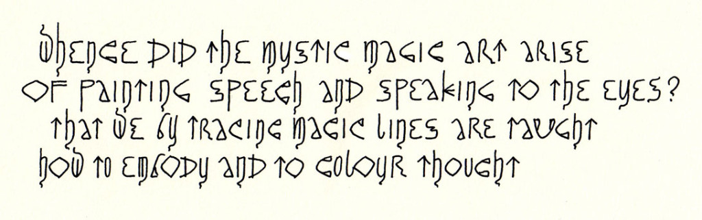
Burgert provides a hittite heiroglyphics image as an illustration to go with his discussion of the leap from flowing oral language to written symbols. After reading this, I constructed an alphabet using elements of that hittite image. It was handy; another image could have done as well. This is the alphabet:
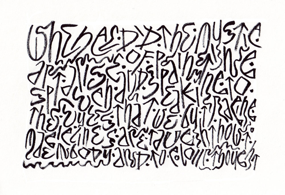
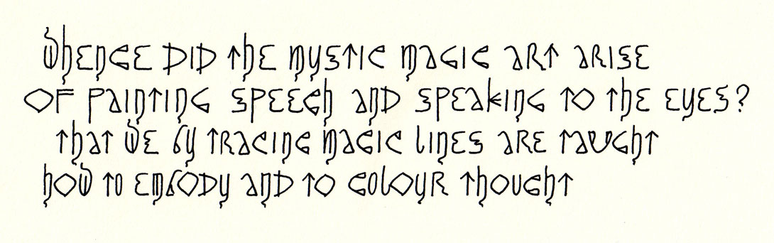
Using this alphabet, I wrote out a quotation following standard rules of typography, writing left to right in horizontal lines, paying attention to kerning, and so on.
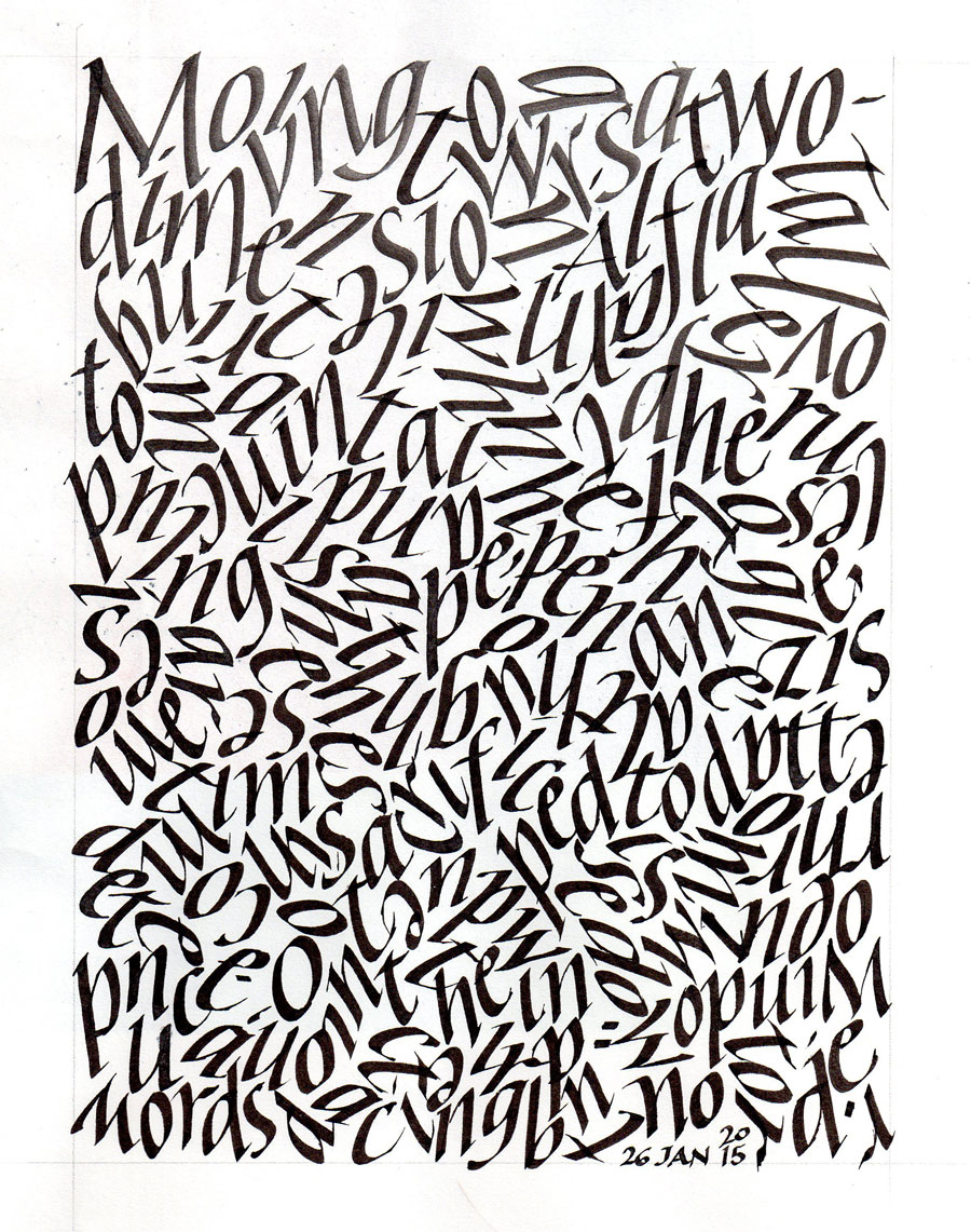
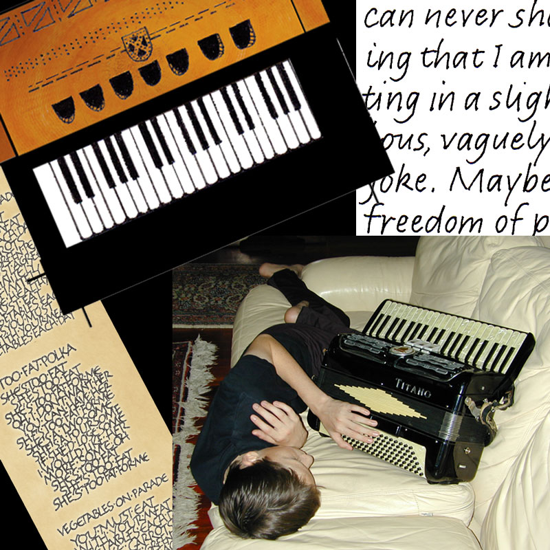
It was interesting, but I wanted to push it further to abstract two-dimensional design. After one falst start, this was the next step:
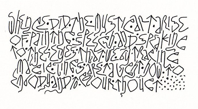
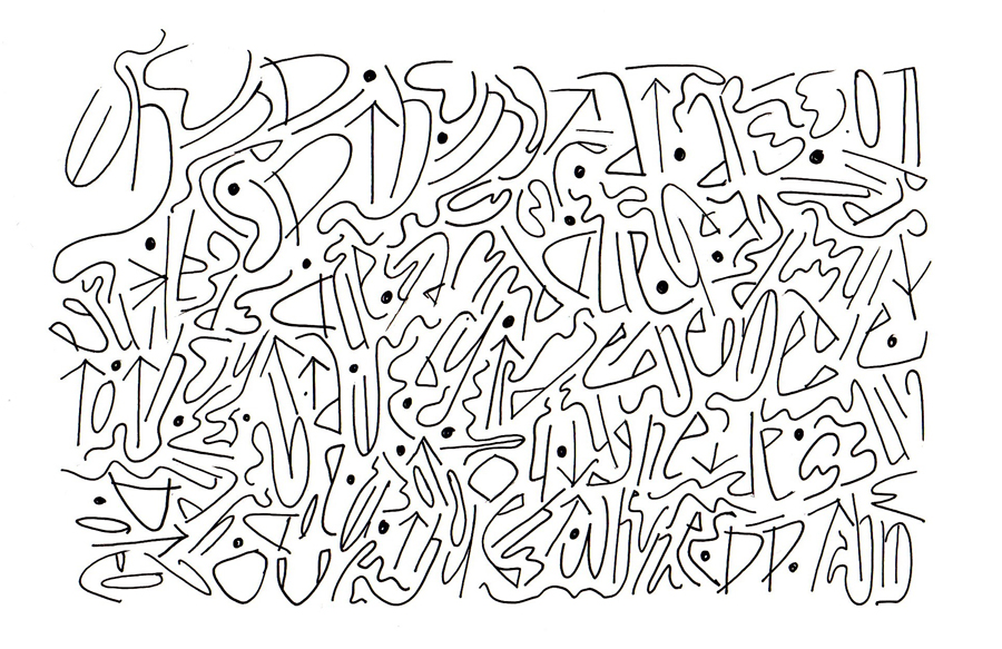
I thought it was interesting. And then pushed it further along the abstraction spectrum:
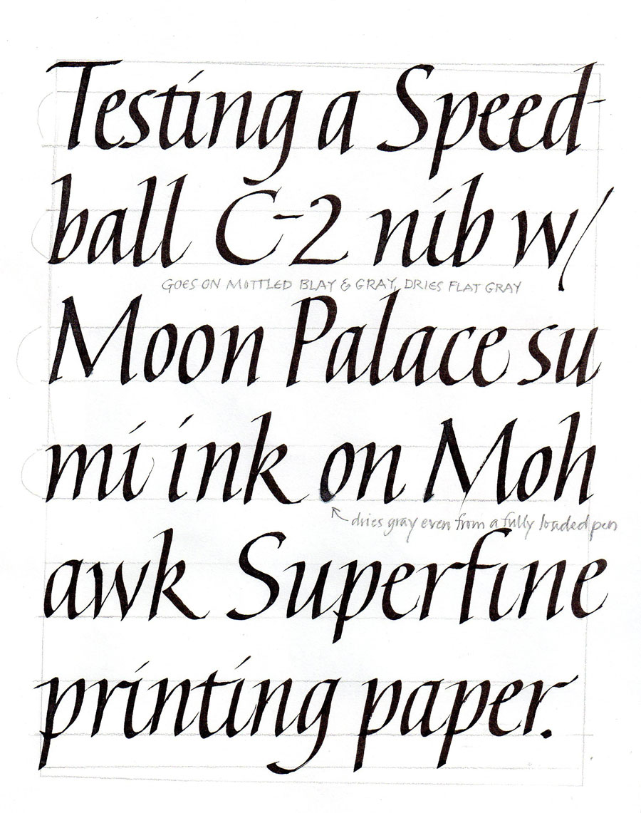
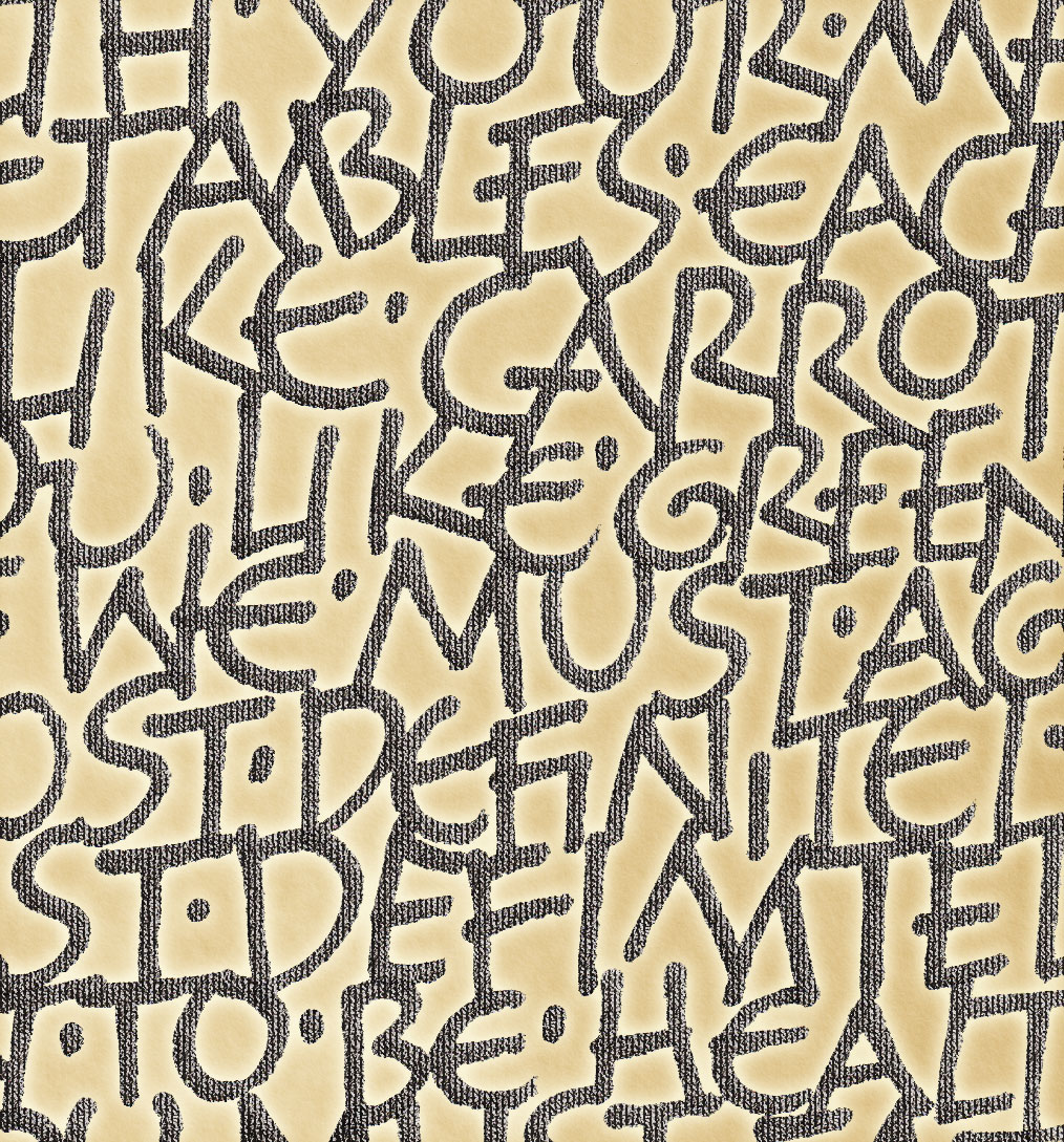
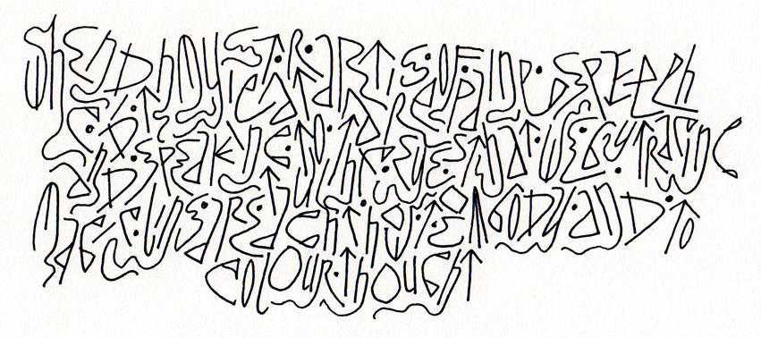 , but was surprised at how little I had moved along the typography/abstraction spectrum between lettering 2 and lettering 3. So far, it’s fairly easy, so I probably haven’t gone far enough yet.
Like this:
Like Loading...